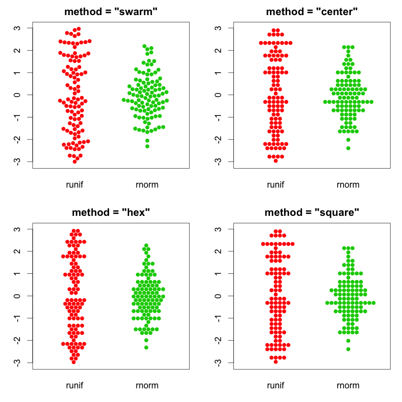
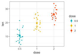
If R visuals are an option, there is an R package called beeswarm that I think creates attractive versions of the type of plot you’re looking for, and meets all your other criteria. Below are just some examples of the types of customization you can do with it.
P.S. another option is Charticulator, about which I know very little, but @MudassirAli and @datazoe would be good sources on the viability of that option here.
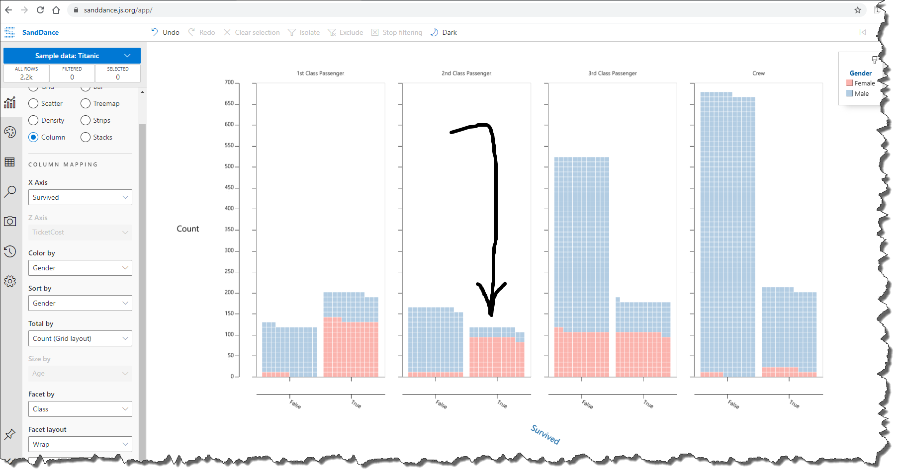
Have you been able to generate good looking visuals with SandDance? I tried it for Challenge #6 and was really disappointed in the results, but that may have been more the limitations of the user than the visual itself…
@BrianJ
Yes I tried but with challenge 6 data, I wasn’t able to produce good looking insights and visuals from SandDance apart from the scatter plot graph which was more or less the same as the native scatter chart visual. I tried other data from my workplace and the visuals were awesome. I guess it’s more about the distribution of data that affects the visuals. However, I tried challenge 6 dataset with ARCGIS maps for spatial analysis and I am just in awe of the insights it produces. Must try for everyone.
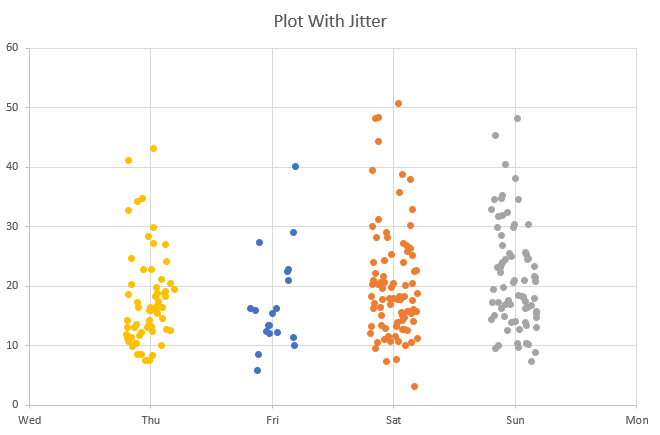
Just FYI -The out-of-the-box ggplot2 package (the core R visualization library) will do the standard jitter you’re looking for, with lots of options to customize:
I just highlighted the beeswarm package because I thought it looked cooler than the standard jitter, and thought from your post you were looking for something a little more “catchy”.
Not pushing R particularly – Charticulator and possibly Sand Dance may be good options too, but wanted to let you know this is definitely a standard visual within R.
@michellepace
If you have the sample dataset I can create a visual for you. Moreover, you can add SandDance from the market place and play with it yourself too.
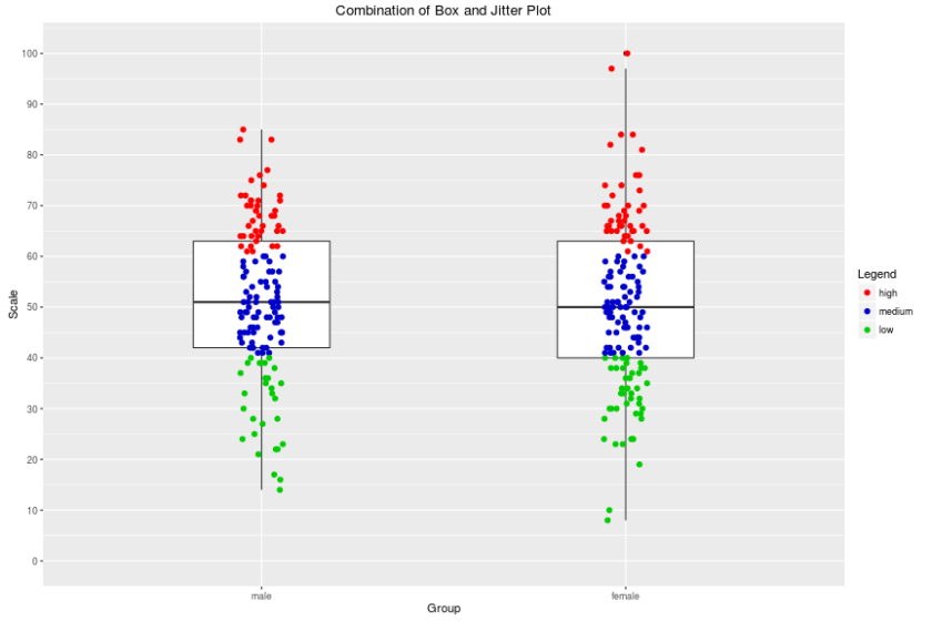
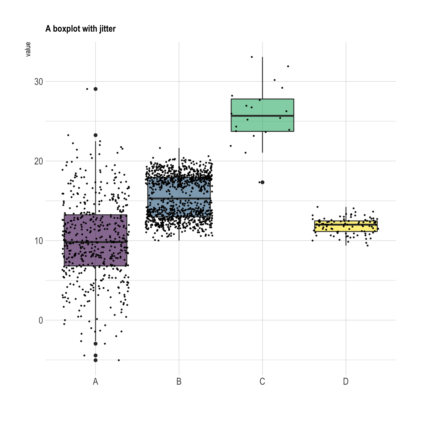
R and ggplot2: Goodness Brian, I’ve never actually used R in PowerBi. But now that I want to look into control charts too… it looks like I’m going to have to take the plunge. If anyone else is interested, I found create power bi visuals using R and box and scatter plot with ggplot2. Its lovely:
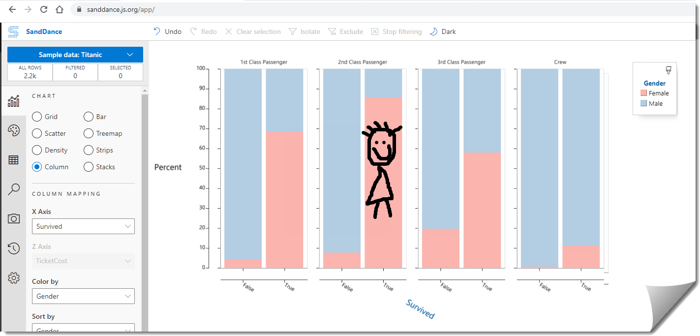
Sundance: Thanks Mudassir that would be great - I’ll randomise my data and upload it tomorrow! I played a little with the online app version. All I can say is go second class and be female!!
These two posts provide great resources (a comprehensive tutorial and an awesome cheat sheet) if you’re going to take the plunge into using ggplot2. Once you get the hang of it, it’s really a pretty simple “fill in the blanks” exercise:
A response on this post has been tagged as “Solution”. If you have a follow question or concern related to this topic, please remove the Solution tag first by clicking the three dots beside Reply and then untick the check box. Thanks!
@michellepace
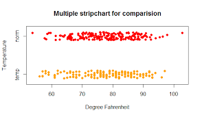
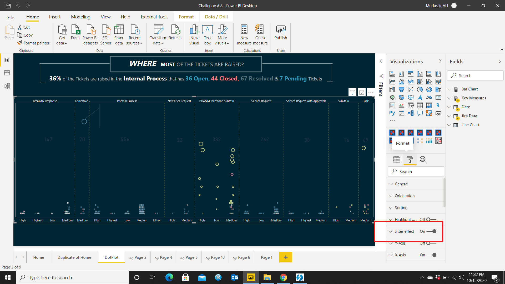
While working on a recent EnterpriseDNA challenge, I came across a custom visual called Dot Plot by MAQ Software which has a jitter effect option in format pane. You just have to go and turn it on for the Jitter Effect.
Better late than never, my visualisation is due 11th January. So no more procrastinating on jumping into unfamiliar waters (namely R / python)! I’ve chosen this histogram chart from the (power bi supported) Plotly library for R. I’m visualising scrap rates - - at the movement we just report on scrap rates as one big monthly (weighted) average. So this will add a lot insight, update to follow…