First thoughts are creating the visuals, then toggle between them with a DAX.
Have a look at the attached for a quick example.ToggleVisuals.pbix (37.1 KB)
Here is an example of what @Heather is describing. I’ve used this technique in multiple reports before, and it definitely has a “wow factor” in addition to being good way to save some screen real estate:
thank you Brian - and attached is an example file (had to rebuild as that wasn’t essential enough for me to save to cloud storage before being kicked out of the office for the quarentine)
Nice! - thanks for rebuilding the full example for us.
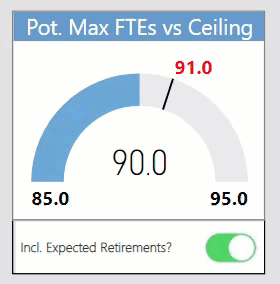
In our HR report, I use a similar approach - stacking copies of the same visual on top of each other, but changing the initial conditions (in this case, factoring in expected retirements or not) via a toggle slider linked to bookmarks. The change in gauge via conditional formatting provides an interesting effect, I think:
@BrianJ, I really like the small toggle, will have to consider that if I’m ever working with a single visual like that. Makes it very intuitive which visual the toggle links to.
The Bar vs Pie is something that I have to (sadly) use a fair amount, customers love their Pies, but I make the Bar charts the default (I have had one come back and tell me they don’t need the pie chart anymore, so I’m slowly winning a few over).
This Technique is much closer to what I am looking for thanks a lot
However the Canvas has 8 to 10 visuals and we need to switch 4 visuals with each KPI Selection so is there a better way to handle Formatting of those visuals since we need to overlap them over one another and when one visual is deselected it goes to default state
Any way to handle this default state of Visual via DAX to format the title and y,x axis so that it looks spot on ?
Bookmarks and Buttons was really Great too however my case is with KPI values in the slicer that keep changing dynamically and we need to place these buttons over these moved or new values all the time which is frustrating to end users and pain to maintain from viz tech… 100% Solution for static values which would never change
I have tried to put this measure filter on Page level but it doesnt seem to accept it
Is there a way to call the Report Page or Bookmark instead of Visual when slicer value is selected using your DAX approach
 Measure =
IF (
    SELECTEDVALUE ( tier_kpis[kpi_title]) = "NC Open Over 30 Days",
 1,
    IF ( SELECTEDVALUE ( tier_kpis[kpi_title] ) = "NC Open",
     2 )
)
Yes I am trying to navigate to another page via Slicer
I do know that recent March 2020 desktop Button has Page navigation from Actions setting
however my requirement is to dynamically Change the Visuals based on Slicer Value selected via your disconnected table method.
I want to have 10 Report Pages for 10 KPI and based on Slicer value selected I want to show that report page so that we do not have worry about formatting or overlay of visuals. This way even if KPI’s increment in future it would be a page add with end users requirement on visuals and dax measure condition handling
Please let me know your thoughts on how to achieve this?
it may be helpful to see why you need so many pages - the original question seemed to indicate a need to change between visual types, which is why we have focused on that.
Is it possible to upload a model of your report so we can better understand?
I want to be able to replace the trend chart and histogram with different visuals based on KPI Value selection. Key Takeaway and Action points will stay right there but those two visuals should change dynamically
when using toggle approach i.e., Disconnected Table value via slicer, the visual which gets deactivated and goes to the back is still seen displaying x axis and y axis scale numbers and that’s an issue given the canvas or real estate of our dashboard.
So when slicer value is selected the visual which goes to the back should be completely invisible
My thinking led me to try the page switch rather than visual switch and hence I asked if there is a way to dynamically navigate to pages via slicer value selection
Okay so I turned off Y axis for both the visuals and since X axis is same for both it is looking okay but users are panicking for that Y axis scale to be on
Is there a way to basically make the scale of both x axis and y axis invisible post deactivation