Hi all,
I like to offer my users the ability to dynamically select from one of many measures to be displayed in the same chart. This works fine if all the measures on offer return the same format, but if they are of differing formats the charts cannot handle the varying formats and do not display correctly.
The new Calculation Groups functionality supposedly resolves this issue, but I am struggling to get it to work.
Please see my sample report: Calculation Groups Query.pbix (441.6 KB)
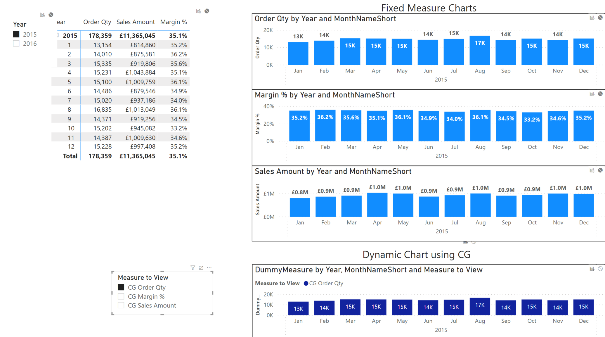
I have the 3 measures below, each with a different format:
- Order Qty - Whole Number
- Margin Percentage - Percent
- Sales Amount - Currency
The top half of my page shows these in their standard format within a matrix and in 3 individual static charts, each correctly displaying their respective format:
Following guidance from the video below I have tried to utilise calculation groups to allow me to fix this issue:
")
In Tabular Editor, I have created a calculation group ‘User Options’ with 3 calculation items, each containing a copy of the DAX used for their associated measure (eg not referencing the original measures themselves) and with each returning an appropriate Format String:
- CG Margin %,
- CG Order Qty
- CG Sales Amount
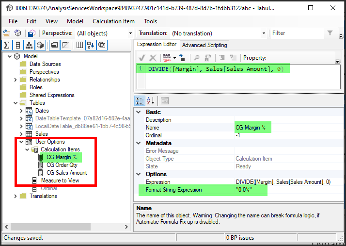
This adds a new ‘User Options’ table to my data model containing a single column ‘Measure to View’.
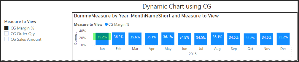
I have added this column to a slicer to allow the user to select one of the 3 measures to chart.
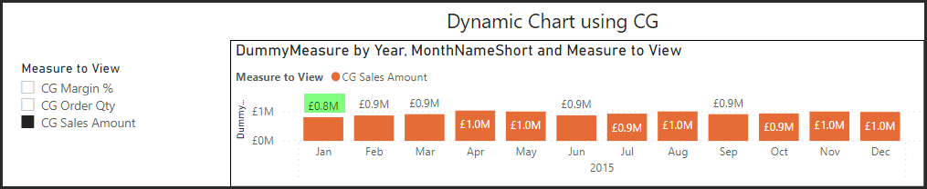
I have then created a new ‘Dynamic Chart’ in the bottom page of my report, which uses a dummy measure for values and the calculation group ‘Measure To View’ in Legend.
This now allows my single chart to dynamically return each of the 3 measures, each correctly formatted
Margin % ![]()
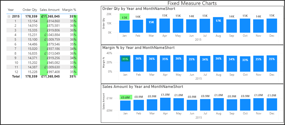
Sales Amount
HOWEVER while it works a treat in my dynamic chart, it breaks my original matrix table and standalone charts, where all measures return the same value as my selected Measure to View?:
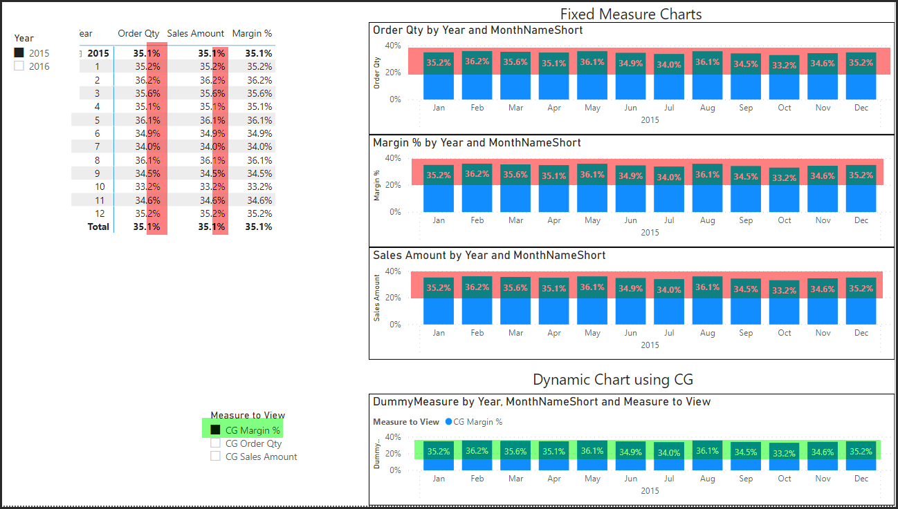
I don’t understand why this is happening as the matrix and 3 static charts are all using measures which are standalone from my calculation group?
It wouldn’t be a problem if I wasn’t displaying the matrix and my page simply displayed the dynamic chart and slicer, however this isn’t realistic. I need to be able to use the dynamic chart and the standalone measures on the same page.
The only solution I have found so far is to use Edit Interactions and set my matrix and 3 charts to ignore my Measure to View slicer.
I appreciate this is a long post and this is relatively new and different functionality I am trying to use, but Calculation Groups are touted as being the fix to this long standing problem and I would love to get it working!!
Many thanks in advance
Mark