This may seem a bit weird but it makes sense to me.
I am producing a complex chart and a simple table based on the product dimension. Everything is done. Now I have been asked to add a slicer to change the dimension the chart and table are based on.
All of the measures - thats the easy bit. I can calculate based on the slicer value.
The difficult part (1) is the line and stacked column chart - I use an attribute of a dimension [Product Name] as the Shared axis (x-axis) withe Sales as the column value and a cumulative for the Line Value.
How can I replace the [Product Name] with something more dynamic - so from the slicer the user selects “Sales Area Name” rather than “Product Name” and suddenly the x-axis is the Sales Area Name?
Problem number 2 is the Matrix table which has the same problem. The first column is [Product Name] and again I want that to be dependant on a slicer selection.
I want a column that would be
Column for the X Axis =
SELECTEDVALUE(‘slicer analysis’[x axis]),
“Area Name”, VALUES(‘dim Area’[Area Name]),
“Product Name”, VALUES(‘dim Product’[Product Name]),
VALUES(‘dim Product’[Product Name]) // DEFAULT
)
I have seen some examples where people have used a slicer, a bi-directional join to the fact table but … Product Name and Area Name are not store on the fact table. They both use a surrogate key to hook up to the fact table and as the fact table is large I want to try and avoid dulicating it.
The only other alternative I can see is using bookmarks but I want the user to look at a slicer and for that to drive the chart and Matrix.
All suggestion gratefully received. Although I have said there are two choices - in reality I know this is going to expand to 10 very rapidly.
Sorry to waffle on but I think a solution would need
to look like they are using a slicer to pick the attribute used for Analysis
I’m providing few of the links of the videos where for charts how one can dynamically switch their axis as well as for the matrix/tables where how to change the column names.
Hoping you find this useful and meets your requirements.
I had gone through all of those bar the last one. Unless I am missing something they dont work for me.
On my fact table is skey_Area and skey_Product.I looked at Patricks solution which seems to be similar to everyone else. But I really dont want to create that could link to 10 possible attributes.
I will have a look in detail but fear that it will make a massive model even bigger.
I now have my calcs for he columns and line sorted. I thought I could have a column on the fact table that gave different values based on a sllicer
If my slicer says Area Show the Area Name as the column value, If my Slicer says Product show the product Name.
A card linked to the slicer changes but the axis on my chart remains
Re-checked Patricks video. This seems to work on one dimension table but not potentially 10 different dimension tables.
To explain simpler I want one chart Money on X and on the x-axis
Area Name (from the area dimension)
or
Product Name from the Product dimension
or
Territory Name from the Territory dimension
etc
The x-axis is to be chosen from a slicer or something that looks like a slicer.
The closest I can get is all of the measures being dynamic so the values work. But the ZX-Axis just stays the same, Tried basing it on a clum added to the Fact table that would show the correct names but when I select the slicer it does not change the values / chart
Can you please provide the working of your file alongwith the desired result that you’re trying to achieve so that members of our forum can also help you. If your data contains the sensitive information then you can mask your data. Below is the link provided of the video about how to mask the sensitive data which was created by one of our Expert @BrianJ.
Because right now lots of guess work is going on. Or you can simply use the bookmark option and overlay the charts on top of one another. I’m also providing some of the links of the videos related to the Bookmarks.
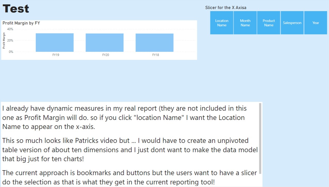
Uploaded a basic example. As you can see it looks like Patricks Dynamic X Axis chart video. But I have a large data set and dont want to bulk it out just because the users want a slicer rather than a button.
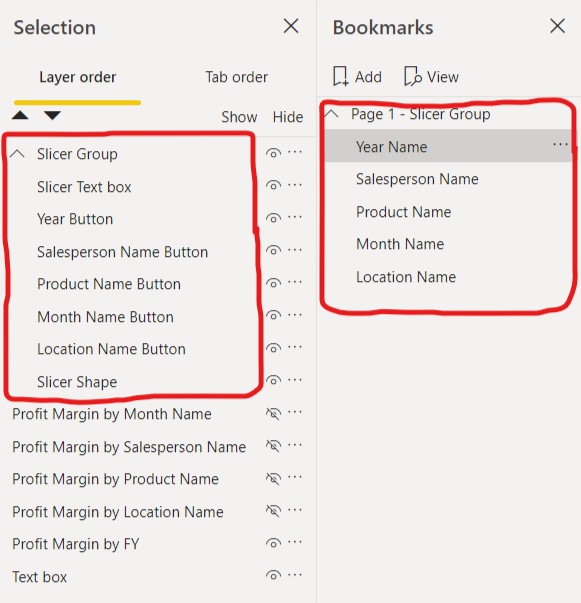
As you said that your data is in bulk and you don’t want to further increase the size of it by unpivoting it. Then the only option that we’re left with it is the “Bookmarks and Buttons” option. I’m the providing the screenshot below of your first page as well as the Bookmarks page of my solution and the results are identical i.e. as good as having slicer on the page.
Thanks,
Is there a way of keeping bookmarks under control so like grouping them. So when I look at the Bookmarks I can see them grouped by the page they are on. Looks like I am going to end up with a lot of bookmarks
Cheers
E.
Yes, you can surely group the bookmarks page wise. Select you bookmarks by pressing the “Ctrl” key and then click on the “…” dots ellipses and then select the option of “Group”. Below is the screenshot provided of the result for the reference.
Perhaps consider a ‘main page’ with your buttons, and then hidden pages with each of the views.
if the buttons were replicated to each page, then you could simply have the buttons lead from one view to another. To the end user, it would probably be much smoother.
updated version attached - please note that this version uses page navigation only, does not require bookmarks.Slicer for the x-axis.pbix (761.0 KB)

")