How can I get rid of the excessive white space in bar chart?

Hi,
There is suddenly an excessive white area between the axis name and the values for my bar chart.
I tried to work with the Y-Axis settings but I was not able to get it solved. It happens no matter what I put into the Y Axis. I was trying to find an explanantion online but wasn’t able to find anything.

What am I missing?
Thanks,
Nico

Hello @nico,

Thank You for posting your query onto the Forum.

Do you’ve any negative sales figure? This could be the reason for a white space, please scroll down the chart and check if there are negative values in the opposite quadrant. If not, then please post a PBIX file so that members of the forum can assist you in a better and efficient manner.

Thanks and Warm Regards,
Harsh

Hi @Harsh
Thank you for your answer.
There are in fact a few negative values, but they are super minor and only take a fraction of the white space.
BI7

I will try to see if I can replicate the issue with some data I can share.

Thanks again.
Nico

Hello @nico,

It doesn’t matter whether the negative numbers are “super minor” or “super huge”. Power BI will allocate the minimum white space once it has the values either ways. I’ve replicated the same scenario in my file where the positive numbers are in “Millions” and has one small negative value. Below is the screenshot of the result provided for the reference -

For this, there’s nothing anyone can do about it in this case/scenario.

Hoping this explanation helps you to understand the scenario.

Thanks and Warm Regards,
Harsh

Testing - Harsh.pbix (15.6 KB)

1 Like

Hello @nico,

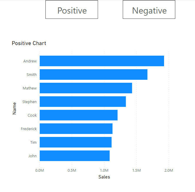
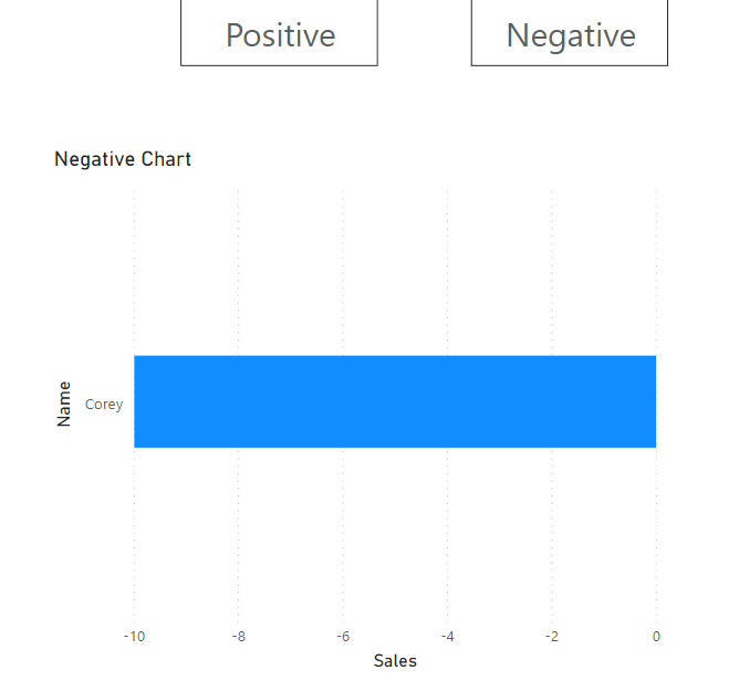
What you can do as an alternative option is to create two charts one with the “Positive Numbers” and other one with the “Negative Numbers” and overlay them one over the another and than use the bookmark technique. By this way you’ll be able to eradicate/eliminate the white space for negative numbers that you’ve in the charts. See the screenshots below provided for the reference -

If you want to learn more about bookmark techniques below is the links of the videos provided for the reference on the topic - “Buttons and Bookmarks” techniques.

As well as also attaching the working of the PBIX file for the reference.

Hoping you find this useful as an alternative option. :slightly_smiling_face:

Thanks and Warm Regards,
Harsh

Testing - Harsh v2.pbix (17.1 KB)

1 Like

Hello @Nico! I recommend keeping only 10-15 values on screen when showing the data inside a barchart. Showing all the data with a huge scrollbar does not create a great experience to the user. What is the message you want to send when showing this chart? Do you want to show the main cities ? Do you want to show the difference between the first cities and last cities (Top 5, Worst 5 would suffice?)

1 Like

Thank you all.
I just played around in Power BI and found the same reason as @Harsh is explaining.
Then I came back and saw all the messages confirming what I saw.
@Harsh Thanks a lot for the Bookmark example. I will definitely use this at some point.
In this case, I might go with @alexbadiu suggestion since I agree that it doesn’t add much value.
Thanks again for the help and detailed explanation!!!
Nico