Nice work @renata_kulagowska ![]()
![]()
![]()
2 Likes
hi,
I thought it was an easy workout… I was wrong: I found a lot of settings to be applied to the line chart and I learn a lot of new things !
Please find attached my entry.
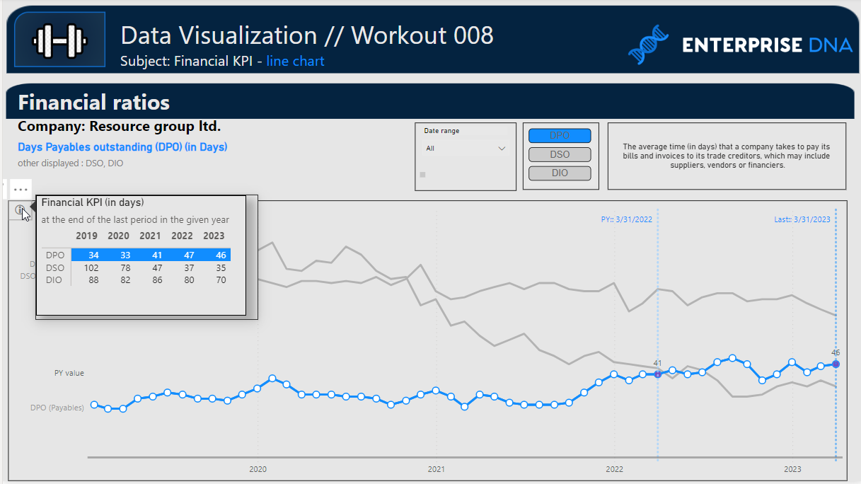
I am not able to apply the bold on the selected KPI label and to set the background color of the metric column in the tooltip. Any suggestion ?
ciao !

Workout 008 - financial kpi line chart - Roberto Ravani OK.pbix (408.2 KB)
4 Likes
thx for help with “DPO,DSO,DIO” slicer ![]()
2 Likes
I also got some inspirations from Angelina since I was stuck with Last value and PY value.
Thanks !
2 Likes
Hi Roberto,
I’m with you in this workout. When I did the line chart I thought the rest it would be a piece of cake. I was completely wrong! The tooltip with the color background blow my mind.
I didn’t finish the workout yet, but I found a solution for that color background. I will soon post my solution with the pbix.
hi,
I just realized that my problem with Last value and PY value, was a problem of granularity: I used a date table with daily granularity while the main table has a month granularity and I didn’t manage it.
If I may, I suggest you the Data Modeling workout 6 (Data Modeling Workout 06 - Many-to-Many Part II).
hi Alexandre !
looking forward to see it !
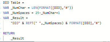
Hi use this:
Hi
So you moved the name of the measure into the measure value…
And you did It in a cool way !
Bravo !
Yes and hide the measure name in the table.
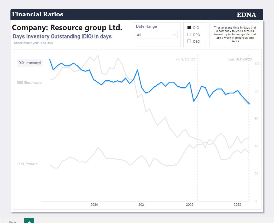
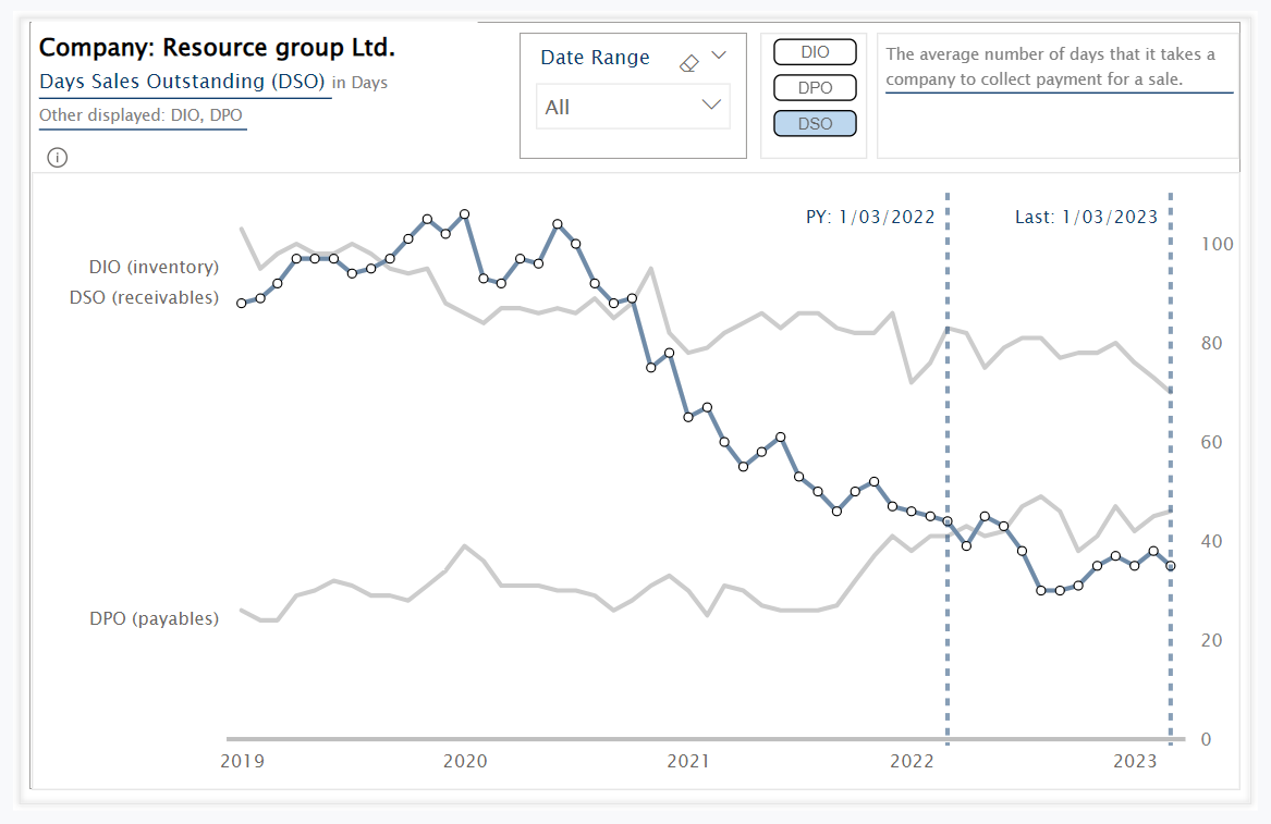
Do you have any clue how to hide the first value on the x-axis like in the example?
For example, the 2019 year don’t appear only 2020.
I have tried some ways but at the moment any one solve the problem.
@AlexandreAndrade
Visibility of 2019 might relate with the date used (start of month or end of month). Need a double-check.
For clarification, “hidden” 2019 in my screen shoot example is not included as the “subject” of this particular workout (in case you would like to make a 1v1 replica of my version).
Nevertheless, awesome to see that you solve all the “obstacles”!
Great work everyone!
Thank you. I’m curious to see your solution to this workout.
1 Like
I still have a bit more to do on this challenge. I must say, I don’t know how the heck you’re dynamically highlighting your line chart with only one graph ![]() . I can’t wait to see your solution.
. I can’t wait to see your solution.
4 Likes
Hi,
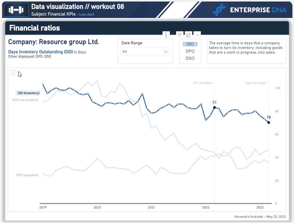
As I said before this workout was harder than I expected, but I’m really glad I managed to finish it.
Here my solution:
Pbix
Workout 008_AA_Final.pbix (551.6 KB)
6 Likes
Hello Friends!
Find below my origin visualization set (PBI file may include some additional tables / measures that was not used to create this particular set of visualization).
Workout 008 - Gustaw Dudek.pbix (1017.9 KB)
Have a great day!
4 Likes
Awesome KimC
3 Likes