Workout 008 – Financial KPIs - line chart
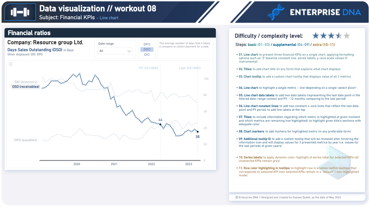
Difficulty rating: 3.5 out of 5
Intro note
This workout combines various visualization techniques. The most important part of the workout is practice - entries does not have to include every element or functionality to be still considered as great . Please pay attention to the list of functionalities (provided in the screenshoot and in published-to-web report), which includes ‘basic’ elements (1st-3th point), supplemental (4th-9th point) and extra (10th - 11th point). I would kindly recommend to review them before executing green/blue/orange points to provide proper plan and flow of your work.
A good starting point is to implement first three basic points, which is: adding all three KPIs into a single line chart (including additional elements such as titles and tooltips). Realizing further points (blue/orange) will provide additional technical practice.
Following workout bases on a ‘new’ datasets which are not used in the previous workouts
**Feel free to use your entries as a part of your project portfolio, if it’s instrumental in realizing your goals.
Additional notes
Regarding the column naming convention:
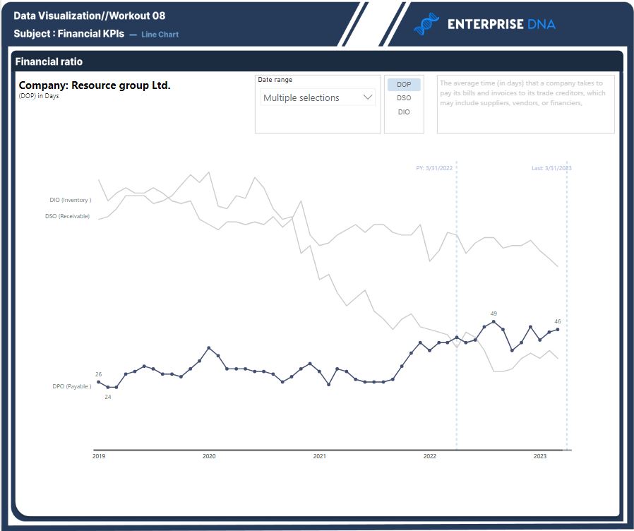
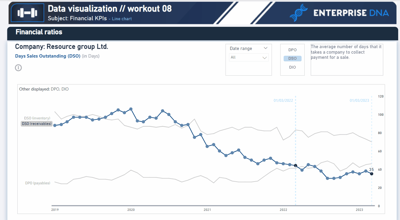
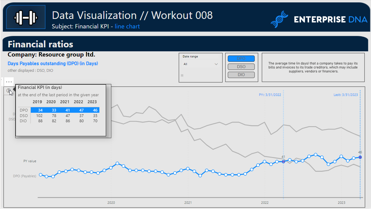
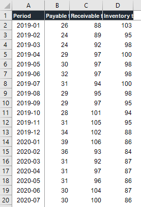
Column ‘Payable turnover’ - DPO (in days)
Column ‘Receivable turnover’ - DSO (in days)
Column ‘Inventory turnover’ - DIO (in days)
Goals
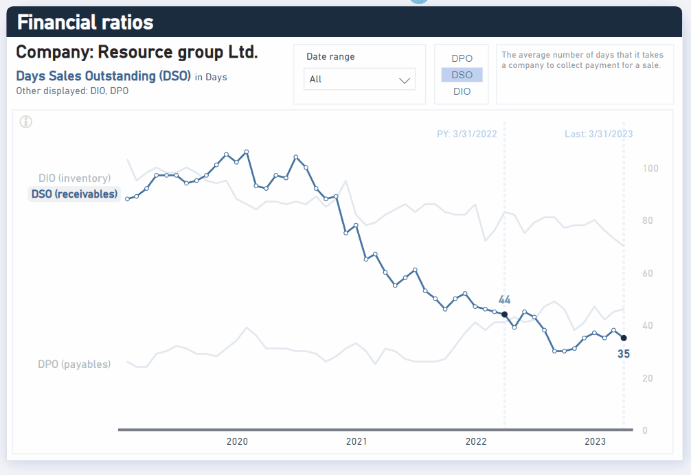
In this workout, using the supplied dataset and reviewing the provided interactive report (link below) we are going to replicate the following set of vizualizations (left section in a report screenshot), including the line chart, additional title section, slicers, text box (KPI description) and tooltips. Also, please feel free to add any extra visual if you would like to (provided that core visualizations are included in the first place).
008 - Workout - Financial KPIs - line chart.xlsx (15.7 KB)
Core actions (practice) :
-
- Creating informative chart headers (various formatting options)
-
- Enhancing visual look of chart when displaying multiple measures / metrics
-
- Getting familiar with various chart formatting options (x-axis lines, markers, fx labels, series labels, secondardy y-axis, y-axis placement switch and others)
-
- Applying dax functions to enable highlighting of given data points
-
- Creating chart custom tooltips and “external” tooltips with additional information
Submission
Please load the supplied data (xls file) into a Power BI file, replicate visualizations (considerating list of points in the introductory report screenshot and the general design and functionality provided through interactive published-to-web report), and reply to this post including the screenshot (or a gif) of your solution along with the pbix file (please, include name or EDNA forum nick in the pbix name).
Period
This workout is released on Monday May 15, 2023, and the author’s solution will be posted on Monday/Tuesday May 22nd/23rd May, 2023.
Additional materials
Link to the interactive dashboard:
KPI descriptions has been downloaded from the website: https://www.investopedia.com/
Have a great fun!
Best regards!