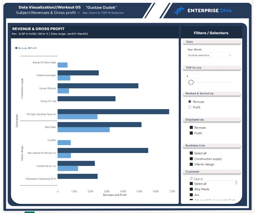
Workout 005 – Revenues & Gross profit – bar chart and TOPn selector
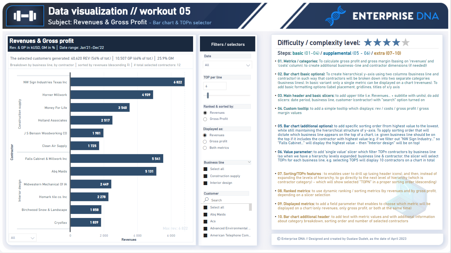
Difficulty rating: 4 out of 5
Intro note
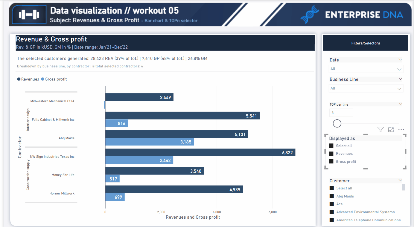
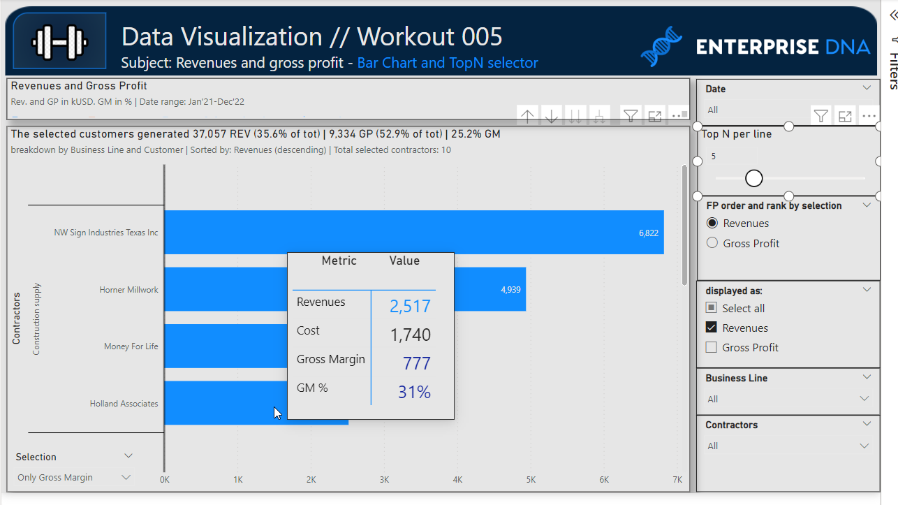
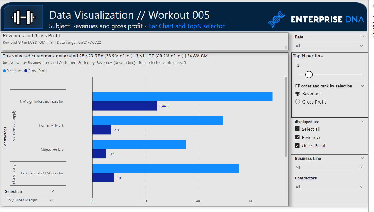
This workout combines various visualization techniques and native functionalities (i.e. field parameters, numeric range parameter, custom sorting options). The most important part of the workout is practice - **entries does not have to include every element or functionality to be still considered as great **. Please pay attention to the list of functionalities (provided in the screenshoot and in published-to-web report), which includes ‘basic’ elements (1st-4th point), and supplemental (5th - 6th point) as well as one extra (7-10th point). If your goal is to incorporate points marked on yellow color (7-10th point) - I would kindly recommend to review them before executing green and blue points to provide proper plan and flow of your work.
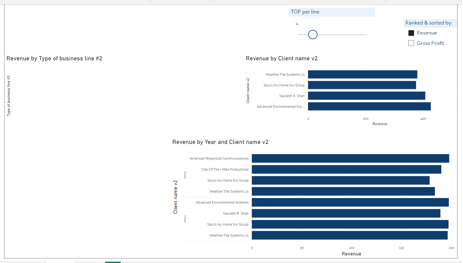
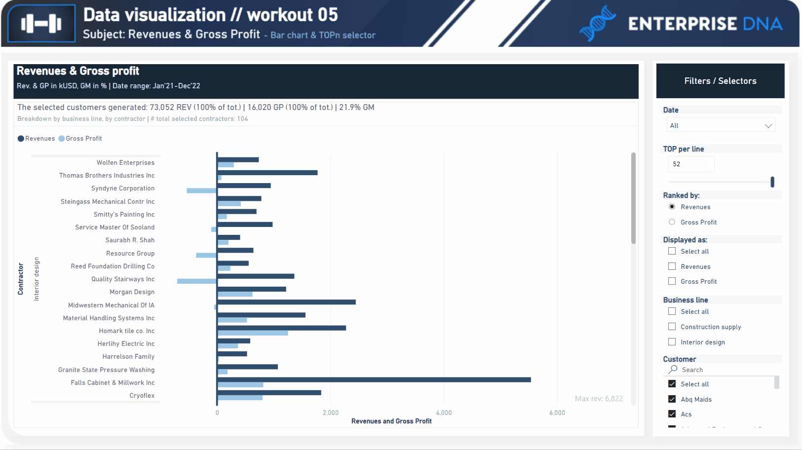
A good starting point is to implement a bar chart with hierarchical structure (by business line by contractor) that displays only revenues. Realizing further points (blue/yellow) will provide additional occasion to practice using numeric range parameters (and field parameters as well), creating custom sorting orders and TOPn segmentation.
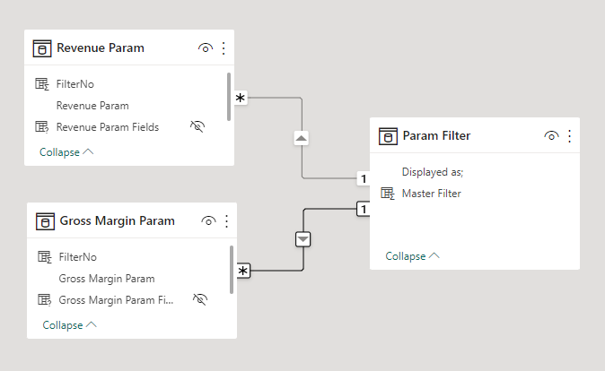
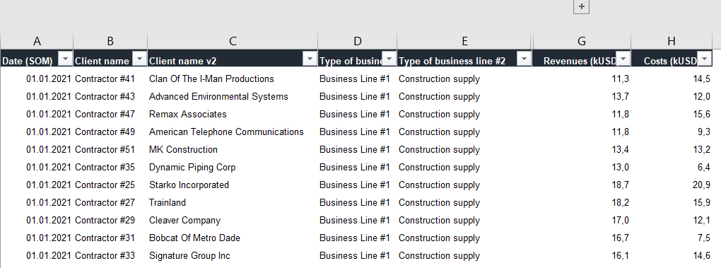
Following workout bases on the same data source as provided in workout 002 (Profitability - scatter chart) - if you already participated in the 2rd workout - please feel free to reuse your already transformed datasource / model / measures etc.
**Following workout does not require to use column ‘Units sold’ . Nevertheless, please feel free to use any columns and any data which is valuable from your perspective. Feel free to use your entries as a part of your project portfolio, if it’s instrumental in realizing your goals.
Goals
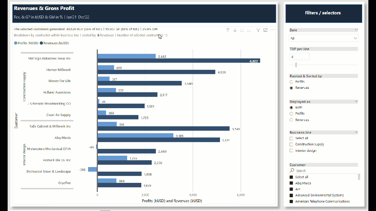
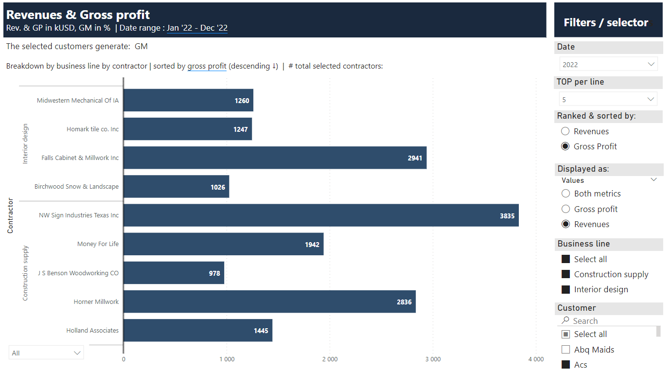
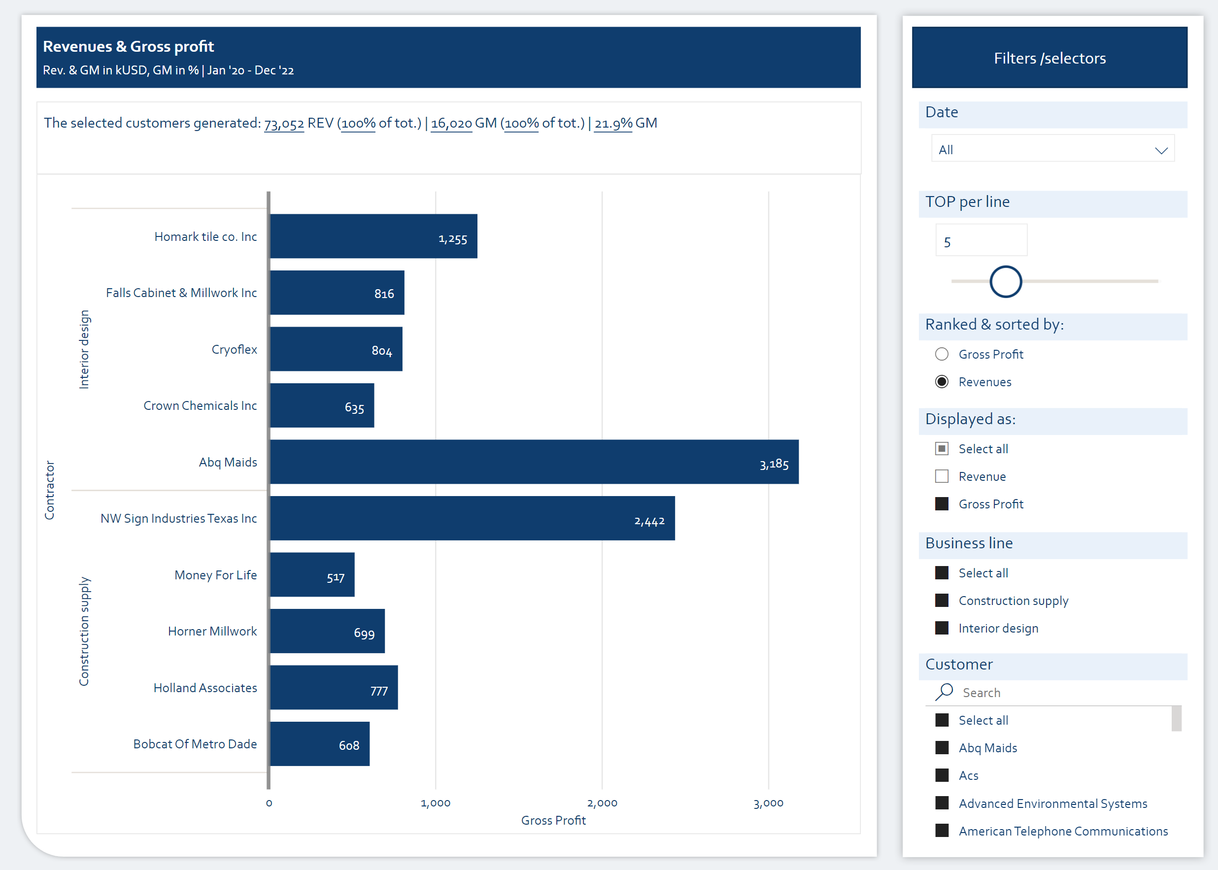
In this workout, using the supplied dataset and reviewing the provided interactive report (link below) we are going to replicate the following set of vizualizations (left section in a report screenshot), including the bar chart, slicer pane, and additional headers. Replicating the slicer (left bottom corner) is not required (slicer allows to change data label density when ‘Both metrics’ are displayed on a bar chart). Also, please feel free to add any extra visual if you would like to (provided that core visualizations are included in the first place).
005 - Workout - Contractor profitability (bar chart).xlsx (110.9 KB)
Core actions (practice) :
-
- Making basic calculation (gross profit, gross margin)
-
- Getting familiar with the bar chart in general (different formatting options, labels etc.)
-
- Getting familiar with hierarchical structure of y-axis within the bar chart
-
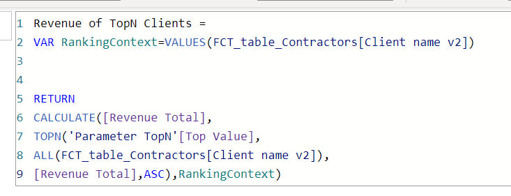
- Creating custom ranking / sorting formulas
-
- Using numeric-range parameters and creating TOPn functionalities
-
- Using field parameter to display preferable measures within a chart
-
- Creating basic custom tooltips
Submission
Please load the supplied data (xls file) into a Power BI file, replicate visualizations (considerating list of points in the introductory report screenshot and the general design and functionality provided through interactive published-to-web report), and reply to this post including the screenshot (or a gif) of your solution along with the pbix file (please, include name or EDNA forum nick in the pbix name).
Period
This workout is released on Tuesday April 24, 2023, and the author’s solution will be posted on Monday/Tuesday May 1-2, 2023.
Additional materials
Link to the interactive dashboard:
Have a great fun!
Best regards!