Good article for you on bookmarks
Thanks, DavieJo.
1 Like
Thank you @JohnG for your kind words,
I tried to discover any distinguishing pattern in the data. I believe that there are always hidden parts/sections in the datasets which discovering it helps the reader to have a more clear understanding of the data and to recognize any issue that might exist in that organization or company.
In my point of view, hidden parts have the information for which the managers are seeking, and the main role of a data analyst or power BI developer (in this regard) is to display these data in the most usable way for the managers.
Regards,
Hossein
4 Likes
This has been my experience.
John Giles
2 Likes
Dear @BrianJ
Thanks for your valuable, inspiring, and motivating comments. You have always helped me to create better reports. I am so thankful for the time you have spent considering my report. I would like to know your comments especially about the “page tooltips” that I’ve used in this report.
Regards
Hossein
2 Likes
" I would like to know your comments especially about the “page tooltips” that I’ve used in this report."
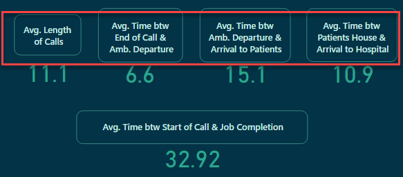
The report tooltips you’ve developed are fantastic - informative, well-organized and gorgeous design. The time tooltip is particular is a knockout:
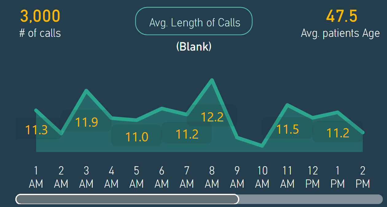
I do have two minor suggestions re: tooltips. When I looked at your PBIX, I realized that you had developed more tooltips than I’d “found” in using the report. You’ve got some clever mouse-overs that activate tooltips, but there’s no obvious indication that doing so will activate a tooltip. For example,
Mousing over the card text activates an excellent tooltip, but I completely missed that in my initial pass-through. I think a very small “i” or “?” icon in the upper right corner of each card would provide the visual prompting that would keep viewers from overlooking this excellent element. I would also extend the activation region over the # as well.
Finally, in places where you’re using the standard tooltip, I would suggest switching it to the modern visual style. I think it just looks cleaner, and also provides a much better UX for situations where drillthrough is available.
But these are very minor points on a masterful report.
- Brian
4 Likes
Thanks for your thorough explanation and your valuable comments. I really appreciate it.
I totally agree with you that the little “i” or “?” icon would be so useful, and I, unfortunately, missed using it. The idea of extending the activation region is so excellent. I will keep all your comments in my mind for my future reports.
Thanks again and regards,
Hossein
2 Likes
Hello tweinzapfel:
I’ve been reviewing your submission, trying to understand your navigation.
I see where you have a bookmark and action setup for the filter/slicer panel - “Show Slicer Panel”. However, I can’t find the visual, or object, that defines the Slicer Panel. Did you use a visual that isn’t in my set?
Thanks,
John Giles
@JohnG -
John - I’m trying to find what section in my report you are looking at. I have three tabs that all use a similar slicer panel. These are the “Total Volume”, “Time Analysis”, and “Patient Details”. On each of these pages, there is a left side navigation bar (see pic below) with the filter icon. Then I have 2 bookmarks per page (one bookmark to show the panel, and one to hide it).
The slider panels themselves (i.e. the objects/visuals) are all grouped under the name of “Slider Panel” (in the Selection Pane).
Does that help?
Also - thanks for the feedback that you gave earlier! I have recently come back from a vacation and haven’t had a chance to go through all the feeds until just recently (and still have to make my way through all the other submissions).
![]()
First, I apologize for my obtuseness here.
Any of the three Filter Panels will suffice to ask my question.
When the user clicks on the Filter icon, a panel will be displayed.
The panel allows the user to specify how they wish to filter the data they’ll review.
The items they can choose include;
Age Category
Ambulance Station
Hospital
Date, via slider
Gender
Protocol Name
In the Selection Panel, I can see how you’ve grouped the Slider. I think the item that corresponds is Slicer Panel - Filter Icon. In the Bookmarks, I see the Bookmark, Vol - Show Slicer Panel.
What I can’t see is the obect that defines the Filter Panel itself, that permits the user to define their filter criteria. I thought I’d see a visual that would be used to do that.
Thanks,
John Giles
1 Like
@JohnG -
I think I understand that you are looking for. So if you look at the “Total Volume” tab (for ease) - in the Selection Pane is a group called “Slider Panel” (see pic) below. That grouping is how the slicer panel is created. It consists of a grey rectangle shape (to serve as the backgroup), all the slicers, a close button, etc. I group it because then in the bookmark called “Vol - Show Slicer Panel” - I then having this grouping as visual (“Show” in the Selection panel) and the “Vol - Hide Slicer Panel” hides it (marking the group has being hidden in the selection pane). So I believe what you are looking for are the various items that make up the slicer pane (i.e. the grey rectangle shape, all the slicers, etc) that are contained in the “Slider Panel” group.
Does this answer your question? Happy to talk more about this.
1 Like
Hossein,
I just looked at your submission to see how you did things, especially as regards navigation.
While doing so, I noticed your Home Page that provides a large text box presenting interesting and idiosyncratic data you found while developing the report. Perhaps, next time add some color that highlights the key points you discovered. Maybe a ‘smart narrative’.
Regards,
John Giles
1 Like
Thank You.
I see the panel grouping.
I may have more questions at a later time, but first I need to create a set of reports utilizing buttons, bookmarks, etc. on my own.
By the way, I’ve seen that ‘weinzapfel’ means ‘tavern keeper’. Is that true.
Are you in Germany.
Regards,
John Giles
1 Like
Thanks for your time to consider my report, and thanks for your valuable comments.
Surely, I will do so.
Regards
Hossein
1 Like
@datazoe ,
Sorry - “Cards with States” is an OKViz custom visual that gives greater control over card options and includes a lot of KPI functionality. I wondered if that’s what you used or just “rolled your own”, but now I know the answer is the latter. Terrific report either way… 
- Brian
2 Likes
1 Like
Congrats everyone on our best challenge so far. Well done
3 Likes
Hello FPastor:
I have a couple of questions regarding your Challenge 14 submission.
Please, only answer if and when you have some free time.
I’ve been deconstructing a few of the submissions to acquire knowledge in a few areas in which I have none. As far as your submission is concerned, my questions relate to the Matrix and Table on the Staff Performance page (see below).
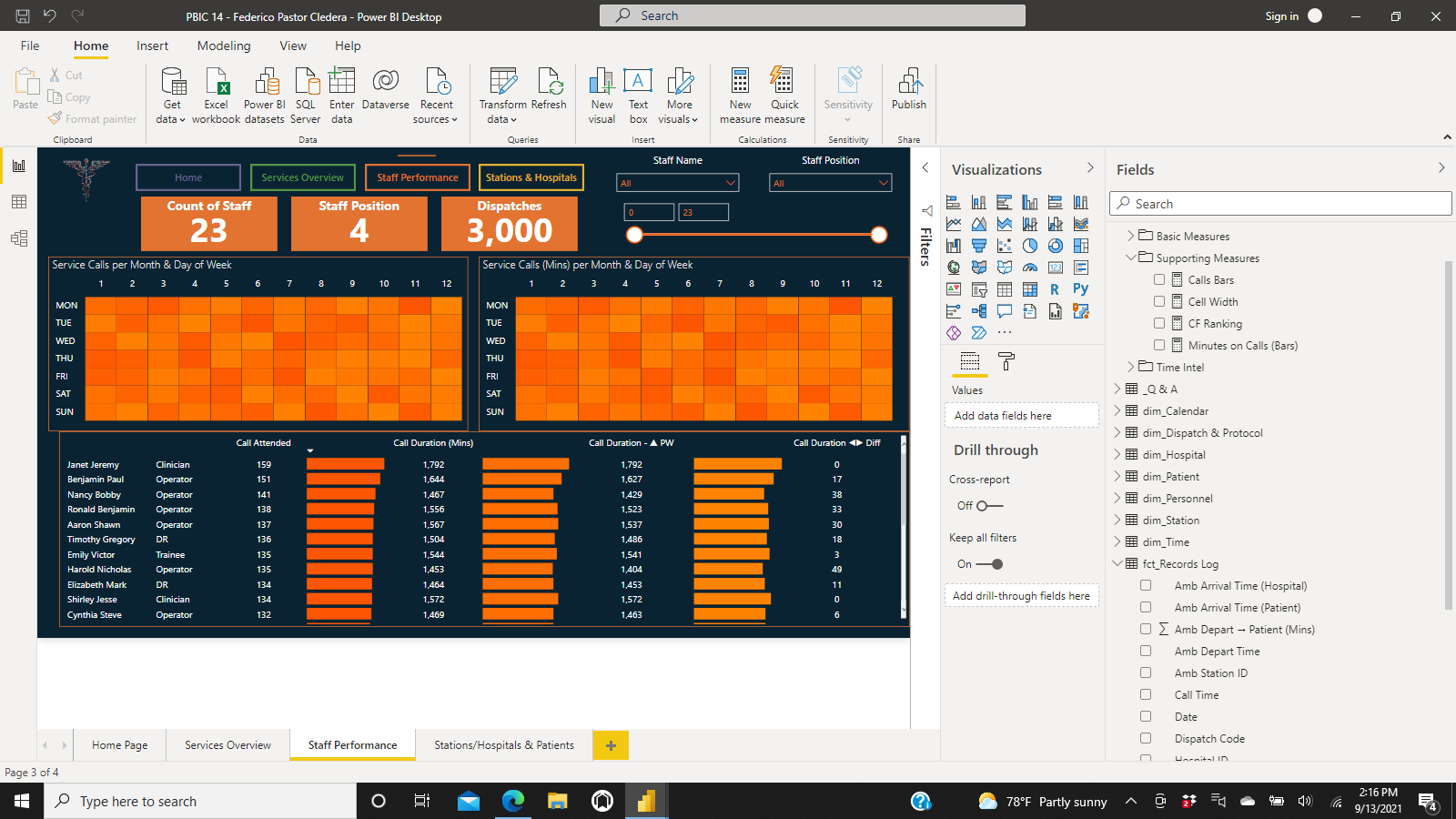
-
How did you size the cells in the Matrix? When I tried to duplicate the matrix, it’s much smaller than the matrix in your report. Did you use your measure “Cell Width”? I tried it, but had no success.
-
In the table, you suppressed some of the column headers by removing, or blanking out, the names of the columns in the Values pane. Again, how did you do this?
Again, I don’t expect you to respond immediately. If you can find some time eventually, that would be great.
Thanks.
John Giles
1 Like