Here is a link to my report
1 Like
Thank you Larry
Best of luck!!
Federico
Hello folks!
I’m excited to deliver my submission to the EnterpriseDNA Challenge19 Call Centres Data Reporting.
My aim has always been to accomplish the main request: “ to prepare a report that summarise, the overall service provided by EDNA’s Call Centres and enabling its senior Management to have a better view of its operations.”
I’d like to explain in a detailed way how I built the report, so there are some features that can be unnoticed at first sight.
I hope you will find this information useful (not just long!) and of course, I hope you will like the report, a lot of effort has been put into it!
Here it is the URL of the report:
Visualization level
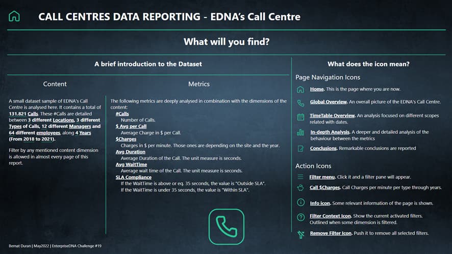
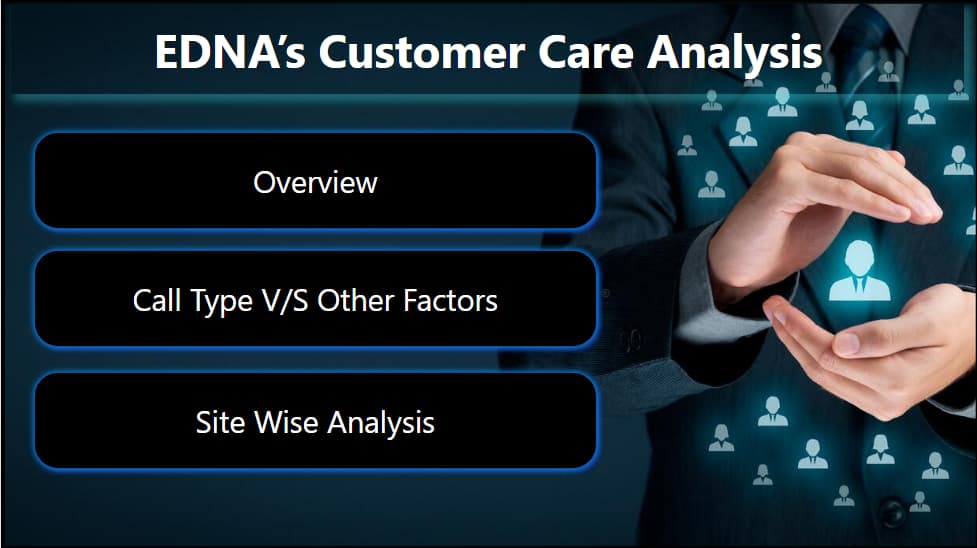
Home Page
Expand for Some Details
The aim of this page is to give to the user some information about the Dataset and a legend about every navigation and action element used in the report.
The big “Call” icon, leads the user to the Global Overview page, the first of the four pages dedicated to the analysis.
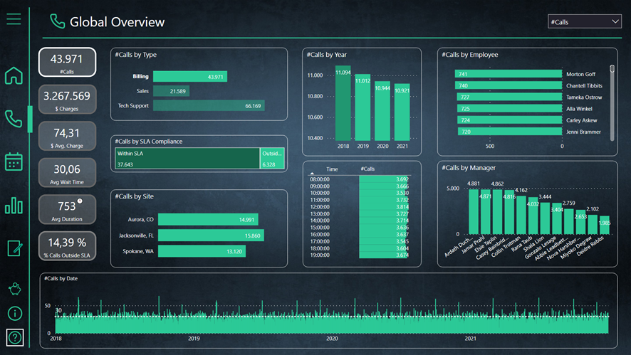
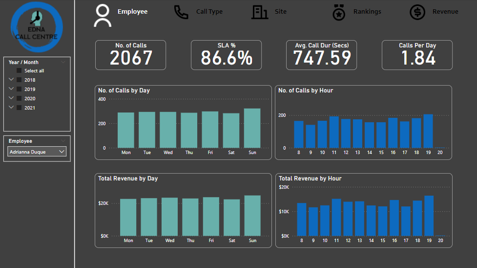
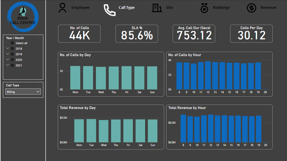
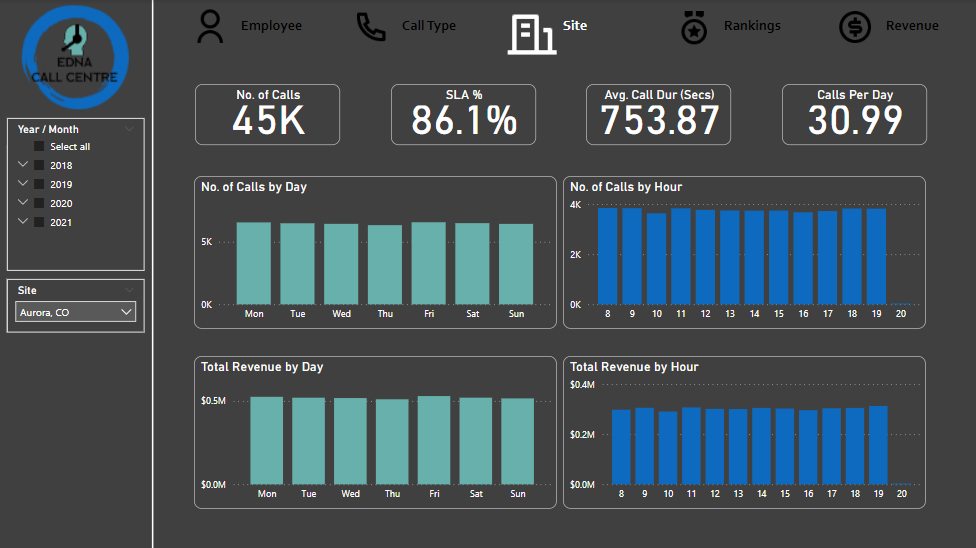
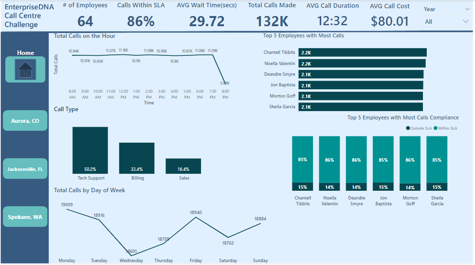
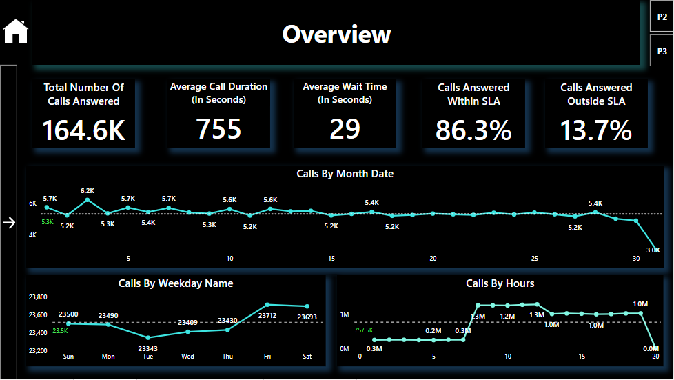
Global Overview
Expand for some details
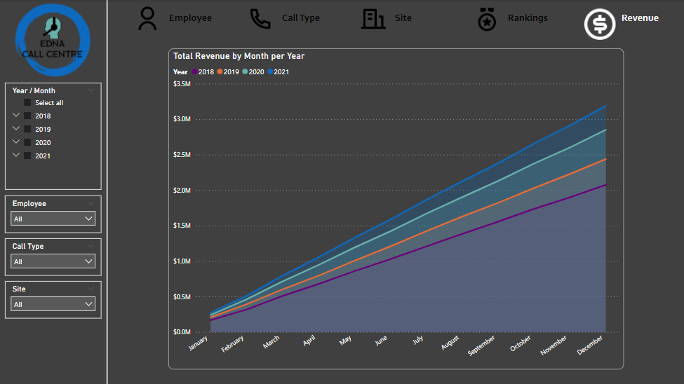
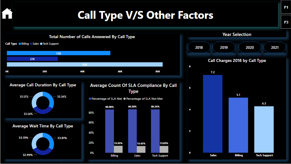
This page shows a big picture analysis of the dataset. Every existing dimension of the dataset is shown here and can be analysed easily. It’s important to change the main metric on top right of the report in order to analyse the data from a different perspective.
Slightly hidden features
Show hidden features
-
Once the main metric is selected, the appropriate card will be outlined.
-
If there is some filter in any dimension, the most left bottom icon will be also outlined. It can be useful because that’s a quick way to know if something is filtered without having to check every possible filter.
-
The Y Axis of the Year visual object is changing dynamically in order to make the changes about the data more noticeable between years.
(The following picture is filtered by “Billing” Type, in order to show the outlined in the filter icon)
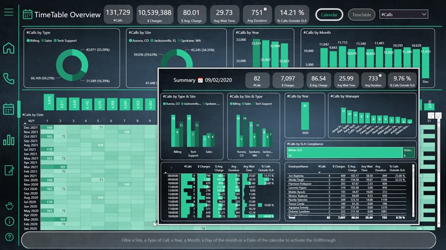
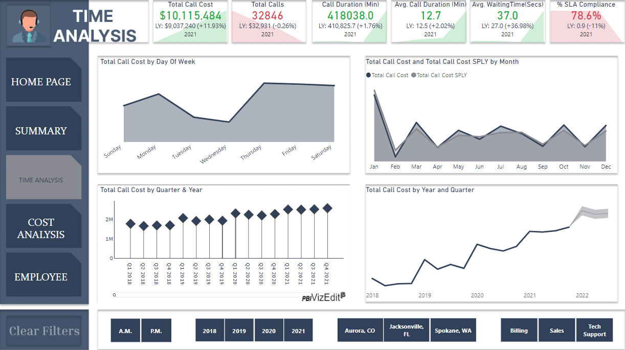
TimeTable Overview
Expand for some details
The aim of this page is to show a Calendar and TimeTable centered analysis, as detailed as possible from time and dates perspective.
That’s why we can thresh the information from almost every possible useful way related with time and dates (from my point of view, of course):
-
Year
-
Month
-
Day of the month (from 1 to 31)
-
Day of the week
-
Date
-
Month of the year
-
Hour
Moreover, to allow the user the ability to check quickly further information, a tooltip from every dimension shown in the page is enabled just hovering the mouse on the data.
In addition, if the user needs to analyse the data shown in the tooltip in a deepest way, drill through button on the bottom of the page can be used.
Slightly hidden features
Show hidden features
-
In the Calendar grid, there are shown just 2 numbers per row: the maximum and the minimum per Month-Year. That’s because if all the data was shown, that could be overwhelming for the user. On the other hand, showing no data was not a good decision because in that case the user would not have any kind of reference but the intensity of the color.
-
In the TimeTable grid, there are shown just 2 numbers: the maximum and the minimum per WeekDay-Hour. As the grid is smaller than Calendar once, it is enough to have a good reference
-
Dynamic titles on every kind of tooltip analysis.
-
Dynamic titles on drill through button when some dimension is filtered.
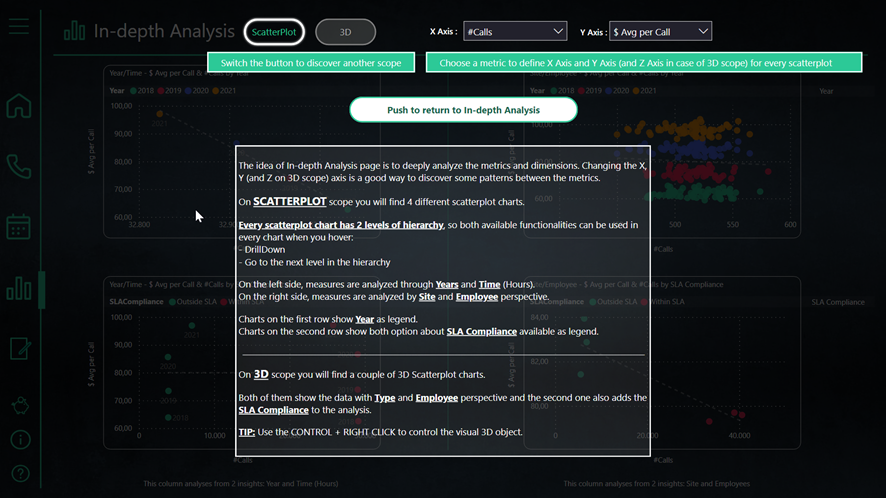
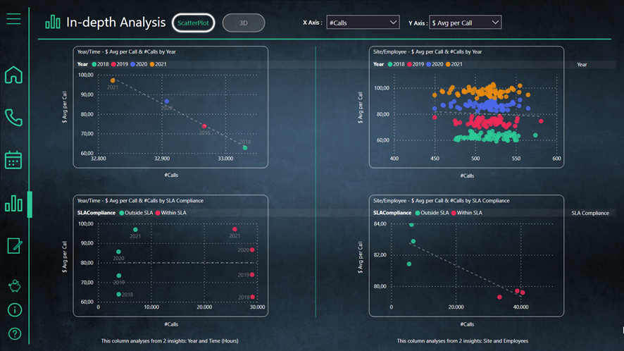
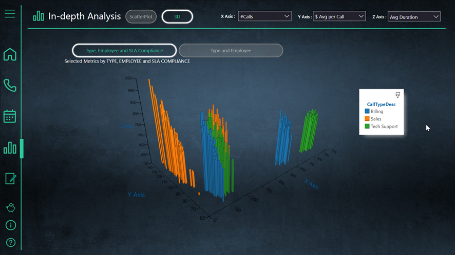
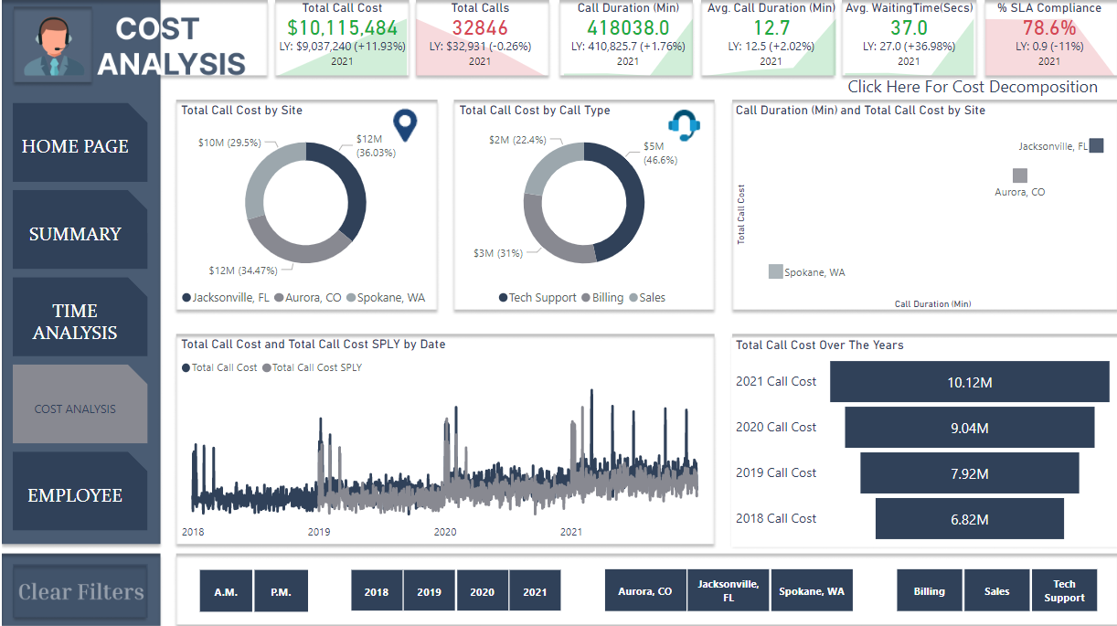
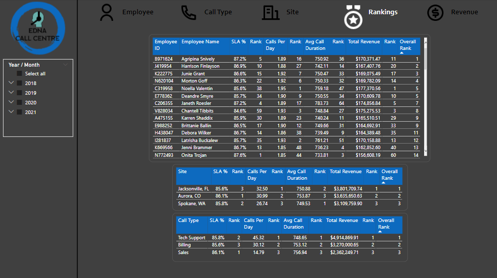
In-depth Analysis
Expand for some details
The idea of this page is to offer to the user the capability to deeply analyse the data and discover any pattern between the metrics, that’s why the X and Y Axis of the scatterplots are dynamic and for the same reason I decided to use an Scatterplot3D visual.
Although the info pane is useful on every page, in this page is really recommended to open it and read it up.
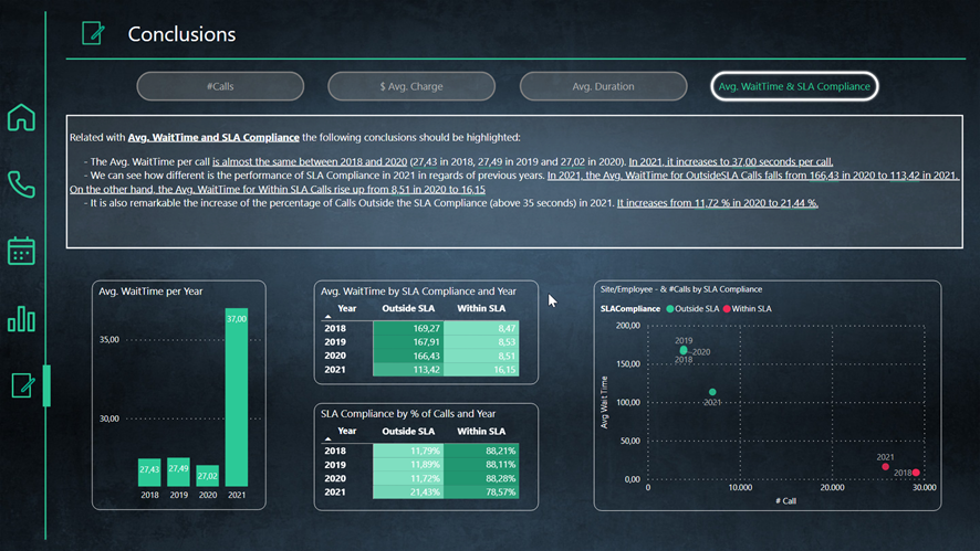
Conclusions
Some non-obvious conclusions are shown in this page
Data – ETL – Model
Expand for more details
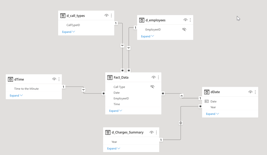
Data
I had to create 2 folders and allocate the CSV files depending on the format of the main date column.

ETL
Anything special but unpivot the Call Charges table in order to make a join between the Call Charges unpivoted and the Call Center Data Fact Table. This join allows us to have the appropriate charge per call in the fact table.
Model
A remarkable thing is the presence of “d_Charges_Summary”, which it’s necessary to show the charges and the table is used in “Conclusions” in a specific way.
Other considerations
Expand for more details
Last but not least, I’d like to write down a list about the things that I struggled with more building this report:
-
Managing with every icon png/gif. I struggled with that not because of its difficulty, but of time needed. I spent several hours looking for an appropriate set of icons and setting it up with suitable colours and its format.
-
Measure that shows both max and min number value in the calendar grid (and timetable). Although it’s not an extremely complicated measure, at some point it’s tricky and I spent few hours until I got what I was expecting.
-
Dynamic title drill through button. I spent many hours trying to make it works as I needed.
-
Dynamic Main Title for drill through page and tooltip page. Same to the previous point, not a nightmare but tricky.
-
Setting up every bookmark has been a little bit painful too. A lot of buttons with bookmarks used in this report.
-
Naming every visual (in the selection pane) and set it up for the bookmarks has been also a high demanding task.
Finally, I can’t finish the entry without showing some gratitude to the EnterpriseDNA team, specially to @sam.mckay , @BrianJ and @FPastor not only for encorauging us to improve our Data and PowerBI skills but also for being such a professional team and example to everyone. Thank you.
9 Likes
Lots to love in this entry @BernatDuran I can’t wait to take a proper look tomorrow! Great entry!
1 Like
@BernatDuran - this is a fantastic report! A number of innovative techniques here - the animated icons, excellent (and informative) tooltips, all the information from the initial page as well as throughout the report, switching the graphs (and the y/x axis elements).
Great job!
-Tim W.
2 Likes
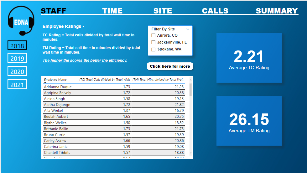
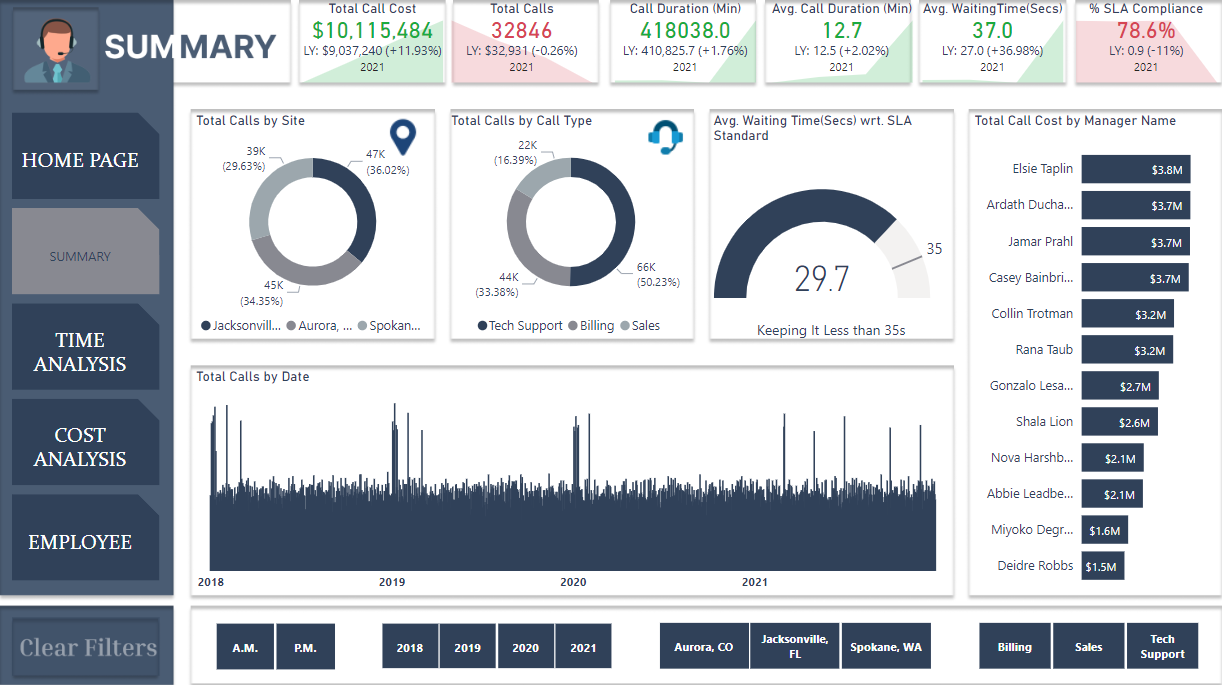
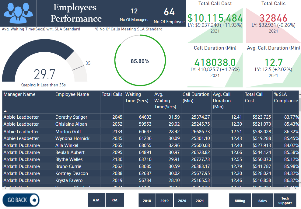
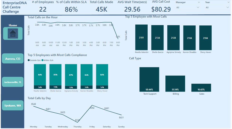
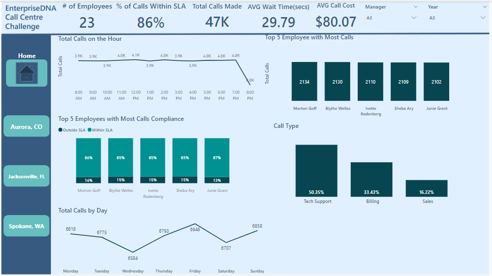
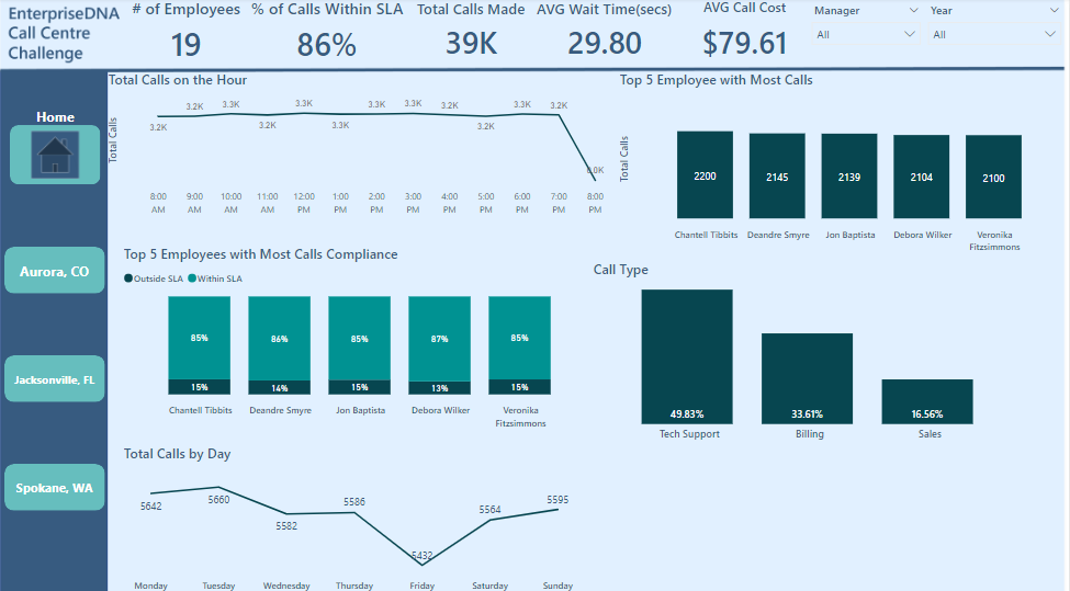
Have completed my report for the challenge!
Kept it quite simple this time. I wanted to really test how quickly I could put together a report with great insights using a design template. I was pleasantly surprised.
I used Numerro design system for the first time! I like it…
Nothing too complicated on the analysis side, but providing all the info someone needs to dig deeper into the data.
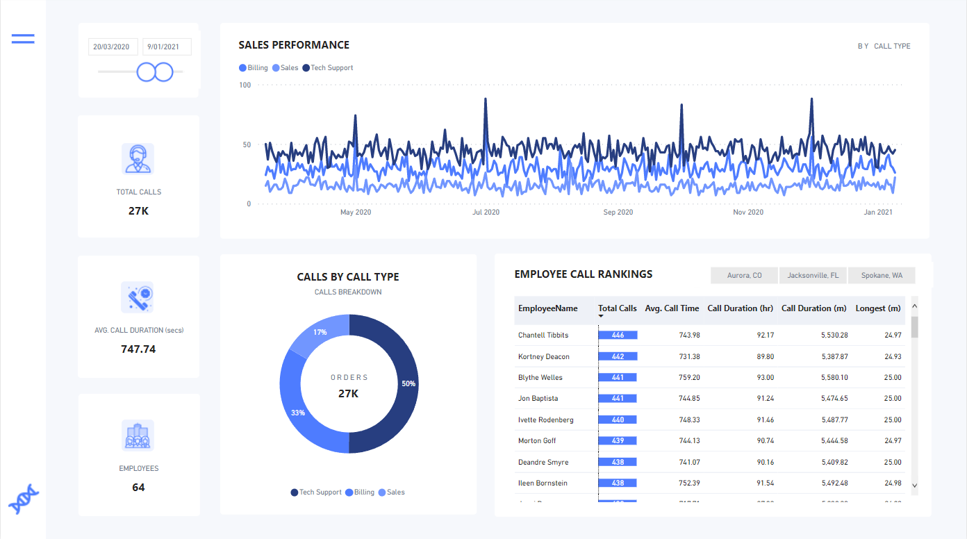
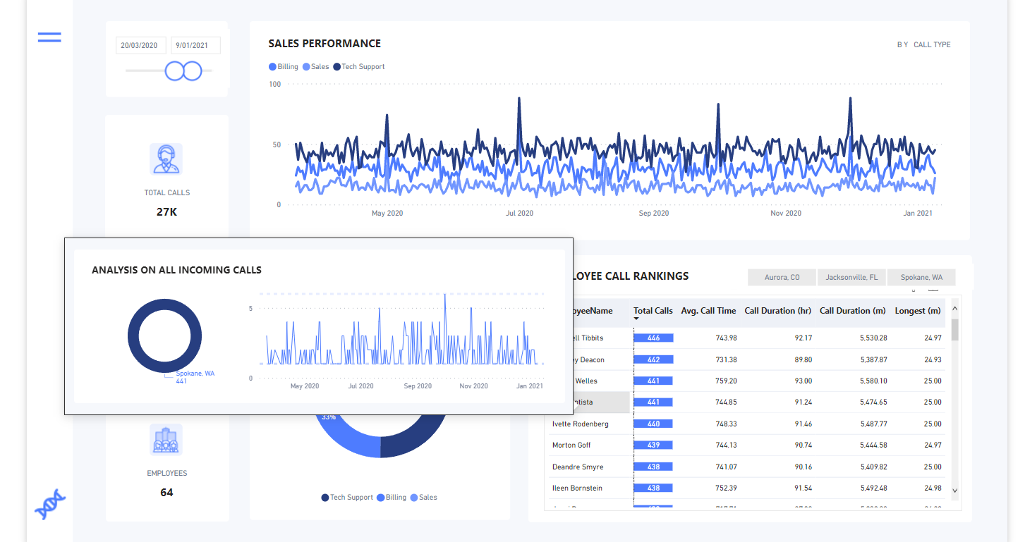
Added a tooltip to dig into locations
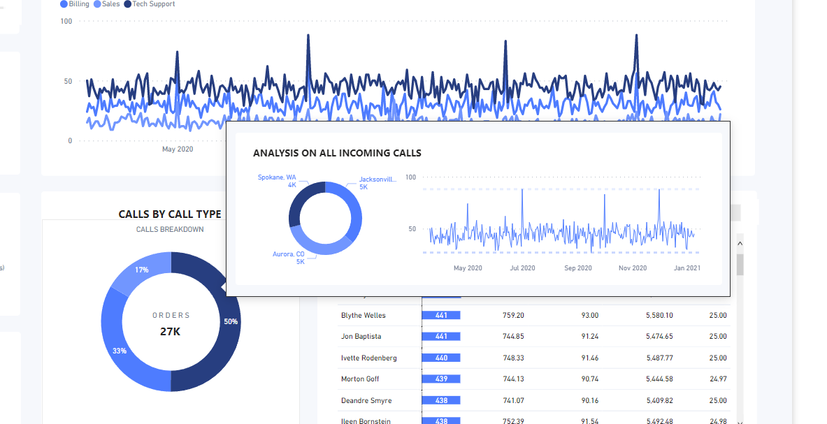
Placed this over the employee table so you could look at any one call center worker easily.
Used Flaticon for icons
Numerro for design template
Publish to web
Any questions let me know.
6 Likes
1 Like
Thank you @DavieJoe. Once revised properly, any kind of feedback would be appreciated!
1 Like
Appreciate your comment Tim, since a lot of effort has been put into this report. As you mention, I’ve tried to gather and fit a lot of different tehcniques and that’s the result.
Thank you.
1 Like


4 Likes
Looks like lots of entries, hopefully we can break some records!
2 Likes
Still waiting for yours 
if you refer to having higher number of entries to previous challenges, yes we already break a record!!!
Federico
3 Likes
That’s great to hear!
You’ll be pleased to know I’m a few hours away from having my completely re-done Home Page completed 
Then onto creating my report that will be full of pie charts with a minimum of 12 segments in each!
5 Likes

I just blacked out.
See you later
1 Like