Reasons for employee attrition

So I found the attrition rates and have created visuals showing the who, where, and when, but I am not sure about the Why.

I had a look at the Key Influencer visual and it looks promising but I am not sure if it would be enough to provide the Why. I guess I don’t understand the Key Influencer visual well enough, so let me know if you’ve come across a good example.

What is the best approach to finding out why there is a high level of employee attrition?

NOTE:
I’ve had a look at some of the Advanced Analytics videos (deals with customers) and they’re really good but I’m having a hard time seeing how I can use those techniques to answer the Why of employee attrition. I might just need an example of how those Advanced Analytics techniques can be adapted to employee attrition.

@powerbideveloper,

As an economist who spent the first third of my career building economic models to try to answer the “why” questions, let me NOT answer your question, but hopefully in a useful way…

I think before asking HOW to do this in Power BI, the relevant question is “is Power BI the correct tool for this problem?”

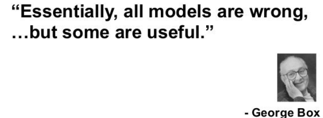
Power BI is a fantastic tool for uncovering patterns and correlations. However, it is much less well-suited to assessing causality. To establish causality, you first need to develop a sound structural model of attrition, based on theory (economic, demographic, behavioral, etc.). You then need to specify that model correctly using the proper statistical techniques, run the model, test the component parameters for significance, and assess the magnitude of changes in your independent variables on your attrition outcome measure. Difficult, and expensive to do properly. Here’s what it looks like when this is done well:

The key indicators visual, while interesting, is not IMO in any way a substitute for the rigorous modeling needed to assess causality.

So where does this leave you? Not knowing exactly what your project charge/goal is, I can’t say for certain. But if I were tasked with trying to figure out what drives attrition in my organization, if I didn’t have the resources to undertake an original modeling effort re: the above process, I would do a thorough literature review, determine if there was general consensus as to the factors that drive attrition, and then analyze my data with regard to the presence/absence/ magnitude of those factors (a task to which Power BI IS well-suited).

Like any other analytic tool, Power BI is garbage in, garbage out, but what sometimes gives me pause (and I say this as a HUGE fan of Power BI) is that it can produce really shiny, convincing nonsense.

Anyway, probably not the answer you were looking for, but hopefully at least some useful food for thought…
  • Brian

image

2 Likes

Brian, this is very good information, finally something I can use as a basis. I’ve done some logistic regression analysis using R and Tableau, but, while quite fun, I don’t think I have the time to delve that deep into what is causing the high attrition rate. I believe correlation would be sufficient at this time.

That being said, would the Power BI Key Influencer visual be enough to see for the presence, absence, or magnitude of relevant factors that affect attrition or would the scatter plot and the techniques described in the Advanced Analytics videos be sufficient or better? How would using both visuals be complimentary to each other? Would it be necessary resort to some R programming in Power BI?

@powerbideveloper,

Not knowing what specific data you have available to you, I can’t say for certain what type of analyses would be appropriate. However, even for a “quick and dirty” analysis I would still rely on review of quality literature and sound hypotheses. Based on the former, if you have available data for the variables that the literature identifies as being essential to models of attrition, then I think the Key Influencer visual (which basically just runs a logistic regression model) will be useful. If you don’t have this data available, using the Key Influencer analysis will be counterproductive, since you’ll be running a mis-specified model that will incorrectly attribute effects to the variables you do have.

Whether or not you have that data available, I think running some more traditional analyses based on the literature findings will be valuable. For example, the study I cited above found that " If all employees were managed by the best supervisor in our data then voluntary attrition would reduce by over 30%". Based on that, you could run an analysis of your data over time comparing attrition rates of employees managed by your highest-rated supervisor(s) to attrition of those managed by the other supervisors. If that revealed a significant difference in attrition rates, it would be reasonable to highlight that as a likely causal factor, although to take the magnitude of the difference with a grain of salt since you are not properly controlling for other factors, as you would be in a well-specified regression model.

Do you have any exit survey/exit interview data? Even if it’s entirely qualitative, it would be an excellent foundation for developing these types of structural hypotheses that would complement the literature findings and help guide your analyses.

  • Brian

Brian,

I am not really sure I have access to the right kind of literature that would appropriately take into account the circumstances found in a food service concern in India. Finding the correct literature sources would in and of itself be a real challenge.

So I feel like I need to simply check for patterns and correlations in the data, and then discuss those with business analyst to see if there needs to be a much deeper dive into discovering any real causes of attrition. I know there is a real desire to uncover the causes but the resources and data is just not near enough for that type of a deep dive.

I am having a bit of difficulty adapting the sales attrition videos to employee attrition, so I will probably post questions about that in the coming days.

Thanks for your helpful information and guidance!

@powerbideveloper,

Agreed. The India information adds a whole separate layer of complexity on top of this, since even if you had good studies that applied to say, the U.S. it’s not clear whether the findings would hold cross-culturally or not.

In this type of data-poor situation, the best advice I can offer is to run a correlation matrix of your independent variables. Microsoft actually has a nice custom visual for doing this within Power BI and presenting the results in a pretty graphically compelling way.

https://appsource.microsoft.com/en-us/product/power-bi-visuals/WA104380814?tab=Overview

Since you don’t have sufficient data to analyze causation, I think the best you can do is appropriately caveat the pattern/correlation analysis your level of data will support. The correlation matrix will let you say something like “we see a strong correlation between X and attrition levels, but X and Y are highly correlated, so we may actually be picking up the effect between Y and attrition. Without additional data and analysis, we can’t isolate the individual effects of X and Y (and probably Z and Q…) on attrition”. Not the end goal of the analysis, but pretty useful info nonetheless.

  • Brian

Brian, this discussion was very, very useful, so I thank you for your guidance and help with this!!

@powerbideveloper,

My pleasure – I’m really glad to hear this was helpful to you.

Best of luck to you on what is definitely a challenging project. I’d be really interested to hear how it turns out.

  • Brian