Project Duration in a Bar Chart

Hi, I want to depict the duration of projects in a bar chart. It is not a Gantt chart, all projects are independent from each other.

The chart should have these components:

project name on the y axis
category (like product design or product generation) for the bar colouring and legend
the date of the project start
the duration (end of project - start of project)
dates on the x axis (projects starts before a certain date (e.g. 01.01.2021) should not be depicted)

I hope this description and this sample data set is sufficient to explain the issue. If you need additional info please let me know. Thanks!
Project Duration.pbix (43.3 KB)

Hi @Matthias.

@sam.mckay showcases a method of using a matrix to display project info in this post:

Hope it helps.
Greg

1 Like

Hi @Greg,
I found that on YouTube and thought it a really interesting solution especially if you want to show columns with several information [going well beyond a single info with e.g. project name].
I admired that @sam.mckay adjusted manually the width of 200 columns for it. :slight_smile: I still hope that some more convenient solution will come up.
Thanks,
Matthias

Actually, the custom visual Gantt chart is not a bad alternative.

Can I get rid of the dotted current line?
Can the bar be shown without corner rounding?

Never used it @Matthias … can you upload a sample PBIX and I’ll dive in a see what I can find?
Greg

Thanks @Greg! Project Duration.pbix (421.8 KB)

Got it, thanks @Matthias … looking … as I said, I’ve never looked into this visual before … what’s the full name? Have you found any websites that might be helpful in adjusting its configuration?
Greg

Hi @Matthias.

So the dashed line is the “Today” line, and I haven’t tripped over any way of hiding it yet. What you can do, however, is change its colour (use the colour picker in Format \ Date Type \ Today Color).

I don’t see a way of changing the rounded corners of the task bars.

In my initial online searching, it seems there are a few other custom visuals that may have the customization you’re looking for. I’d experiment with a few and see if they might be more suitable.

Good luck.
Greg

Changing the colour is a good idea, making “Today” grey makes it less annoying. Thanks!

@Greg I checked also alternatives. The main blocking point is that there seems no possibility to have report page as tooltip.

So I still hope someone knows how to solve it per bar chart.

The matrix solution has a limitation through the number of possible columns which can be used for the values. It support only up to 100 columns. That would be 100 days can be depicted.

@Matthias,

I have done exactly what you want to do in SSRS using a range bar chart. SSRS explicitly allows the creation of a custom series definition that includes a start date/end date defined as a duration in much the same way as the custom Gantt chart visual.

Power BI does not appear to have that capability with any of the standard visuals, specifically because each series only supports a numeric aggregate value in the Values well.

I did get things to the point where individual items can be displayed on the Y axis (i.e. projects, devices, etc.) and a relative horizontal spacing is created for the duration bar. However, I lost the ability to colorize the data bars based on a field value (no Expression function for that) and can only display the numeric count of days on the X axis rather than dates.

Here is the original SSRS range bar chart implementation for the usage of audiological devices over time (FYI, report is embedded in an iframe in a web app and has incredibly informative tooltips per bar :slight_smile: ):

Here is how far I got it in Power BI using a stacked bar chart:

I didn’t take it any further because key items you asked for were not possible. My tricks included:

  • Calculating a Precursor column per device assignment: Precursor = DATEDIFF(MIN(Dates[Date]), DeviceHistory[DAStartDate], DAY).
  • Calculating a Duration column per device assignment: Duration = DATEDIFF(DeviceHistory[DAStartDate], DeviceHistory[DAEndDate], DAY)
  • Setting the Data Color for Precursor to white so it is “invisible” on the chart.
  • The slicers work as expected on each of the applicable dates.

Here is the PBIX, which includes the actual data with no PII included: Range Bar Chart Test.pbix (75.2 KB)

It looks like one of the available Gantt chart custom visuals is the way to go.

John C. Pratt

5 Likes

Hello Matthias! I think that Sam’s method could work best. The only difficult part is to manually adjust the size of the columns. I recently saw this trick showcased by Curbal to adjust the size of the columns.
Maybe it can help

Hello Alex, thanks for sharing! I understand how that can widen the column uniformly, but can’t think about how to make it smaller, e.g. to the width of 1.

The 100 value column restriction can not be changed, means if I go for months and a 10 year horizon I am exceeding the range. So the only option might be to to adapt the formula for quarters. That seems to be rather rough.

@jpratt, you came very far. Thanks! So if we use as value a meansure for each DAType it gives the colouring. If there are not a lot of DATypes that would be doable (I have perhaps around 20 relevant entries).
Perhaps you have an idea how to deal with the x axis. Anyway, thanks a lot for the endeavors John!

Assigned Duration = CALCULATE( DATEDIFF(MIN(DeviceHistory[DAStartDate]), MAX(DeviceHistory[DAEndDate]), DAY), DeviceHistory[DAType]="Assigned" )

Loaner Duration = CALCULATE( DATEDIFF(MIN(DeviceHistory[DAStartDate]), MAX(DeviceHistory[DAEndDate]), DAY), DeviceHistory[DAType]="Loaner" )

3 Likes

@Matthias,

A great idea to get the colored bars. Limited as you noted because a separate measure has to be created for each “category”, but it works. I have 3 possible DA Types, so I added measures for all 3 even though this example only uses 2.

I extended the concept to the Precursor, creating a measure that is colored white in the chart. This enabled me to start working on the X axis issue which I’ve been able to partially address. An updated PBIX is linked below.

Problem 1 was to establish a dynamic “Zero Date” which allows the oldest DAStartDate to be the 0 value unless the date range is sliced, in which case the oldest applicable DAStartDate is the “Zero Date”. I believe I have that solved in the Precursor Duration measure shown below.

Problem 2 is the date axis. The only potentially workable idea that came to mind is a chart overlay, which is a technique I’ve seen others use on this forum to solve very complex issues. I did get the date axis of the overlay chart to appear “under” the primary chart, but there are a number of issues with precision and interoperability to deal with.

Some remaining problems include:

  1. Dynamically setting the “Zero Date” and max date on the underlying date chart, and then getting it to align with the primary chart. My educated guess is that some kind of derived/dynamic Dates table is needed to establish the min/max dates for that chart based on the dynamic filtering in place. Solving this will at least allow the range bars to align with the date values across the whole X axis.
  2. Improving the date axis display. I’d also like to have vertical gridlines, but the date chart needs to be under the primary chart to allow the bar tooltips to work (et al) and the primary chart’s gridlines go under the bars so you see weird gaps where the Precursor bars are.
  3. Somehow hide the tooltips on the Precursor bars. I’m not sure this is even possible with the limited customization available in Power BI (i.e. no Expression capability like in SSRS).

This is at least a couple steps closer to the desired end game.

Range Bar Chart Test.pbix (84.0 KB)

6 Likes

@jpratt, for only three categories it is a very good solution!

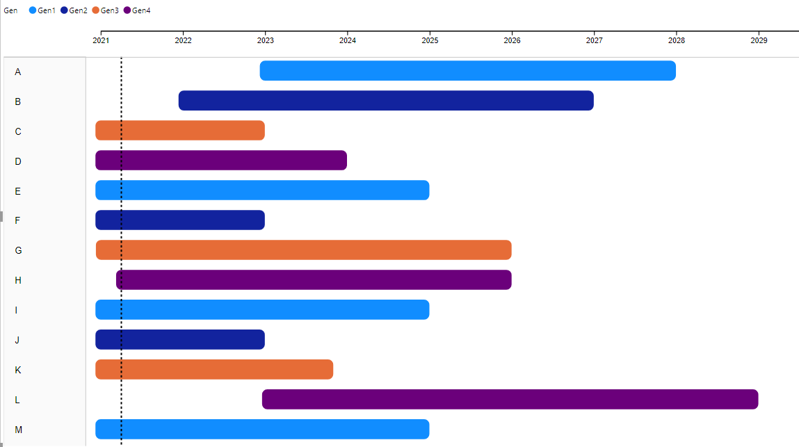
Overlaying is a very good option, below you see how precisely it works after adapting position and width.

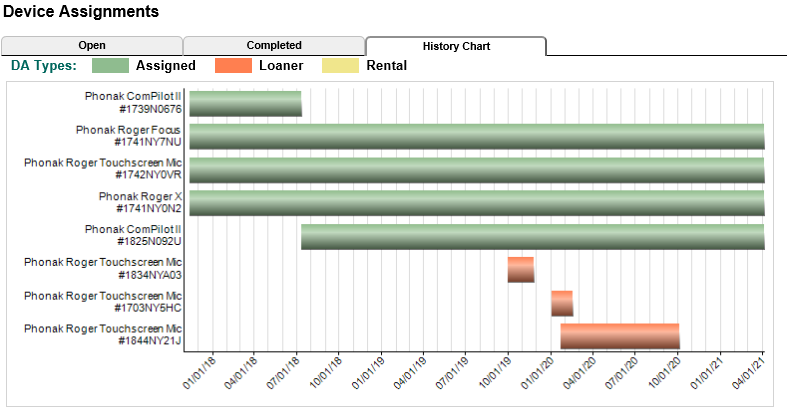
You need to consider the Date with a slicer for Date plus some DAX modifications. I do not know the best way but this works. I really would like to know if this could be optimized, because I have more than 20 categories!

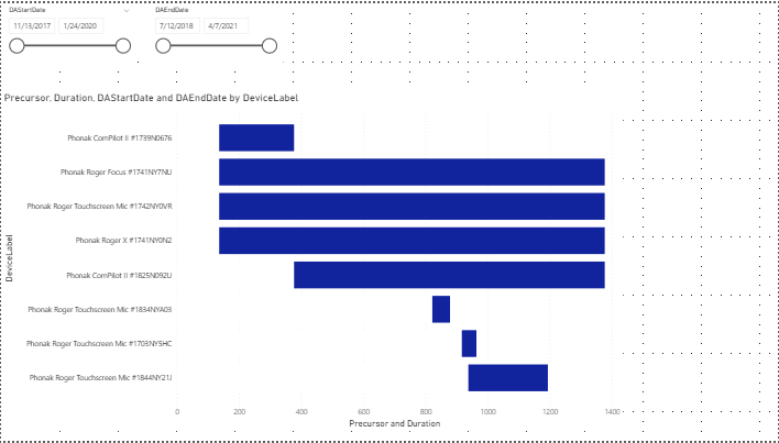
Precursor Duration = 
VAR ZeroDate = CALCULATE( MAX(MIN(DeviceHistory[DAStartDate]), MIN(Dates[Date])), ALLSELECTED(DeviceHistory) )

RETURN
    IF(CALCULATE( DATEDIFF( ZeroDate, MIN(DeviceHistory[DAStartDate]), DAY ) )>0,
        CALCULATE( DATEDIFF( ZeroDate, MIN(DeviceHistory[DAStartDate]), DAY ) )) 

Assigned Duration = 
VAR StartDate = CALCULATE( MAX(MIN(DeviceHistory[DAStartDate]), MIN(Dates[Date])), DeviceHistory[DAType]="Assigned" )
VAR EndDate = CALCULATE( MIN(MAX(DeviceHistory[DAEndDate]), MAX(Dates[Date])), DeviceHistory[DAType]="Assigned" )

RETURN 
IF(CALCULATE( DATEDIFF(StartDate, EndDate, DAY), DeviceHistory[DAType]="Assigned" ),
    CALCULATE( DATEDIFF(StartDate, EndDate, DAY), DeviceHistory[DAType]="Assigned" ) )

All other Durations accordingly.

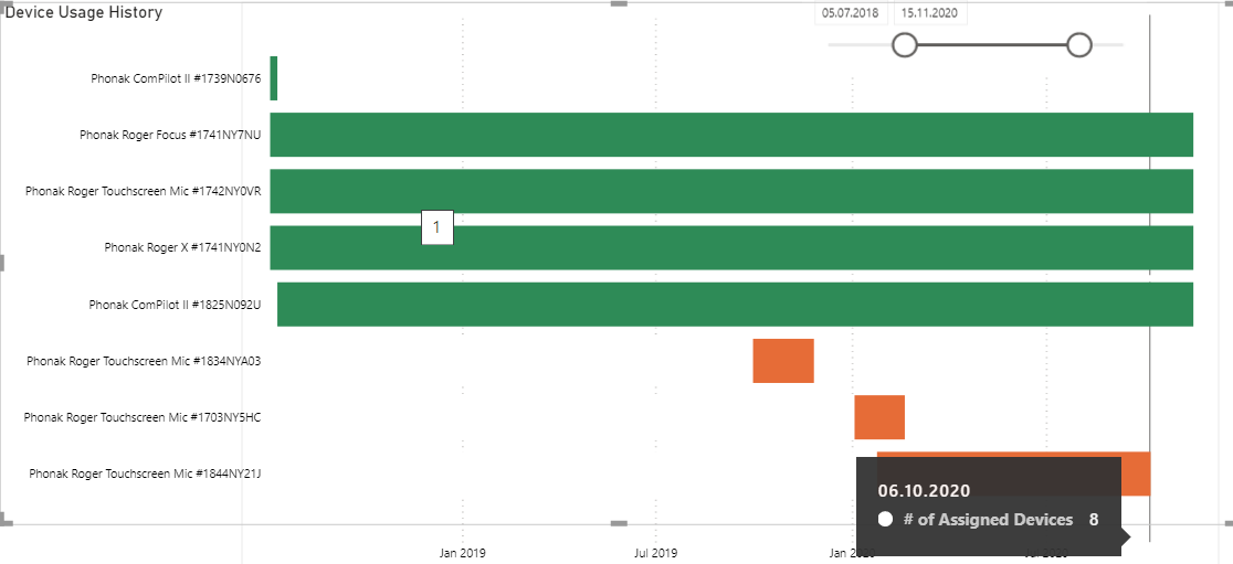
For the gridlines I have no solution (take them out?), but you can definitely turn off the automatic tooltips and use a tailor made report page as tooltip instead. That is actually the main reason why I am not happy with the custom Gantt charts. I want to use my own tooltip.

Have a good look! And I hope that you or someone else has some ideas to optimize it, especially make it the most efficient DAX possible. Great John - I think we made it, thanks a lot!
Range Bar Chart Test (2).pbix (75.5 KB)

1 Like

Love this. Nice one

2 Likes

Hi @Matthias, did the response provided by @jpratt help you solve your query? If not, how far did you get and what kind of help you need further? If yes, kindly mark as solution the answer that solved your query. Thanks!

@jpratt, @Matthias,

Awesome thread, and extremely fortuitous for me. @sam.mckay and I are in the final stage of developing the eDNA Dynamic Learning Map, and we want the last page of the report to be a Gantt-type schedule automatically created from user-specified parameters and slicer selections. I have been experimenting with every Gantt custom visual in AppSource, and none of them really work well for this purpose for various reasons.

However, I think the approach you’ve collaboratively developed here will work great - thanks for the really detailed solution posts! I plan to put them to good use…

Great stuff.

  • Brian
4 Likes