I have a measure (and it is a percentage) or a couple. when I put it on a bar chart, it splits out by month correctly.
However, because of the nature of the requirement, I would like to use that same measure on a KPI card but this time, I want it show up as YTD number or average (preferrably YTD number)
My issue is that, in the KPI card, the measure sums up. Is there a way to get it to show as YTD number (I’ve tried this) or even average. It works however when I use the month slicer .The YTD measure I tried, when added to the card, comes up BLANK.
Cards can be challenging, because unlike tables, matrixes or charts, they don’t provide any inherent evaluation context. Thus, in situations like this you need to build the proper evaluation context into your measure in the form of a virtual table against which your measure can be evaluated.
This post explains the issue in depth with an example. The same approach should be directly applicable to your problem.
I hope this is helpful. If you need additional specific guidance, please post your PBIX and I’ll be happy to work through it with you.
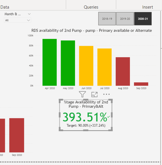
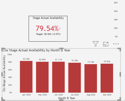
Thanks Brian, I tried the Inside range, but wasn’t quite able to get it to work. please if you can have a look. this is the measure in a bar chart vs in a card