Haha well I’ll be the first to admit that since I definitely didn’t go about creating the measures in the most optimal way and as a result theres A LOT of extra measures that would probably be better as variables… the majority of them were originally placeholders to test the dynamic time selection feature for each step of the process so there’s easily 10 times as many measures as I need
For the small multiples, those are technically all their own visual… I couldn’t get either of the existing small multiple visuals to work the way I wanted and just used the Sparklines by OKViz for each one and the Advanced Card to showcase the numbers above it. I really was hoping that Microsoft would have launched their small new small multiples visual that they had planned to launch with the November Power BI release, but had to make due till then.
Haha thank you. Machine learning is great, but people like myself often get obsessed with creating these amazingly complex models and neglect the ‘ask’ from the client. Yeah as I looked into some machine learning for this report it just didn’t seem like cost-benefit (aka time spent vs. value) was really there for the ‘client’. It felt like trying to use a light saber as a letter opener… Yeah, it would be cool and technically the letter would be open but it completely ignores the main goal of reading the letter.
And thank you for the suggestion! The Executive Dashboard page is intended to do that (at least that was the spirit of it I guess), but looking at the rest of the report it’s pretty clear that it didn’t accomplish this haha. There’s a hundred of things I’d like to have done differently looking at this report now.
Thank you! It’s hard to find different ways to to visualize historical analysis so that can provide unique insights, so I very much appreciate you noticing that.
I didn’t use Zebra BI 4.4 but I really should have looking at it now… That’s what happens when I rush a project haha. The main custom visuals that were used were just the Advanced Card, the Sparklines by OKViz, the Waterfall by Visual BI, and the Advanced Trellis by xViz.
@bradsmith I noticed it because I was also looking to provide historical analysis especially the exchange rate in a Stock Exchange looking format where the company can keep a track of the Exchange Rates. I signed up for Zebra BI visual for this challenge and have 1 month till it expires. I still feel that Custom visuals are not as flexible as they should be and most of them are very slow in loading the data. In this instance, I can say, cooking maggie is faster than loading data in custom visual. However, that’s not the case with your own built visuals. They are as fast as native visuals and way more flexible but take a lot of time in creating one.
Frankly speaking, your report looks like as if it’s designed in Tableau and I love the report a lot. And yes as @BrianJ mentioned, you did hurt my feelings too
That’s why I can’t wait for Microsoft’s the new native small multiples visual to get launched next month… That’s one visual that there’s either minimal-no flexibility working with in the existing small multiple custom visuals or you need to have independent custom visuals like I did which slows down reporting a lot.
And the inspiration from this was definitely from Tableau haha I love Power BI but there’s definitely some features Tableau still outshines it in.
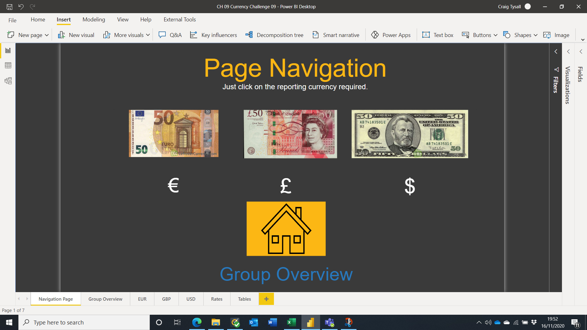
@alexbadiu Say it a coincidence or not, the theme of the report I planned was exactly like yours (the colors were different) even designed the Background with pattern fill in power point. This time the navigation was also inspired by @datazoe that she used in the previous challenge with the difference being the bookmarks were going at the bottom of the page rather than at the sides.
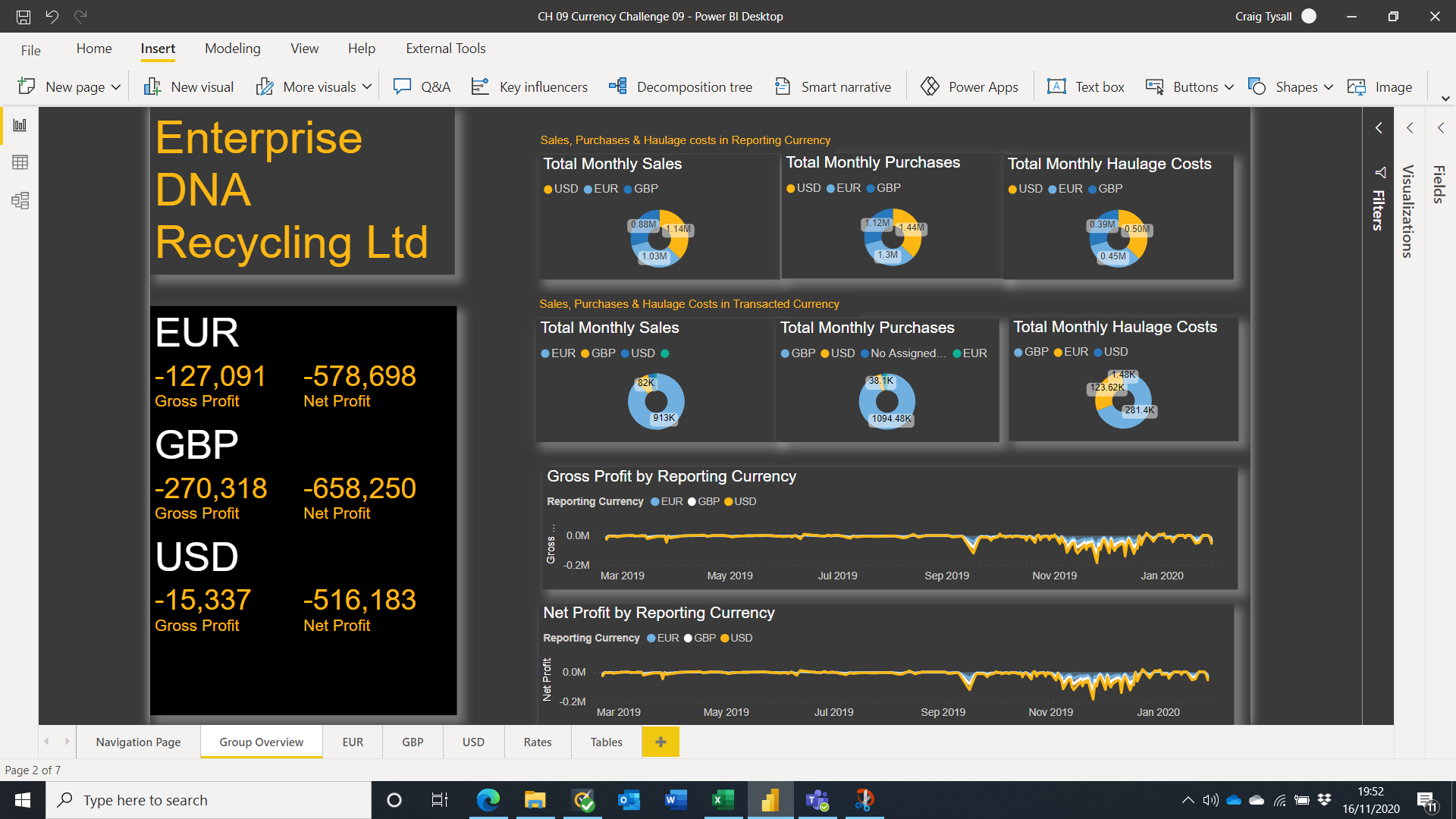
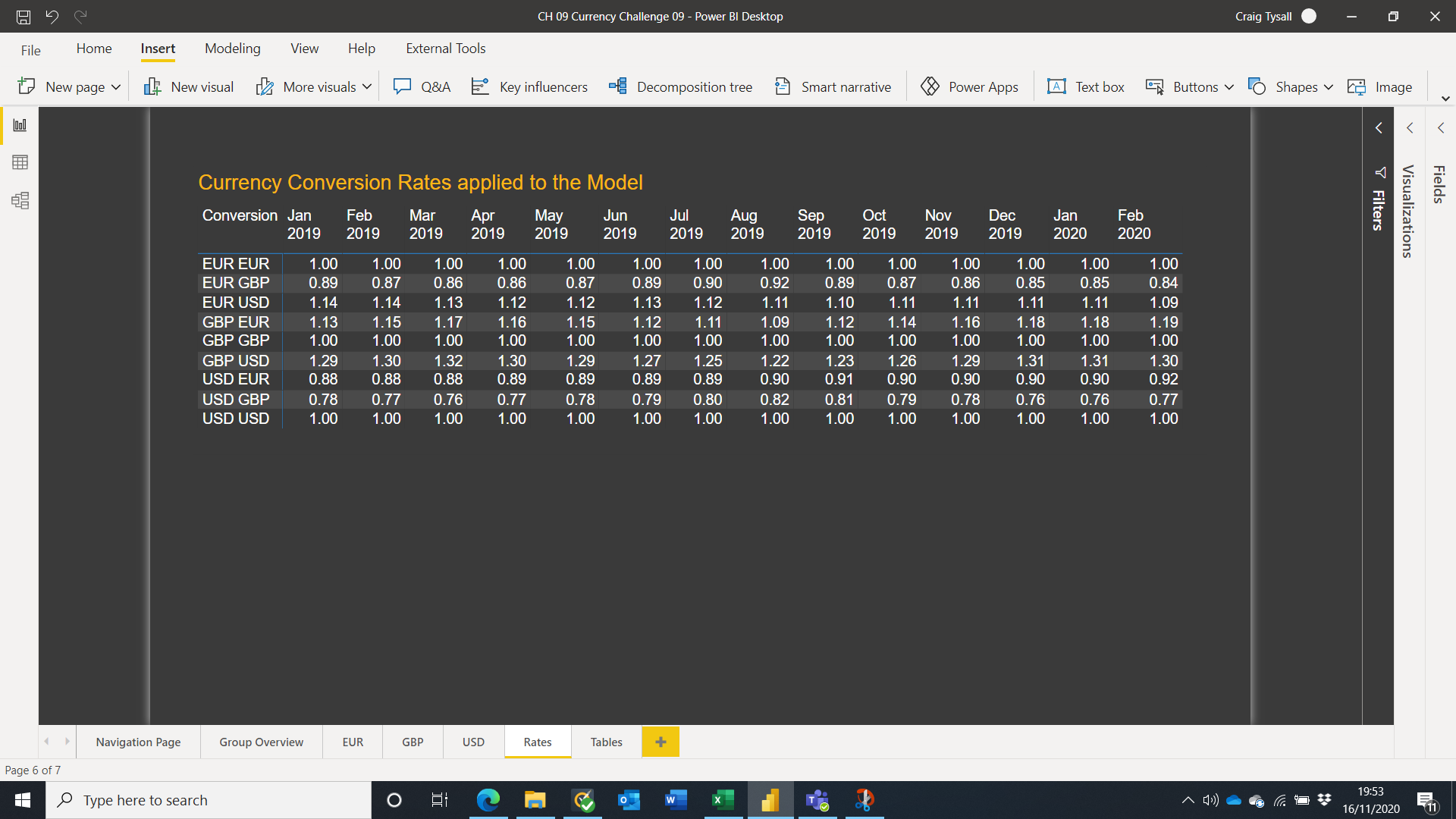
There is only one slight thing I noticed is the placement of Currency Filter. Twice it’s placed at the right hand corner and the other times at the top left of the page. I feel it should have been constant at one place and I prefer it to be at the top left outside of the border. For the dumbbell visual, you could have asked me to design one for you because then you could have got more space in Y-Axis like getting some spaces between supplier or buyer.
For design and navigation wise, you absolutely nailed it.
@bradsmith I hope they design it good not screw it like they did with Anomaly Detection in line charts. You can’t get anomaly detection with secondary values. I mean seriously Microsoft?
No apology accepted if you keep creating this type of reports in one day. At least take three days for the apology to be accepted.
@datazoe ,
Great looking report. I really like all the smooth navigations on this report with some awesome analysis.
Your use of tool tips to give more information to the user is amazing as well.
@MudassirAli oh you wanted to actually see and read the anomaly detection output? How strange…
Does it help if I say that I took me four days to create the logic behind main function that controls period selection? Ok, I didn’t create it for this report and didn’t have to spend anytime working out the logic there, but it did take me a few days to work that out.
I’ve just got to say, I am consistently amazed with how striking your reports are and in your ability to display a lot of content with minimal visuals! Another amazing job sir!
@MudassirAli I think it is not a coincidence. Great minds think alike
You spotted well the currency filter placement! You know why it is placed at different places? It is because I started to place it everywhere at the exterior… Then I took a step back and looked at it and decided it is best inside the page… Then I took a step back again and looked it. Actually it looked better at the exterior… Then I published to see how it looks… Then I hit the button problem and spent some time on that… Completely forgot to take a look again at my filters… But you are right… It should be consistent between pages…Conclusion: Never publish your report without checking everything twice
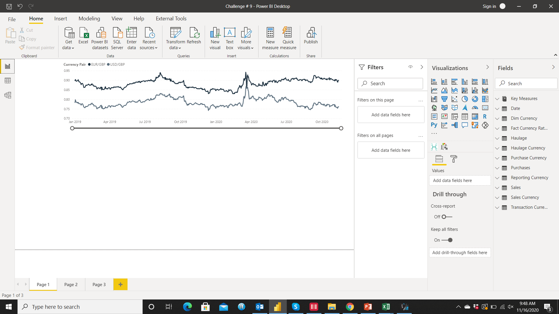
@bradsmith I was expecting more flexibility as for now the anomaly detection only works with one value in the line chart. I noticed it as I was trying to get the historical exchange rates in GBP (EUR to GBP & USD to GBP) and was excited to try the anomaly detection but it doesn’t support with 2 visuals like this
@alexbadiu I think it’s weird because most of the times we feel that something is missing or wrong after hitting the Send button in the email. When the email is for the management, the probability increases by tenfold.
@datazoe,
You did a very nice work ! I love the theme with combination of police/color… it makes the report looking so pure and elegant. It might seem to be minimalist at first glance but provides all necessary details information when navigating through it.
I also like the idea of the slicer panel not overlaying over the metric column but shown just on side of it. Well done
@alexbadiu
Wow… you have one more huge fan over here ^^
Nice inspiration… as always it results being attractive, efficient and simple to understand/navigate!
I like the combination of Top/Worst ranking within a same chart, I will wait for the write-up to see how you did it
@bradsmith
Looking at your report… and thinking of myself looking for different ways or ideas on how to showcase the data
Great variety and complexity in your report ! Congrats.


 Ok, I didn’t create it for this report and didn’t have to spend anytime working out the logic there, but it did take me a few days to work that out.