Thank you for your feedback @MudassirAli !
In order to get the green I started from the logo (which I wanted to be a bright yellow). I found similar colors for green (and pink, blue, red etc). I tried them all and finally decided to use the green. I then tweaked the green on my background until it looked as I wanted. I wanted to use a high contrast green to showcase the power of pre attentive signals. I do not have a color pallete per say, I just tried to use the colors where it is needed.
This report does a fantastic job telling the story of the dynamics driving this business. I am really bummed that I couldn’t get the publish to web version working in my browsers, since I wanted to fully explore the deep multidimensional 3 x 3 x 3 structure (three currencies x three navigation levels x data/process/people ) on which you’d organized this report. From what I was able to see though, the report does draw a very clear line of sight from the analytical results to the final recommendations, and again demonstrates a signature of your reports, which is cutting through a complex analyses to highlight just the most important aspects, and making the fact that they are important obvious to the reader through things like position, color, and particularly in this report the creative use of negative space.
As always, the design is beautiful and fits the theme of the challenge so well – I felt like this was like looking into a complex financial terminal screen and that the use of the dark background was extremely effective. I also particularly liked the dumbbell chart and wondered if that was a custom visual or Charticulator creation?
Another in an incredible run of top-notch reports.
– Brian
1 Like
Thank you very much for your feedback @BrianJ !
I have good news! I found a workaround and made my buttons work as they should  I updated the link and now you can have fully explore the report !
The dumbbell chart is a custom visual (by MAQ Software).
1 Like
I wish you fast recovery @MudassirAli! Health is precious! You will come back strong at the next challenge
1 Like
Thank you Datazoe for your feedback ! Your past challenge submissions inspired me. I used this time a navigation that is subtle, discrete and used bold colors that pop up as in your past challenge.
When I look back at my report, I think I managed to incorporate a bit of @datazoe, a bit of @MudassirAli with dumbbell chart and of course, a bit of myself too 
1 Like
@alexbadiu,
I found your report is stunning executive report! I spend long time with this report and feel like I want to come back again tomorrow too.Super colour use I have never ever seen before and I think only you can nail this difficult colour theme to magically match up.Nicely story telling and focusing on the essential. This is a superb winner’s model 
2 Likes
Wow! @alexbadiu another excellent submission you really are a master of UI/UX elements within power bi.
A very seamless report and easy to understand.
Love the improvement page some great insights and the ability to flick between data, process and people is a nice touch.
Thanks,
Haroon
Impressive work @Neba. I think the presentation is excellent great use of subtle colour and the navigation between the currencies is also very convenient. Excellent use of tooltips.
Great work @Neba.
Thanks,
Haroon
Wow another great entry.
Lots to take away here some excellent analysis.
I am happy to publish the report for you if required?
Thanks,
Haroon
Sorry to hear that @MudassirAli I wish you a speedy recovery and hopefully catch you on the next one :).
1 Like
Great entry @datazoe. Some very detailed analysis and great incorporation of the box plots will have to dig into these in more detail when reviewing.
The numerro grid also looks amazing the slicer panel is 
Thanks,
Haroon
1 Like
@Greg as always a masterful delivery.
Appreciate its a busy period for you but thank you for sharing.
Has all the making of @Greg masterpiece and the writeup is just awesome. I always take away so much from reading your writeups.
Thanks for sharing.
Haroon

Love the choice of presentation very unique teamed with some great analysis.
The only comment I would add is when hovering over the icons it would be nice to get some info in the tooltip as to what is being selected.
Thanks,
Haroon
1 Like
@datazoe, you managed once again to create an incredible report. I like the navigation, the fonts and the slicer panel as in your last challenge submission, but I like even more the new elements you used, especially the tooltips!
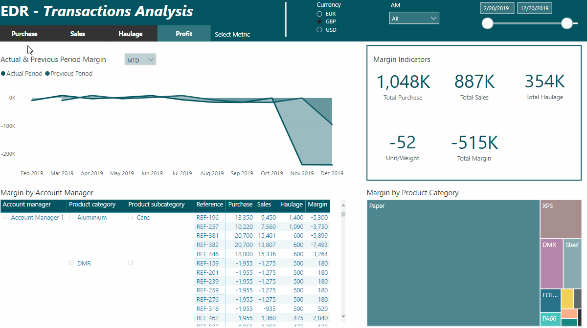
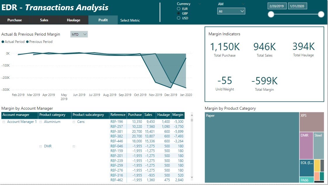
In the Profit page I like how you used consistent red color between the charts. You used pre attentive signals using color by the book! I understood right away where to look, what is wrong with the margin, and where to click next. Very effective and intelligent to guide the end user and offer a great customer journey.
For Purchasing and Sales I like you grouped the products but I have mixed feeling concerning the use of color for every group.
Overall, I really liked your submission and except some minor things, in my view, your report is close to perfection
2 Likes
@Hideo, congratulation on a another great report!
I like your unique navigation and the choice of visual elements! They are clear and effective! I like the theme color and the light grids you use sometimes in your graph. You know how to keep the attention on your data. Your report breaths harmony and flow.
If I may, I have a little improvement suggestion. It is a simple visual design trick you could do to improve your titles in the first page: Replace “Sales( grey ) vs Profits( orange )” with Sales written in grey color and Profits written in orange. It will be more visual and intuitive to read faster your charts.
Also, for the main Title “(Currency conversion, sales and profits analysis)” I think it will look better if it was centrally aligned with the period slicer and without parenthesis
See you at the next challenge!
Best regards,
Alex
2 Likes
Hello everyone,
First challenge for me… and looking forward to improve myself ![]()
I can’t publish to web but I did send the file to the EDNA email, feel free to edit the post with the publish web link if wanted.
Others submissions are really nice, great job to everyone !
Best,
Alexandre
@haroonali1000 Thanks for the publish to web: report here.
8 Likes
Welcome @Alex7891.
A terrific entry and great way to announce yourself.
Some really nice elements in your report.
I have published your report for you please add the link to your post above.
Welcome to the challenge, looking forward to seeing more of your work.
Thanks
Haroon
2 Likes
@All,
If any of you are struggling to publish your reports please reach out to me and we can get it published for you.
Thanks,
Haroon
That would be awesome! With all it’s best features really being interactive that would definitely showcase it more!
Could you kindly send the pbix file to powerbichallenge@enterprisedna.co
Thanks,
H
1 Like