Hello forum members,
Here is the details for the report.
(Data preparation)
–Ex-Rate
I have accessed Yahoo finance for the historical exchange and kept in CSV file.
| Date |
GBP/USD |
EUR/USD |
USD/USD |
| 1/02/2019 |
1.310925 |
1.145082 |
1 |
| 4/02/2019 |
1.307856 |
1.145725 |
1 |
| 5/02/2019 |
1.303084 |
1.143576 |
1 |
| 6/02/2019 |
1.29584 |
1.140875 |
1 |
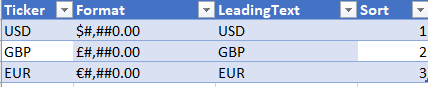
– Currency format
Created currency format referred EDNA video.
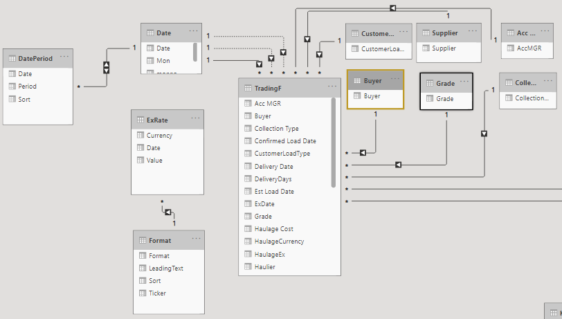
(Model)
*To make use of Date Period I have disconnected “Date” and “ExRate” table.
without connecting these tables, Dax Lookupvalue have done very good job to achieve currency conversion
(Power Query)
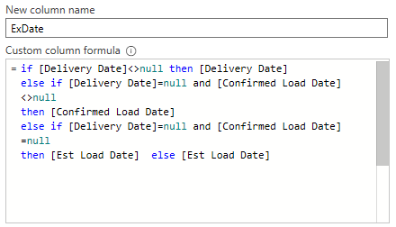
*Need data clean up as I have notice some dates are missing in Delivery date, confirmed load date and Est Load date. So I have created some logic to use for currency exchange date.
*As this is my first challenge for the currency conversion, I wanted model as simple as possible.
So I have selected single currency model (USD) for the fact table this time.
https://www.daxpatterns.com/currency-conversion/#dax-formula
*To bring USD exchange rate to the fact table I have merged two tables using left outer join by Date & currency.
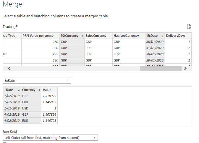
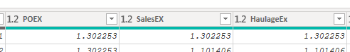
I have created three exchange columns for Purchase , sales and Haulage.
(Dax)
TotalSales =
SUMX(TradingF,
TradingF[SalesEX]*TradingF[Weight]*TradingF[Unit Sales Price])
ConvertedSales =
var CurrentDate= MAX(TradingF[ExDate])
var currencyselected= SELECTEDVALUE('Format'[Ticker],"USD")
var CurrentExrate= LOOKUPVALUE(ExRate[Value],ExRate[Date],CurrentDate,
                                             ExRate[Currency],currencyselected)
var converttedsales= [TotalSales]*1/CurrentExrate
return converttedsales


FormattedSales =
var sales= [ConvertedSales]
var formatting= LOOKUPVALUE('Format'[Format],
                    'Format'[Ticker],SELECTEDVALUE(ExRate[Currency],"USD"))
var  AddonCurrency= SELECTEDVALUE('Format'[Ticker],"USD")
var result=CONCATENATE(AddonCurrency&"  ",FORMAT([ConvertedSales],formatting))
var clearblank= IF(ISBLANK([ConvertedSales]),BLANK(),result)
return clearblank
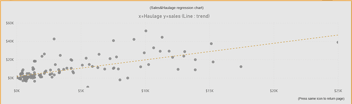
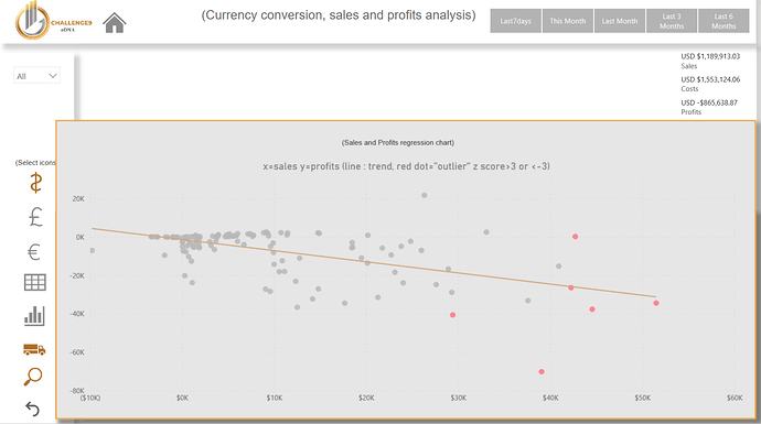
(I have used Z score rather than rankx or topn this time and found this is easy and useful)
Sales Z score =
var allave=AVERAGEX(ALLSELECTED(‘Date’),[ConvertedSales])
var allstd=STDEVX.P(ALLSELECTED(‘Date’),[ConvertedSales])
var zscore= DIVIDE([ConvertedSales]-allave,allstd,0)
return zscore
SalesOutlier = IF([Sales Z score]>3 || [Sales Z score]<-3,1,0)
(Overall)
As this is my first time to deal with currency conversion, eDNA is having plenty of good videos so I have learned a lot.
Also I really appreciate for all the members who are supporting each other.
This is a great community.
Thank you so much eDNA for giving me a learning opportunity.
Regards,
Hideo