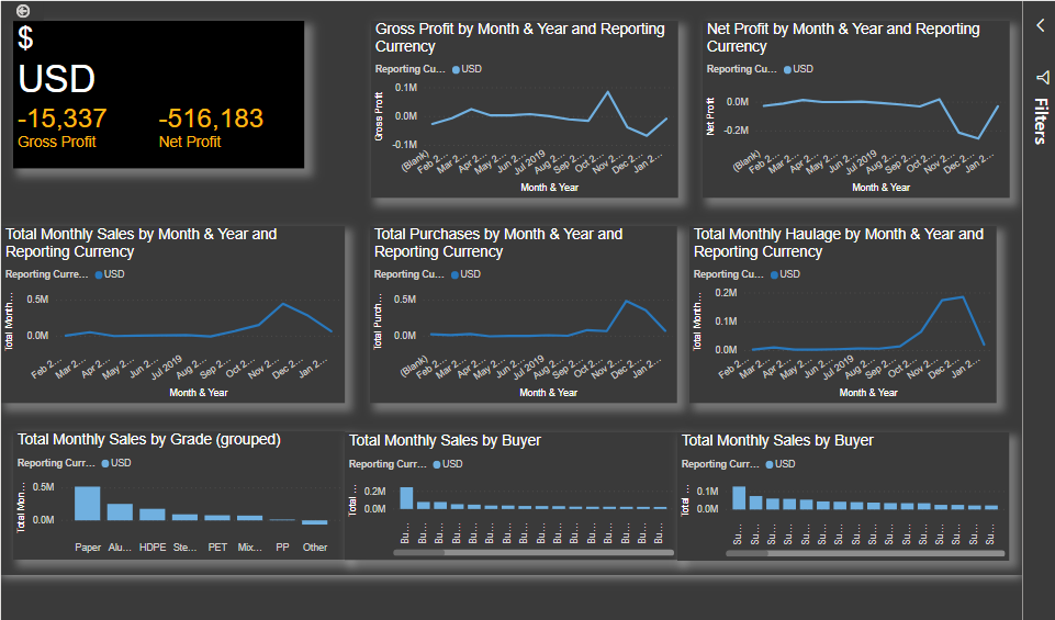
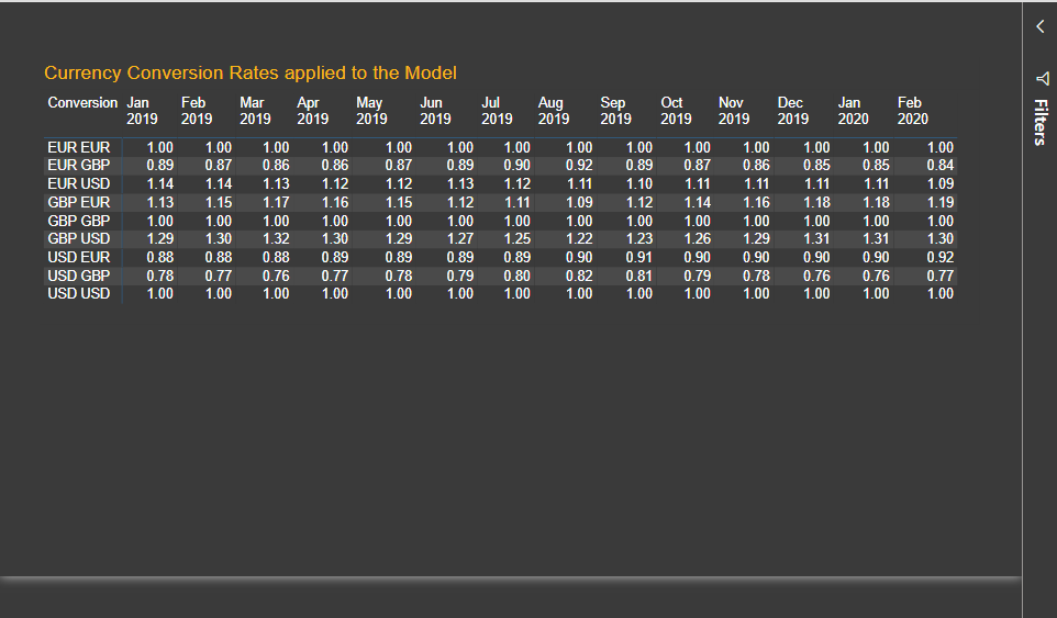
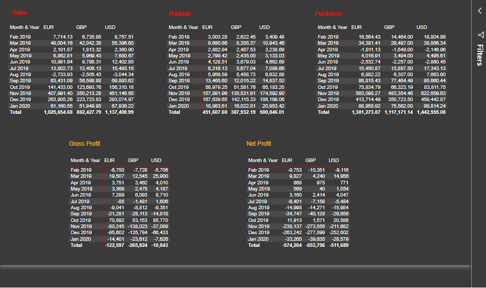
Here’s Craig’s entry for Power BI Challenge 9. @Craig, would you like to share how you built this dashboard and what your inspiration is in building it?
To learn about the real-life scenario presented for the challenge, be sure to click on the image below.

1 Like
This post is part of the Enterprise DNA platform improvements, through the Data Challenge our members can now share how they built their dashboard and what their inspiration is in building it. We hope all members can utilize it efficiently.
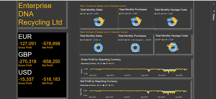
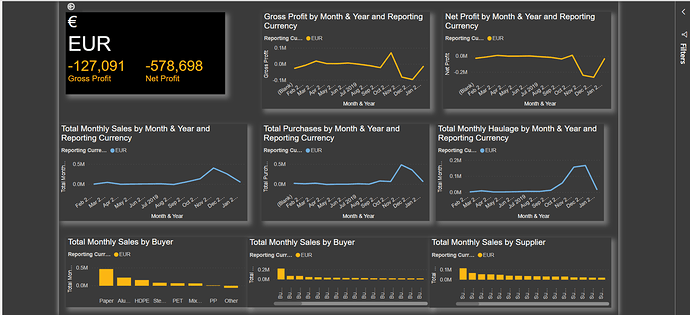
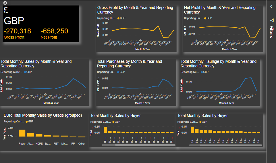
Nice one Craig, a really informative report. I really like how you have used the grid system and boxes to make each different visualization and insight stand out. You’ve also really labeled things well which I appreciate. Sometimes labeling can be so small and hard to read but you’ve really made it easy to work through each different page and understand what to look at and identify any anomalies or pieces of analysis that should be focused in on.
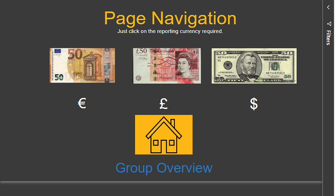
Also really like the page navigation. It’s quite imaginative and I appreciate the design aspect of it.
I think the colors work well. Also the calculations you’ve worked into your reports are really solid as well.
Congrats on your submission really looking forward to seeing some followup ones in the near future.
Sam
1 Like
