Here’s Brad’s entry for Power BI Challenge 9. @bradsmith, feel free to add other details of your work.
Here’s how Brad described it:
Alright everyone, here’s my submission for data challenge 9!
I should start off by saying that unfortunately I didn’t include any machine learning in this report as I did last time, I’ll explain why at the end. Also, I didn’t really have time for this challenge as I only started this over the weekend haha.
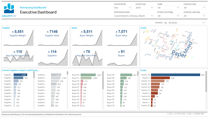
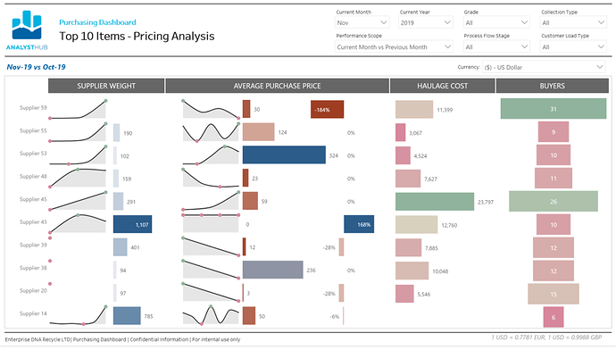
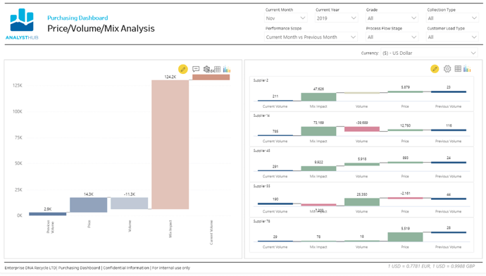
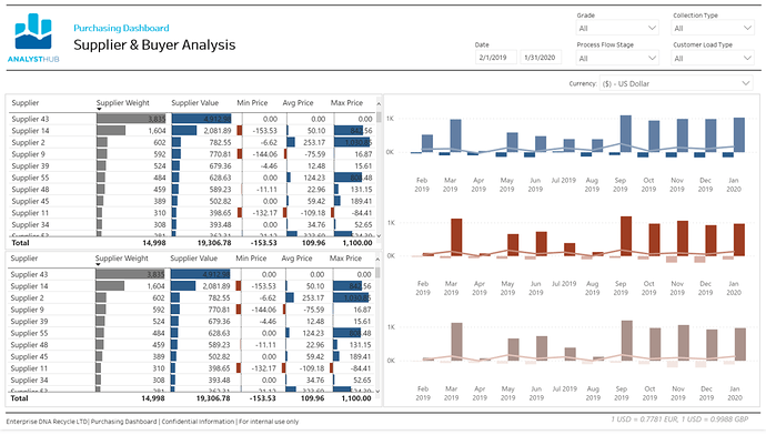
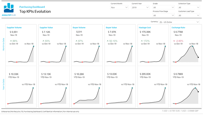
Anyways, I did still take a different approach to this challenge as many others. Almost the entire report is dynamic. The main goal was to try to give the user the ability to determine what they wanted to see. A user can chose to see the any of the measures and how they are doing compared to the historicals in terms of MTD Current Month vs. Previous Month, MTD Current Month vs. Previous Year, or YTD Current Year vs. Previous Year. The currency selector is located just below the filters on each page with the current exchange rates used for that period listed at the bottom right of the page.
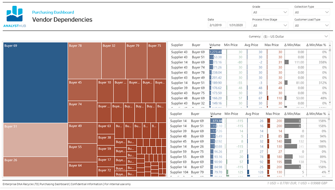
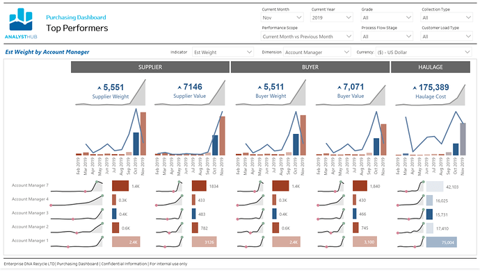
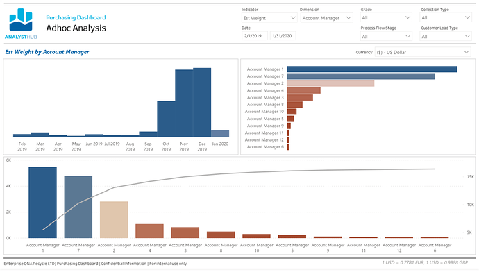
The most dynamic pages in the report though are definitely the last two (Top Performers & Adhoc Analysis). This one not only has all the features of the previous pages, but the user can see which dimension they want to see the data in and by which measure.
Machine Learning - As for machine learning, as my last challenge showed and were probably hoping to see some more of this time, I really like integrating machine learning into my reports, but this report was truly more focused on on the reporting side by providing a report for Enterprise DNA Recycle LTD (EDR) that allows everyone to be able to compare the same data universally across the company while being flexible enough to report any of the currencies. As a result, I didn’t really see anywhere from my perspective that machine learning would have been a value add for this report. Although I debated including a page that would go into forecasting exchange rate prices so that they could look at leveraging currency futures and save money or even make money based on that… If anybody would like me to create that page or walk through how to do that I’d be more than willing.
And that’s my report! I really tried for flexibility this time rather than my usual approach, but I think it turned out alright.
To learn about the real-life scenario presented for the challenge, be sure to click on the image below.
