Here’s Alexandre’s entry for Power BI Challenge 9.
@Alex7891, would you like to share how you built this dashboard and what your inspiration is in building it?
Here is the link to the report:
To learn about the real-life scenario presented for the challenge, be sure to click on the image below.

Hi,
Again thanks for the opportunity of participating and learning from EDNA Challenges.
This was my first entry… I finally took time to deep into a challenge and for sure it is and will be a nice learning path.
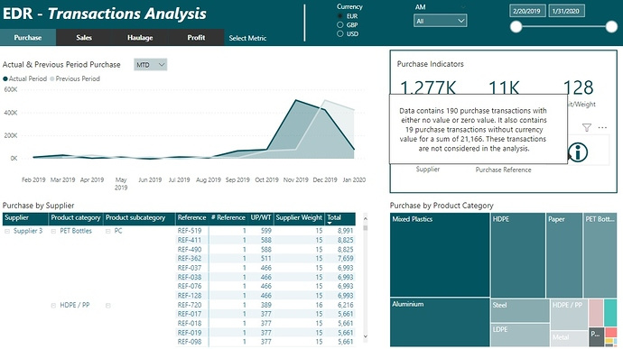
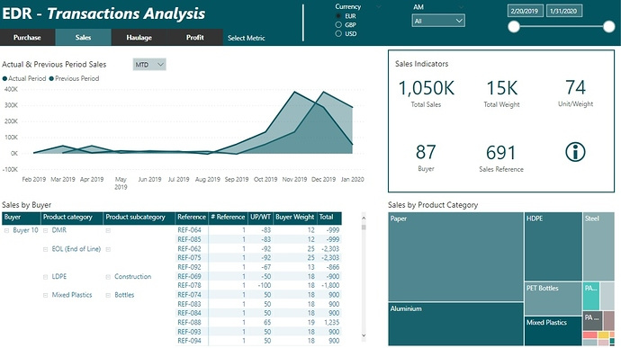
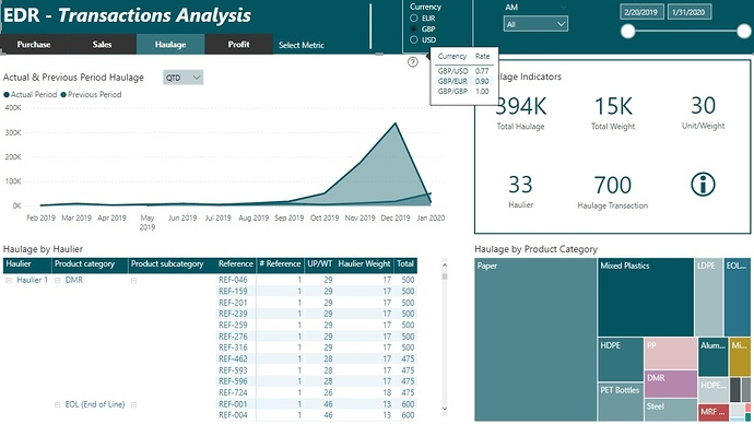
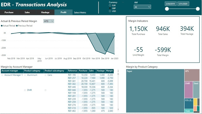
Here some insights on how I work around this report:
Excel:
- Add a table showing exchange rates for each currency pairing with SourceCurrencyKey column (as key for Transaction table) and ReportCurrencyKey column (as key for Report slicing table)
Power Query:
- Create Date table with EDNA PQ Date fx
- Add Custom columns
“Rev Supplier Weight” = if [Est Weight] = 0 or [Est Weight] = null then [Total Supplier Weight] else [Est Weight]
“Rev Buyer Weight” = if [Est Weight] = 0 or [Est Weight] = null then [Total Buyer Weight] else [Est Weight]
“Purchase Amount” = [Unit Purchase Price] * [Rev Supplier Weight]
“Sales Amount” = [Unit Sales Price] * [Rev Buyer Weight]
- Unpivot columns to have in a same column Purchase/Sales/Haulage amounts. This would simplify the relationship with SourceCurrencyKey table (just 1 active relationship)
- Merge with the Exchange Rate table to expand common key for relationship within the model
- Create bridge table for Grade, splitting columns with “-” separator to create product hierarchy levels
- Create bridge tables for Suppliers and Account Managers
PBI Model:
- Exchange Rate table filtered by both ‘Source Currency’ and ‘Report Currency’ tables
- Create a ‘Period Comparison’ table with 3 periods (MTD, QTD, YTD) to be selected through a filter shown in the area chart. With the use of a SWITCH/TRUE fx it shows the related values in the chart.
DAX:
- Main DAX fx to retrieve the converted amount of metric, for example Purchase Amount:
IF ( HASONEVALUE ( 'Report Currency'[Currency Code] ), SUMX ( 'Transaction', [Purchase Amount] * CALCULATE ( VALUES ( 'Exchange Rate'[Rate] ) ) ) )
- Others as Unit Price/Weight, count of transactions, MTD/QTD/YTD, etc.
Report:
- The idea was to be able to filter by a specific currency as required in the challenge brief and also show some main indicators related to each metric (Purchase, Sales, Haulage and Margin) and the group accountable for it (Supplier, Buyer, Haulier and Account Manager) by navigating through buttons.
- Area chart for time visualization, Matrix for calculations at deeper levels, Cards for indicators and Treemap for big picture distribution.
Regards,
Alexandre
2 Likes
Nice start here, like how you have used the grid system to set up your report page. I think it makes it easy on the eye. One thing that I think detracts a little bit from the report. This is just honestly a small thing, but in the tree map you’ve got these random colors showing up. So you want to try and avoid that and use visualizations where that doesn’t occur. Maybe a simple bar chart would have been sufficient here.
I like how you’ve used the tooltips effectively and enabled the information pop up.
Also I like how you’ve embedded the filtering navigation to the top of your page. I think that it works really nicely and also looks great.
Really solid if it here, really appreciate the write up as well. Look forward to seeing many more submissions in the future
Sam
1 Like