Overall
The report was to provide insights on the tickets created in JIRA for the IT department.
Design
Lately I’ve been trying to improve my report design so I decided to use a design toolkit/template from numerro.io, which was awesome. They do have a try out demo one available if you are curious.
Colors
It comes with a few color palettes and I chose their red/black because I rarely use those colors.
Icons
The icons are from https://remixicon.com/.
Charticulator
I used https://charticulator.com/ again and this time to create the radial bar charts. I saw these on @Greg’s submission (though his were in python) and realized I could do that in charticulator. I wrote a short run through of what I did on my site. I tweaked these for hours!
TTR by Isssue Type (2).chart (28.1 KB)
You can open that chart file above in charticulator and pick up right where I left off.
And here is some more info and examples of that type of chart: https://datavizproject.com/data-type/circular-bar-chart/
Report
The navigation panel is really neat and wasn’t too difficult to set up and adjust to my report.
Navigation/Panel
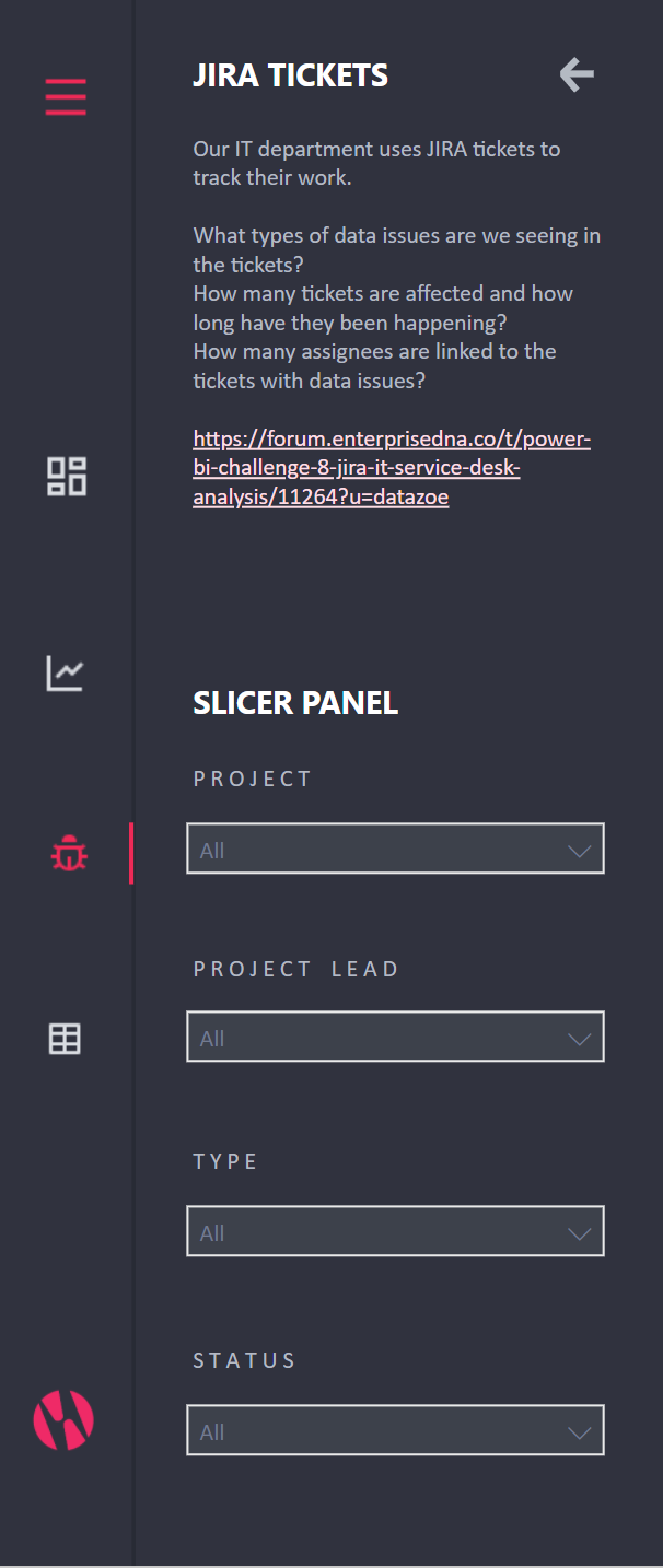
These were part of the template and moved the slicers off the page, and I customized the text on each page. The slicers are all linked.
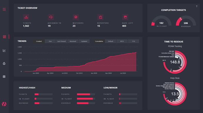
Ticket Overview
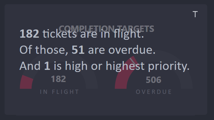
Here is an overall summary, with quick view of volume over time, how many are currently not done, how many were overdue, and summary of the time to resolve by issue type in the radial bar charts.
I originally had a table instead of those radial bar charts, but the data is much more accessible in the charts. There is some caution in using the radial bar charts as the bars get smaller the closer to the center (even if they are the same value), but I think they look awesome.
The top arches also include a smart narrative hidden by that little “T” in the top right hand corner:
There is also a distribution of the ticket priorities using a number of DAX measures to pull it off. It’s not as interactive so I am not sure I like it, but it does give an idea of the distribution nicely.
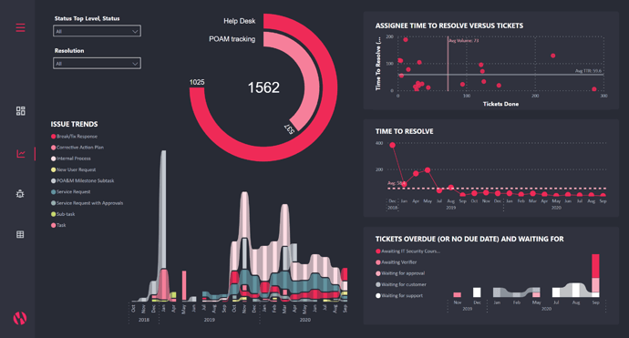
Ticket Patterns
The patterns looks at trends over time with issue type in a ribbon chart (which I love). I also used a ribbon chart to show the overdue/waiting for tickets. These are probably the most actionable by management, not the assignee, which is why I included it. They can follow up and make sure these blockers are removed. Overdue was chosen because those are the higher priority for management as well.
I have a scatter on top, with quadrants determined by average volume and average time to resolve.
Time to resolve trends are also included, and again I provided the average line for reference as there was not stated target.
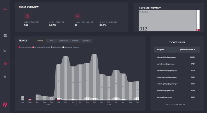
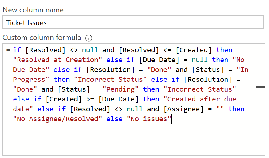
Ticket Issues
These data issues were actually determined in Power Query.
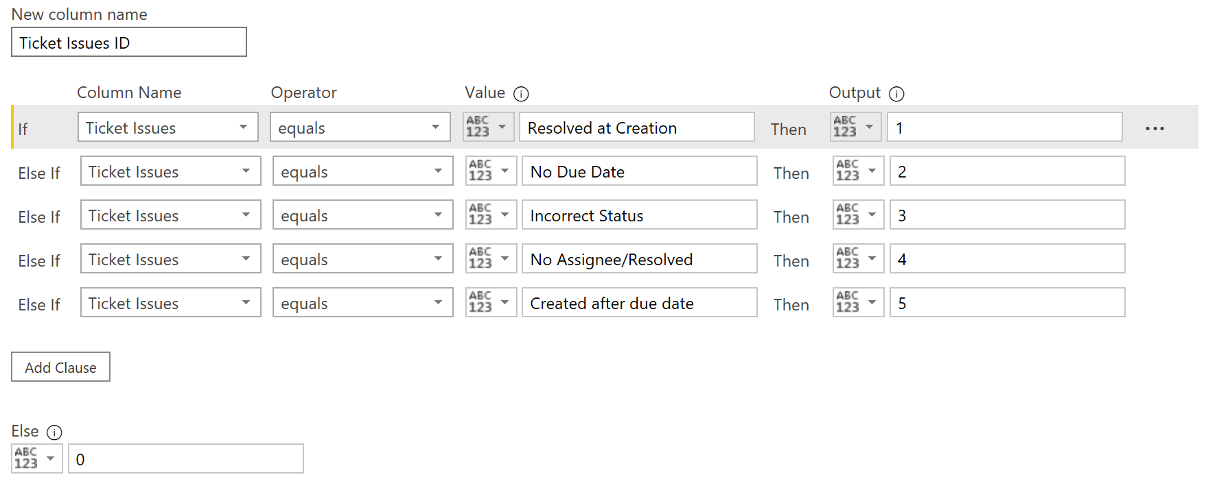
Which I then followed up with another column to give them a number (so I could highlight them in the Ticket Detail table too).
Afterwards, I thought it may have been best to do them in individual columns so I could call out tickets with multiple issues. But at least this way when I showed volume of issues there were no duplicates.
I gave a summary of how many tickets with issues, and what % of the tickets were with an issue to show how widespread of an issue it was, and included the % of assignees that also had tickets with data issues. This would be to see if it may be something that only a few people are doing, so could maybe be resolved with a meeting only with those, or if it’s with everyone, then perhaps a mandatory training session would be more advisable.
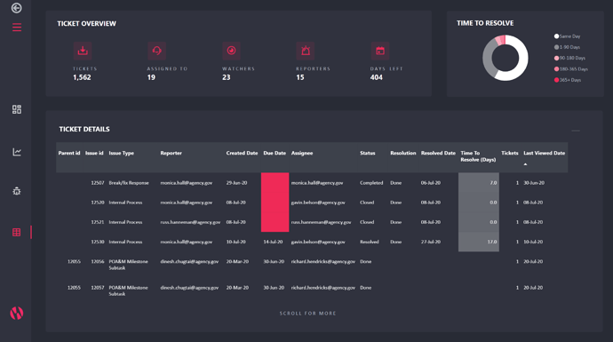
Ticket Details
This is really the drill-through page but I used it frequently to get into the details of the data, so I made it accessible from outside of drill-through too. Here I bucketed the TTR too.
I highlighted some of the ticket issues here in the brightest color, so they were also hard to miss. I did consider icons or a legend too, but I stuck with the simpler approach.
Thanks!
Again for this wonderful challenge, I love seeing all the other submissions!