Here’s the entry from one of our non-member participants, Timothy.

Here’s the link to the report:
And here’s how Timothy described it:
(Special thanks for Brian Julius for publishing the report)
Features I tried this time:
- Used a Switchboard to allow the user to select among the four areas:
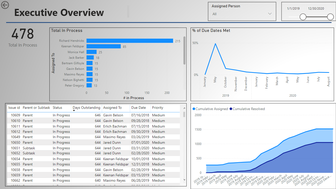
- Executive Dashboard – a quick overview
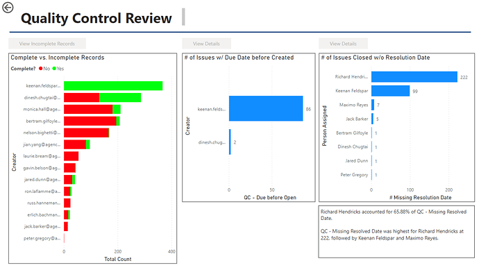
- Quality Control Dashboard – to provide quick information on three key areas
1.Incomplete records (no due date)
2.Tickets with a due date before a creation date
3.Tickets closed without a close date
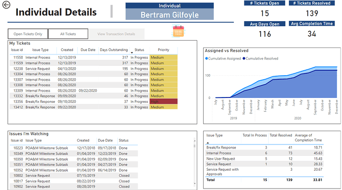
(The green text boxes indicate the # of records in this area and will update if an individual user is selected)- Page for Person Specific Details. (For this – I have a button to show the list of names to select from. Selecting a name will then active the button to view the details.)
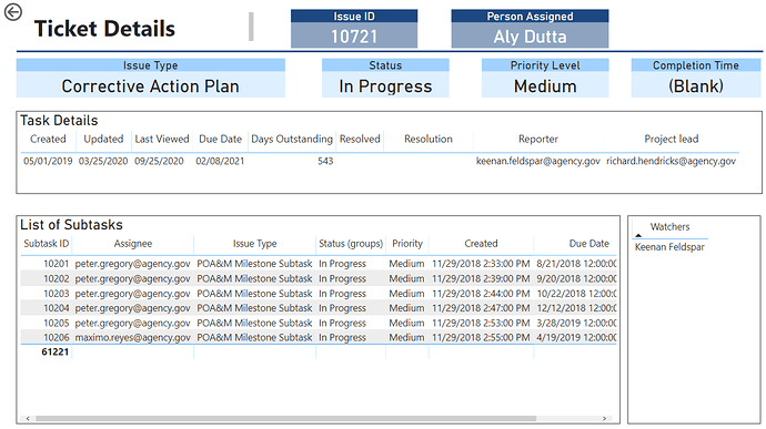
- Page for Ticket Details (Similar to the person, there is an option to search for a ticket and then see the specific details)
- Using R script in the Power Query to get a separate table of “Watchers”. To do this, I used a copy of the “Tickets” dataset, removed all columns with the exception of the “Issue ID” and all “Watchers” column. Then – I used a simple R Script to convert the table into “key-value” pairs. The output is a separate row for each unique Issue ID and Watcher. I then cleaned this up by splitting the columns to remove the email address and convert the end result to just the person’s name.
To learn about the real-life scenario presented for the challenge, be sure to click on the image below.
