Here’s the entry from one of our non-member participants, Prajakta.

Here’s how Prajakta described it:
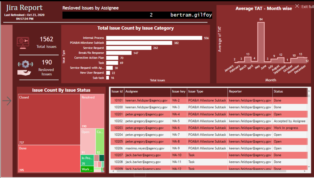
I have focused on more visuals rather than data, as it was my 1st attempt.
I had no clue that we can modify data in the contest, rather focused on what can be shown.
I was actually excited to use my own ideas, new & creative look of the dashboard.
There was inconsistency in data, but I have included insights on:
- Total Issues.
- Resolved Issues.
- Resolved issues by assigner (Scroll).
- Total issues by issue category
- Monthly Average TAT.
- Issues by their respective status.
- A table with issue details( My clients mostly are good at excel they do prefer a table in dashboards).
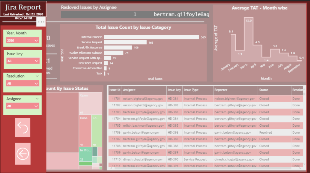
- A button on left which gives options to show slicer. (Saves the space, makes it attractive and less compact). Sclicers are - date, issue key, resolution and Assignee.
- Slicers can be selected (Background gets blur).Also a reset and a back option available
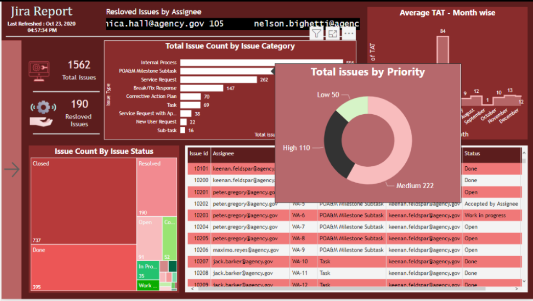
- Visuals in tool tips are used to show more information in single page which also reduce time in performance analyzer.
- Refresh time is given below the title for user to know when the data got last refreshed.
To learn about the real-life scenario presented for the challenge, be sure to click on the image below.
