Here’s Nebiyu’s entry for Power BI Challenge 8. @Neba, feel free to add other details of your work.
Here is the link to the report:
And here’s how Nebiyu described it:
Hello EveryOne,
Here is my submission for challenge 8 which I had a lot of fun working on.
Data Model : -
For this challenge I created a Data model which consists of 6 Dimension tables and one Fact table in Power Query. ( I guess I am getting comfortable using Power Query to create a Data
model instead of SQL Server as I did before ).Dimension Tables : -
The five dimensions were created using distinct values of :-
- Projects
- Issue Types
- Statuses
- Assignee
- Watchers ( I Unpivoted Watcher_4 , Watcher_5 , Watcher_6 and Watcher_7 and merged them with Watcher and removed duplicates ).and
- Dates ( Thanks @Melissa ) .
Fact Table:-
- Jira_Tickets
DAX Calculations:-
Once the Model was created, most of the calculations were not too difficult. But, some of the data needed to be modified in order to make it work.
To verify the validity of the Tickets, based on @haroonali1000 's instruction, I used the following Measure:-
Verifying Tickets = IF (
					ISBLANK (
					MAXX ( Jira_Tickets, Jira_Tickets[Due Date] ) ),
					       "Incomplete Ticket",
				        IF (
                                                 MAXX ( Jira_Tickets,
        							DATEDIFF ( Jira_Tickets[Created], Jira_Tickets[Due Date], DAY )
                                                              ) < 0,
                                                              "Implementation Issues",
                                                   "in "  & MAXX ( Jira_Tickets,
                                                                  DATEDIFF ( Jira_Tickets[Created], Jira_Tickets[Due Date], DAY )
                                                                                      ) & " Days"

)
)
Then I created a Calculation Group in Tabular Editor to classify each ticket based on the above measure.
E.g. For incomplete tickets, the following DAX calculation was used in Tabular Editor.
CALCULATE (
SELECTEDMEASURE (),

FILTER (

    Jira_Tickets,

    [Verifying Tickets] = "Incomplete Ticket"

			)

			)
and the same for Tickets with Implementation Issues and the rest of the Tickets were assumed as Valid Tickets.
I also used Calculation Groups for to merge Statuses: -
E.g. the following Statuses were assumed as Resolved.
CALCULATE (
SELECTEDMEASURE (),

Jira_Tickets[Status] = "Completed"

    || Jira_Tickets[Status] = "Closed"

    || Jira_Tickets[Status] = "Done"

    || Jira_Tickets[Status] = "Resolved"
)
This is the first time I used Calculation Groups and I found them to be very useful ( especially for multiple Time Related DAX Calculations ).
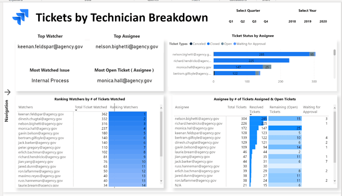
Visualizations :-
For the theme of this Report I used one of Atlassian’s Logo and matching blue colors for most of the Report.
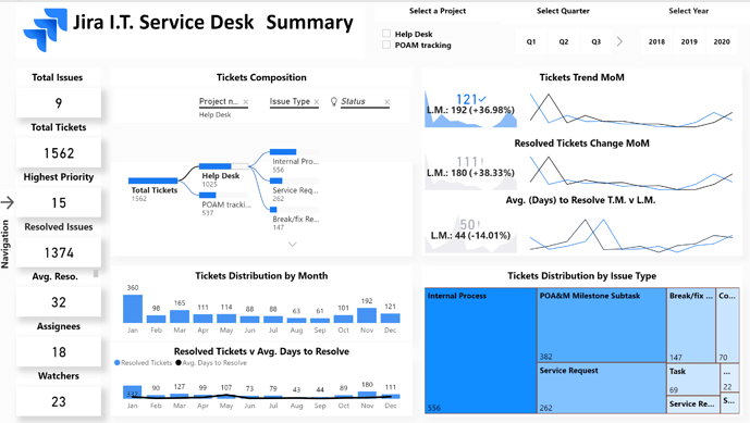
I took a visualization Idea of combining a Column chart and a Matrix to display bars for the months from one of the Top Experts on this forum (Thanks @MudassirAli ).
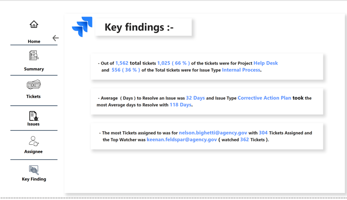
To learn about the real-life scenario presented for the challenge, be sure to click on the image below.
