This Challenge taught me a lot of things including Ranks with Tie Breakers (Thanks to @AntrikshSharma & @BrianJ), adjusting Ranks to work with Charticulators, lots and lots of Conditional Formatting and last but not least designing own custom visuals. Frankly speaking, I love the liberty of incorporating the creativity in designing the visual and conveying the story with visual itself which I find very hard with native Power Bi visuals.
I wouldn’t have dived into the Charticulators if it wasn’t for @datazoe (from whom I first heard about this cool visual designer) and EDNA forum (where I stumbled upon a post inquiring about the Tableau looking line chart). Solving the question on the forum gave me the idea what this designer is capable of.
First I decided that I will just have custom designed HeatMap and Slope Chart but soon things became crazier. The biggest problem wasn’t designing the visuals but rather What I wanted to design, What story I wanted to convey & How I wanted to convey it.
Data Transformation In Power Query
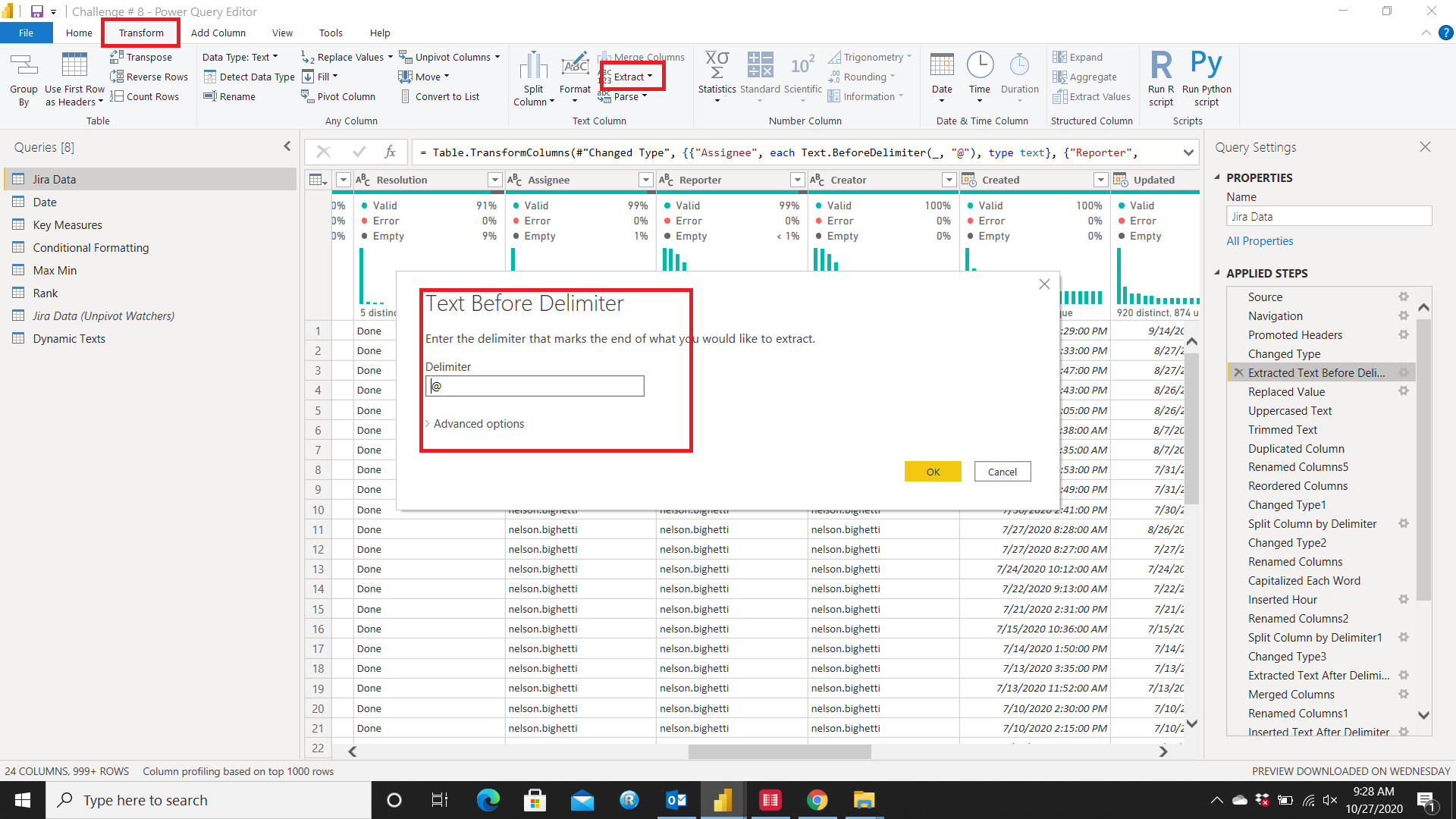
First what I did was to extract the names form the emails. To do this, I selected all the columns with emails and selected Extract from Transform Menu and under extract, chose the option Text Before Delimiter and chose @ as the delimiter.
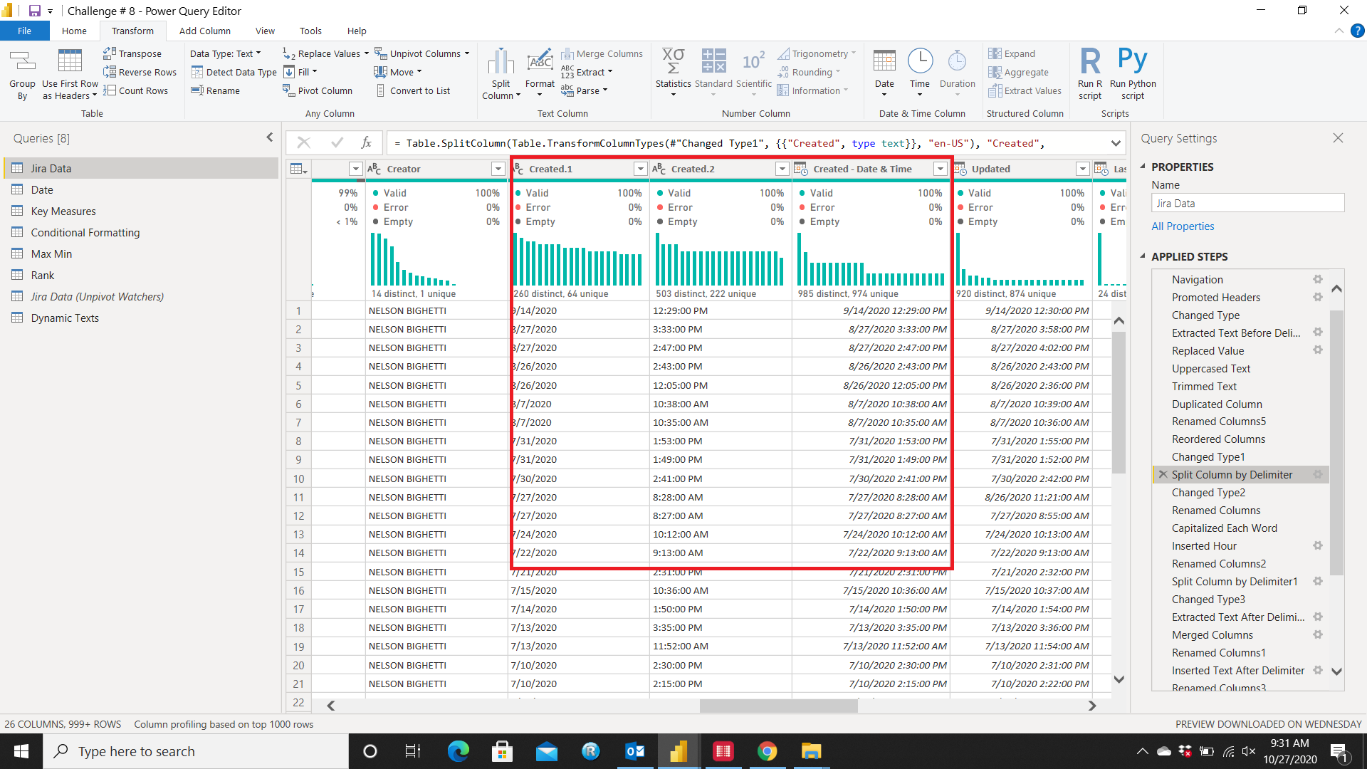
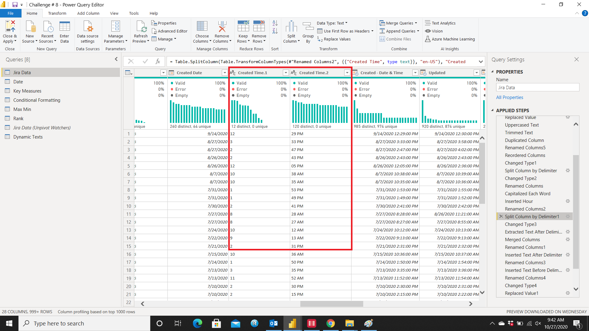
Secondly, I tried to extract the Time for my HeatMap from the Created Date column. I duplicated the column and selected Split Column and selected Space as the Delimiter
Now the Created Time looks like as follows:
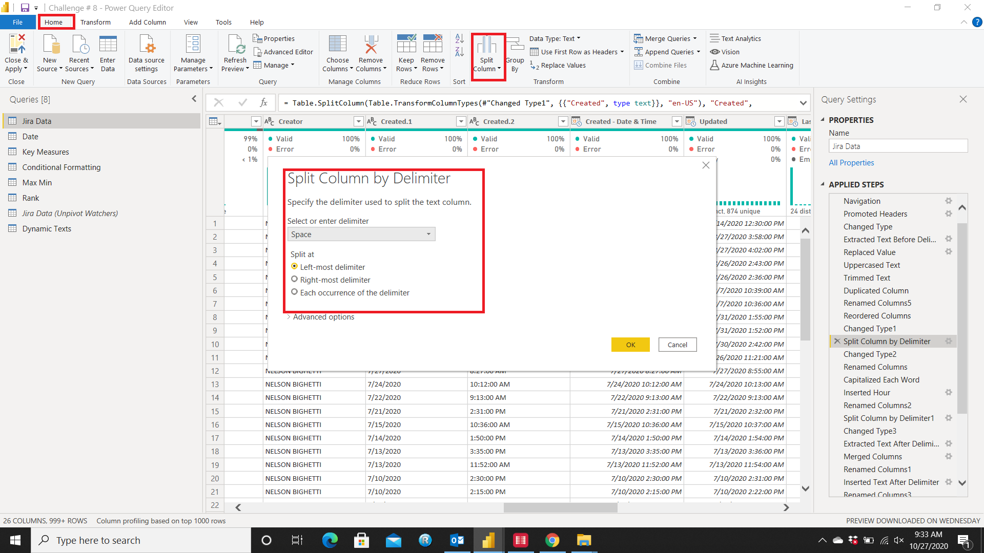
Now separated the
Hour form
Minutes by again selecting
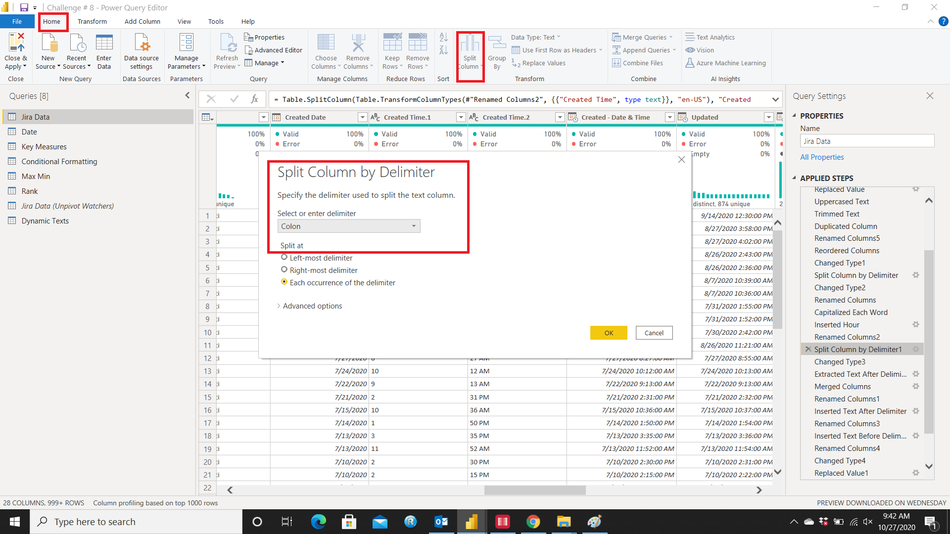
Split Column and choosing
Colon as the delimiter
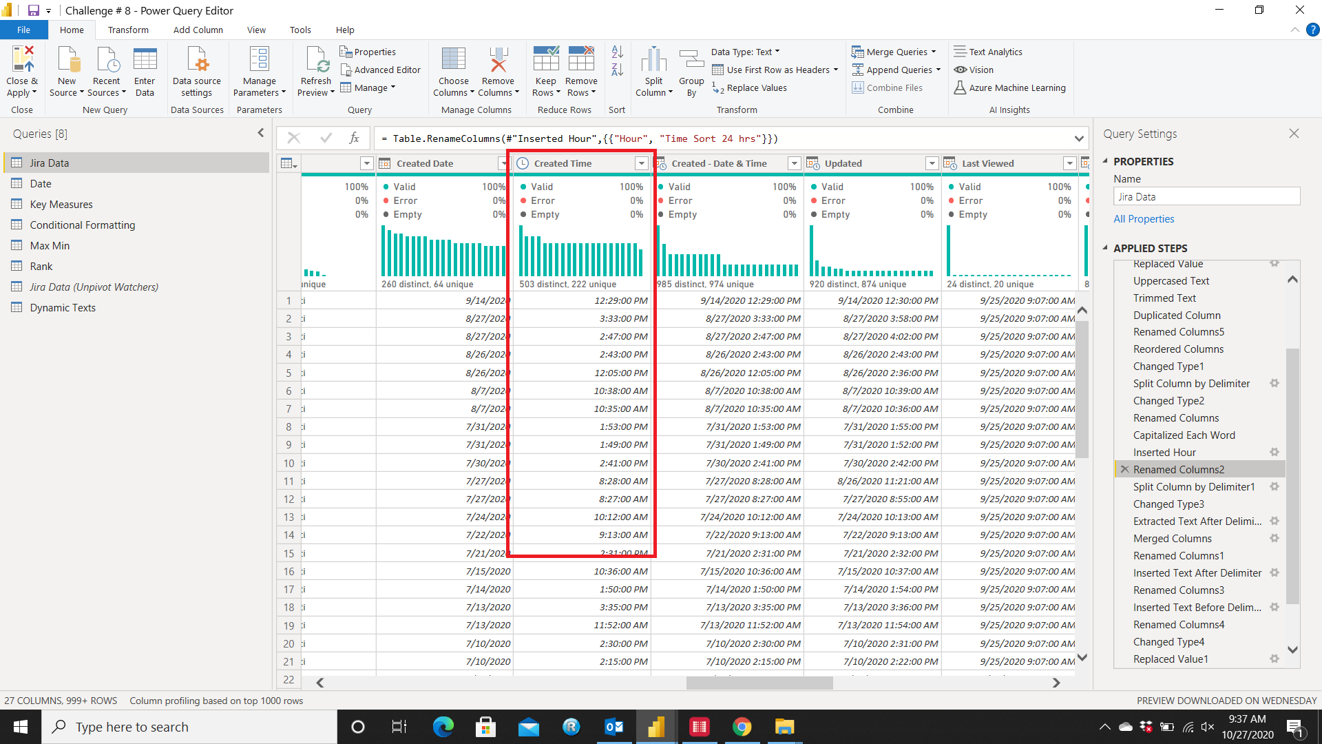
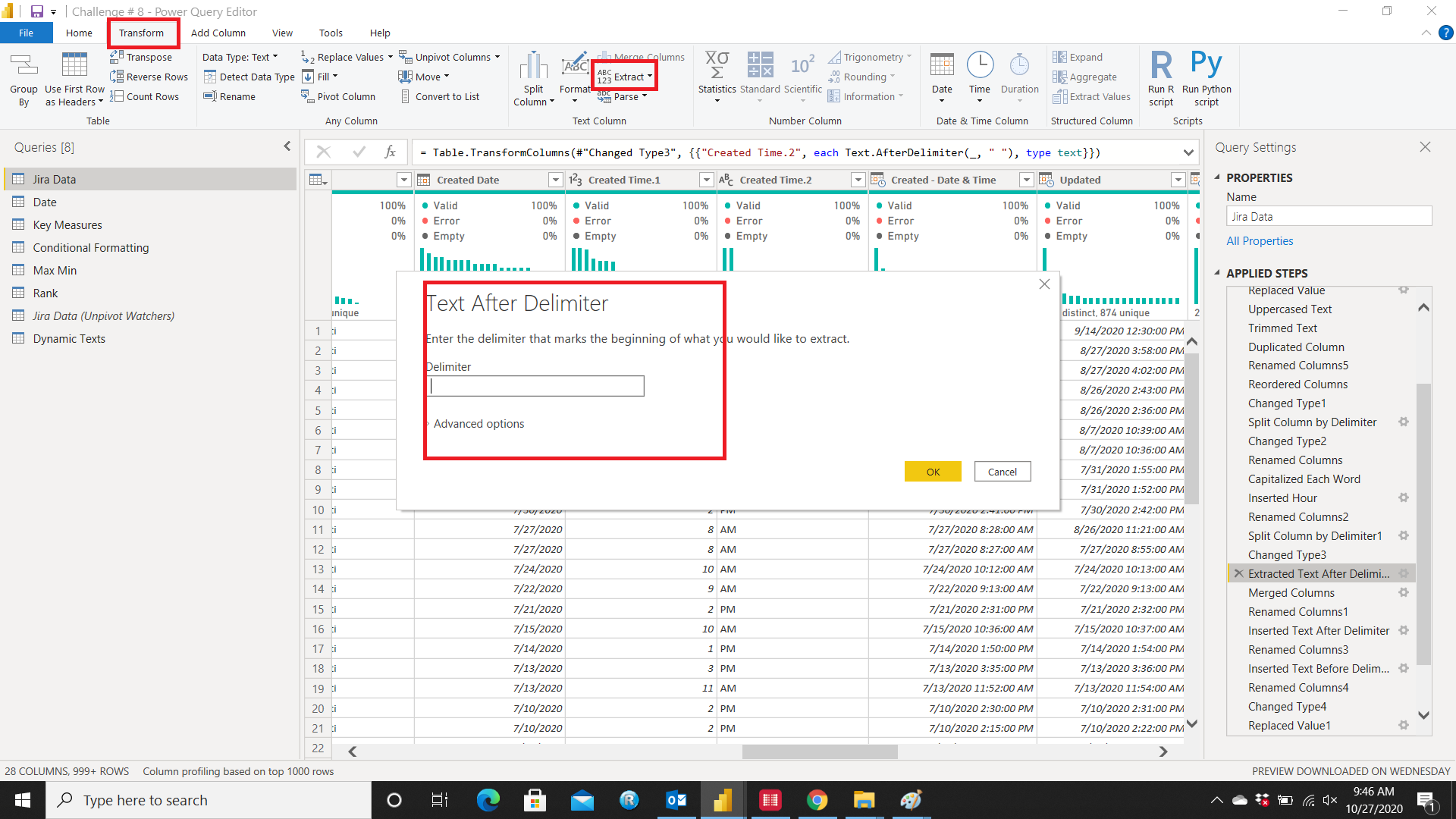
Then extracted the
AM/PM from minutes by selecting
Extract and under extract chose
Text After Delimiter and selected
Space as the delimiter
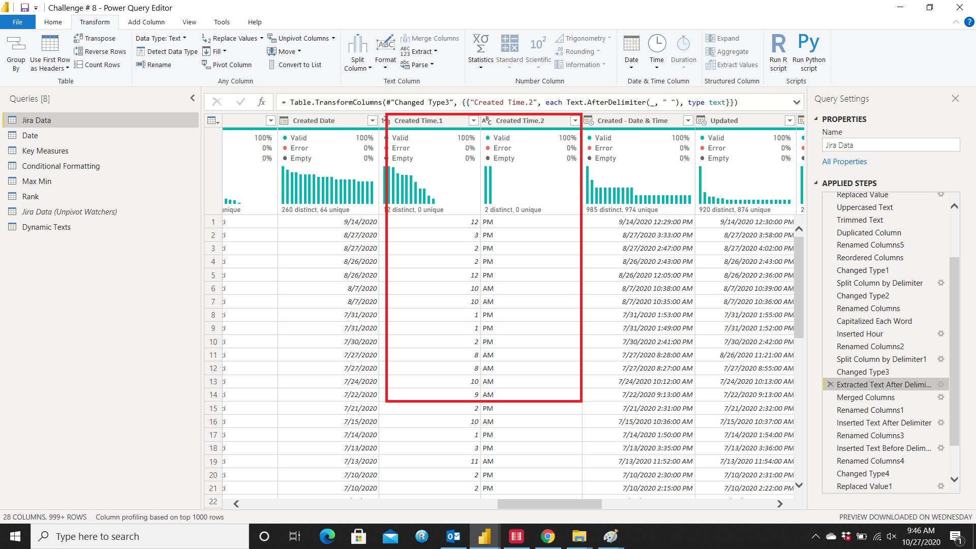
The last thing required to do was to merge
Hour with
AM/PM. I selected the columns I wanted to merge and selected
Merge Columns
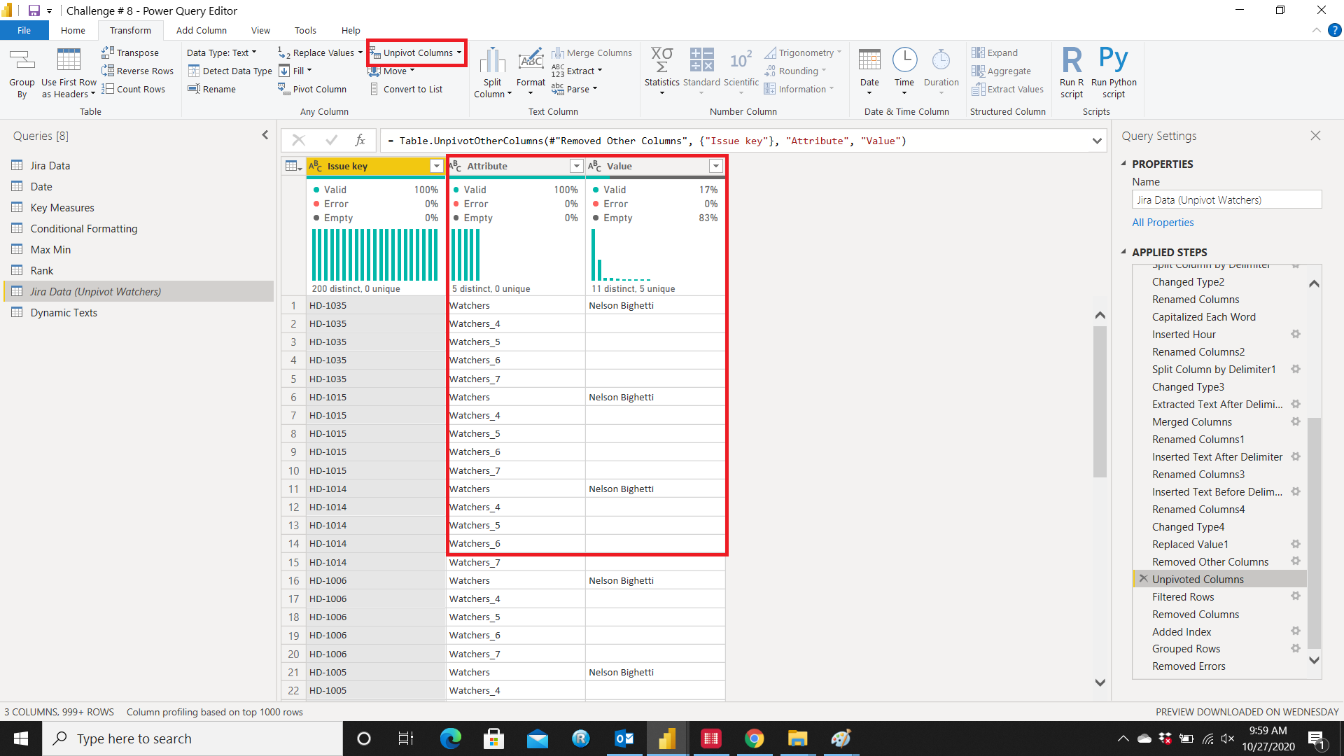
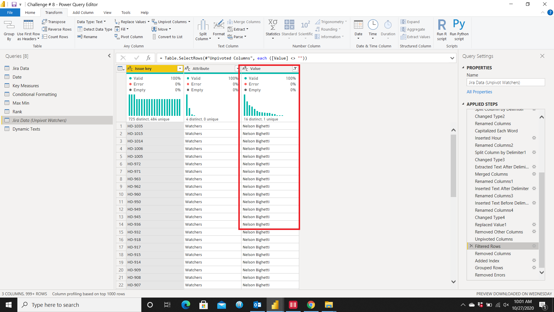
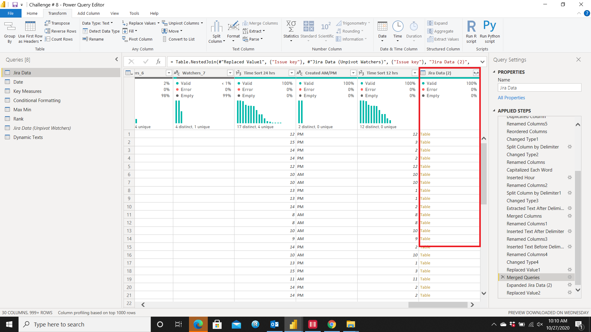
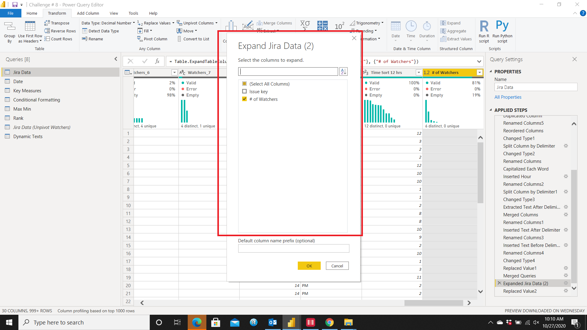
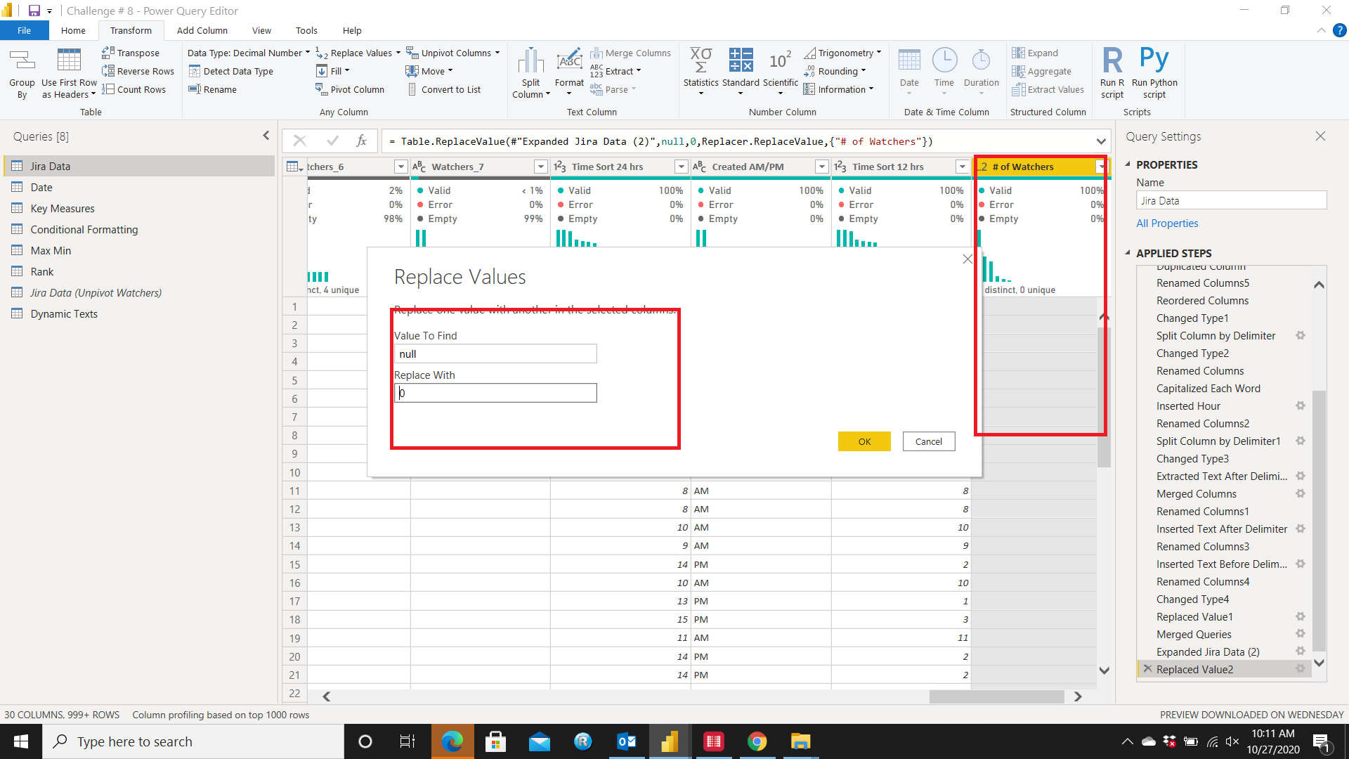
Lastly, to get the # of watchers I duplicated the Data Set Query and kept only Issue Key & Watchers Columns then Unpivoted Watchers Columns and Filtered Rows from Value Column
After that Removed the
Attribute column and added
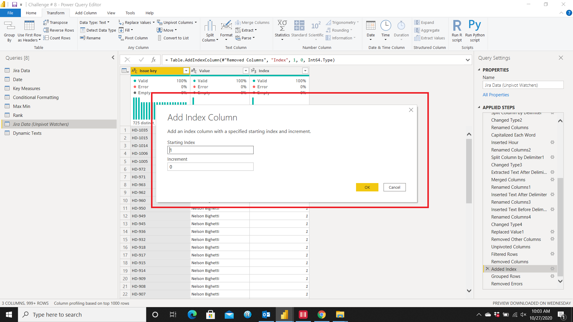
Index
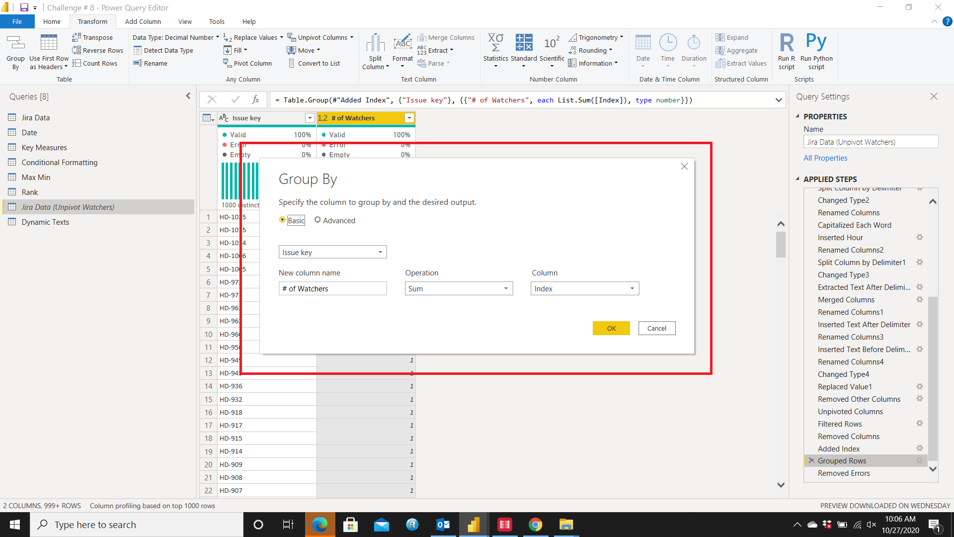
Now
Grouped Rows so I have the Total # of Watchers against the Issue Keys
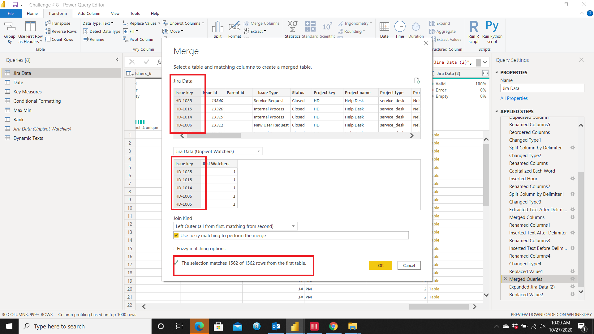
The last thing was to Merge the # of Watchers back to the Original query. I selected Merge Queries option and Merged it by Issue Key, Expanded the Columns & Replaced Null with 0
Now all set to move to Power BI.
Main Calculated Columns
-
Days To resolved
Days To Resolve =
IF(‘Jira Data’[Resolved]=BLANK(),
BLANK(),
DATEDIFF(‘Jira Data’[Created Date],‘Jira Data’[Resolved],DAY))
-
Status Modified = (Combined Status into 3 categories)
IF(
AND(
‘Jira Data’[Resolved] <> BLANK(),
‘Jira Data’[Due Date] <> BLANK()),
“Resolved With Due Dates”,
IF(
AND(
‘Jira Data’[Resolved] <> BLANK(),
‘Jira Data’[Due Date] = BLANK()),
“Resolved Without Due Dates”,
IF(
‘Jira Data’[Resolved] = BLANK(),
“Open”,
BLANK())))
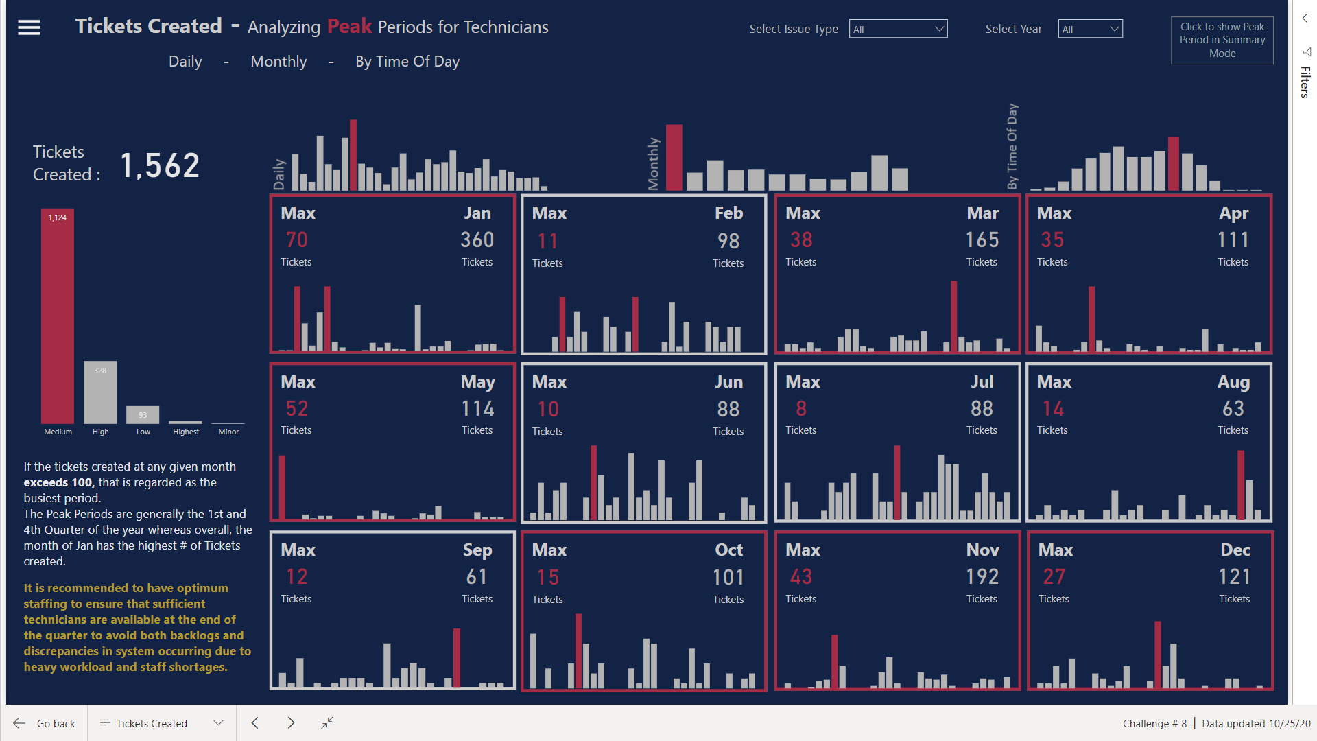
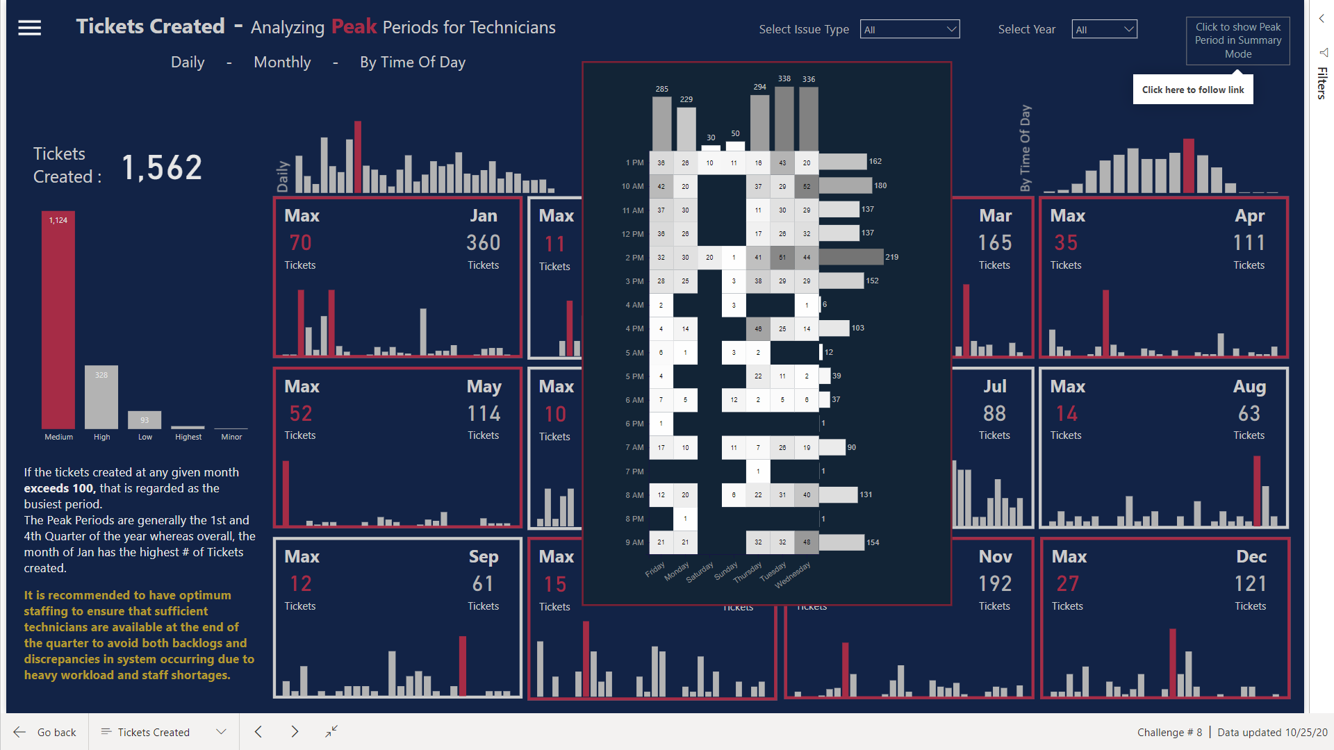
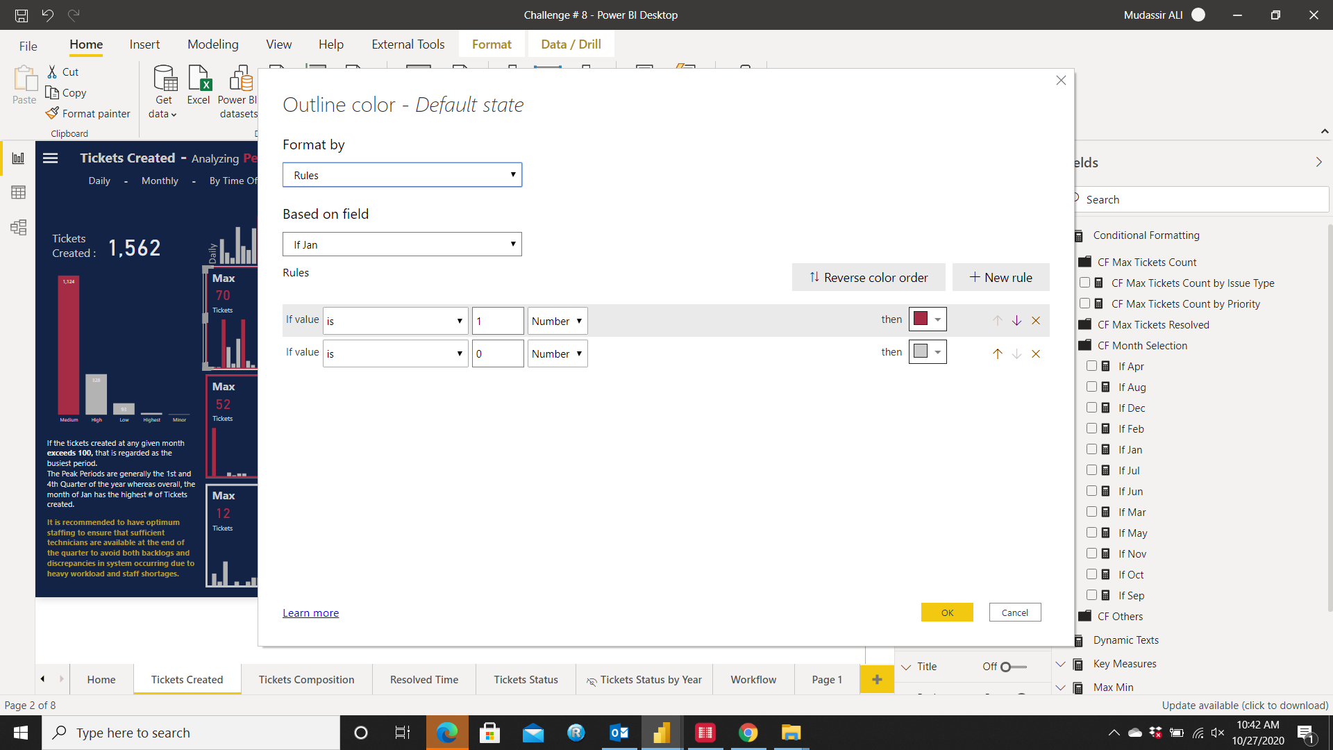
Peak Period
I used the Calendar looking style and HeatMap to show the Peak Periods by conditionally formatting the Highest Tickets Created with Red Color and by using the following DAX formula:
VAR
TicketsCount =
CALCULATETABLE(ADDCOLUMNS(
SUMMARIZE(‘Date’,‘Date’[DayOfWeekName]),
“Tickets”,
[Count of Tickets]),
ALLSELECTED())
Var
MaxValue=
MAXX(TicketsCount,[Tickets])
Var
Currentvalue = [Count of Tickets]
Return
IF(Currentvalue=MaxValue,1,0)
The Borders of the Calendars will change Dynamically to Red if the # of Tickets Created are more than 100 in a month to easily identify the busy periods. I did this by using the Blank Button as Borders and placing the measure to conditionally format it. Measures were created for every individual month as follows and then were placed in the Outline section of the Blank Button
With this, it was easy to identify that the First & Last quarters were generally the busiest periods of the year.
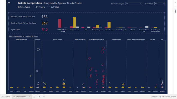
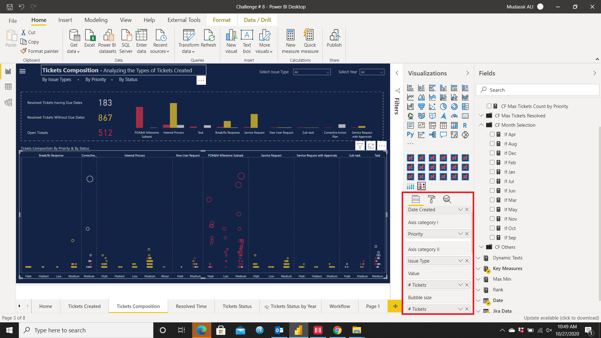
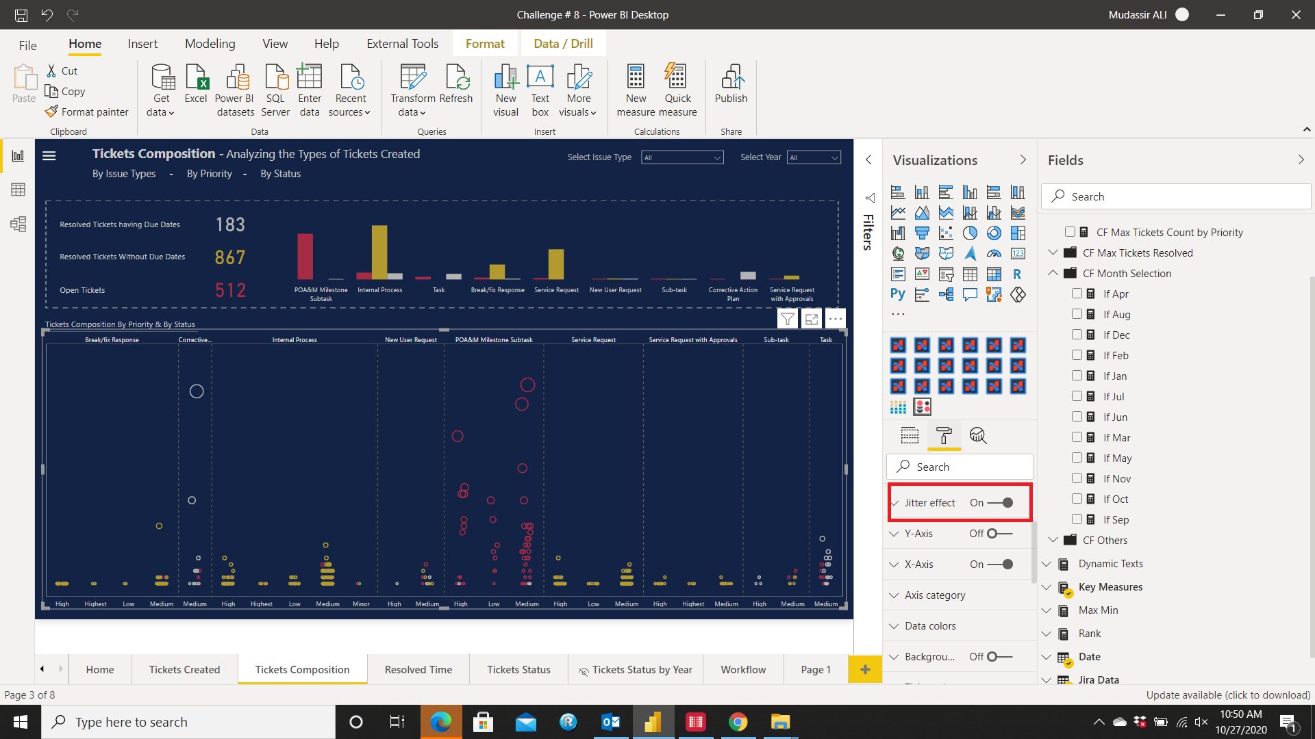
Tickets Composition
The Dot Plot custom visual by MAQ software was used here to show 3 dimensions:
- Tickets Created shown by Size of the Bubbles and broader the column, higher the tickets created in that Issue Type.
- Showing the priority in the X-Axis
- Showing the Status of the Tickets by different colors (Grey = Tickets Resolved Without Due Dates, Yellow = Tickets Resolved having Due Dates, Red = Open/Active Tickets)
Turn On the Jitter Effect option from the Format Pane
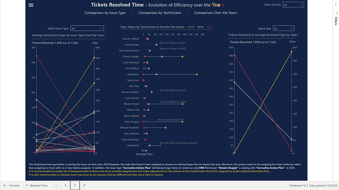
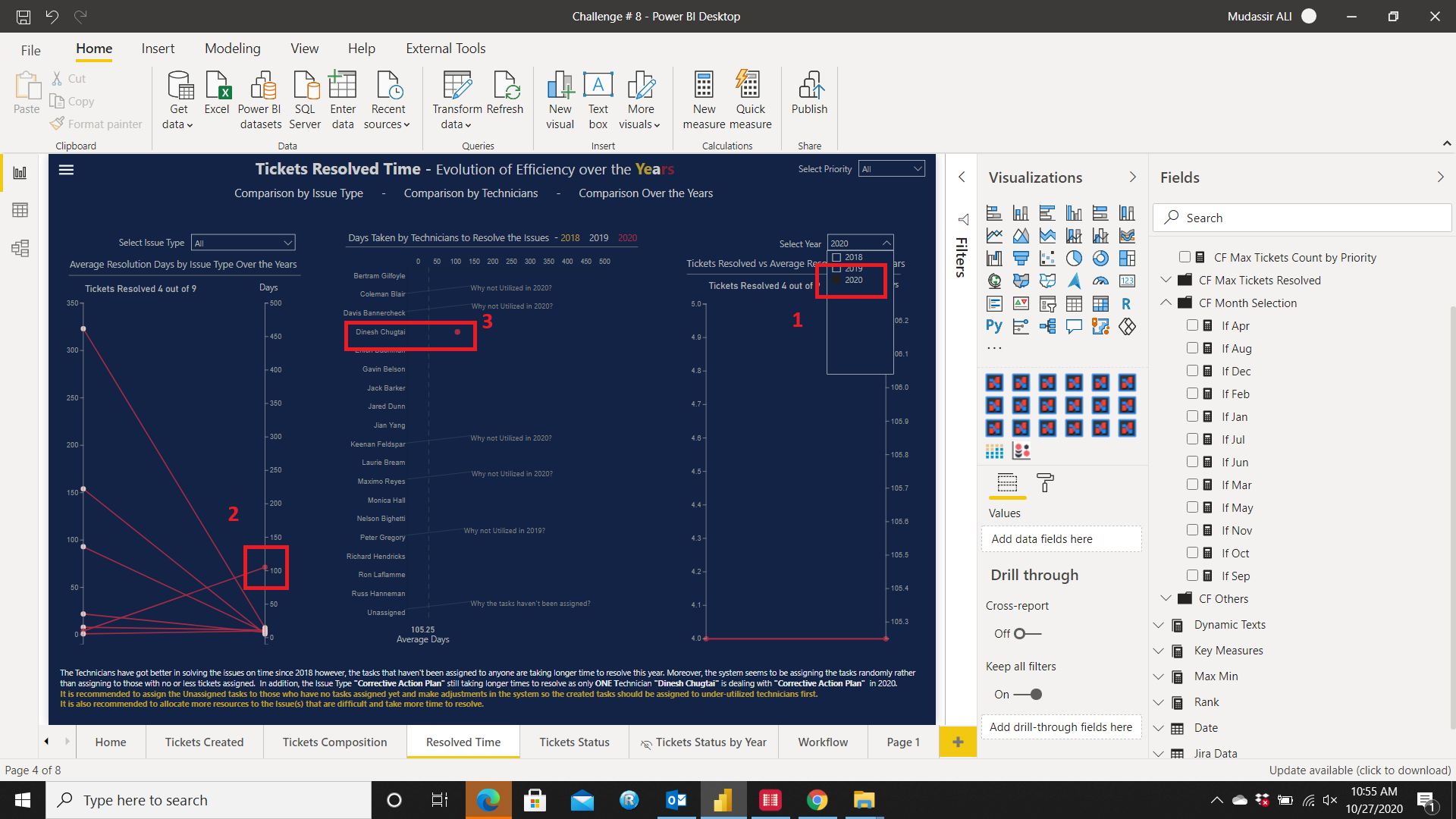
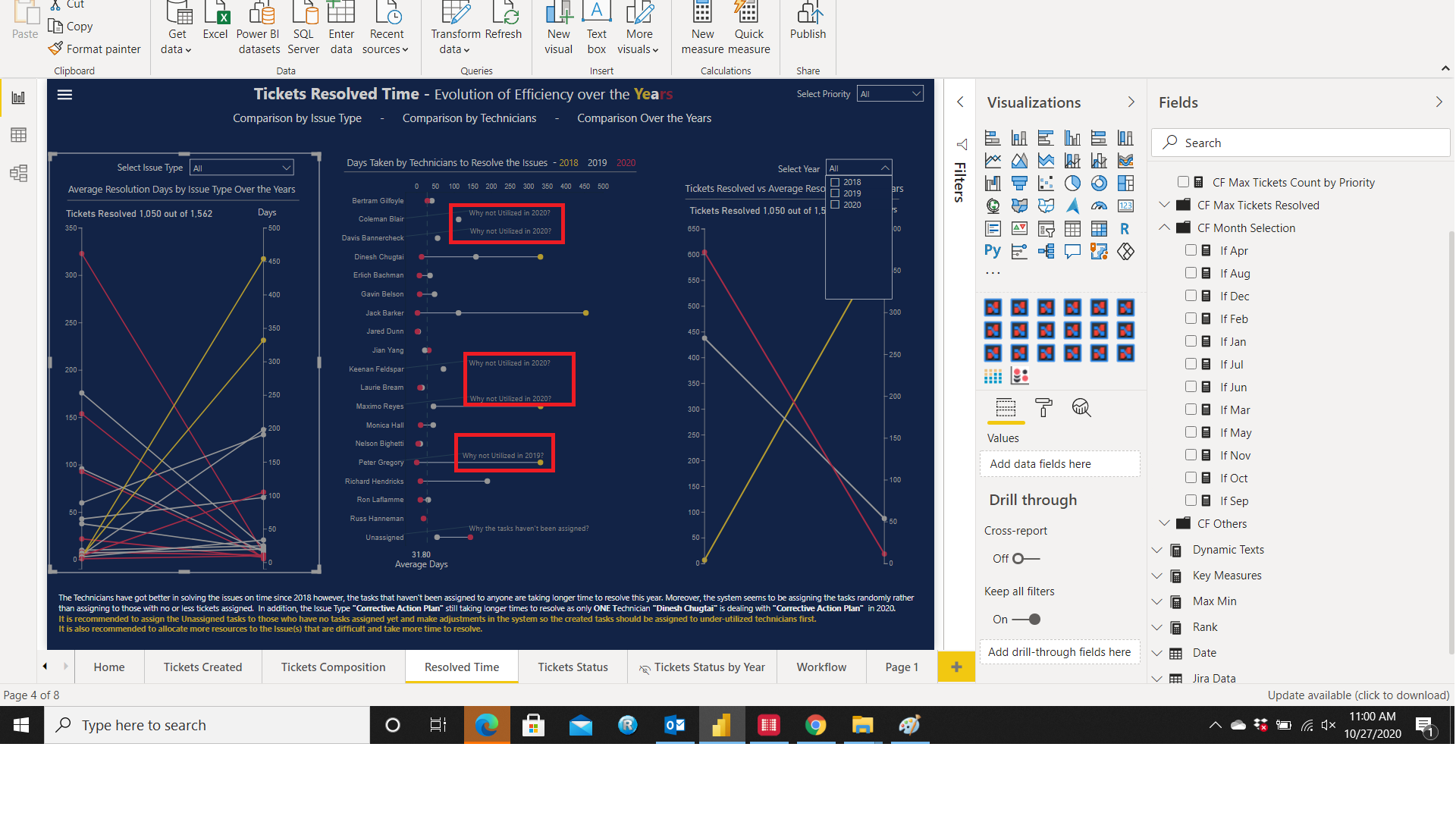
Tickets Resolved Time
Here where the Own built custom visuals were used. Power BI do have custom made Slope Charts & Dummbbell Charts but they aren’t as flexible and painful to work with. So much information can be obtained easily for e.g. I selected the Year 2020, looked at the left hand side visual and noticed one Issue Type was taking more days to resolve. When I clicked on that Issue Type it showed that in 2020, only one person was dealing with that Issue and that’s causing longer resolve times
Moreover, by differentiating with colors it can be easily noticed that some Technicians weren’t assigned Tasks
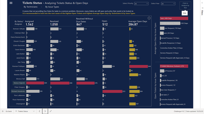
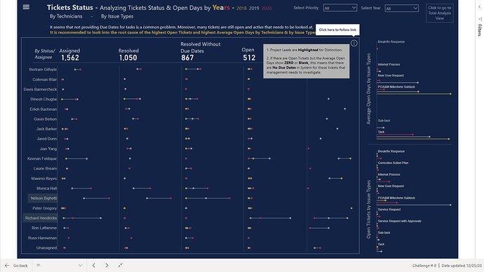
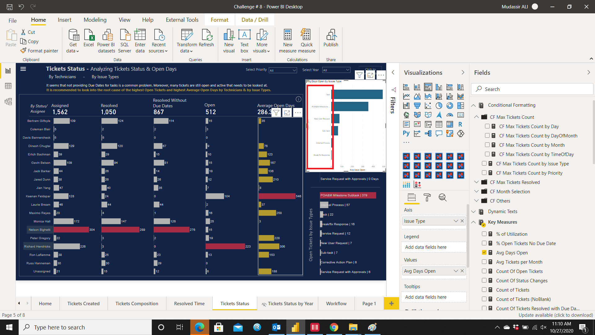
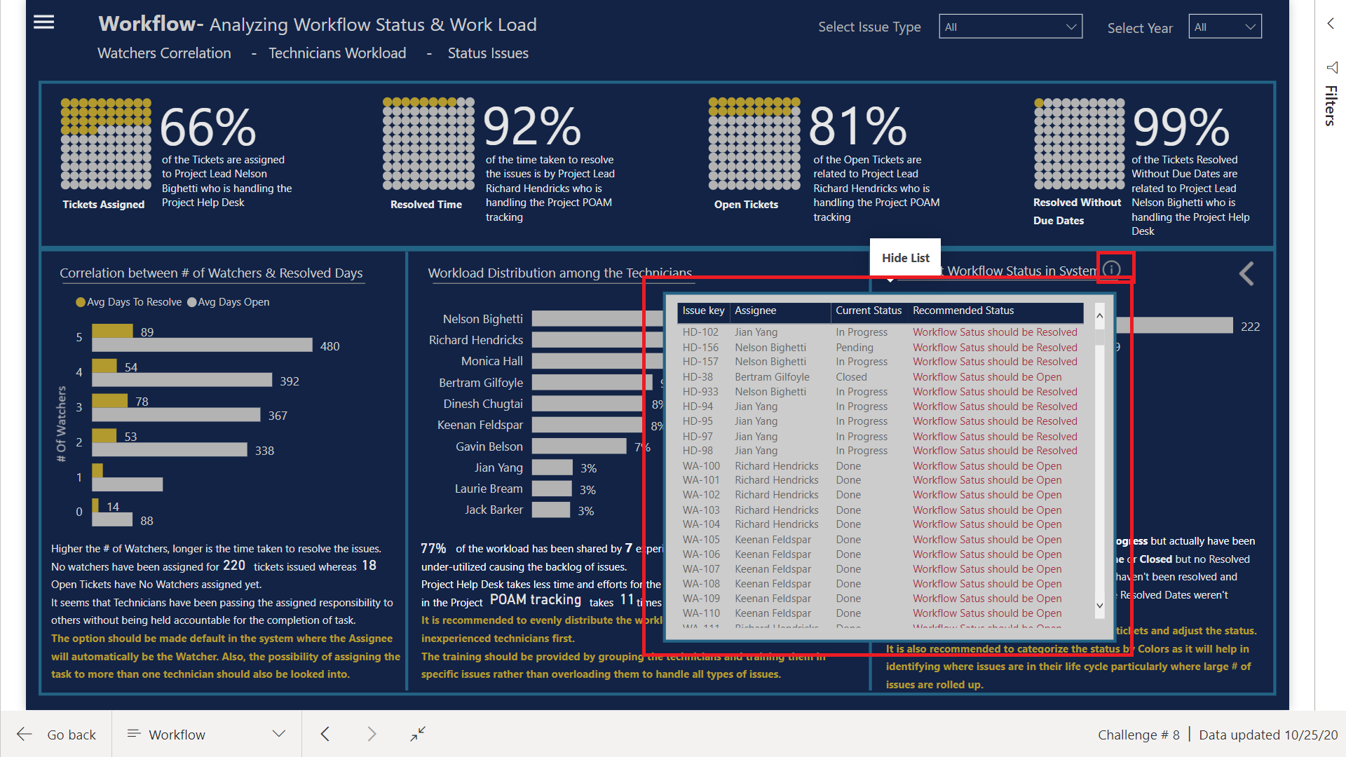
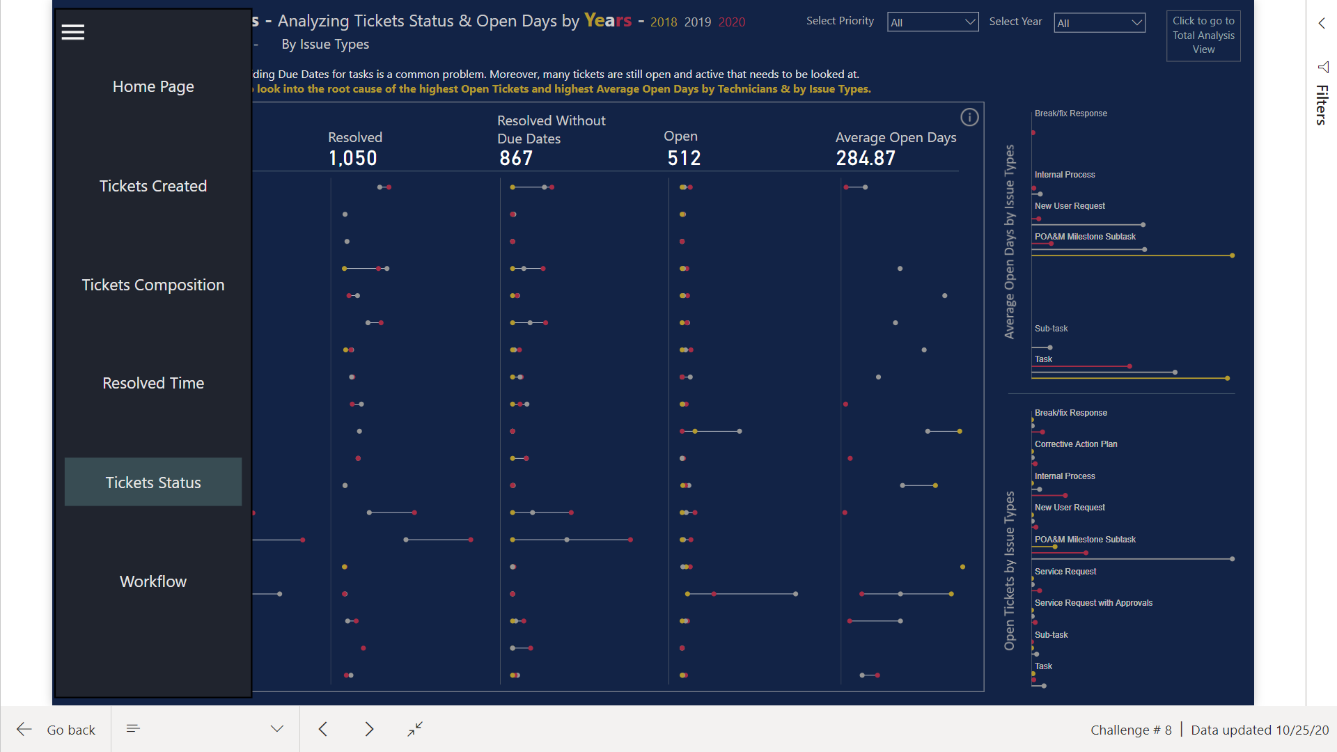
Tickets Status
Tickets status was the hardest part in terms of presentation. The chart containing the Status information by Assignee was first designed in one visual only with multiple Y-Axis however, when I filtered the data I noticed that Bars with low values weren’t showing any Bars and it wasn’t looking good visually. Then I designed different charts for every column and then struck with a problem. All the assignees didn’t have Open Tickets so the Y-Axis position was misaligned in the Open Tickets Column. The details of how I fixed it will be explained when I am finished completing the write up on how I designed the visuals and what problems I faced in designing them.
After that hit the roadblock when I tried to design Bar Charts by Issue Types shown in the Right Hand section. The reason of not using the native Bar Chart was that it took a lot of space in Y-axis when Issue Types were shown and didn’t look good at all
Here the problem was to force the Charticulator to show the Bar Chart sorted by Descending order which was very painful to do as it only sorts by Categories not by numerical values (Yes it also does by numerical values but there are other problems come with it). Here
@AntrikshSharma &
@BrianJ helped me in achieving the desired visual.
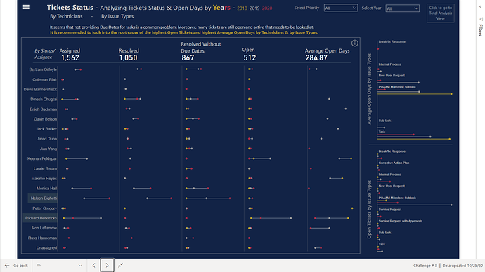
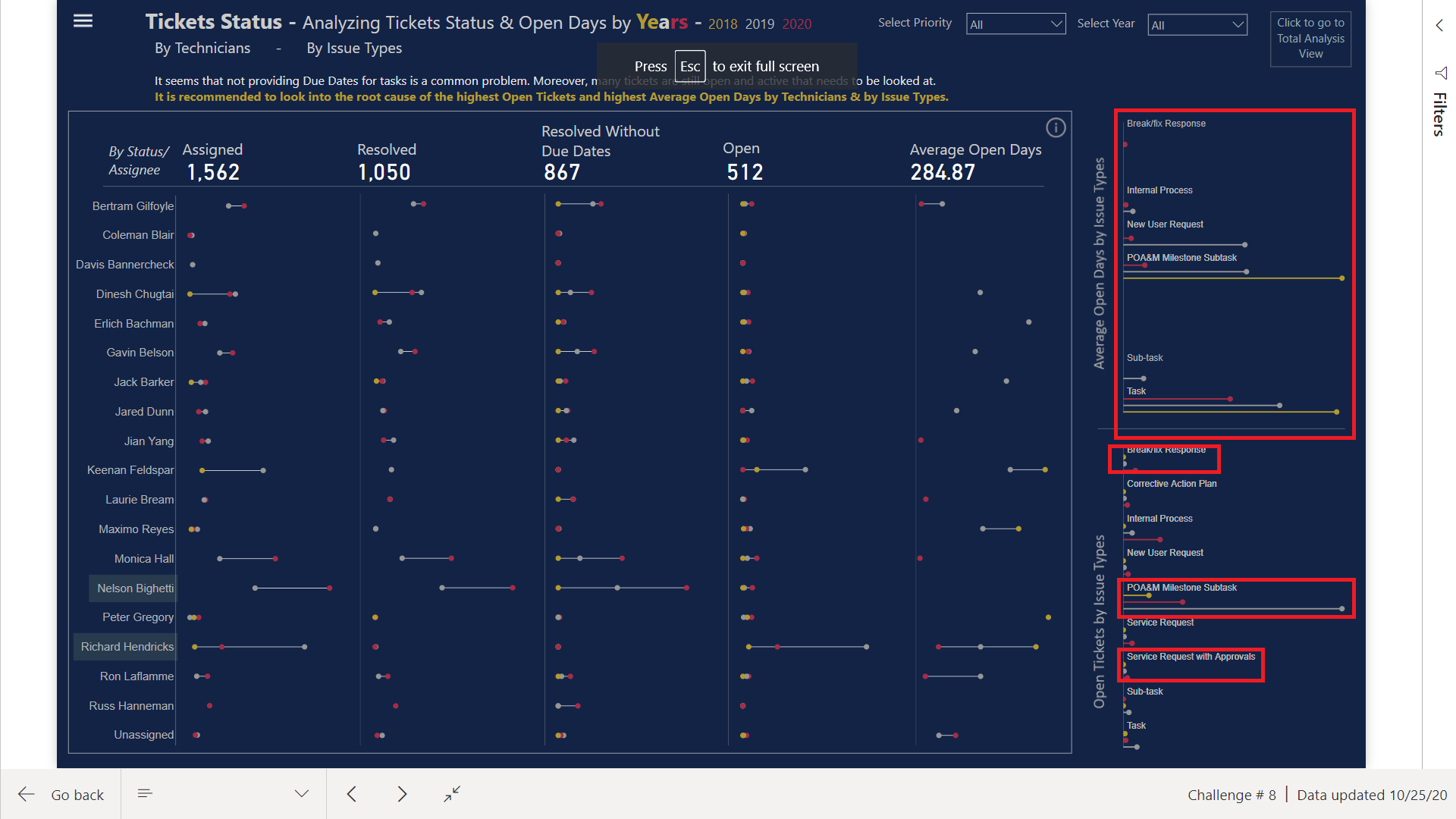
I also showed the Ticket status in Dumbbell Chart style categorized by Years and the color was assigned to every Year. By then I knew how to create a Dumbbell Chart so there was no issue here however, creating Lollipop charts shown at the right hand side were the hardest. The hard part was to put the Text on top of every category. Spoiler Alert: These are actually 2 charts combined in Charticulator, one showing the values and bars & the other only Text. This was something I didn’t see anywhere else and this visual is my favorite one.
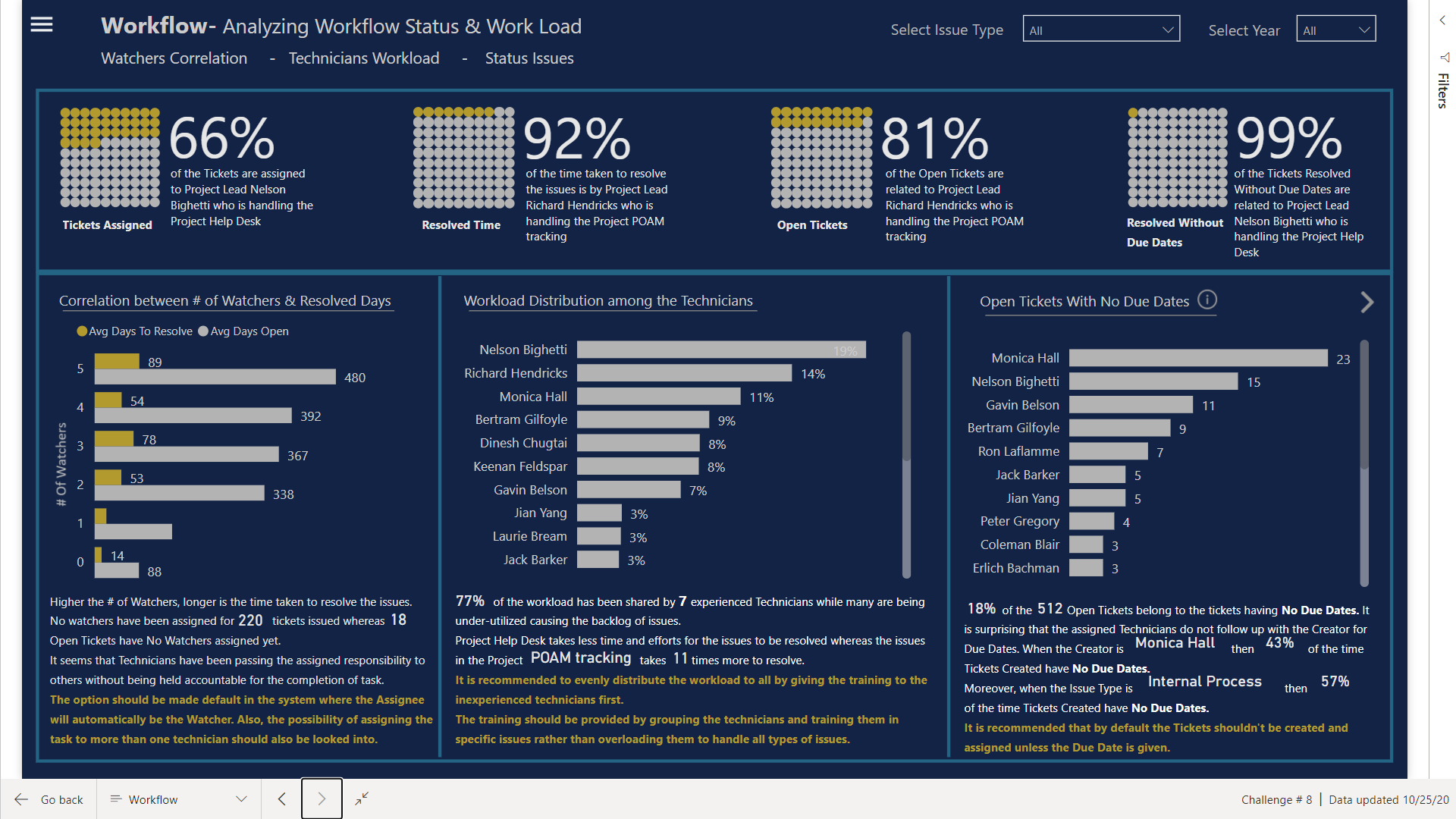
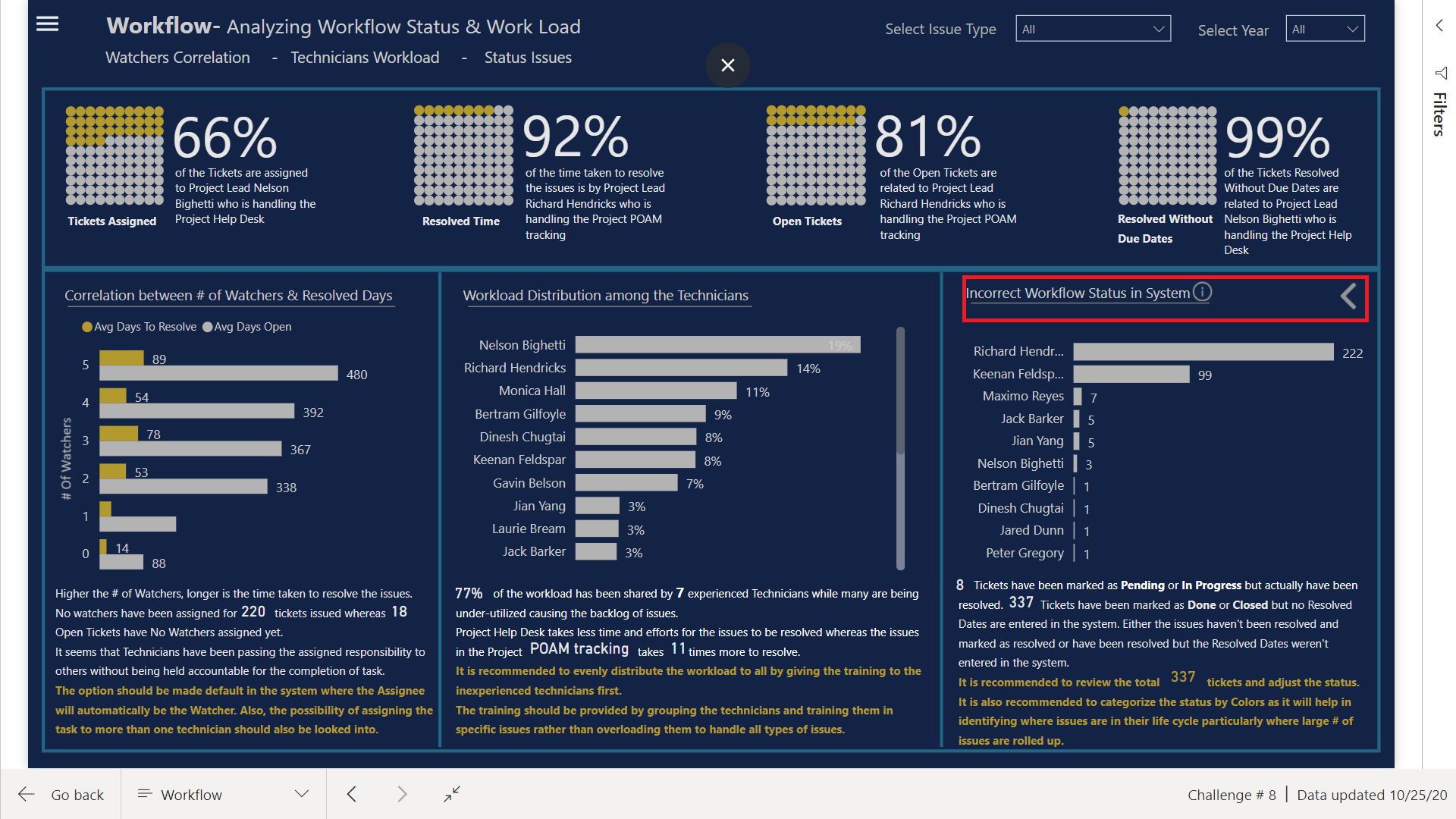
Workflow
Here I used the Enlighten Waffle Chart by MAQ Software as these charts are very good in showing comparison between 2 categories only. So I showed different analysis containing Project Leads & Project Name and the Texts are all dynamic created via measures.
To analyze the workflow I divided this section into 3 categories (What happens to Resolve Days in relation to # Watchers? Is the workload evenly distributed? What’s the problems noticed in the system?
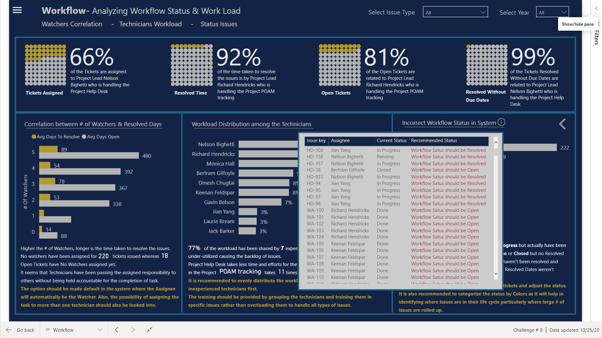
The last section is further broken down into two categories (Open Tickets with No due Dates & Incorrect status in system) and placed the Next & Previous button to navigate. The texts are all dynamic in this page
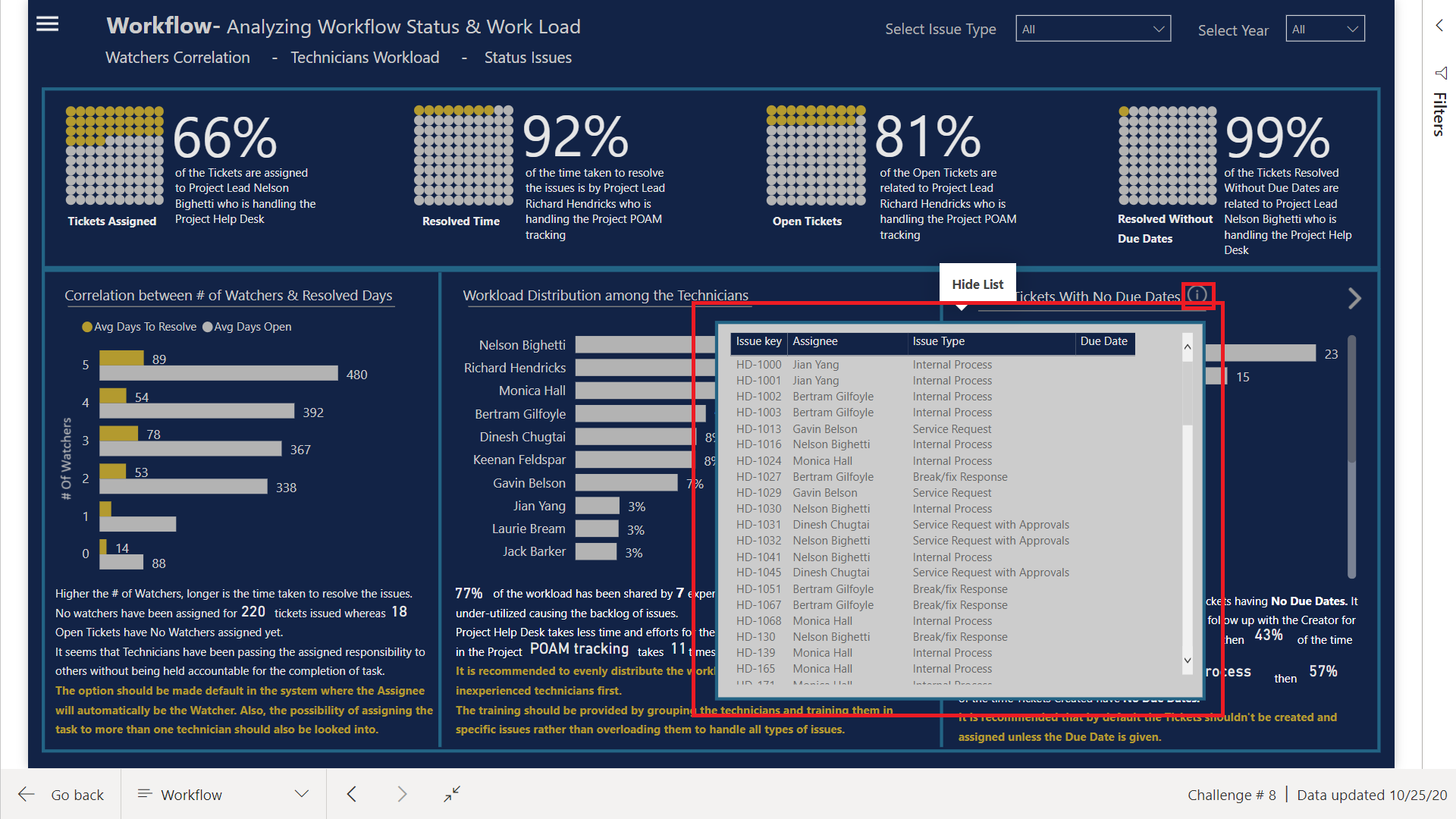
Moreover, also placed the info icon for the management to generate the list of issues.
What I couldn’t do?
- Didn’t place Report Page tooltips that could have added more information like % of same day resolution this year vs last year. I created the measures but ran out of time.
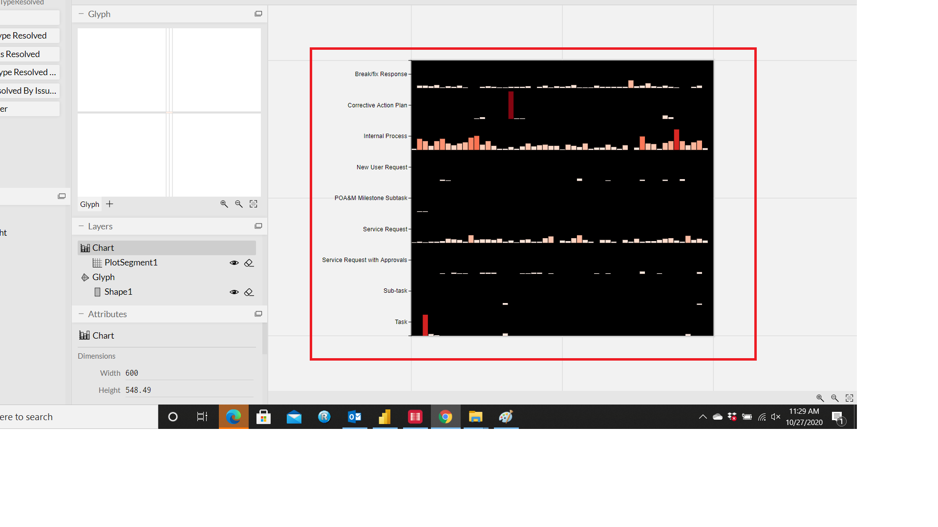
- Wanted to show weekly trend of Resolved Tickets by Assignee & by Issue Types. Wanted to use the Bar Chart and in front of the Bar Chart wanted to show the trend by each assignee & issue type as follows:
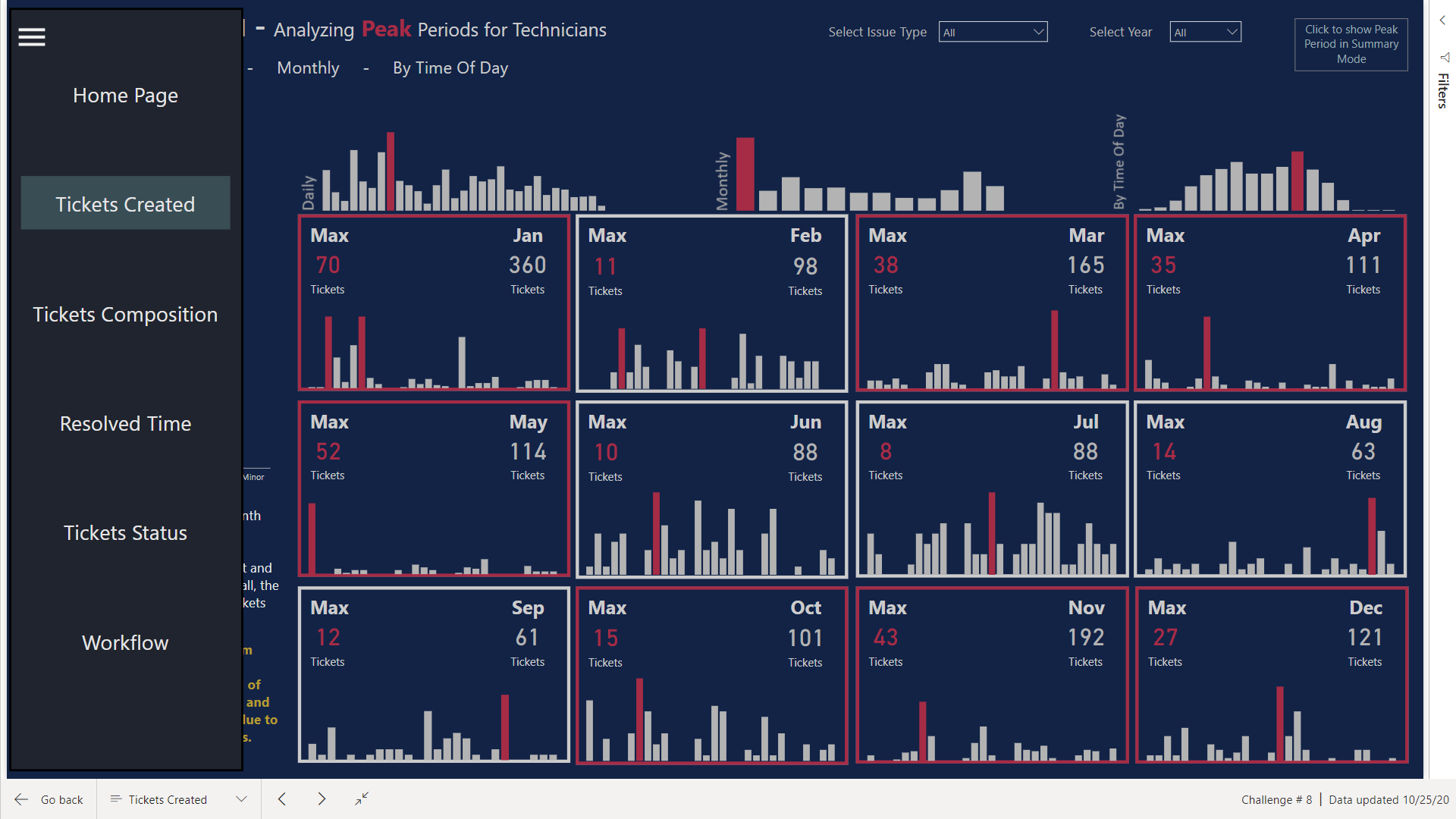
Navigation Bar
I used the navigation Bar inspired by the Menu Bar of excel or outlook and also made use of the Blank Buttons option to change the colors of the Page icon when in default Mode and when you hover. This will give the end user the idea at what page they are currently in. Used Green for the current page you are in & Red when you hover over it
Why I used the Charticulator
To be frank, I never liked the native visuals and these visuals haven’t been changed much since Power BI launched. Secondly, nobody has actually dived into it and used the custom made visuals in actual reports. If you are trying to design a custom visual just for fun then it wouldn’t take long to do so. However, if you are actually trying to incorporate the visuals in the actual report, aligning them in a page, making them interact with other visuals and above all to make them aesthetic looking are the challenges you will face.
Documentation
I am working on documenting how I made the visuals. I think making a video will be much easier.
Conclusion
I had a lot of fun completing the challenge and I will keep exploring and keep learning.
Thanks to EDNA experts and team members for making it happen and keep motivating us to do something better each time.
That’s all from my side for this challenge.


 . Maybe those folks don’t like me.
