Here’s Jarrett’s entry for Power BI Challenge 8. @JarrettM, would you like to share how you built this dashboard and what your inspiration is in building it?
Here is the link to the report:
To learn about the real-life scenario presented for the challenge, be sure to click on the image below.

1 Like
Here are the details of my entry for this challenge:
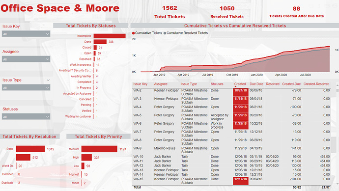
Brief Overview
Summary
Didn’t have a lot of time for this challenge, so my entry was not as thorough as I would like. Had a fun time creating this one, especially with my theme being based off the movie Office Space! Here is a copy of the Image I used as the background:

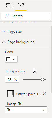
Color Theme
Summary
I used the Image from above as the page background, but adjusted the transparency to 85%.Main colors used were Gray and Red. Here is what the page background details look like:
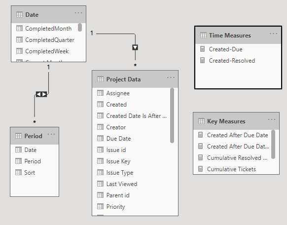
Data Model
Summary
The data model for this entry was pretty simple. Did a bunch of cleaning up the naming of some of the columns in Query M, but tried to limit the amount of DAX measures involved. Here is a copy of the data model:
Report Design
Summary
For the design of this report, I only used the basic visuals that come with Power BI. Didn’t use any custom visual for this entry, but in most of my entries I do use Smart Filter Pro by OKVIZ. I have a subscription to that custom visual, and in my opinion worth every penny!
Wrap Up
Summary
I wish I had more time for this entry, because I really enjoyed the dataset. Just glad that I was able to put an entry together on Sunday. Lots of great entries for this challenge, and I can’t wait to dig into some of the PBIX files. When creating your own models outside of the challenge, PLEASE make sure that you build your model around your end user. I have picked up a few clients recently, and many of them switched because previous their previous consultant created complex models that didn’t make sense.
** A special thanks to @bradsmith for the tip on creating the wrap up this way **
Thanks
Jarrett
3 Likes
Nice one here Jarrett.
Simple and effective is what this one showcases to me. Easy for a consumer to log on see what they need, make an evaluation, and then ultimately make a decision based on the data.
This would also work well on say an iPad or tablet with its simple design and easy way to filter down to more granular information.
Color palette works well and like the interesting background image of chosen. You’ve really taken some creative license on that one!
Nice one
Sam
1 Like