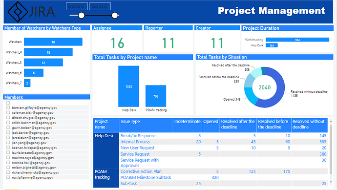
Here’s the entry from one of our non-member participants, Abel.

To learn about the real-life scenario presented for the challenge, be sure to click on the image below.
Here’s the entry from one of our non-member participants, Abel.

To learn about the real-life scenario presented for the challenge, be sure to click on the image below.
This post is part of the Enterprise DNA platform improvements, through the Data Challenge our members and non-members can now share how they built their dashboard and what their inspiration is in building it. We hope all members can utilize it efficiently.
Abel, thanks for your submission and participation in the challenge. I hope that you got a lot out of it and using this as a solid learning experience to improve your Power BI skills.
I think you’ve made a really good start here and I can see that you have used a lot of the design best practices that we talk about Enterprise DNA. You’ve used grids well, you’ve also made your title stand out so it’s really easy for the consumer to work around your report and know what they’re looking at.
Also I think you’ve used the colors well. I would maybe only make the main logo white so that it stands out a little bit more from the dark blue background.
Maybe for the next challenge try to challenge yourself a bit more and look to add some interesting navigation features maybe some tooltips, maybe some advanced analytical techniques to really build out what insights you’re showcasing.
Look forward to seeing your next submission I think that you’ve got a great opportunity to leverage off our awesome community to really build on your power BI knowledge.
Sam