Power BI Challenge 7 - Purchases, Inventory And Sales Entry from Mudassir

Here’s Mudassir’s entry for Power BI Challenge 7. @MudassirAli, feel free to add other details of your work.

image

image

image

image

image

image

image

Here’s how Mudasssir described it:

1st Technique:
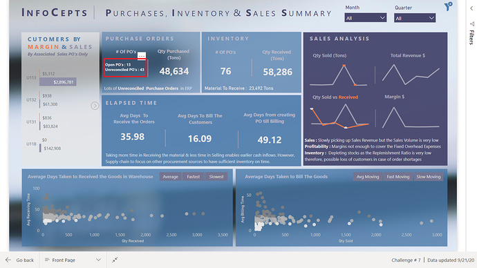
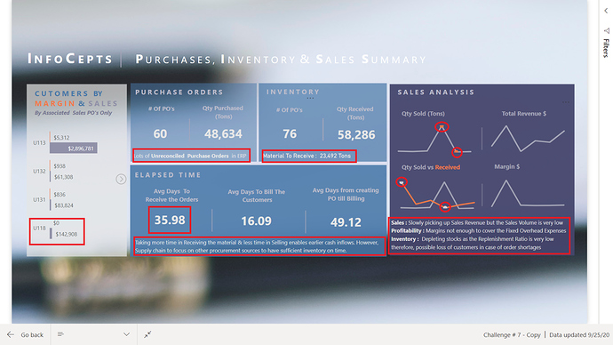
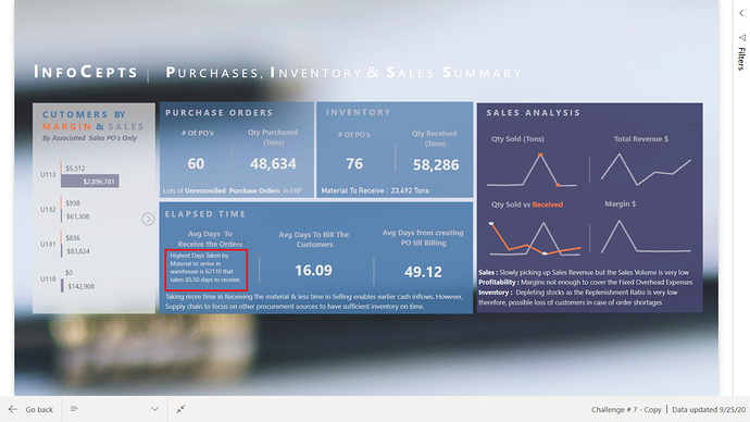
As it was mentioned in the task to keep it as brief as possible therefore, tried to use a new trick that I never used before called “Embedded Hover Over Tooltip Effect” on a Card & on Headings as shown below:

To see the tooltip hover over the cards or in case of charts, hover over the chart headings.

2nd Technique:
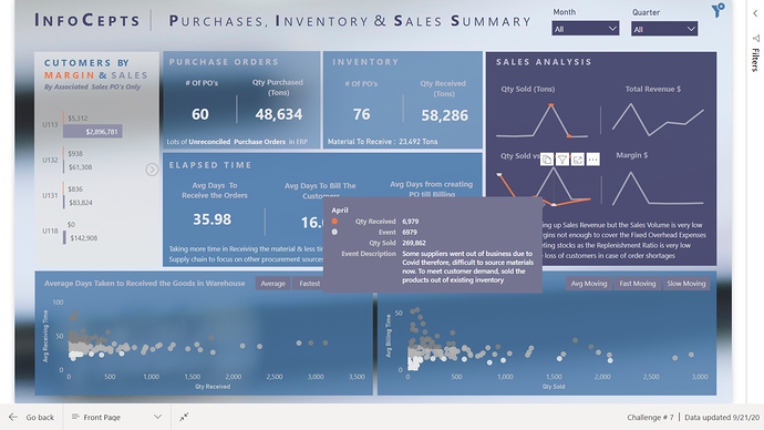
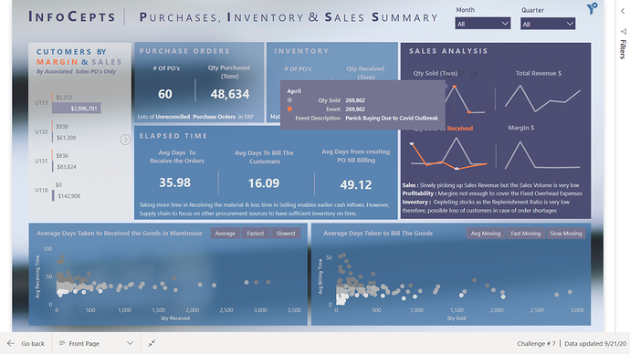
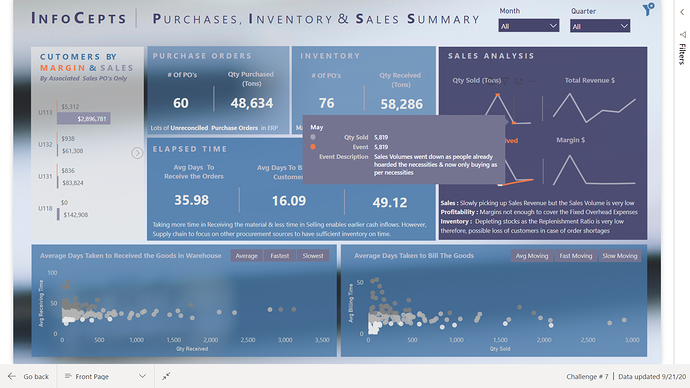
Another technique used called " Chart Annotations " where the events are described via tooltip as follows:

3rd Technique:
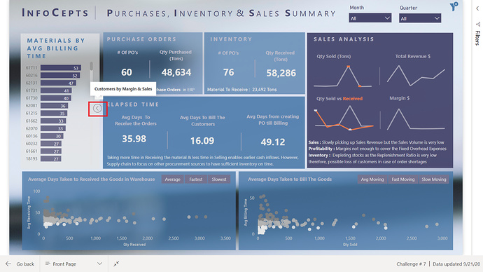
This technique is a bookmark (Next Image) to go to different visual for analysis. When hovering over the image it will indicate what’s the next visual is.

When the last visual is reached the image position will change indicating to go back to the first visual.

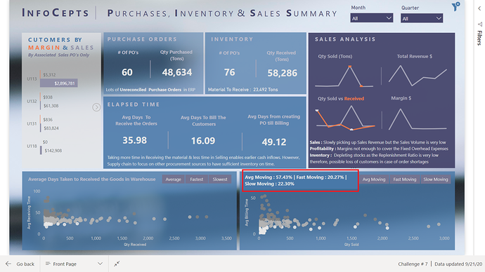
At the end scatter charts show the average times taken to arrive at the warehouse and to bill the customers characterized by average, fast and slow moving. The management can see and try to take actions for slow moving inventories and for the materials that take longer time than usual to receive in warehouse.

It looks like a very brief report but the amount of measures created in this challenge is a lot.

To learn about the real-life scenario presented for the challenge, be sure to click on the image below.

power-bi-chal-1

2 Likes

First of all apologize to all the members as I didn’t give enough explanation when I submitted the challenge. Now here is the detailed overview of how to generate insight from this report and how I used some tricks in developing it.

It was mentioned in the requirement to be as brief as possible therefore, tried the information to be as summarized as possible but still ended up incorporating more information than was required. I remember that a director back home once asked for the summary of production details, I gave him the summary with some details for analysis at the end of the page. He threw the paper and said ““This is what you call summary”” and also said “If I had wanted the detail I would have downloaded it from the system.”

I also showed the report to my friends & colleagues for the feedback and they all said that the information is still too much on the report. In summary, only highs and lows and unusual events are shown. Therefore, I haven’t added any table or matrix table as it wouldn’t be relevant in the summary report. For summarized view, card visuals are the way to go. Spoiler Alert I haven’t used any card in the report, instead these are Blank Buttons :smile:
Seriously speaking, if I had to show the brief report in real life, I would have shown this :

This information is enough to give the overall view of what’s happening in the company.


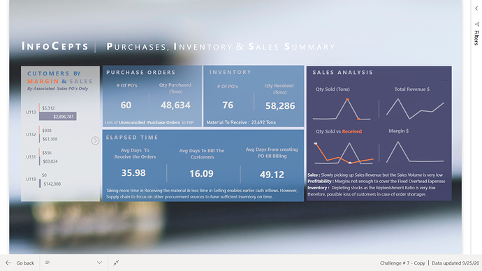
Starting With report

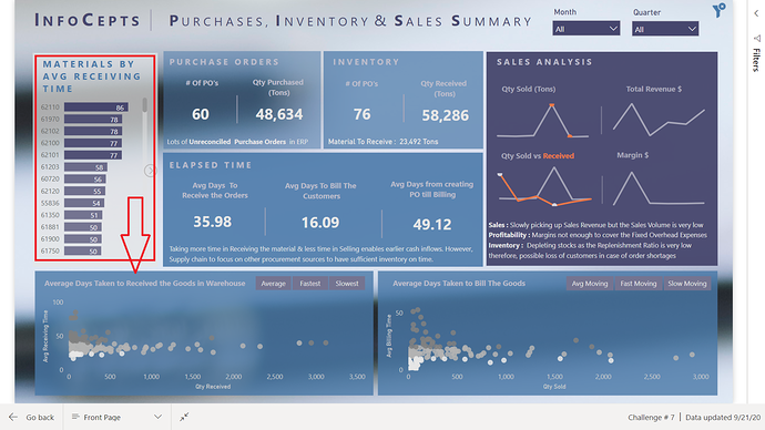
It can easily be seen at the left side graph that customer U118 is problematic. Here, only the sales & margins are shown whose associated purchase price is given. In the Profit Calculation section, I have explained what this means. this section actually contains 5 visuals i.e. Customers by Margin & Sales, Profitability by Materials, Revenue by Materials, Materials by Avg Receiving Time & Materials by Avg Billing Time. When you hover over the next image icon, it indicates what the next visual is:

Scatter Graphs

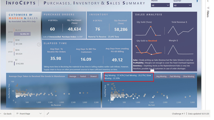
Here I grouped the material categorised as Avg, fast or slow moving. I also used the tooltip trick on the heading of the scatter charts to indicate % of Avg, fast or slow moving materials:

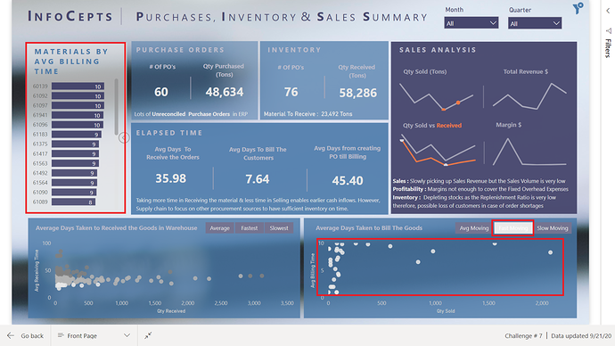
Here scatter charts can be used to identify the material based on the categories mentioned in the slicer. To generate more insight first click the next image icon to go to the section Avg Receiving Time by Materials or Avg Billing Time by Materials:


Now you can slice by relevant categories:

Profit Calculation

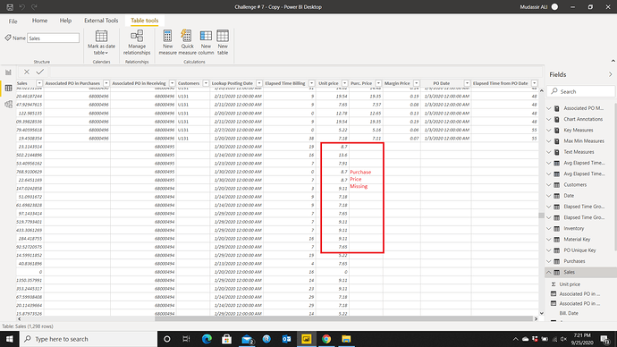
I used Lookup value function to retrieve the values from a table. There is a slight hidden complication in the dataset that is the Sales Value. If profit is calculated using the provided sales value and value of purchases, the profit value would be misleading as there are many Billing Invoices that are without the associated purchase orders/value. That’s why I calculated the profit based on the Sales whose related purchase price is available.

Tooltip Trick

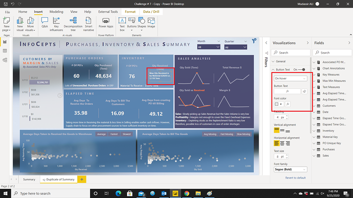
Tooltip trick is used on a blank button. To create the flippable card like effect, two measures should be created. One for the default and for the hover effect as shown below:

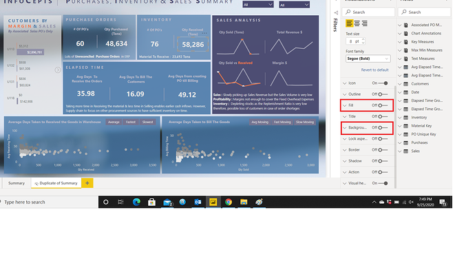
For the tooltip effect change the setting from Default Text to On Hover and then placed the measure. Don’t forget to turn off the Fill and Background color.

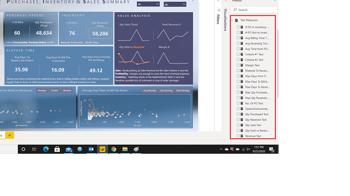
However, to use this trick, the measures should be text or wrapped around text function. To implement the trick, I had to create a lot of measures to convert into text format.

Chart Annotations

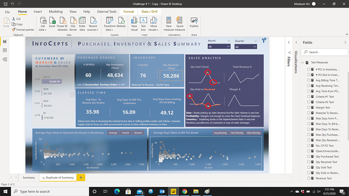
Chart annotations are really cool to highlight the important values in a chart visual. I wanted to highlight the maximum and minimum point in two of my charts and the description as to what caused the values to be highest or lowest. End User can see the 2 annotations in one chart:

When hovering over the points, the information is displayed via tooltip:

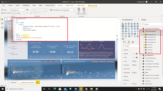
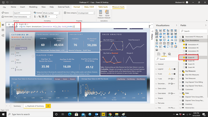
To implement this trick, 2 measures are used for one annotation. One is to get the maximum or minimum value and the description to be used for that value and the other is for the chart to detect if the value is maximum or minimum to create the annotation and do nothing for the rest:

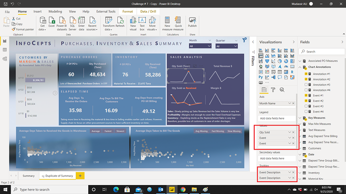
The month can easily be dynamic but I wanted it to be static. Then placed the measures in the fields & tooltips section:

Conclusion:

I didn’t use the Sales or Purchase Value to generate the insight instead used the quantity because the company is struggling both with sourcing the material and selling it. The value part is taken care of by the Profit/Margin calculation.

Thanks to EDNA team & @haroonali1000 to come up with different types of data set to analyze.

I hope I managed to provide the desired insights.

Now looking for the next challenge!

That’s it from my side!

5 Likes

@MudassirAli,

As always, fantastic submission and a great writeup. I really appreciate the time and detail you put into your explanations, since there’s so much to learn from the techniques you employ – many of which I’ve never seen elsewhere. You can bet that I’ll be borrowing more of these in future challenges…

I feel like your entries can be best appreciated if you have the opportunity to play with them hands-on in the service. If you’d like me to publish yours to web, just message me your PBIX and I’ll send you back the web link.

Thanks also for the honest feedback on my entry. Point about the color palette and design very well taken – in looking at the professional design quality of many of the entries over time I definitely feel like I’m sitting with a box of crayons among a group of skilled oil painters. However, I will take your suggestion and shoot for a bolder color palette next challenge. I’m always impressed when @sam.mckay goes in a crazy direction color-wise like bright pink or purple, and then totally makes it work.

Thanks for making the time to participate, even though it sounded like a really busy week for you. Great stuff.

– Brian

2 Likes

Very very impressive submission. The first thing that leaps out to me is how well the grids work within your visualizations. You’ve really laid this out so effectively. For the consumer it’s a really compelling viewing experience.

Also I feel like you’ve got all of the right information summarized in such a easy to consume way.

You’ve used some simple filters in the top right which I like. You’ve also used tooltips so effectively You’ve also used the dynamic grouping technique really well in your scatter chart. So you’re bringing to light a lot of information which generally doesn’t stick out from the raw data.

I just really like how you’ve been quite creative here around many different aspects to make this all fit into one page. I think that was a really good part of the challenge where you had to think outside the box a little bit and try and create summaries which made since to place on the same page.

Appreciate the comprehensive writeup there’s just so much to learn from your efforts here. You have done a lot of really interesting work across the entire Power BI Desktop application. Also just your visualizations are world-class here. A lot of inspiration for users to gain from. The simple overlay charts and annotations are so effective, really commend you on those.

Another aspect I love is how you have integrated narratives around key insights that dynamically change based on filters and selections. That is seriously just taking things to another level and so inspiring for myself to really think deeper around how we can tell super stories about data. Power BI just really enables you to create in an efficient way these great narrative’s around what has happened but also what you could do to make things better or to optimize things.

Really really well done so impressed.

Sam

3 Likes

@sam.mckay Your appreciation and comments means a lot to me. Actually the submissions are the result of your videos from which I came to know the real power of this software. Excellent insights in videos plus the visually appealing dashboard designs made me fall in love with power bi.

Really thankful for your feedback and your amazing power bi lessons.

1 Like

Stunning report

2 Likes

I’ve had a bit more time to look over the report, one of the many things I love is how the background image/colouring contributes to how the Visuals look.

What did you use as a background Mudassir? How did you get it to blur so nicely?

The image I have used as a background wasn’t giving me the desired effect. I tried many other images to no avail. However, when you import Page Background into Power BI, it gives you three options under Image Fit i.e. Normal, Fit & Fill. I mostly go with Fill because it shows the whole background image but for this report I set it as Normal that gave me the good blurry effect for this report. The image you are looking for is here:

1 Like

Great, I’ll have a play around with that myself.

1 Like

Hi @markperrone. Welcome to EDNA community and thanks for completing the challenge.
If you can post your work on the challenge forum, you will get good feedback from experts and other challenge participants. Following is the forum link:

Thanks!

ok - post moved.