Here’s Kiran’s entry for Power BI Challenge 7. @kirank.gh, would you like to share how you built this dashboard and what your inspiration is in building it?
Here is the link to the report:
To learn about the real-life scenario presented for the challenge, be sure to click on the image below.
Here is my write up
• Data loading and transformation
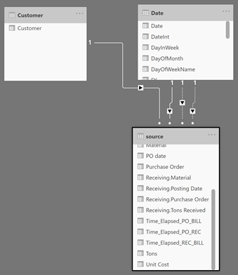
Excel is loaded into Power BI. As the data is coming from different data sources, I have loaded Purchase, Receiving and Billing data separately. I have merged these data into a single table (source) based on Purchase date.
As there were non-associated Purchase orders after merging, replaced them with 0 (placeholder for non-unassociated purchase orders).
• Data modelling
As the tables are merged into single table (source). It was easy to find the time elapsed among purchase,receiving and billing and store it in the model. I had created role playing date dimensions for Purchase date, receiving and Billing date and made one of them as active relationship.
Created a Customer dimension and created a relationship between source and customer table.
• DAX calculations
Created following DAX calculations
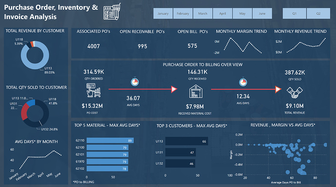
• Reports and visualizations
Created a background image based on EDNA Data Visualization course
Developed color template using color generator and imported the theme
Reused couple of icons from EDNA course (Inventory management)
Downloaded icons from flaticon and following are the attributions
Icons made by Freepik from www.flaticon.com
Really strong report. Very attractive design, well-organized and directly addresses the charge questions. I agree with @MudassirAli, in that I particularly like the center section and the way you clearly emphasized via placement and color how that is the most important element of the report. I’m also a big fan of the spark line–like visuals you used to convey trends in key measures.
Two very minor things I would do to make this report even better:
stick with a shades of blue approach for your donut charts. The report has such a good top to bottom flow, that I think the use of the red and the black distracts from that flow and attracts your attention too much to the left side of the report.
I would either make the stopwatch representations dynamic (i.e. the red slices representing the relative numbers below in dynamic fashion) or eliminate them entirely. As is, the red slices appear to be conveying information, but actually don’t, which I think is potentially confusing.
Minor points, however. Overall, I really like what you’ve done here, and great to have you participating in the challenges. Thanks also for taking the time to do a detailed write up – I think those add a lot to learning element of these challenges for all of us.
Such an awesome submission. From the colors to the layout to the unique designs and ways that you’ve told your data stories.
All of these work super well and tell a really clear picture of what a consumer needs to know.
The navigation experience is top notch and also really easy on the eye. So in combination just a really high quality submission and Power BI report.
Appreciate your write up as well I can see that you have kept things really optimized in the data model so that’s really impressive.
Really glad to see you’re utilizing a lot of the content and resource is as well within your reports. That is exactly what it’s there for, to leverage off and to get inspiration for your own designs and development.
Really impressed on your work here and look forward to seeing more like it in the future.