Here’s Greg’s entry for Power BI Challenge 7. @Greg, feel free to add other details of your work.

Here is the link to the report:
And here’s how Greg described it:
I opted to use many bookmarks to make a single-page report look like a multi-page report. I had a blue-based colour theme initially, but @JarrettM’s timely video this week provided much better results, so thanks. Also, I was a little later completing my submission than I had intended as I anted to spend some time with the new Smart Narratives visual (available since Sep 22).
Here’s the notes I took during development (I hope all are still applicable; I was a bit rushed to get this in, so please bear with me … my editing might be off a bit, but anyway…):
NOTES:
What I liked:
- the colour theme and transparency of visual backgrounds I used; I think it looks great
- the “fake” navigation that made this single-page report (with many bookmarks) react like a multi-page report (via the extensive use, flexibility, and power of grouping in the [Selection Pane] to make assigning and updating bookmarks easier)
- the “bounce” of the button text and images; slightly changed font colour, size, padding, image weight, size, etc. to identify that an action can be performed
- the new “Smart Narratives” visual available as a preview feature as of the September 2020 release of Power BI Desktop; I’m really looking forward to exploring this further
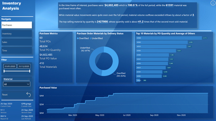
- the “Horizontal Bar Chart” custom visual by Microsoft, as a technique to save space when presenting a bar chart by placing the category inside the bar instead of having axis labels
- the use of the “Top 10 and Average of Others” in said Horizontal Bar Chart; I think this provides a great insight as t let’s you know just how far the top 10 are above the average
What I didn’t like / needs more work:
- I used the whitespace character to try to hide the tooltip for the “Info” dialog open button and the “Close” button in the “Info” dialog, but they now show a portrait blank white tooltip … a complete absence of tooltip was the goal, but oh well…
- the scroll bar in the “Horizontal Bar Chart” custom visual used in the Sales bookmark section seems to be automatically set to a dark colour when a dark background is chosen; needed to increase the transparency of all visual backgrounds to 50% (I initially set everything to 25%, as I liked it better, but, again, oh well…)
- I got a bit lost in the interactions of the bookmarks and visibility of the dialog box, and on closing the dialog box, then display reverts to the [Purchase] bookmark, which was not the intent, so this is a “known issue” with this report
- the “Departures” table in the [Time] bookmark incorrectly shows all materials, including those that have not “departed”; ran out-of-time that I had allotted myself to pursue further, so this is a “known issue” with this report
- the visualizations are a bit sparse, but my focus was more on the presentation of the bookmarked data than on a full analysis of the data
- the fragility of the new Smart Narratives visual; I’m guessing the fault was mine, not the visual’s, but regardless, I was almost done when I decided to clean up a little and reorganized one of the measures used into a new table; this broke the Smart Narratives visual and I couldn’t recover it … I needed to start again from scratch. From now on, I’ll create my text in an outside editor, including placeholders for measures, then replace the placeholders with measures once at the end only; I’m sure this will get better over time and will shortly no longer be an issue
- only on final polishing did I publish to the Power BI Service for final testing, and with USERPRINCIPLENAME() now being active for the current user, the width of the sidebar is now qite enough; I’ll test the published report sooner in the development cycle from now on, but this remains a “known issue” with this report
Setup:
- used Power BI Desktop September 2020 release (Build 2.85.681.0, dated 9/22/2020)
Goals:
- to gain experience using the new Smart Narratives visual (only available as of September 22, 2020)
- to increase my experience with multiple bookmarks on the same page
- to increased my experience with “bounce” to give users an extra visual clue that a button can perform an action
Data Model:
- used eDNA extended date table as [Dates] Extended Date Table (Power Query M function)
- marked [Dates] table as a date table
- changed all date formats to dd-mmm-yyyy [by typing “dd-mmm-yyyy” into “Format” box directly]
- imported Invoices, Purchase, and Receipts as staging tables; disabled load
- renamed [Material] as [Material ID], so once a duplicate column had been created as [Material], could change type to “Text” and enable “Search” in a slicer
- deleted all auto-generated relationships
- arranged table model in a “waterfall” and used “Manage Relationships” dialog to add all relationships (all 1-to-many)
- created empty tables for [Key Measures] and [Admin Measures]; opened 2 sessions of Tabular Editor (1 each on my Challenge #6 PBIX and this file) and copied measures
- added [Last Refresh] table
- hid all ID fields
- added disconnected supporting table for [Materials plus Others]; accepted default of many-to-many relationship offered by Power BI when linking to [Materials] table
- imported tables from dataset as staging queries;
- created references for Purchasing, Receiving, Invoicing
- created reference (remove other columns, remove duplicates) for Customers
- created reference (remove other columns, remove duplicates) for Materials; where a value was in more than one table (e.g., Material) created staging level 2 reference from each and appended all results (then removed duplicates) to ensure all values accounted for); duplicated the [Material ID] column to [Material] and changed type to Text so the “Search” option could be used in slicers
- created reference (remove other columns, remove duplicates) for Purchase Orders from each of Purchasing, Receiving, Invoicing; as some PO numbers were present both on the Inventory and Sales sides, added a custom column and set the [PO Type] to “INV” for PO’s from the Purchasing and Receiving tables, and [PO Type] = “SALES” from the Invoicing table; duplicated the [PO] column to [Purchase Order] and changed type to Text so the “Search” option could be used in slicers; appended all results (then removed duplicates) to ensure all values accounted for)
- disabled load for all staging tables
- renamed columns to ensure consistency
- deleted all auto-generated relationships
- created relationships:
- Customers[Customer] → Purchasing[Customer]
- Materials[Material] → Purchasing[Material]; Materials[Material] → Receiving[Material]; Materials[Material] → Invoicing[Material]; all inactive
- Purchase Orders[Purchase Order] → Purchasing[Purchase Order]; Purchase Orders[Purchase Order] → Receiving[Purchase Order]; Purchase Orders[Purchase Order] → Invoicing[Purchase Order]; all inactive
- Dates[Date] → Purchasing[Purchase Date]; Dates[Date] → Receiving[Received Date]; Dates[Date] → Invoicing[Invoice Date]; all inactive
DAX Calculations:
- added “Admin” measures for:
- [Is Desktop] using difference between NOW() and UTCNOW() to determine user interface
- [Is Service] using difference between USERNAME() and USERPRINCIPALNAME() to determine user interface
- [… Tooltip] measures to use [Is Desktop] and [Is Service] to display the appropriate tooltip regardless of interface
Visualizations:
Custom Visuals:
- Horizontal Bar Chart (by Microsoft)
General:
- used filter pane to restrict report to historical dates by using Dates[IsAfterToday] = False
- used “Work” pages to try out different visuals and identify trends that were interesting and should be included in the main report page
- formatted measures using eDNA DAX Clean Up tool https://analysthub.enterprisedna.co/dax-clean-up
- made extensive use of the [General] section in the [Visualizations] pane to ensure consistent sizing of all visual elements and adjusted the X/X/Width/Height as necessary; tried to keep multiples of 10 px and 20 px spacing between visuals
- made extensive use of the [Selection Pane], naming and ordering all visuals and assigning into groups, which eased the copying of “Work” page “groups” to the single visible page and subsequent assignment to bookmarks
- used internet search to find blue abstract background image;
- (followed steps from @Jarrett’s YouTube video on choosing a colour theme https://www.youtube.com/watch?v=4gKm-AF1fdo)
- used eDNA Colour Theme generator “Image to Colours” option and selected light and dark HEX codes (#48A8F0, #003078)
- used Data Color Picker https://learnui.design/tools/data-color-picker.html#palette with the above-two HEX codes to generate a 5-colour palette (HEX #48A8F0, #3488D3, #226AB5, #114C96, #003078)
- used Power BI Tips Theme Generator https://themes.powerbi.tips/ with these copied HEX codes to generate JSON theme file
- visual colours: set background colour to darkest theme colour 25% darker #00245A; set background transparency to 25%; set font colour to white for all (items, column headers, axes, data points, etc.)
- hid all pages in the report except for the single main page (i.e., hid “notes” page and all “work…” pages)
- added “Info” button in top-right corner to display info dialog and altered button text padding, button font, button colour, and button fill slightly between “default” and “on hover” (as well as icon colour and weight) to give the user a visual indication that an “action” can be performed
- added “Info” dialog with placeholder sample text
Sidebar:
- used buttons for false “navigation” (to fake the appearance of a multi-page report even though this is actually a single-page report) by:
- activating bookmarks to show/hide the desired visuals;
- altering button text padding, button font, button colour, and button fill slightly between “default” and “on hover” to let the user know an “action” can be performed
- duplicated navigation buttons and set background to white, font colour to black for “active” navigation choice;
- used selection pane and bookmarks to show/hide the appropriate “active” and “inactive” navigation buttons
- added Reset (slicers) button and altered button text padding, button font, button colour, and button fill slightly between “default” and “on hover” (as well as icon colour and weight) to give the user a visual indication that an “action” can be performed
- used “shadow” and slightly darker background colour to ensure buttons and slicers stand out on navigator
- added 210 px-wide rectangle background for sidebar and title textbox; grouped both in selection pane with title above background so would always appear in front
- used 2-column multi-row card at bottom to display report admin and session admin measures
Top:
- used Smart Narratives visual to display summary text and dynamic measures
- used line to separate Top portion (unchanging with bookmark) from Bottom portion (changing with bookmarks [“false” navigation])
Bottom - Purchases bookmark:
- used [Horizontal Bar Chart] custom visual to display top 10 materials and average of others (this visual saved horizontal space by placing the category inside the bar)
- ([TopX] set to 10, so will show 10 bars for the Top 10 materials plus an 11th bar for “Others” [average of values outside the Top 10])
- ref: https://www.proserveit.com/blog/ms-power-bi-topn-and-other
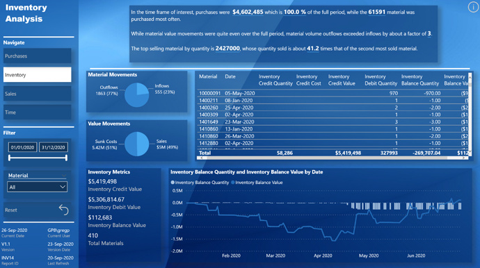
Bottom - Inventory bookmark:
- used pie chart to depict material movements for inflows vs. outflows
- used pie chart to depict value movements for sunk costs vs. sales
- used inventory summary table to show detailed quantity, value, and balance amounts
- used combo chart to show inventory balance quantity vs. inventory balance value
Bottom - Sales bookmark:
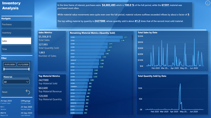
- as the was a large quantity of one material sold compared to all others, decided to break-out the top selling material into it’s own multi-row card, so that the Horizontal Bar Chart custom visual could be useful in presenting the relative quantity sold of the remaining materials
- used line charts for total sales and total quantity; noted the spike of material quantity sold between the 17th and 24th of April 2020
Bottom - Time bookmark:
- used table visual to present materials arriving in the warehouse, including their delivery days; used conditional formatting/data bars on delivery days
- used table visual to present materials departing from the warehouse, including their residence days; used conditional formatting/background on residence days
To learn about the real-life scenario presented for the challenge, be sure to click on the image below.
