Dear all,
Be warned, this report description will include “Directors Cut Extended Version”. I will detail the process of thinking and getting to build this report.
Challenge 7 was special. It was a step up in terms of complexity from the data model perspective (and the data it contained), it had very clear requirements and everything had to be built in just one page.
It was a great challenge, because as an analyst we had to understand the data, choose the angle for analysis, create a good data model, create DAX measures and choose the right visualizations. Moreover, there were lots of insights that could have been presented.
The difficulty was in deciding what to keep. When you are limited to just one page, you need to be extra clear in what you present, and make your message easy to understand to the end user.
For me the lesson I learned was that I had to go back to the basics. At the end I am happy I chose to create a report that doesn’t even have bookmarks, doesn’t have many visuals, but from the data perspective is still rich in information.
Making things simple is hard. As a famous philosopher and mathematician (Blaise Pascal) once said:
“If I had more time, I would have written a shorter letter”. To go to the core of analysis, you need to have time to think. You need to test, take a step back, rethink.
This challenge made me think about photography. What makes a good photography? It is not only the subject itself, it is the way you layout the story. There is not only one subject of interest, there has to be a flow, a tone, a feeling. It is said that a great photo says a thousand words.
A report is similar from many points of view with a photography. It has to be clear from the start, it has to follow simple best practice rules, it has to place the right information at the right time in the right place in the simplest way possible so that the consumer understands the message and takes action or at least provokes a reaction. A report tells a story.
Back to the report - at the request of @BrianJ I will include “the Extended version”
So here is the story of my report for Challenge 7
I started looking at the data, turned it up and down, decide what data could be interesting to analyze, taking notes along the way.
After I finished analyzing the data and considered I know enough to start working, I had an idea: Focus only on POs and Materials that are available in all 3 tables: Purchase, Receive, Invoice. I also wanted to present the data using cohorts.
I find cohorts visually appealing and a great analytical technique. As I never created cohorts in Power Bi I told myself that this is the right time to create them.
I looked at all the videos from EntrepriseDNA and read several blogs that explain this technique.
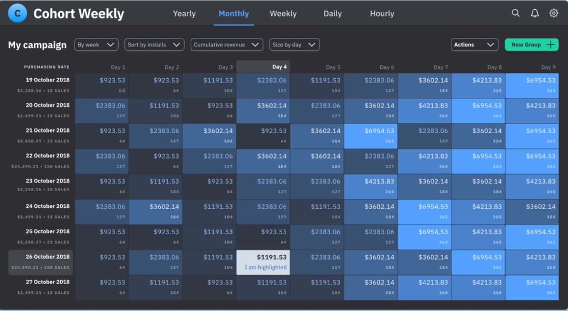
I searched for inspiration that will help me prototype the report I wanted to build. I found this photo, and I knew I was on something good
I imagined using a toggle to switch between a cohort showing the volume and a cohort presenting the margin.
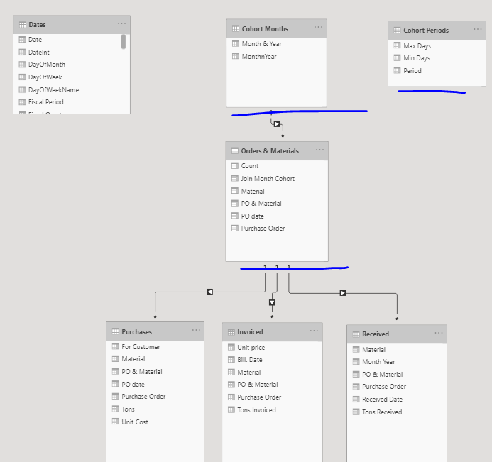
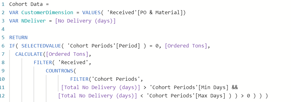
I created my data model around this technique. I created a Orders & Materials bridge table which is a dimension table linked to a Cohorts Month based on the minimum received date.
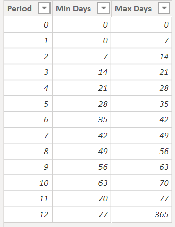
I created a disconnected table : Cohorts Periods that will organize my cohort based on weeks
I created my Cohort formula following the the Churning example explained in the video by Sam
At this stage I was very confident. I had all the pieces needed to create my cohort… Until I created the matrix and looked at the numbers.
It made no sense, the data was not reacting to the cohort periods, I had always the same numbers.
I spent two nights working at it, re made the formulas, searched for my mistake. I knew I was close, but just couldn t find the error.
At that moment I was so focalised on getting the cohort done, that I was not thinking if the cohort really made sense for the analysis I wanted to present.
2 days passed and I knew I had to find a solution. I contacted Brian, and he gently pointed out the problem. It came from my simplest formula.
I adapted the formula, and had my cohorts working! I felt like Superman!
Until I looked better at the numbers and found out that the cohort idea is actually my kriptonite… What will the user understand from it?
What’s the purpose of using it if it doesn’t bring real value to the end user?
First of all, the end user would expect a more precise timeframe then week level. Then the end user would want more details. Last but not least, the cohort had to work with other charts as well because the cohort by itself it was just not enough for this challenge.
So I had to re think the whole report once again… I had to refocus, simplify and reorder my thoughts. I remember telling myself “Refocus”, and at that moment it clicked. It was not only me who had to refocus, it was the general idea of the report.
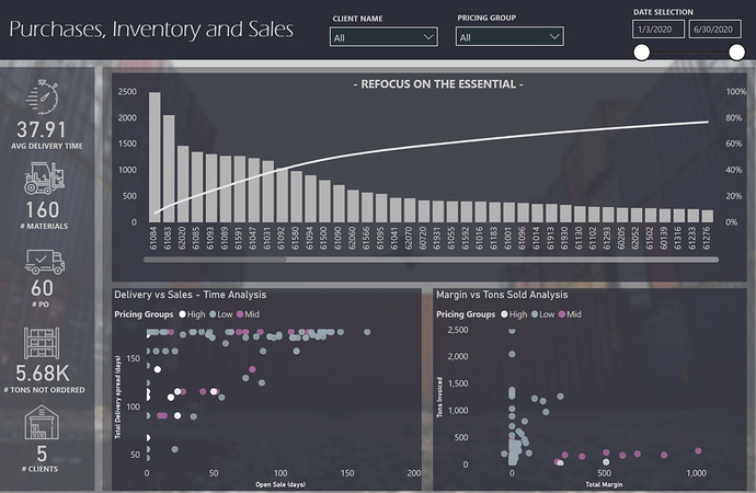
Too many POs, to many products, the most sold products that produce 0 margin. It made no sense. The idea of the report became “Refocus on the essential”
From that moment I knew what I wanted and all ideas came to place. I wanted no bookmarks, I wanted to use tooltips to find details, I wanted to use the Pareto as my entry point for my story that will somehow take the place of the usual “Overview Page” and I knew that with the recent “lasso” release it will be interesting. Then the Pareto shows easily the most important products. By selecting them you need to see details so that you can explore better the data.
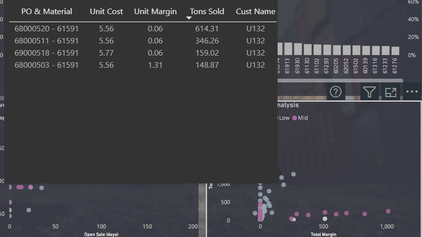
What is the best way to see details? I thought of tables. So I tested tables, but the problem with tables is that it takes space and also a table is “read” not “seen”. What I want to say here is that I think that a chart can be faster understood by
a reader. A table needs generally more time to be processed… So I thought of scatter charts.
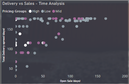
Scatter chart with groupings based on price. With tooltips for details. And with visual header tooltips… And even better, 2 scatter charts in interaction.
One will show delivery time vs sale time and the other tons invoiced vs Total Margin
Scatter Chart
Tooltip
At this point I had most of the report done. The pareto chart and the two scatter charts… But I wanted more.
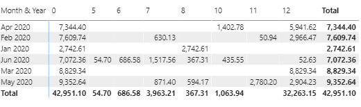
I read again my notes and I saw I was quite surprised by the fact that for some products we receive twice as many tons compared to what we
Ordered. And the quantity wasn’t sold… And it produced 0 margin ! It was simply to important to ignore this insight. And this insight was in line with my main message “Refocus”
I incorporated this insight inside one simple card + tooltip + visual header. The tooltip contains the new smart narrative of course. Just had to used it!
Final touch, I did the same type of analysis using one card for the number of clients.
In conclusion, I am very satisfied with my 1 page report. I think I managed to build a story, and a user experience and pushed forward important insight thats present
only 1 single big idea: Refocus on the essential.