Here’s the entry from one of our non-member participants, Alejandro.
Here’s how Alejandro described it:
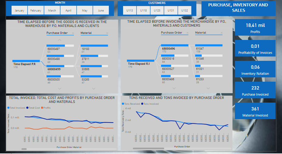
My presentation consists of a report that reflects in the first instance in two hierarchical diagrams the time elapsed before the goods are received, and the time elapsed before invoicing the goods for purchase orders and materials.
Also, billing is analyzed compared to costs and profits for purchase orders and materials, as well as a comparative graph between received and invoiced tons of materials.
In the same way, five cards were placed, each one illustrating the profits, the contribution of the invoices to the profits, the inventory rotation, the quantities of purchase orders and invoiced material.
All of the above can be filtered by two segmenters of months and customers respectively.
To learn about the real-life scenario presented for the challenge, be sure to click on the image below.

2 Likes
Awesome work on this submission. I really like how you have looked to try out some different visualization techniques. I think it sort of works here and I like the dynamic aspect of it. How you can click into different customers or time frames and see how the granular performance has been for specific purchase orders or materials.
One improvement I definitely would make as I don’t love how in the bottom line charts you can’t really see the actual purchase order numbers on either chart. I think you want to have a better think about this and see if there’s a way to make it easier on the eye, or easier on the consumer to see specific results for specific dimensions in your charts. Maybe the line chat isn’t the best visualization there, maybe it was a column chart. Maybe it was combining some formula patterns which enable you to summarize the information a little bit better in these visualizations.
I really like how you’ve used grids effectively and love the design. I think the background is great and how you have used grids within your report as an overlay. It really makes certain aspects and certain insights stand out a lot more effectively than if you didn’t do this.
Nice one
Sam