Love the colour scheme Jarrett. Perfect combination used throughout
3 Likes
Unbelievable creativity here. So impressed!
I’m inspired myself look at your report.
Love many small details here
4 Likes
Great colour scheme here. You haven’t over done it and it superb based on it’s simplicity
1 Like
Amazing work everyone,
I look forward to doing a more in-depth analysis on each report in the project update category.
Sam
1 Like
mic drop !!!
4 Likes
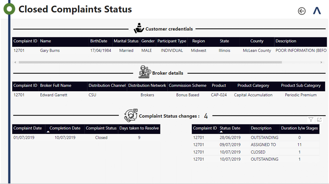
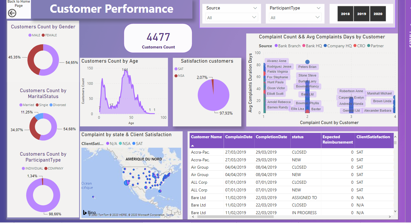
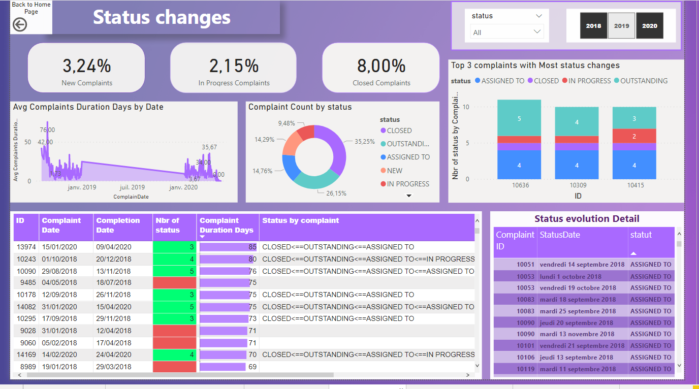
@sam.mckay this is the first time I have seen you using so many techniques in a report. I loved the way you broken down individuals and business complaints analysis in two different tables.
The way you analyzed status change using different colors and icons is also very cool.
1 Like
Hello Forum members,
Please let me share my submission.
My focus on this challenge 6 are.
- Simple colour use
- Pages to condense
- Logo size and locations to be consistent
These are what I could not achieve in the previous challenge 5 so I have done my best to improve this time.
The report screen shots are as below.
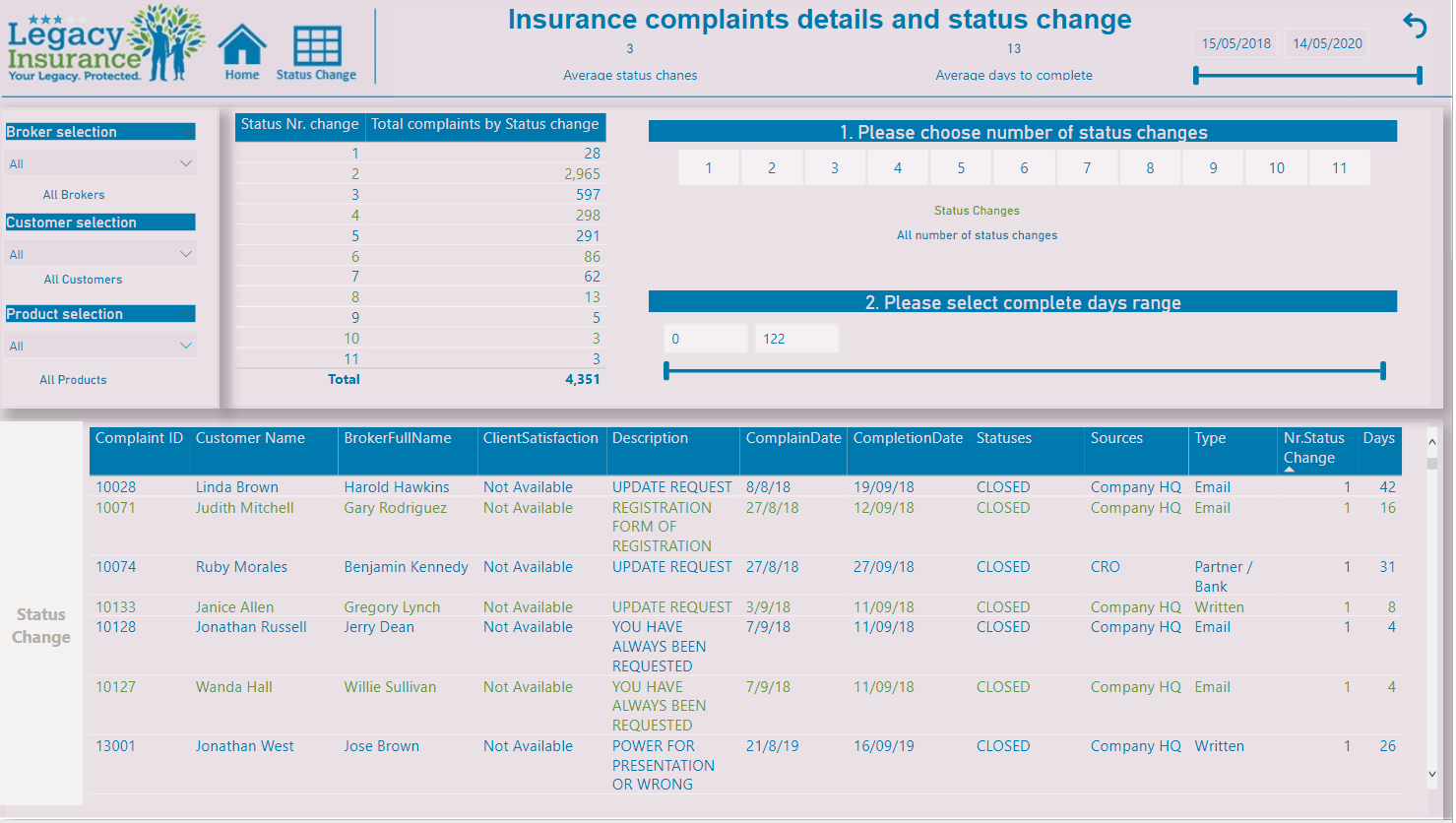
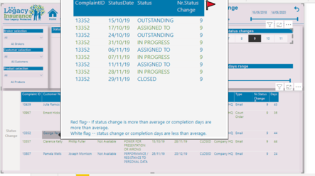
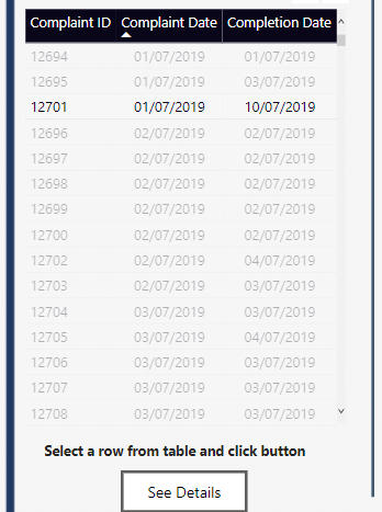
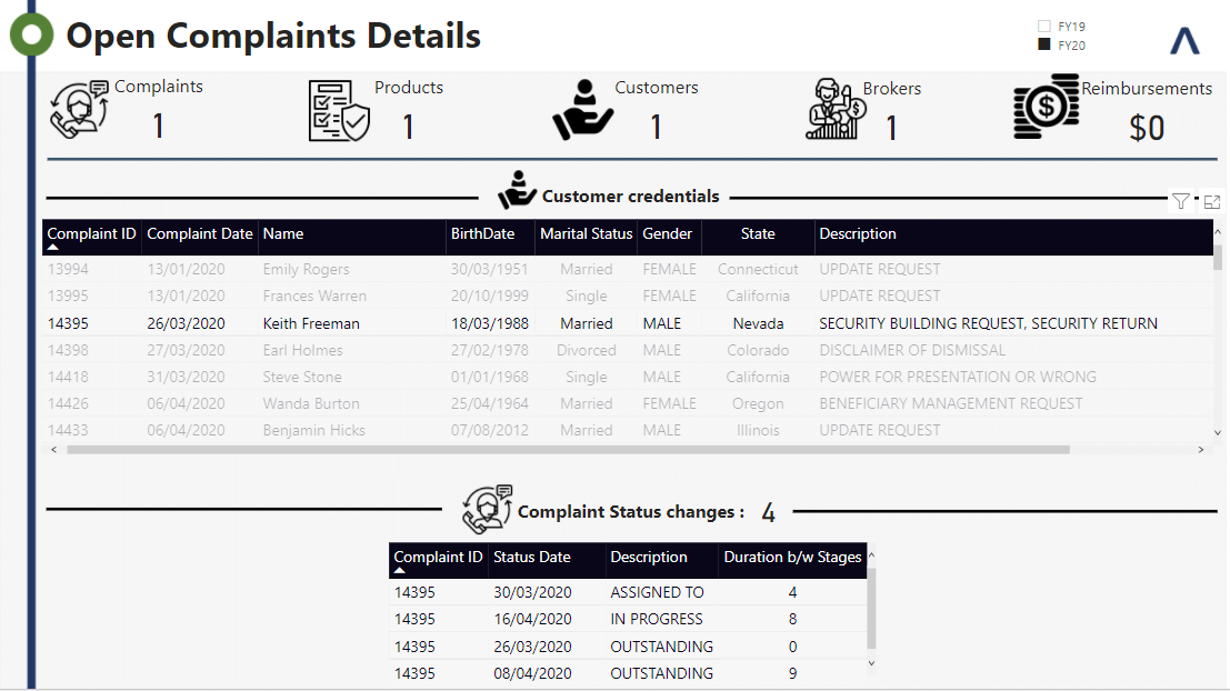
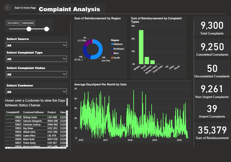
I have created two parameters for status changes and completion days so the auditors can find which complaint ID files they need to look into.
After filtering those, result details are shown on the table.
Red flag pops up in visual tool tip if days to complete (average 13 days) or number of status changes (average 3 times) are over the average.
Just wondering how amazing all the other participants reports are. They are so beautiful.
Thank you for letting me to share the report.
Regards,
Hideo
9 Likes
…Speechless!!!
Wow wow wow. Everyone well done, an amazing standard of work. Its going to be a tough one to judge!
Please can you all ensure that your pbix files have submitted and any participants wanting to be considered for the newcomer challenge please let us know.
Thanks All.
Haroon
1 Like
Hi everyone
Sorry for leaving this to the last minute. I underestimated the scope of the challenge and started very late but finished just in time
Here is my submission to Challenge 6!!
I will post a detailed report later with techniques and metrics used.
Awesome submissions by everyone. Please do give feedback and suggestions.
The report can be seen at the following link
Looking forward!
Regards
Abu Bakar Alvi
12 Likes
@MudassirAli thank you and I totally agree, it’s really cool to see so many different (and high quality) reports on the same data. Especially data you already understand.
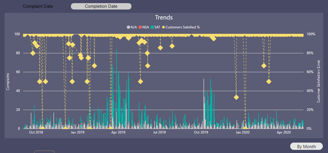
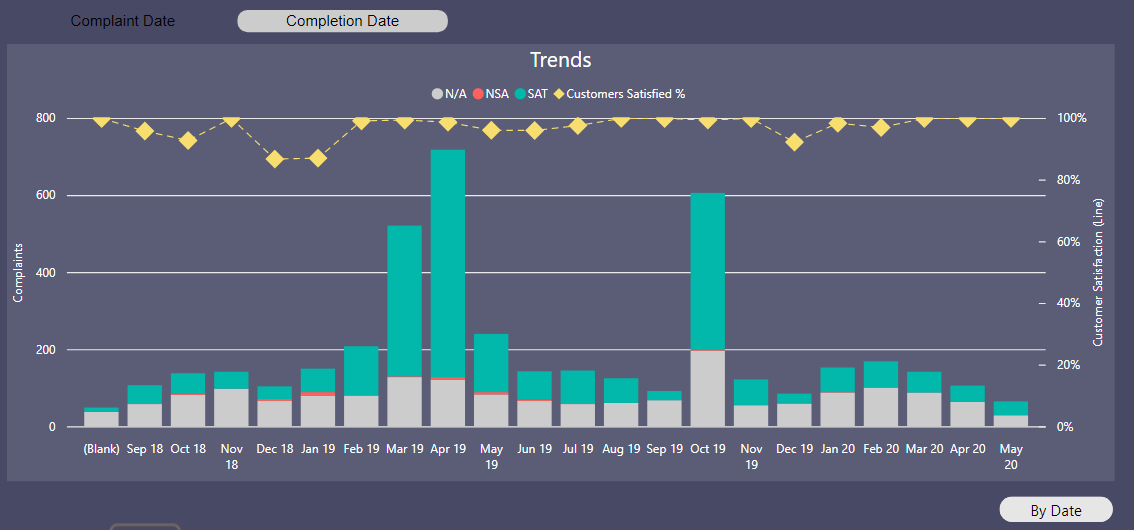
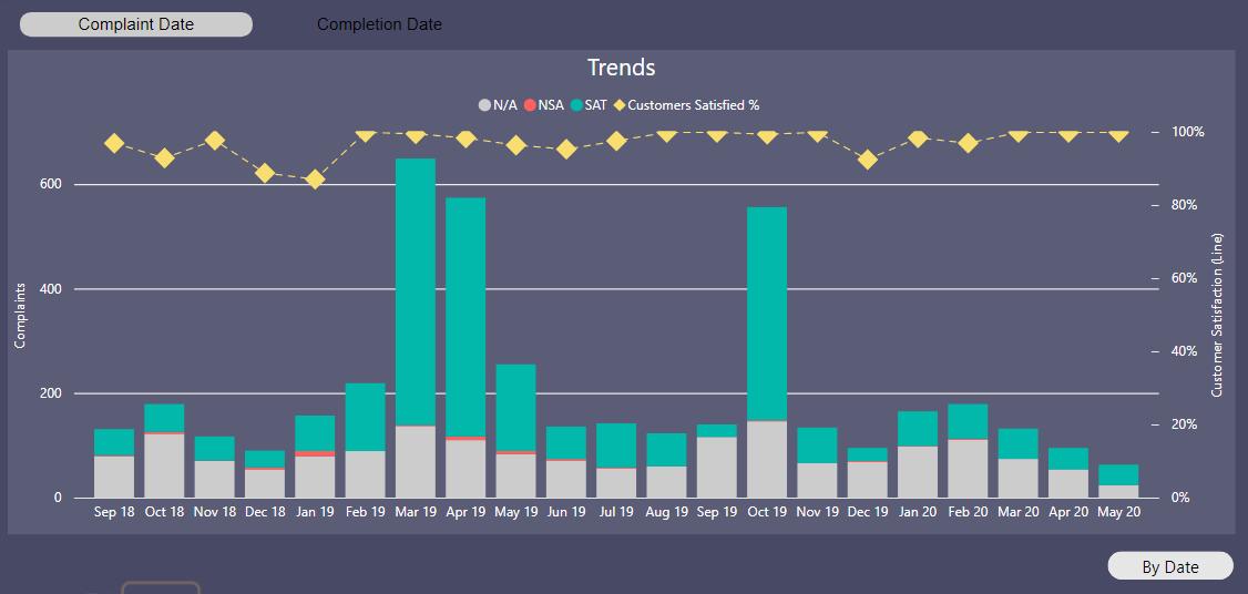
The chart I used on the Trends is the combo line/stacked column chart. It gave the look I want but the tooltips would not cooperate with me at all!
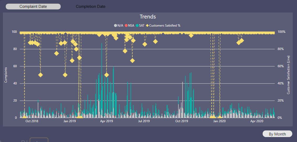
My fav part about this was playing with the calculation groups to be able to use a chiclet to flip the date table to be joined to complaint date or completion date. And then also using a bookmark/button to move between date/month.
7 Likes
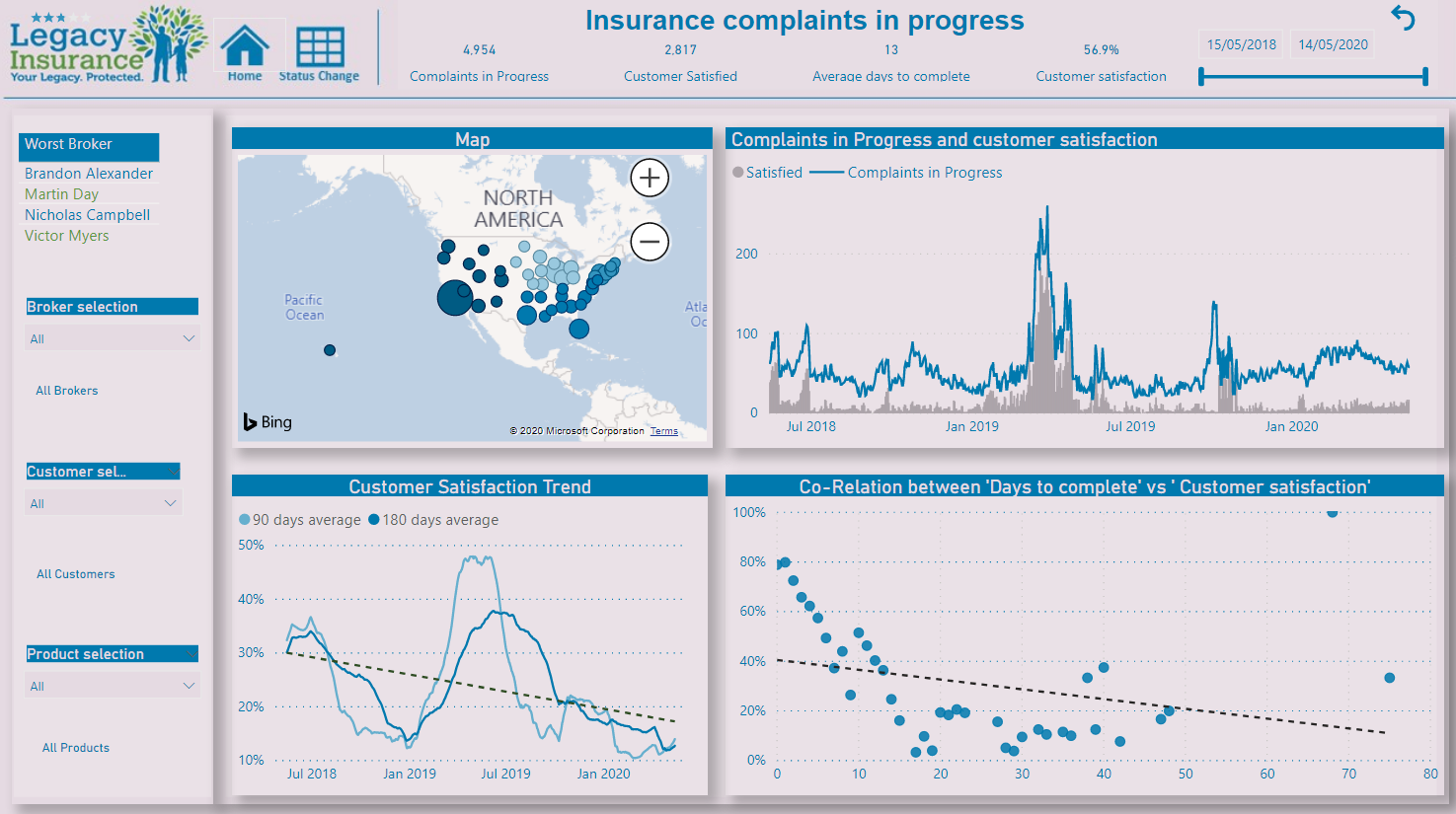
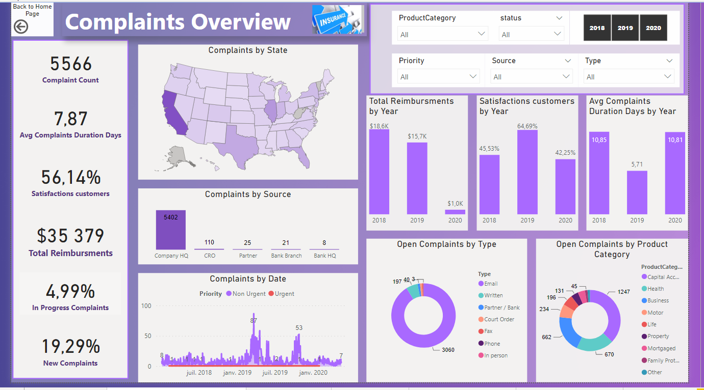
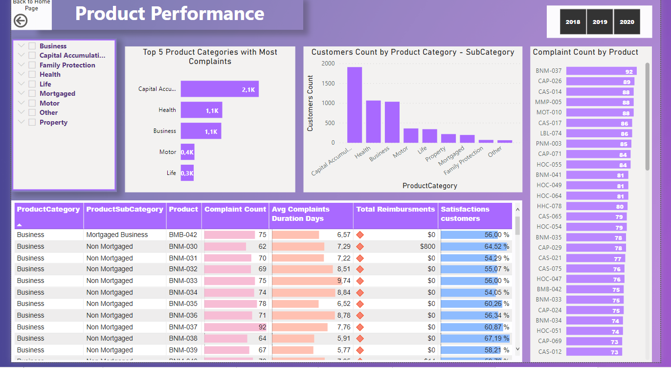
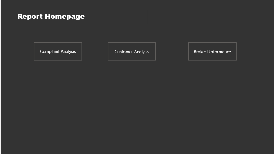
Hello everyone, pls see below images of my report and pbix file. HomePage|690x387
A brief overview
- Created a reporting homepage from where we can access three other reports
(i.e. Customer,Complaints and Broker Analysis) using
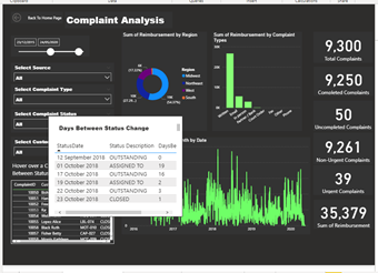
page navigation - Created a table tooltip on the Complaints analysis page to show the numbers of days
between change in status
3 Likes
InsuranceComplaintAnalysis.pbix (1.8 MB)

2 Likes
@BrianJ This is super interesting, I am always struggling with getting that AI visual to work honestly! I am not sure why Daniel Harris is chosen though. From what I can see he’s doing ok – 5 complaints and the the only one with an outcome is positive, the rest are N/A. I am wondering what I am missing?
@alexbadiu this is really cool design! My favorite part is the highlights on the line chart to drill through to those time periods. I noticed those periods on my charts too and was thinking of a way to get to see what was going on there. I hadn’t thought about making a button and overlaying (which is what I looks like you have done), as that wouldn’t work with a continually refreshing report, but this wouldn’t be so it works out really well the way you have it! Great job! I also like how you incorporated the map and you did an amazing job with the dark background too.
2 Likes
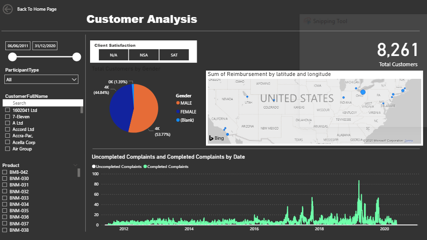
@sam.mckay I love the look of this report! My favorite part is the little bitty map in the top right – I always hate how much real estate maps tend to want – and it’s pretty and useful.
4 Likes
Again - so many amazing submissions for the challenge. We truly have an inspired and talented community, that’s for sure!
Well done to every participant!
 :
:
I like the buzz around the forum when a deadline starts to near, there is this real anticipation and appreciation for each others work which I absolutely love.
Don’t envy @haroonali1000 wish him wisdom in judging #6 !!!  (BTW think you and the Enterprise DNA team are doing a terrific job in making these challenges a succes
  )
)
11 Likes
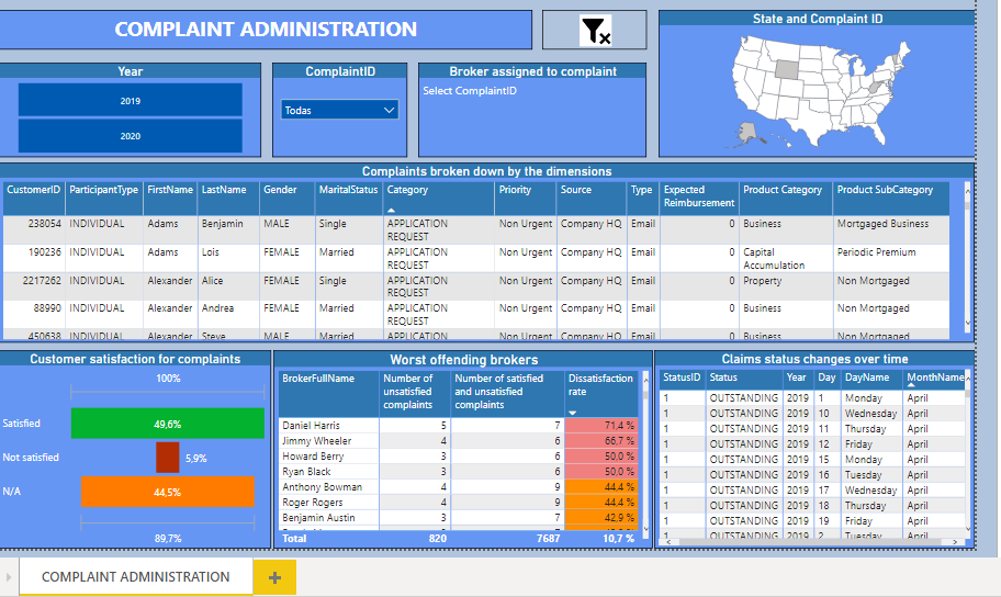
It is a simple model for the last two years, composed of a single page that contains the specific responses to user requests.
Using two segmenters; one for the years and one for the ComplaintID.
By selecting a year and / or a ComplaintID, the dimensions for each complaint are displayed in the table called “Complaints broken down by the dimensions”. The map shows the state where the complaint occurred and the card shows the broker’s name and code.
The table called “Claims status changes over time” indicates the statuses of the complaint over time.
The funnel type graph called “Customer satisfaction for complaints” indicates what the customer’s feeling was when their complaint was addressed (satisfied, not satisfied or N / A) in percentage.
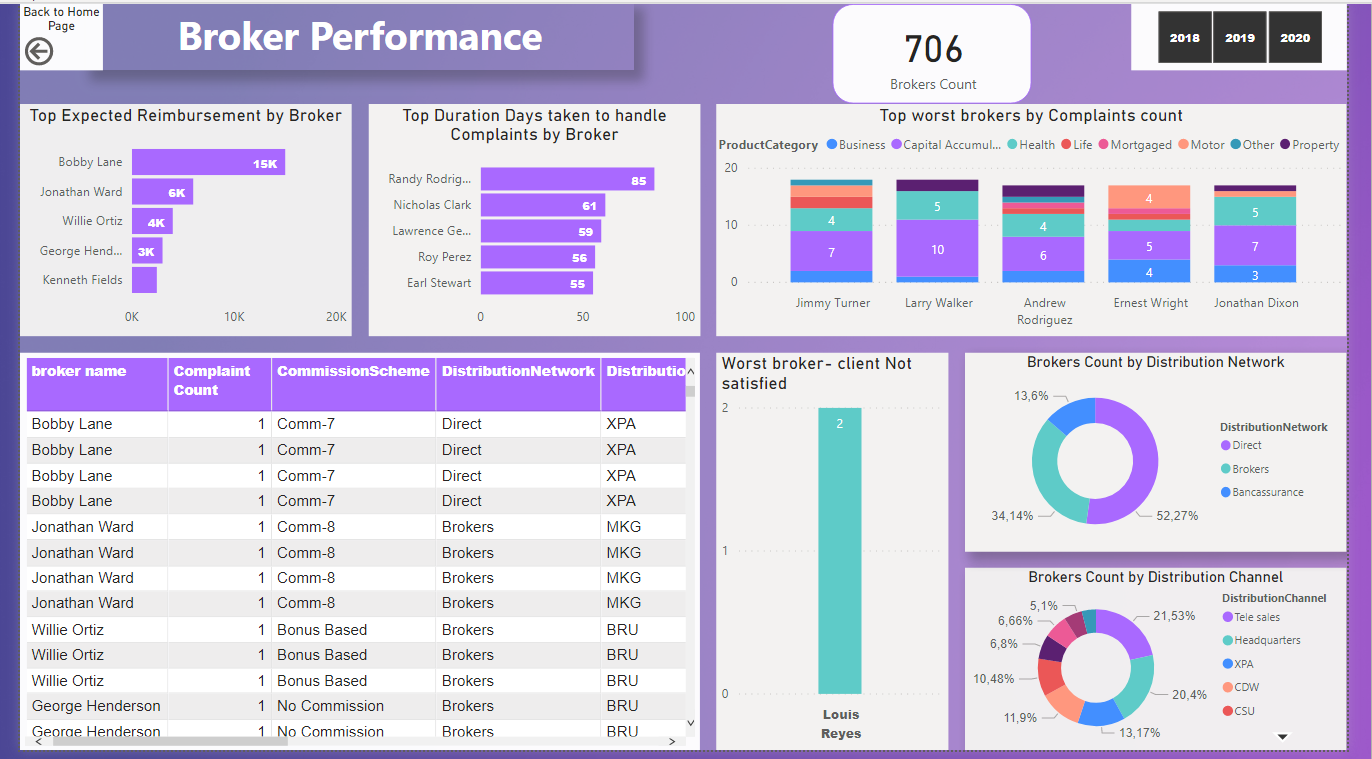
The “Worst offending brokers” table shows the brokers that have produced the most dissatisfaction among clients, measured in a dissatisfaction rate.
7 Likes
@alejos1971 welcome to the community!
WOW I expect you’ve set a challenge record that will be hard to beat, did you really just join 2,5 hours ago… Amazing.
3 Likes
Good eye. If you run the dataset only from 2018-2020, there are so few non-N/A data points per broker that the model produces no results. Thus, I ran it over the entire dataset, 2011-2020, which I should have noted in my writeup.
Really enjoyed your entry - lot of interesting and unusual elements, including the mirror image top and bottom chart axes, the dynamic narrative explanation in the tooltips, the use of chiclet slicer to further filter the results. Also interesting to hear how folks like you and @Greg are starting to leverage tabular editor in powerful ways. Nice work!
- Brian
3 Likes