The approach that comes to my mind to address this problem is to use a disconnected table in your slicer, and then use IF or COALESCE to keep the current value if date <= disconnected slicer value, and then assign a different value if date > disconnected slicer value (say, -1 for example), and then in your conditional formatting rules assign a color to the value representing dates outside the slicer range.
My recollection from the past challenges is that I used a similar heat map in Challenge #1 and @alexbadiu had one structured very much like yours in one of the early challenges. You may want to look at the PBIX files from each of those to see if they provide any additional insights.
I checked both the reports and yes the visual i have used is the same as @alexbadiu and yours. In your report also, you have have disabled the filter on the matrix table so any selection made on other visuals or slicers, the heat maps don’t change on the table. If I enable the filter, the table expands or collapses with selection(s) whereas I want the columns and rows of my table to be intact even if there is no data to be shown in the table/heatmap.
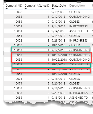
I’ll offer a tip here. There are a lot of records in the Status History table with the same Complaint ID and Complaint Status ID, but a different date. Those latter records are not useful in computing the duration between stages and actually make the DAX quite a bit more difficult. If you remove them (but keeping the one with the earliest Status Date) it makes calculating the duration between stages much easier through the use of the Previous Value DAX pattern.
For example, in the screenshot below, keep the records in the green boxes and get rid of the records in the red boxes.
I think it would be broken down by reimbursements, # of complaints and by processing times. Also have to see over the years whether the brokers have been performing badly consistently and in which products.
I love the clean, streamlined look of this. A great hybrid of your distinct style with some of the excellent design elements of @Melissa’s winning entry from Challenge #5.
Wow! This is an absolutely incredible piece of data storytelling visualization. Reminds me of Minard’s legendary “Napoleon’s March” visualization:
The way you break down the elements of the upper plot in the visuals below and relate them together vertically and horizontally is wonderful. No need for slicers or other interactive elements - a complete story on one page.
@BrianJ Thanks a lot for the appreciation. I have adopted the audit reports approach with #MakeoverMonday visualizations. With this technique I instantly know that there is a problem in 2nd and 4th quarters where there are cluster of N/A survey data that needs to be investigated.
I think power bi is still way behind powerful visualizations.
Hopefully the report turns out to be good.
The timing of this question couldn’t be better. Right now we have a real life business challenge where we have to measure all durations (in our case working days) of the different stages. For example the duration from start to assignement. Sometimes statusses are repeated for example when tickets are reopened and gets reassigned.
I am trying to figure out how durations between such repeating statusses are calculated and also how to avoid double counting when stages are changing within a day. So in some cases you wouldn’t delete double status ID’s
Our customer has a bit similar table with status history. The only major difference is an extra column with timestamps. Those timestamps are status transitions like “Timestamp 1-4” from outstanding to assigned to and are generated by power automate when a user of a powerapp changes the status of a ticket.
You’re absolutely right that it comes down to the specifics of the question(s) being asked in determining the right approach here. In this case, I interpreted the language of the initial brief (" The ability to see status changes and when they happened) as pertaining to changes in the Complaint Status ID. WIth this interpretation, intra-complaint information that doesn’t result in a change in status is extraneous.
However, in your case the problem is specifically defined such that those repeating status entries are relevant. To make the previous value pattern work, you must have a column that is continually increasing within the scope of the calculation (in this case, has to be increasing within a given complaint, since we don’t care in this calculation at least, about status changes across complaints). The increase doesn’t have to be uniform, but it does have to be continuous( e.g., 1, 14, 67, 195 works just as well as 1, 2, 3, 4).
In your case above, a Power Query transformation of the timestamp, removing “Timestamp”, the hyphen, and converting the remaining digits from text to whole number looks like it will work perfectly, since it will serve as an increasing identifier within the right scope that will make the “repeating” entries now unique.
I hope this is helpful. It is interesting to see how frequently the challenges mirror real life. WIth every challenge that goes by, I find that I am incorporating more and more of what I learn (and steal from others… ) in my work reports, despite the fact that none of them are substantively similar to the work I do, which is a real credit to @haroonali1000 and how broadly relevant he has constructed these scenarios to be.