Power BI Challenge 6 - Insurance Complaints

@BrianJ
:laughing: still, you know if there are no doctors or internet in a small town a dude who goes to the city and googles the symptoms and gives a diagnosis is considered as a Doctor in that town? so it’s close enough :laughing:

Thank God for google.

2 Likes

Thanks to @BrianJ, here is the link to the report:

1 Like

Hi everyone
My considerations

DATAMODEL

There was a lot of dimension. In the excel file from sheet Complaint Data I when through all the dimensions sheet to find which column could be linked to sheet Complaint Data.

Then I found that Sheet Regions and State Regions had connection to the customer and not Sheet Complain Data.

In the beginning of my process I thought the main Fact table was Complaint Data and the table Status History Data should have link to Table Complaint Data.

Afterwards I realize that all the dimensions from Complaint Data should be merge to Status History Data and table Status History Data had also record on claims which still where in process.

QUERY

The table Regions in some of the columns, had also Underscore between the words. I could handle it manually but looks in M code to see how this should be handled if there was a lot of tables with this issue. Because there was no function in Power query to handle this.

I came to this M-code.
“= Table.TransformColumnNames(#“Changed Type”,each if Text.Contains(,"“)
then Text.Replace(,"”," ") else _)”.

This M-code look for the Underscore and if not, it leaves the column.

There was a function to change word where, so the first word starts with Capital letter. I used that afterwards on column name.

MEASURES AND CALCULATED COLUMNS

I did only make one measure it was DISTINCTCOUNT to count number of claims.

What I found interesting was to show how many days a claim was in each status. In last challenge 5 with eyes I would also like to calculate how much have the ex. Left eyes change from last time. Could not solve that.

This time I solved it. Each claim has many records for each status and a date for when the claim started the new status. I had to Range each claimID limited to the each ClaimID. Afterwards calculate the dates between to days. So, Rank 1 Status Start days 2019-01-15 and Rank 2 Status Start days 2019-01-20. So, Rank 1 status has then been on its status up to the day where Rank 2 status get its start date.

Remembered that I have read something about this issue. Now I found it SQLBI.COM. I used RANK as calculate column and then LOOKUPVALUE as calculate column. The calculated columns is placed in table Status History Data.

There is one issue. If the user gives a claim two different status on the same date. So, Rank 1 have two different status and up to Rank 2 the days will be counted twice.

I would say this could be an issue for the Internal Audit , as it should not be allowed. If change status on a date where it already has a status. The right way should be changing the status on an already record on the date.

I also decided that below 1o days in one status was fine. < 10 Green, < 20 Yellow, >= Red.

VISUALIZATION

One factor we should consider was “Complaints broken down by the dimensions”. I find there was so many dimensions and not all I know what means.

I decided to show this as a Decomposition Tree Visualization, so the user can decide what to look at.

INSPIRATION

This time I did not see in challenge 6 to get in inspired.

Now I look forward to being inspired.

Challenge 6 - Insurance Complaints Data Amdi Silword.pbix (1.7 MB)

(upload://obPdeb9RZ0e46hd8uUAlp2appMm.pbix) (1.7 MB)

10 Likes

@Neba,

Thank you very much! :+1:

Daniel

1 Like

Have a good day everyone, :smile_cat:

Here is my submission for this challenge.

https://drive.google.com/file/d/1VITQoLF8la9w3bRj9XXjJUFeMoOYIPa9/view?usp=sharing

Thanks & Best Regards

Nhat Lam

7 Likes

Hello all,

Please find below my entry for the Challenge number 6. I went for a different approach for this challenge.
I wanted to try out some new ideas and techniques and also concentrate on the message to transmit.
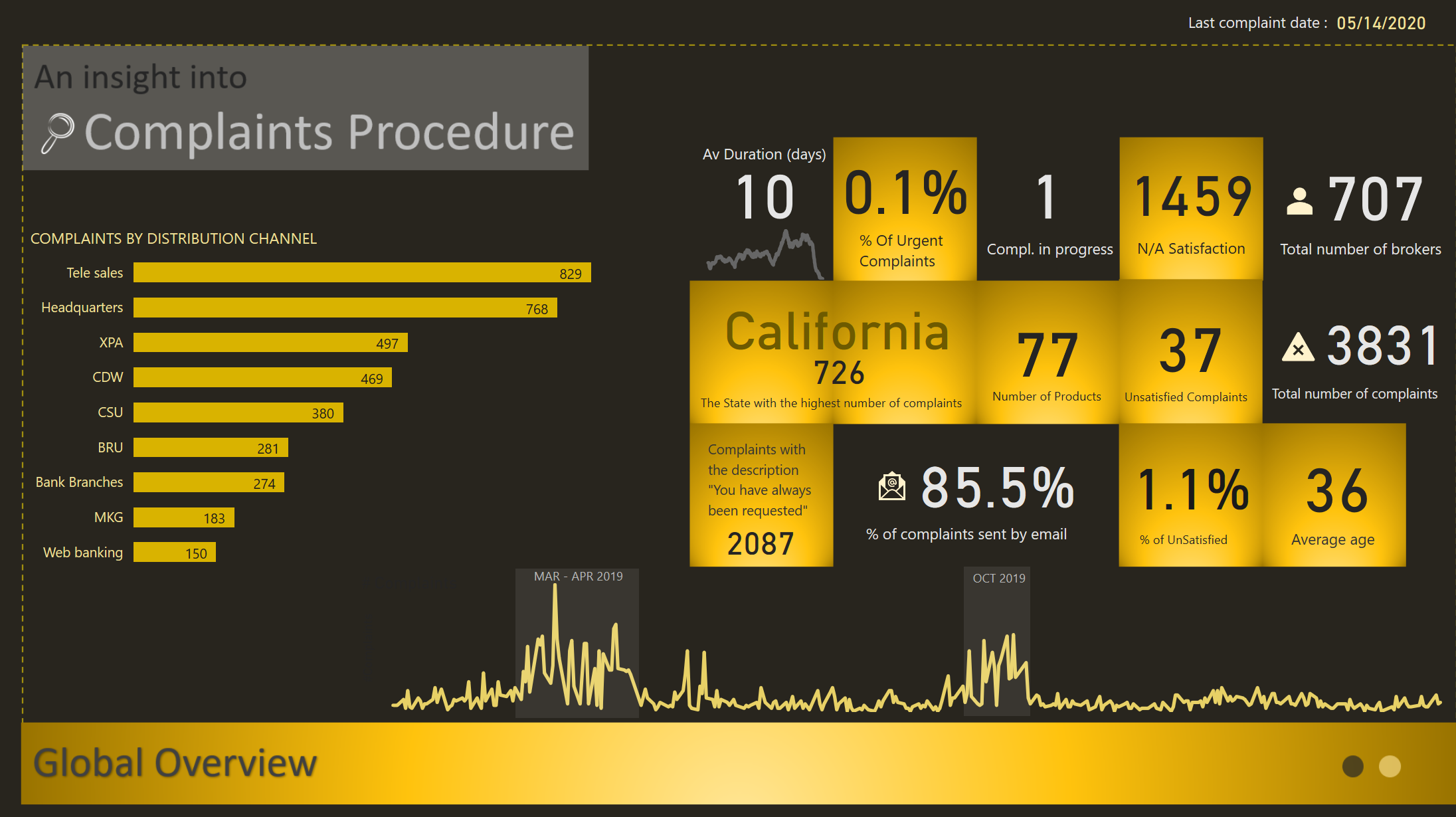
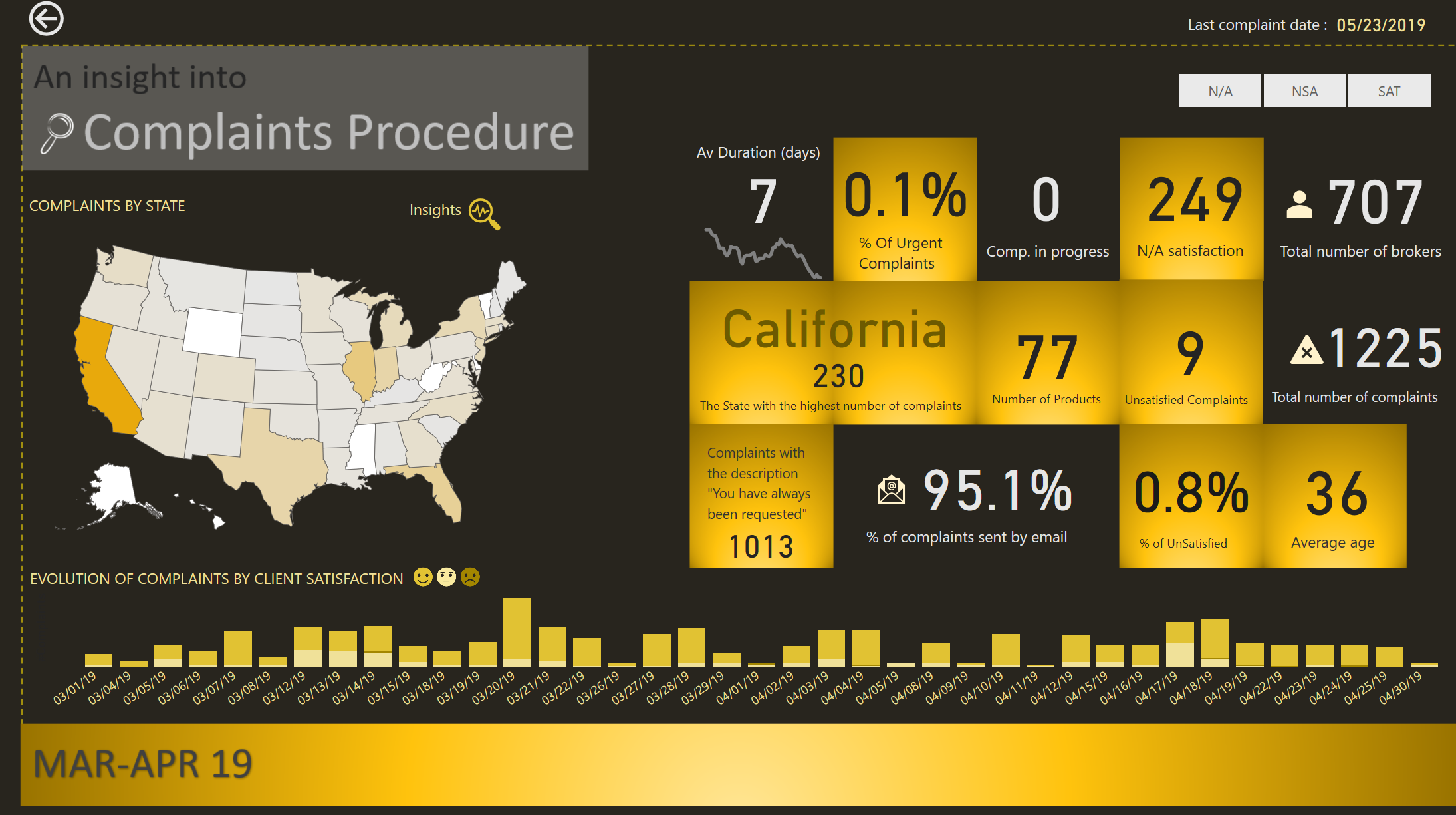
GLOBAL OVERVIEW

I started with a Global Overview which contains the main information I considered useful. I wanted the end users to know the main facts and numbers. Basically I wanted them to know the “WHAT and WHEN”
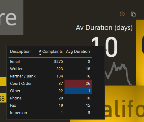
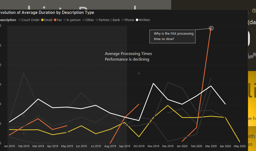
The main KPI, the one related to the Average Duration, has more information to it then we consider at first glance. We have the card that shows the average duration, the trend below, a tooltip and a Visual Header
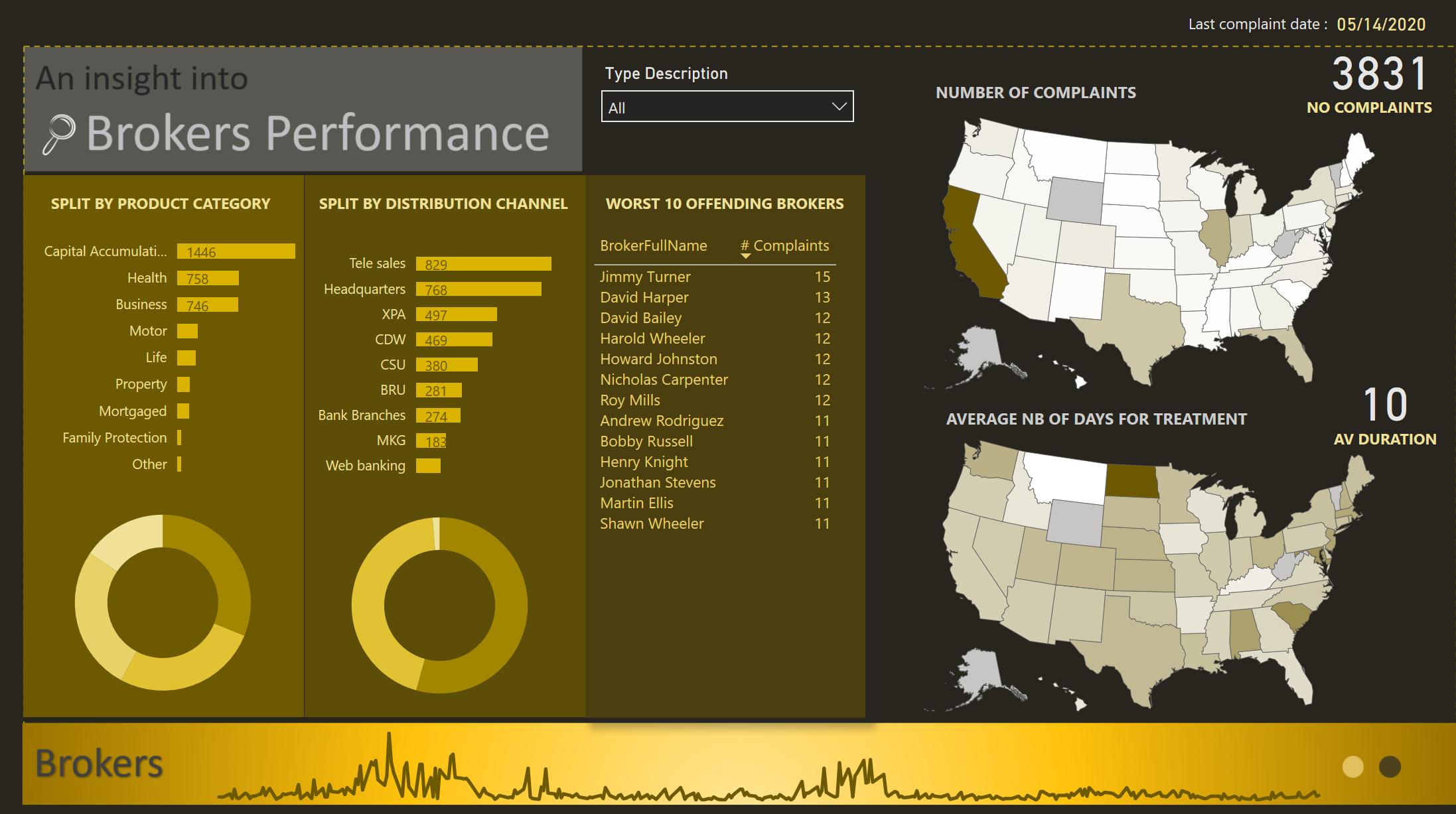

Tooltip Duration

BROKERS

My second page navigation focuses on the “WHO” question.

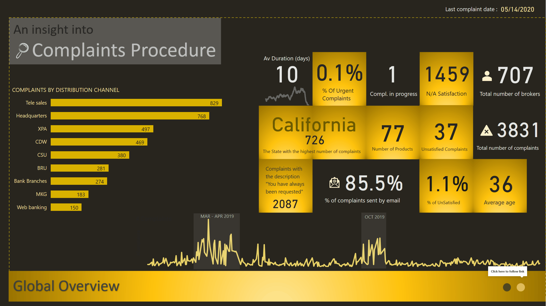
ZOOM into MAR-APR 19/ OCT 19

By now I should have the attention of the public and the story needs to focus to smaller details.
I built the navigation so that the user could drill down into 2 periods that are the outliers of the data.
2 Periods are in this category, MAR-APR 2019 and OCT 2019

INSIGHTS AND RECOMMENDATIONS

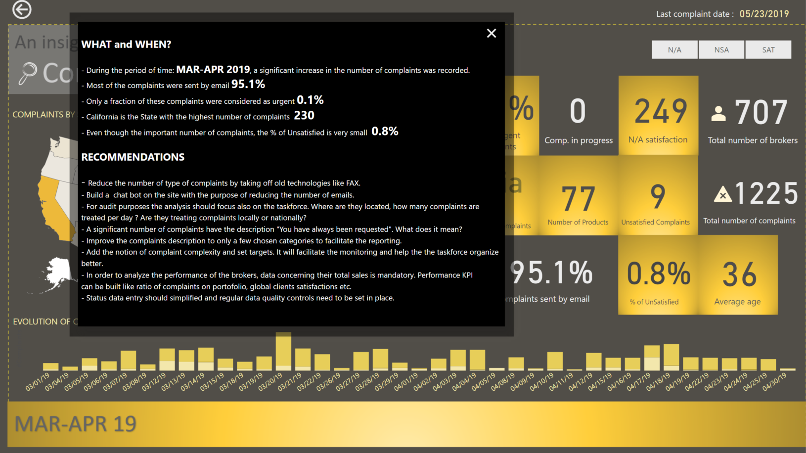
The difficulty of this challenge is that we have to provide a lot of information to the user. But to much information presented could create to much mental fatigue. In order to avoid that, I concentrated to show only informations I think are useful and added an Insight and Recommendation page.

Best regards,
Alex

GIF
Challenge 6

Update: With the help of @BrianJ, I can now share the link for those interested to have a look.
Thank you Brian

17 Likes

Hello everyone,

Here is my entry for this challenge. Full write up will follow in the following days, since this is a holiday weekend for us in the States. I do want to point out that I took a slightly different approach to this challenge. From the Customers table, I only chose “Individual”, not “Company”. Therefore, my numbers will be slightly different than other entries.

Here are some screen shots of my report pages:

Here is the link to my report:

Thanks
Jarrett

12 Likes

@alexbadiu wow really cool work again. Absolutely love the theme, tooltip and the way you highlighted the months in the trend chart. That’s awesome.

1 Like

Were you having Whisky while deciding colors? because at a first glance It reminded of it. Great report!

2 Likes

Lol @AntrikshSharma ! not quite from whisky. My inspiration came from Microsoft Windows 8

a) for the blocks

and
b) From Microsoft Power Bi site for the colors

4 Likes

Hi all,

Here is my submission for the challenge. I will put write down my considerations later on. It’s a simple report.

CH6 DA 2 ![CH6 DA 3|690x380]
I have used a GIF insife a tooltip (infobutton) in the report to explain some functionality.

I can’t publish to the Power BI Service because of policies so I’ll provide my PBIX.

eDNA CH6 DA.pbix (1.9 MB)

Looking forward to feedback.

Daniel

11 Likes

Thanks for the shout out @Neba, but all the pattern posts are a collaborative effort of the expert group and the eDNA team (and most often to follow-on forum posts), so thanks to all.
Greg

3 Likes

@uriah,

Very cool - I love the interaction between the small multiples and the mapping tooltip – I’ve never seen that done before.

  • Brian

P.S. I just sent you a published to web link you can include with your submission.

1 Like

@BrianJ

Thanks for the web link!

Daniel

1 Like

Hi All!

Here is my submission: DataZoe Power BI Challenge #6

Some images:

Tooltips:

I used the PowerBI.tips theme “Spash-o-Red” available here: https://powerbi.tips/product/layouts-splash-o-red/

I also found some guidance on the Status History from the Microsoft docs on using DevOps feeds to Power BI here: https://docs.microsoft.com/en-us/azure/devops/report/powerbi/create-timeinstate-report?view=azure-devops

14 Likes

Hi All:

Here is my (incomplete) submission for challenge #6. I didn’t even get to the Status History table, but thought I’d submit what I had.


I started out on this challenge with more of an experimental sandbox mindframe, and never quite made it to a fully prepared report submission, but there were many areas I wanted to explore, which are below the “liked” notes:

What I liked:

  • Using PowerPoint for all backgrounds
  • Using the “Top N and Others” technique for pie and doughnut charts
    • I really like pie charts and doughnut charts, as I find them very useful and easy to communicate relative size, but they can be less useful (more overwhelmed) when there are too many “slices”. I looked for and found a great technique to limit the number of slices, by only displaying slices for the Top N categories, then a single “others” slice with all those outside the Top N
    • I am excited to use this technique in the future with bar charts too, as I think it will be terrifically insightful to not only see who my Top N are, but also how far they are ahead of the average of others (and conversely how far behind average my bottom N are)
  • Using simple back and forward images with “bounce” for navigation
  • Using familiar back and forward chevrons, reminiscent of browser buttons or the “swipe” icons in Windows Photos

What needs more attention/what I didn’t like:

  • The red abstract background and theme that I chose; I had used muted blue, muted green, and white backgrounds in previous challenge submissions, and wanted to see if I could make a more garish colour and background work, so I chose a bright red abstract background. This was generally midly OK, but I the colour palette I chose didn’t provide enough differentiation, and I chose a couple of complementary colours, which (alas) didn’t work well at all, but did provide differentiation.
  • I think that, after my experience, that I’m leaning towards using simpler backgrounds in my reports, for a couple of reasons:
    • I end up spending too much time on colour selection
    • I’m too concerned with how the visuals look within the theme rather than concentrating only on how well they display the data so useful insights can be extracted

Here’s a more detailed list of some of the techniques I used in my report:

NOTES:

Goals:

  • to gain experience using PowerPoint for all backgrounds, including header, footer, and visual backgrounds
  • to gain experience using image buttons
  • to gain experience using the Decomposition Tree AI visual
  • to gain experience with the DAX Studio and Tabular Editor external tools by using them as much as possible for measure development

Setup:

  • used internet search to find a red abstract background image
  • used PowerPoint to create left-to-right gradient semi-transparent rectangles in a dark complementary colour for header, footer, and body rectangles, to provide the canvas for transparent visualizations
  • used filter pane to limit records shown in the report to those with Dates[Is After Today] = FALSE
  • used eDNA Colour Theme Generator https://analysthub.enterprisedna.co/colour-theme-generator to extract colour hex codes from background image, then used eDNA Colour Fan to identify colours for theme
  • setup navigation image buttons and images using arrow icons sourced from iconsdb.com (arrow 24, arrow 88) in #FFFFFF, #BFBFBF, #000000 for disabled, default, and on hover

General:

  • used “Work” pages to try out different visuals and identify trends that were interesting and should be included in the main report pages
  • formatted all measures and calculated columns using eDNA DAX Clean Up tool https://analysthub.enterprisedna.co/dax-clean-up
  • made extensive use of the [General] section in the [Visualizations] pane to ensure consistent sizing of all visual elements and adjusted the X/X/Width/Height as necessary (I made everything multiples of 10 pixels [where possible] to help me keep things aligned)

Data Model:

  • used eDNA extended date table as [Dates] Extended Date Table (Power Query M function)
  • used eDNA period table as [Periods]; adjusted for two periods: Last 2 Years, and Previous Dynamic Date Range Slicer- Query M
  • marked [Dates] table as a date table
  • changed all date formats to dd-mmm-yyyy [by typing “dd-mmm-yyyy” into “Format” box directly]
  • updated [Dates] table to use the fxStartDate and fxEndDate values (see below)
  • added all “*_Tbl” tables from Excel file;
    • renamed fields as necessary (e.g., in [Types] changed [ID] to [Type ID], changed [Description] to [Type] to avoid future confusion)
    • changed case of “lookup” table columns as necessary to be consistent (used “Transform\Format\Capitalize Each Word”)
    • corrected reverse naming of Customer[First Name] and Customer[Last Name] columns; created merged column for full name (Customer[Customer])
    • renamed [Regions] table to [Locations]; renamed [Region ID] fields in [Locations] and [Customers] tables to [Location ID]
  • deleted all auto-generated relationships
  • arranged table model in a “waterfall” and used “Manage Relationships” dialog to add all relationships (all 1-to-many)
  • created empty tables for [Key Measures] and [Admin Measures]; opened 2 sessions of Tabular Editor (1 each on my Challenge #5 PBIX and this file) and copied measures
  • added [Last Refresh] table
  • hid all ID fields
  • added disconnected supporting tables for [Categories plus Others] and [States plus Others]; accepted default of many-to-many relationship offered by Power BI when linking to [Categories] and [States] tables
  • added [Status Group] to [Status] table, with “Closed” and “Resolved” status values assigned to the “Closed” group, with all others assigned to the “Open” group

M/Power Query:

  • added fxNow, fxToday [date of fxNow], fxFirstComplaint [min compliant date], fxStartDate [start of year of fxFirstComplaint], fxEndDate [one year after end of year of fxToday]

DAX Calculations:

  • added [Is Desktop] and [Is Service] using difference between NOW() and UTCNOW() to determine user interface

Visualizations:

Custom Visuals:

  • used Enlighten Data Story custom visual
  • used Sunbust by MAQ Software custom visual

General:

  • used blank buttons in header with separate “default” and “on hover” images, all using “Fill\Image Fit\Fit” for back and forward; used slightly larger copies of the default images to create the “bounce” effect on hover (with “Fit”, larger image appears smaller in same size box)
  • hid all pages except “Summary” page, so all navigation in Power BI Service would be via back and forward buttons
  • used multi-row card in footer to display report info

Summary page:

  • used transparent black “back” image instead of back button to show “start”
  • added [Periods] slicer to easily display last 2 years
  • used many instances of the Enlighten Data Story custom visual on the left side of the page to present summary insights
  • used [Top States plus Others] in doughnut visual ([TopX] set to 5, so will show 5 slices for the Top 5 states plus a 6th slice for “Others” [sum of values outside the Top 5])
  • used [Top Categories plus Others] in doughnut visual ([TopX] set to 5, so will show 5 slices for the Top 5 categories plus a 6th slice for “Others” [sum of values outside the Top 5])
  • used multi-row card in the footer to present report admin and session admin measures

Source page:

  • added [Periods] slicer to easily display last 2 years
  • used Decomposition Tree to identify breakdown of complaints by source, product category, product subcategory
  • used conditional formatting to colour 3 groups in the [Complaints by Broker], [Expected Reimbursement by Customer], and [Complaints by Customer] charts: top 20% - dark red; 50-80% - red; bottom 50% - light red
  • used multi-row card in the footer to present report admin and session admin measures

Time page:

  • used transparent black “forward” image instead of forward button to show “end”
  • used Sunbust by MAQ Software custom visual to showcase average processing days by distribution network and distribution channel, complete with animation
  • used relative date slicer to show only the last 2 years of complaints data in the two graphs on the right; adjusted the filter interactions so that these two graphs would not be affected by the date slicer selections
  • used multi-row card in the footer to present report admin and session admin measures
14 Likes

Wow I really like your design, very polished! Great job!

2 Likes

@datazoe Great work. What’s the chart you used on Trends? Amazing how everyone looks at the data differently.

2 Likes

@Greg you deserve an award just for explaining in detail the steps and tricks you used in creating the report. I haven’t yet seen the TopN and others technique in donuts and pie charts. Would love to try the technique in other visuals.
I like the red abstract theme you used and you really made the theme work. Only if you could have carried the red theme in all of the visuals it could have been awesome. Blue and green color doesn’t seem to be working in the report.
Lots and lots of tricks to learn from your report.
Thank you for completing the challenge as these types of reports give the motivation to learn more and more.

4 Likes

@Greg,

Totally agree with @MudassirAli in that I think the bright red theme looks awesome, but wish you’d committed to it fully. As always, so many detailed touches to love in this report (I’m 100% stealing that Chevron page navigation construct). One thing I absolutely cannot figure out is how you got the publish to web to default to full-screen with no other on-screen navigation except that which is native to the report itself?

  • Brian