Overall, I wanted to balance with this report is the customers satisfied % and the number of complaints with this report. The customers satisfied % was the main metric I wanted to focus on.
Key Features
Overall
- I wanted to use a PowerBI.Tips layout template for this one, as I had been wanting to use one in general, less time on design and more on features/data. I did this after I started which was a mistake as I had trouble moving the model easily as the template was built using an earlier version of Power BI Desktop and didn’t cooperate with external tools as well. Tip: Start with the template!
- I created a measure table, and I actually did this last, then moved all the measures around. This broke all my visuals and I had to fix them one by one. Thankfully I didn’t have that many charts, and utilized the drilldown/bookmark method, so it wasn’t so bad. But next time I’ll just create the measures where I want them to start with.
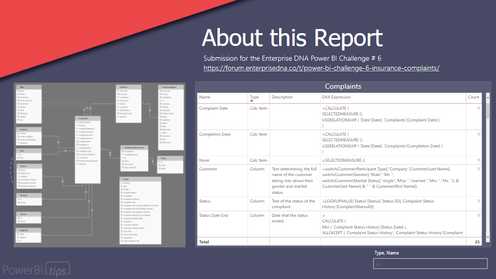
- I tried to make the report self documenting – I included a picture of model, nicely laid out, and all the DAX expressions in a table with descriptions for each of them.
- Fun with tooltips.
- Fun with charts having drill down/bookmark only on that visual to make a slicer of categories on a chart.
- Colors consistent.
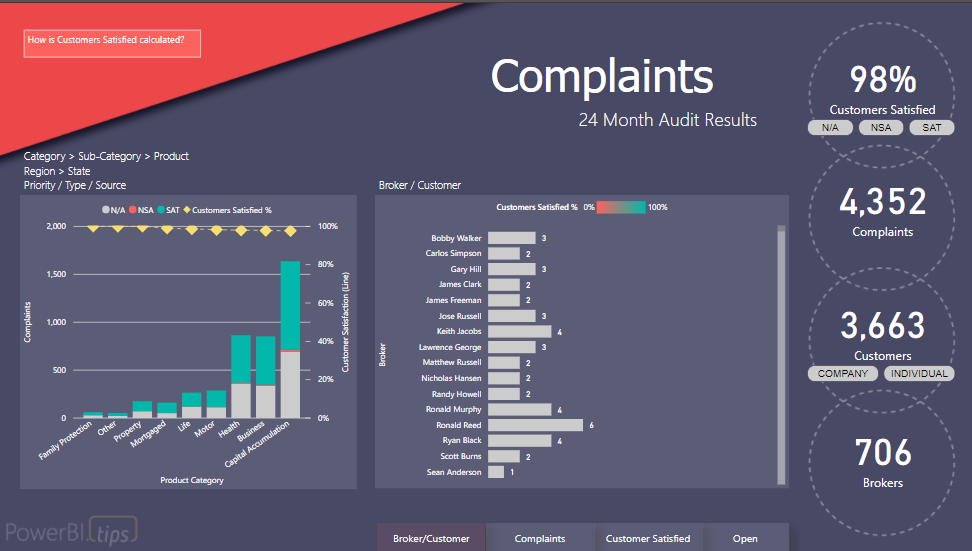
Broker/Customer Report Page
-
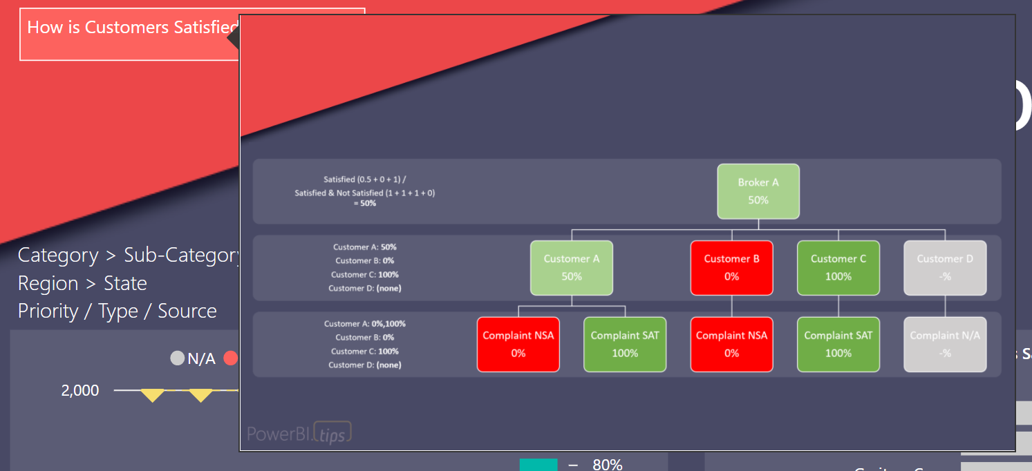
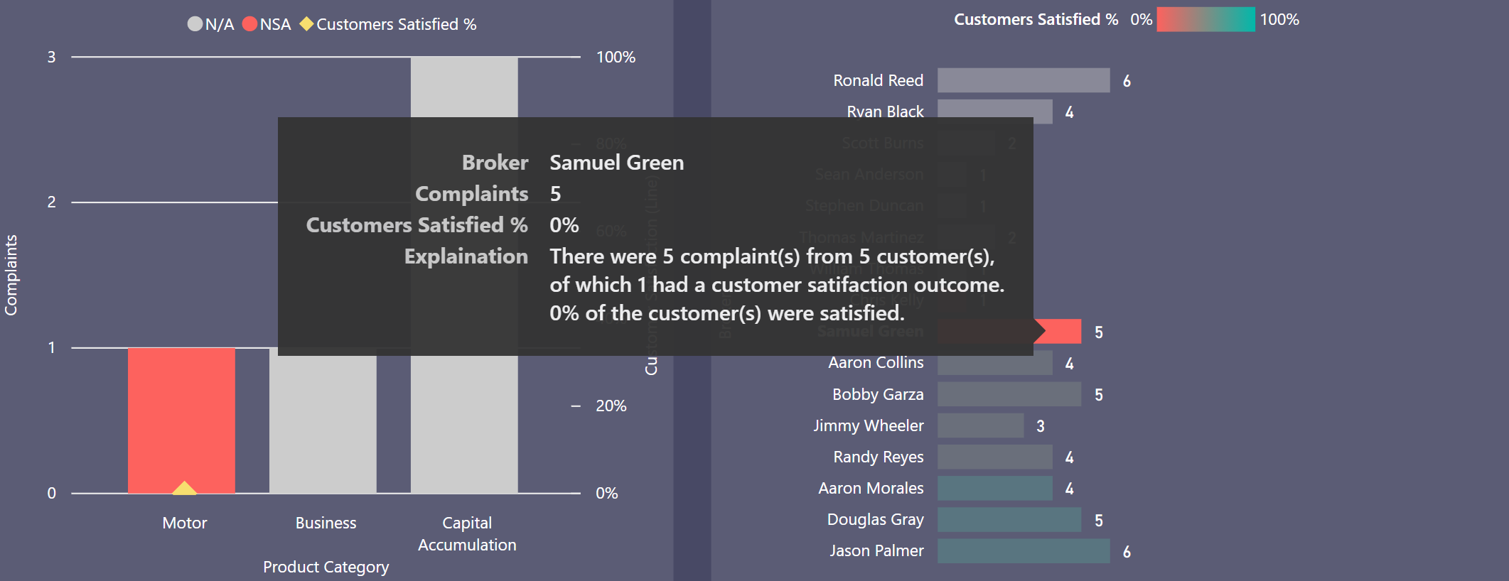
Customers Satisfied % is calculated by looking at the complaints with customer satisfaction outcome of satisfied or not satisfied at the complaint level then aggregating to customer and broker.
-
Tooltip to explain how the Customers Satisfied % is calculated available on the report pages.
-
Bars colored by Customer Satisfied % on the chart have a tooltip to explain exactly how it is calculated.
-
The charts show # of complaints by length, then color based on Customer Satisfied %.
-
The main chart can be flipped between Customer and Broker without creating a new chart. It is actually utilizing the drill down feature of a chart with a bookmark that only affects that one chart.
-
The secondary chart can also be flipped between 8 different categories and this illustrates the break down of how many complaints, and how many had a satisfied, not satisfied, or N/A outcome – to be clear on how that Customer Satisfied % is derived.
-
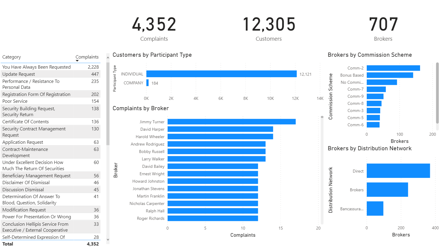
The right side 4 circles gave all up numbers of Customers Satisfied %, Customers, Complaints, and Brokers.
-
I used chiclets instead of slicers to enable to user to limit the data to any combination of N/A, Satisfied, Not Satisfied outcomes which is right by the Customer number, and if you wanted to see just individual, customer, or both types of customers, again, right by the Customers number.
-
For Customer I choose to create a long name that took into account all the different attributes that were provided about that customer.
Customer =
SWITCH (
    Customer[Participant Type],
    "Company", Customer[Last Name],
    SWITCH (
        Customer[Gender],
        "Male", "Mr. ", SWITCH ( Customer[Marital Status], "single", "Miss ", "married", "Mrs. ", "Ms. " )
    ) & Customer[last Name] & " " & Customer[first Name]
)
Which may be less inclusive, I find it irritating that only woman are prefixed by marital status, and it doesn’t take into account other prefixes such as Dr. But it gave me a way to aggregate in a fun looking DAX expression, so I included it.
- Finally, I turned on cross filtering by default instead of highlighting, so when a customer or broker is clicked on, the data is now filtered down to them in the secondary chart and you can click through the 8 options you have for it.
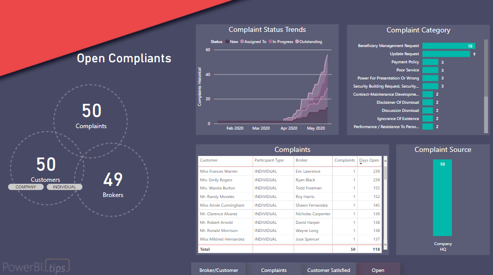
Complaints Report Page
- The same elements: 4 right circles are used with their chiclets, and the tooltip explaining the Customer Satisfied %.
- The Complaints Category chart shows the # complaints by length with Customer Satisfied % by color. If a category was all N/A it would be light grey. Same as Broker/Customer charts.
- The Complaint Status Trends show active complaints by each day so you can see the daily status changes over time.
- A text box at the bottom gives overall stats on average, median, min, and max days to close a complaint.
- The cross filtering again will allow you to see the trend chart and text box by any of the complaint categories.
Customer Satisfied Report Page
- The main focus is to see how the customer satisfied % had changed over time and with complaint volume. Which it really hadn’t.
- You can change from seeing this by Complaint Date and Completion Date at the top with a chiclet slicer.
- You can also change the chart from by date to by month aggregated using the button at the bottom.
- The buttons and chiclets look the same.
- There is only one chart but you can adjust it to look like 4 different charts with these two elements.
Open Report Page
- I utilized the other layout in the template, which was for drill through pages but I didn’t use drill through in earlier pages, which gave a different feel for the open complaints. This was ideal because this is now changing from historical to actionable now elements.
-
Same circles in different layout give the 3 overall elements of Complaints, Customers, and Brokers. I couldn’t figure out why there was only 49 brokers!
- I reused the Complaint Status Trends and Complaint Category, then added a table with Days Open and overall source of complaints.
Days Open =
VAR maxNew = CALCULATE (
    MAX ( 'Complaint Status History'[Status Date] ),
    FILTER ( 'Status','Status'[Status] = "New" )
)
VAR maxClosed = CALCULATE (
    MAX ( 'Complaint Status History'[Status Date] ),
    FILTER ( 'Status','Status'[Status] = "Closed" )
)

RETURN
MEDIANX ( Complaints, DATEDIFF ( maxNew, COALESCE ( maxClosed, TODAY () ), DAY ) )
- There is a drill through available on either Customer or Broker that will take you to the Broker/Customer page so you can see their historical data only. If you drill through using a column you can choose not to bring in all the filters.
5th Report Page
This is the self-reporting page.
- I laid out the model nicely and took a picture.
- I named the measures nicely (to avoid renaming in charts) and gave them definitions.
- You can search for specific DAX expression in the slicer.
Data Modeling
I did exploratory data analysis using Power BI with this data set to understand the data and figure out the relationships. This wasn’t pretty but was helpful in having me get a feel for the data:
The brief said that only last 2 years data was relevant so I tossed out the earlier data early on. I noticed there was some issues with historical status dates and the complaint dates, but it was in rows earlier than 2 years so I didn’t pursue it.
I did end up using the status only with the historical table, because that one had the most statuses. I then included the bi-directional relationship, which was mostly because I was lazy and didn’t want to do a bunch of CROSSFILTER(). The model was also small.
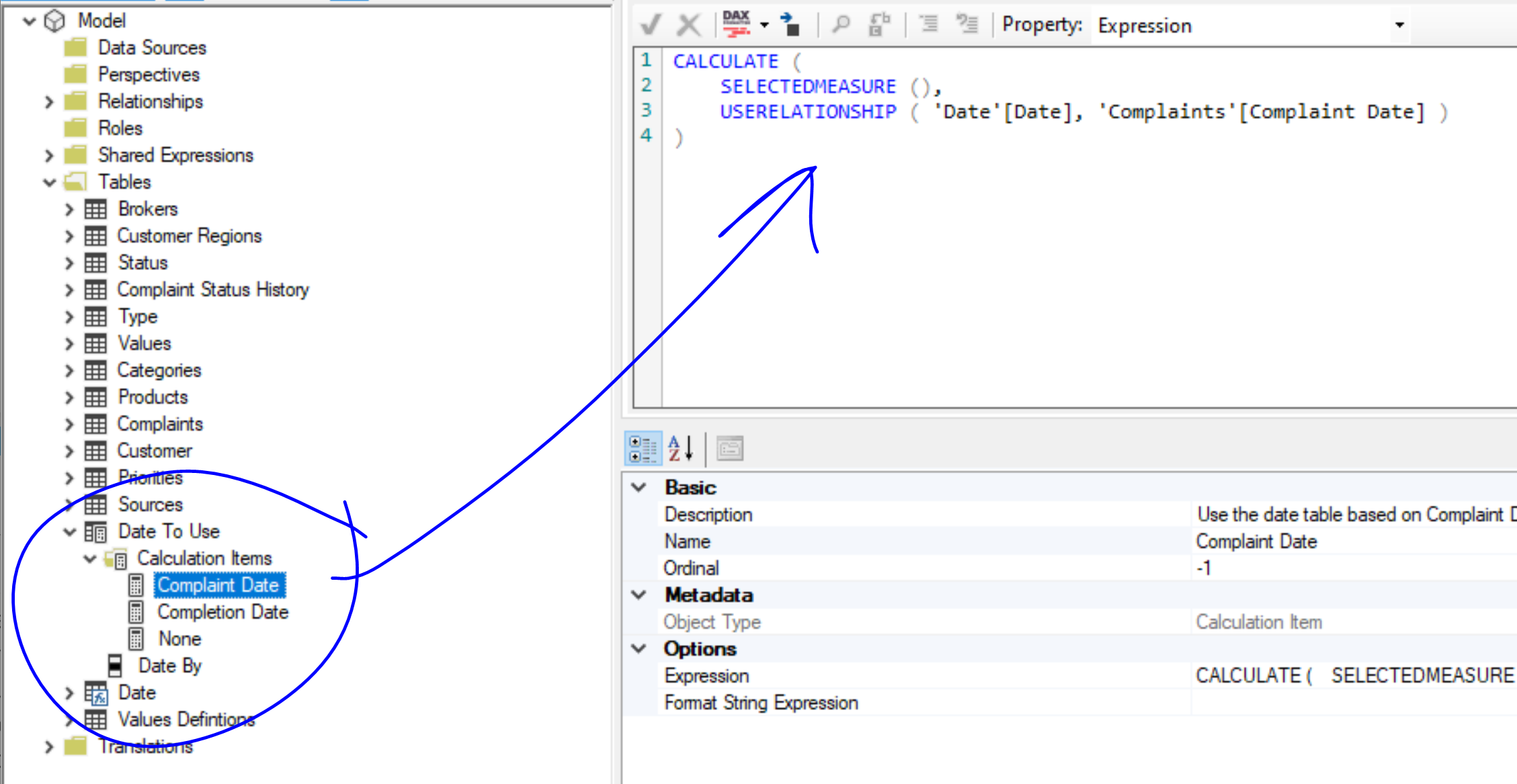
I have the Date table disconnected by default, then two inactive relationships for Complaint and Completion date. This was to allow for the status trends and then also to use the Complaint/Completion date via Calculation Groups.
I hid all the columns that weren’t useful for the report, such as indexes and the metadata about customers that I aggregated into the Customer column.
At one point I actually created one BIG table with all the fields too, but decided I didn’t like it that much and would cause a performance issue with any calculated columns I wanted.
Tabular Editor
@BrianJ has mentioned I used tabular editor a few times, and I did. I love tabular editor. My new favorite thing is calculation groups in Power BI actually.
Calculation Groups
I used these to change the date context. That is, the date table is disconnected by default, but can be reconnected via slicer (or in my case, chiclet) to reconnect it to either complaint date or completion date for EVERY measure, all at once. It’s fantastic, and no duplication of measures.
So many uses!
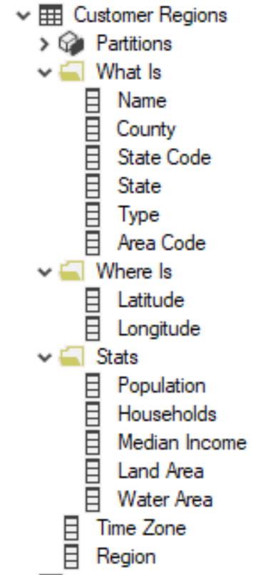
Organization into Display Folders
If I have a table that has more than like 5 or 10 fields, I find it a little overwhelming. Display folders can give structure not only to measures but regular old columns too. I used it to organize the Customer Regions table:
Documenting
I also went ahead and formatted all my DAX expressions and did the definitions in Tabular Editor too. It’s so much faster than trying to do it one by one in the modeling tab! Took me all of 5-10 minutes.
Thanks
Congrats on reading to the end of my write up! Thanks to Enterprise DNA for providing these challenges. They are a lot of fun.