Here’s the entry from one of our non-member participants, Vida.

Here is the link to the report:
And here’s how Vida described it:
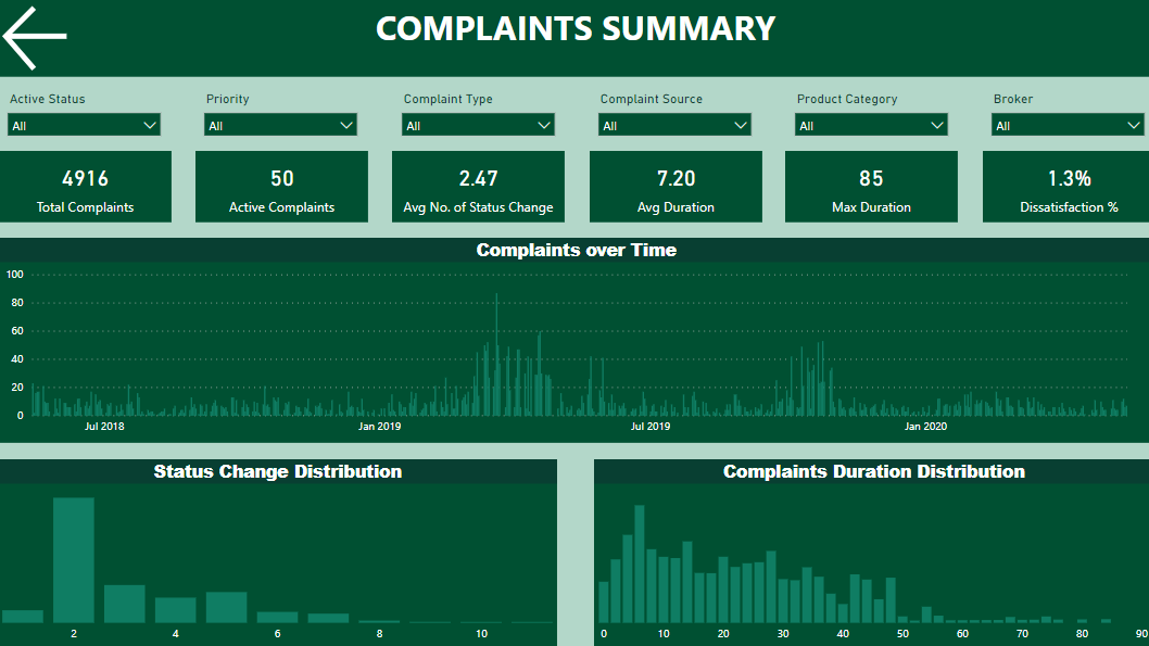
I used Power Query to show 2 years of data. Max date was retrieved from Complaint Date and Completion date columns and 2 years were deducted from this date.
Then the first challenge was to set relationships between tables. I used two inactive relationships, which were activated via DAX.
On Complaint summary page I wanted to show how status change and complaint duration were distributed. Bins feature was used to achieve this. The result shows that most complaints had 2 statuses and most complaints were resolved in 6 days. Some slicers were added to the page to enable user to see distribution for different dimensions.
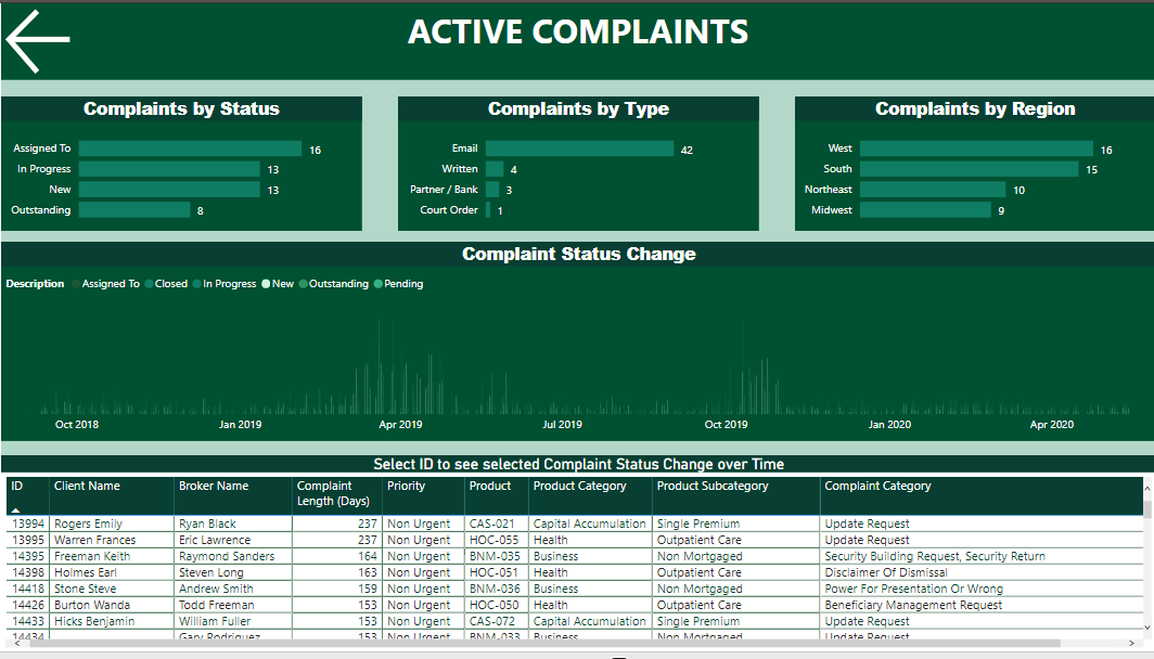
Complaints summary is more like a past picture. However, I wanted to separate active complaints to enable managing future. I had an idea to show all the stages on a time scale and this was the hardest thing to achieve from reviewing relationships to choosing correct visual. I thought this might be useful for decision makers. They can select a complaint from the table and see how distant different statuses were on a time scale and which statuses the complaint went through. When a single complaint is selected, the visual also shows days from complaint start to today.
One more challenge was to show the worst offending brokers. I used bar chart to highlight brokers with most complaints and maximum average duration, but I wanted something more. So, I decided to add a scatter chart and enable user to choose number of complaints and average duration. This was achieved with parameters. The max duration is showed in bubbles colour intensity.
Not all ideas came at the same time. I needed some breaks to come back with fresh mind next day. I really enjoyed working on this challenge. It is the second one I am participating in.
To learn about the real-life scenario presented for the challenge, be sure to click on the image below.
