Here’s Sunip’s entry for Power BI Challenge 6. @Sunip, would you like to share how you built this dashboard and what your inspiration is in building it?
Here is the link to the report:
To learn about the real-life scenario presented for the challenge, be sure to click on the image below.
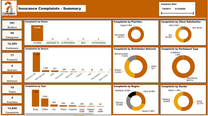
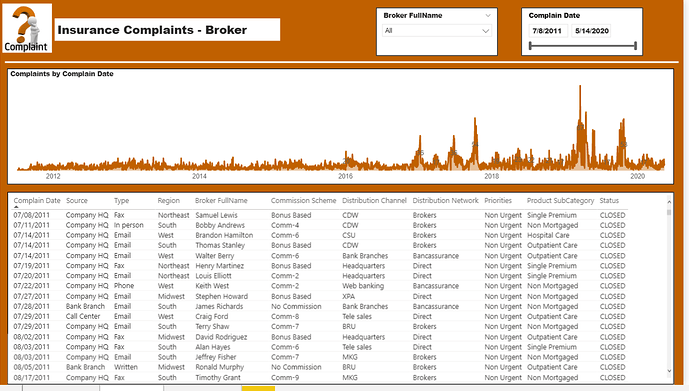
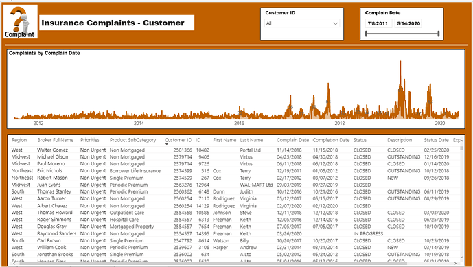
Data Model is the key for this report with multiple tabs in the excel. The idea to have Summary, Brokers and Customers details in different tabs. Started with creating all the aggregate Key measures for the Summary tab and didn’t get time to focus in depth on Broker and Customer tabs.
Congratulations on your submission here and if it’s in the challenge.
One thing that definitely sticks out to me here is the brief only asking for the last two years of data. See you you’ve got to remember to stick to what the stakeholders are asking for. It just takes a little bit of investigation into the data and aligning it with what is being asked. Easy fix.
I definitely feel like you get everything answered here in the brief though, it’s just quite extensive because it hasn’t been drilled down into the last two years.
I think the colors are great in general, I would challenge you though too maybe try and create some transparent backgrounds to the visuals and try and blend the visuals more into the background of the report page. I think I find this looks just better overall and avoids having to have white and a black border around every single metric and key insight you’re trying to showcase.
Well done here a good start, I would definitely recommend trying to boost up your creativity around designs and to really just leverage off and steal ideas of others have participated in the challenge because there’s some amazing work being showcased and lots of great tips and techniques that you could embed in future designs for challenges.
@sam.mckay Thank you, Sam! Your feedback is very valuable to me and based on time constraints, I couldn’t complete and hence missed adding 2 year filter. I agree with your feedback and need to start of adding Creativity.