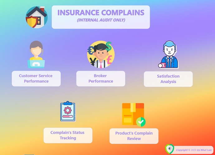
Here’s Nhat’s entry for Power BI Challenge 6. @NhatLam, would you like to share how you built this dashboard and what your inspiration is in building it?
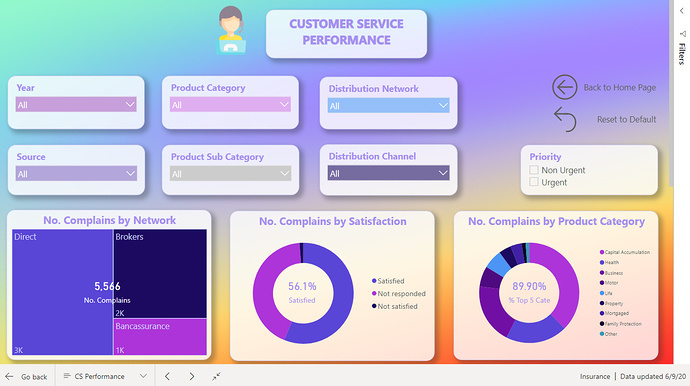
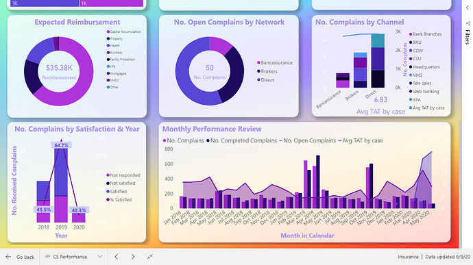
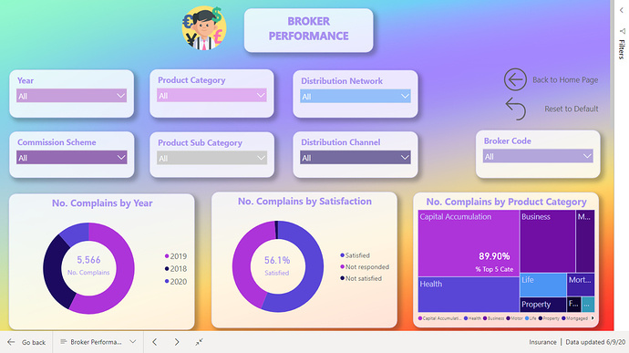
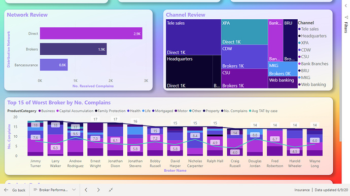
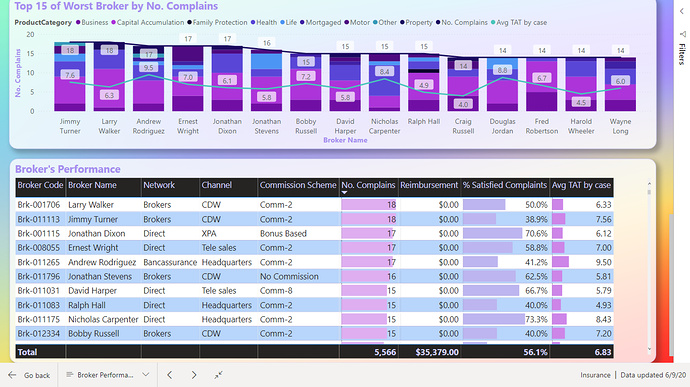
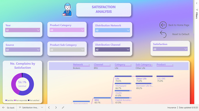
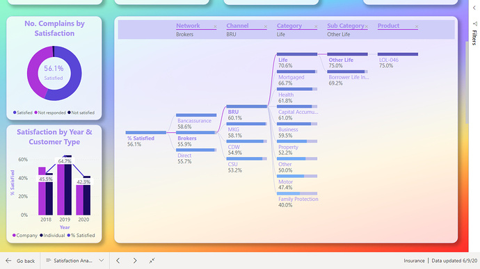
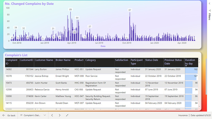
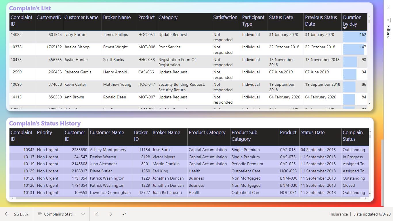
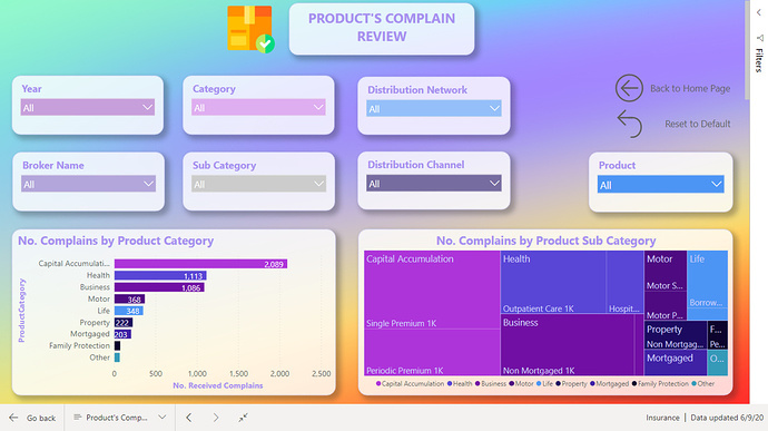
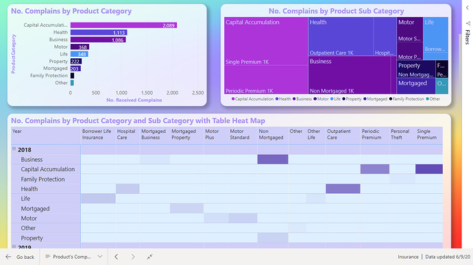
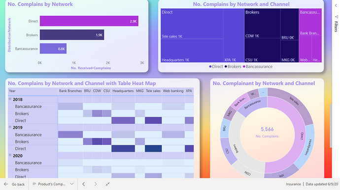
This is so detailed. You certainly couldn’t complain that you weren’t seeing enough information if you came across this report.
I also really love the colours used. I think they work really well across all the different report pages. The visuals also blend in nicely to the contrasting background that you have used.
I also think that you’ve really done well here with the navigation. You’ve created a seamless application design here which any consumer would enjoy using I feel.
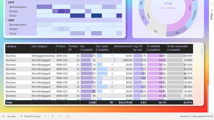
The only thing I would have a think about for the next challenge would be seeing if you could summarise the information in a more compact way. I do feel that you could in this challenge have produced only 2 to 3 pages and been able to fit all of the relevant information in.
It’s certainly not a requirement it’s just an idea to challenge yourself on. What it makes you do is just have a deeper think about how you can summarise information with different calculations and visuals and navigation. And I think that’s a great learning experience.
This challenge helped me learn a lot to improve the look of the report and learn how to use new charts. Your opinion on the information in a more compact way is the point that I will do my best to improve when implementing the BI report in practice.