When I saw the details of the challenge I knew how my report is going to look like but the difficult part was to actually make it work because there were many details in the data set. The report was meant to help prepare the management for the audit and more often than not management wants a summary of issues rather preferring to slice/dice the details to get the results. Therefore, decided to prepare the report that can be easily understood by management with self-explanatory visuals.
The 70% of the time was spent in figuring out the design and flow of the report and 30% was actually spent in completing it. The report does not have fancy navigation and bookmarks but the creative organization of visuals for the story-telling. Here is how I prepared the report:
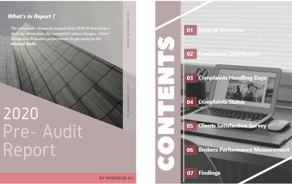
Home Page:
I made use of the following online website for the report template:
https://www.canva.com/
However, I used the combination of three to four different reports to design the home page. At home page, a brief description is given about what to expect in the report and from the table of contents, it is possible to navigate to different pages by clicking on the headings.
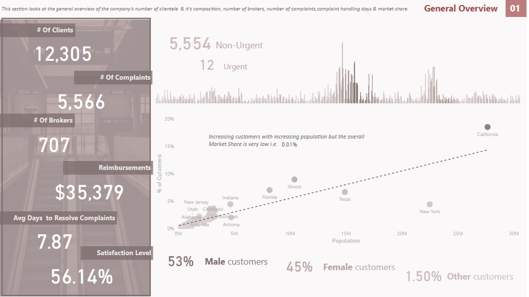
01-General Overview:
On the very first page of the report, a general summary of the organization is given to the end user i.e. the number of clients, complaints, brokers, expected reimbursements, average time taken to resolve the complaints and clients’ satisfaction level.
Line and stacked column charts show the number of complaints by day also pointing out on a card about the number of Urgent & Non-Urgent complaints. This gives the idea that almost every time the brokers have good amount of time to resolve the complaints and get clients’ satisfaction as the complaints are non-urgent.
Scatter Chart shows the company’s clients compared with the population in different states to give the estimate of the market share.
At the bottom, cards show the % of customers by Gender.
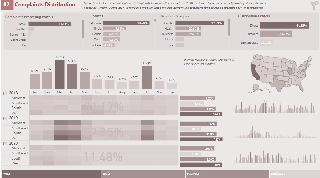
02-Complaints Distribution
Here is how it got tricky as I wanted to highlight the products and other elements where the % of complaints are higher without stuffing the report with irrelevant details. Instead of using the slicers, I made use of the clustered bar chart as it gives the good visibility of % of complaints.
The matrix heat map table contains the yearly % of complaints by regions, surrounded by :
-clustered column chart that highlights the complaints by month
-clustered bar chart that highlights complaints by region
-Line & stacked column chart is placed next to the above chart to show the complaints trend by year
-Cards are placed atop of heat maps to give the % of complaints by year.
Map is also used to highlight the worst affected areas in terms of complaints.
At the bottom of the page , tree map is used instead of the horizontal slicer because conditional formatting is allowed in tree map and the dark color shows the highest % of complaints by region.
To go back to the Home Page, click on the heading at the top.
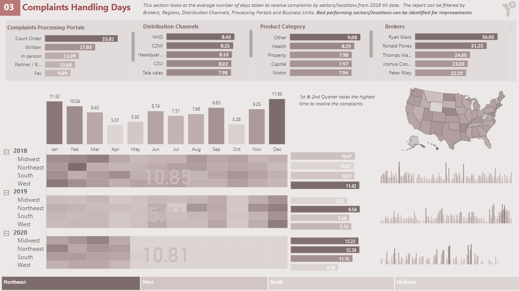
03-Average Complaints Handling Days
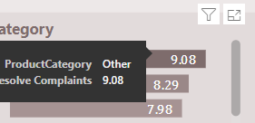
The same technique has been used as in page 02-Complaints Distribution with the only difference that the % of complaints is replaced by the average handling of complaints days.
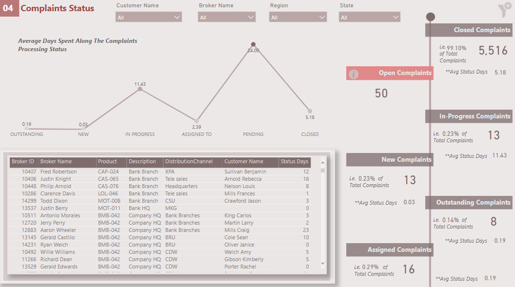
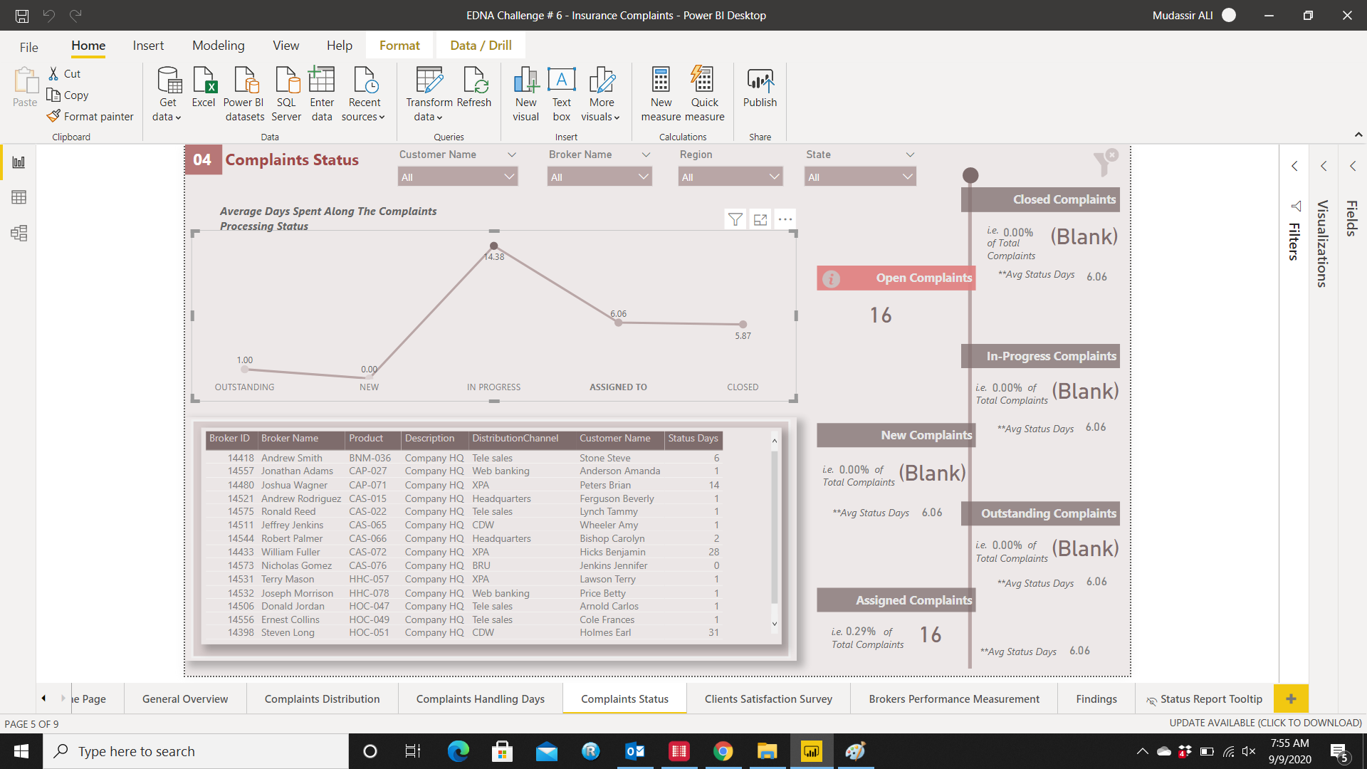
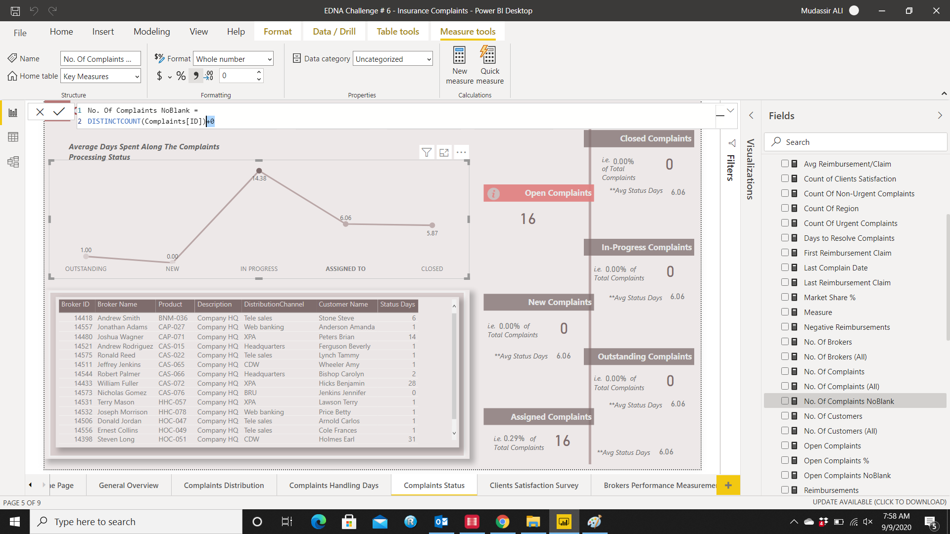
04-Complaints Status
The number of complaints segmented by status is shown at the right side of the page including the average days the status takes.
The line chart also shows the average days taken in each complaints processing stage where In-Progress status takes the highest amount of time.
At the bottom table shows the detail of the complaints with status and a tool tip is also added so the status for each complaint can be seen.
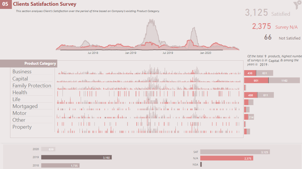
05-Clients Satisfaction Survey
The card visual shows the number of clients satisfaction survey broken down into three components i.e. Satisfied, Not Satisfied & Data N/A.
Area chart is also used to highlight the highest number of surveys by days.
Just below the area chart, line & stacked column chart is used to highlight the surveys for each product category in days and it can be easily be seen when the highest number of surveys was conducted in general and also by each product category.
With each product category, stacked bar chart is also used to give the total of surveys for each product category.
Here the issue is not about the # of dissatisfied clients as the % is very small but the number of surveys not obtained. It is possible that those customers were dissatisfied and didn’t bother to go ahead and take part in the survey.
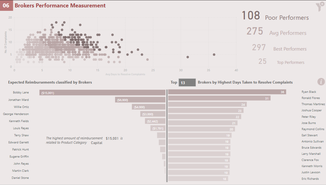
06-Brokers Performance Measurement
Here I made use of the scatter chart with technique discussed by @sam.mckay:
The brokers are grouped into Poor, Average, Best and Top Category based on number of days taken to resolve the complaints. Customers dissatisfaction number was not used to measure the performance because firstly, the dissatisfaction % was not significant and secondly it is implied that the customers will be dissatisfied if the length of time taken to resolve the complaints is higher.
With the grouping, the company can pick both the poor and top performers and analyse what each group segment is doing to resolve the complaints
Clustered bar charts are used side by side to highlight the expected reimbursements and average days taken to resolve the complaints by brokers. I multiplied the expected reimbursements with -1 so I could show the chart from right to left for comparison. Moreover, I used the What-If-Parameter to dynamically select the number of brokers.
The info icon is also placed if the end user wants to extract all the brokers. The total number of brokers can be inserted in TopN slicer to see all the brokers.
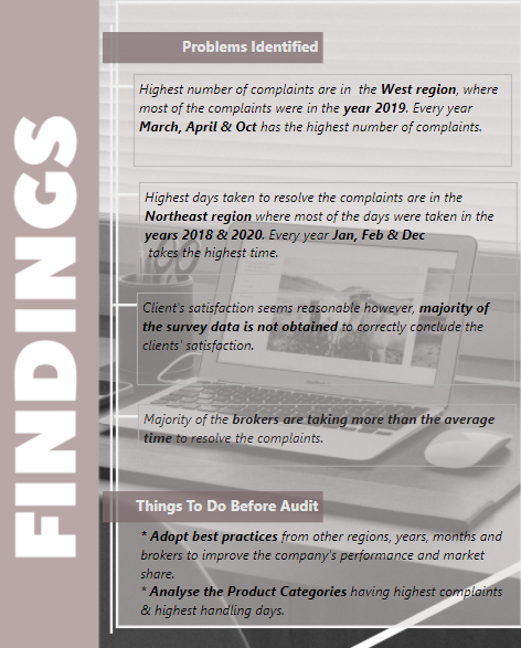
07-Findings
In the end, summary of findings and recommendations are highlighted to management so the relevant action(s) can be taken before the internal audit.
To navigate to the Home Page, click on the Findings Heading.
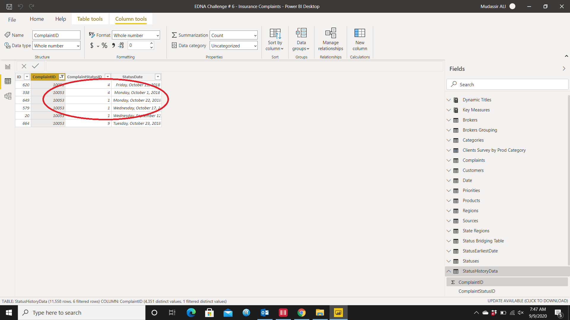
Dealing With Status History Table
This was the complicated part as there were multiple dates for the same status:
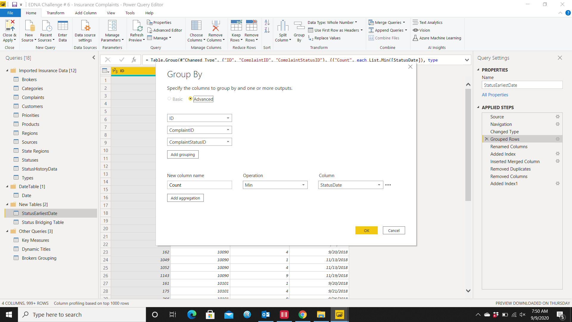
So to cater this problem, I used the Power Query instead of DAX formula. I created a duplicate table and used the Group By function to extract the earliest date of a particular status:
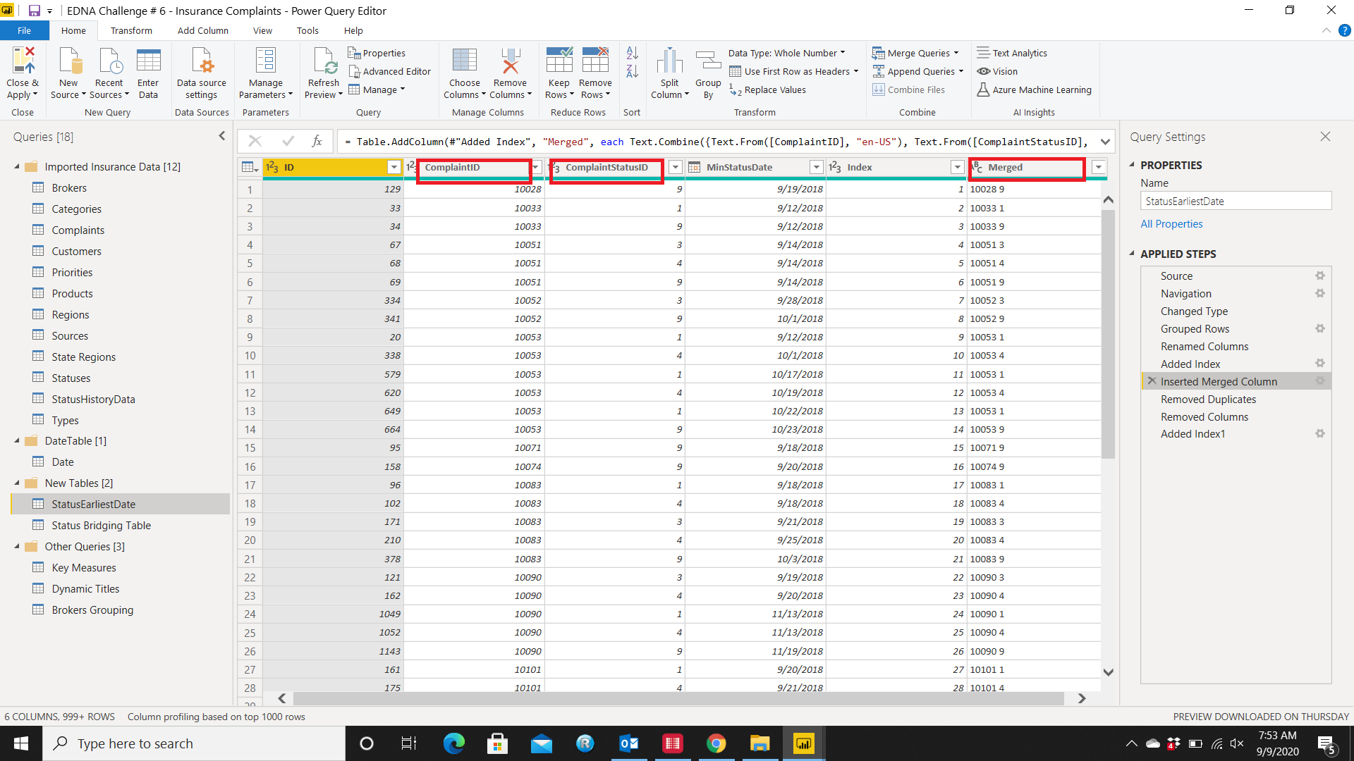
Then I created a Merged Column with ComplaintID and Complaint Status ID to create a unique column and then removed the duplicates:
Dealing With Blanks in Card Visual
It’s not appealing for the end user when a Card Visual shows blank when there is no data for that item/category:
Therefore, I used a quick fix to cater this problem by adding +0 at the end of a measure so the field shows 0 when there is no data:
However, there is only one caveat for this fix and it’s that it only works well in a Card Visual not in table or other visuals.
*- - - - - - - - - - - - - - - - - - - - - - - - - - - - - - - - - - - - *
All in all it was a very good challenge because the data set was close to the actual data stored by sophisticated ERP systems.
I learned the hard way that Good Relationships are also important in Power BI.
Thank you EDNA team members for making this happen.