Here’s Marieke’s entry for Power BI Challenge 6. @marieke, would you like to share how you built this dashboard and what your inspiration is in building it?
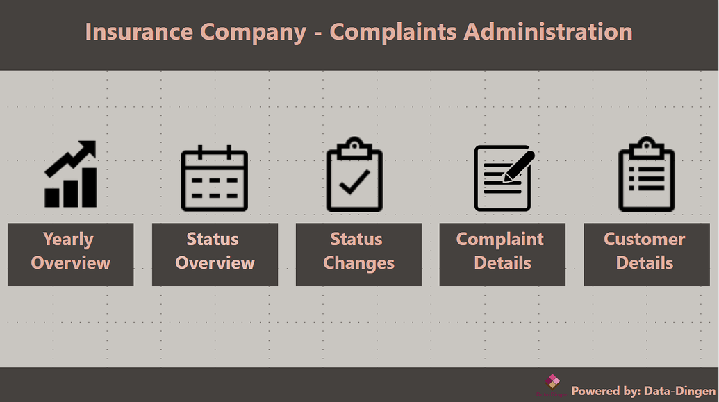
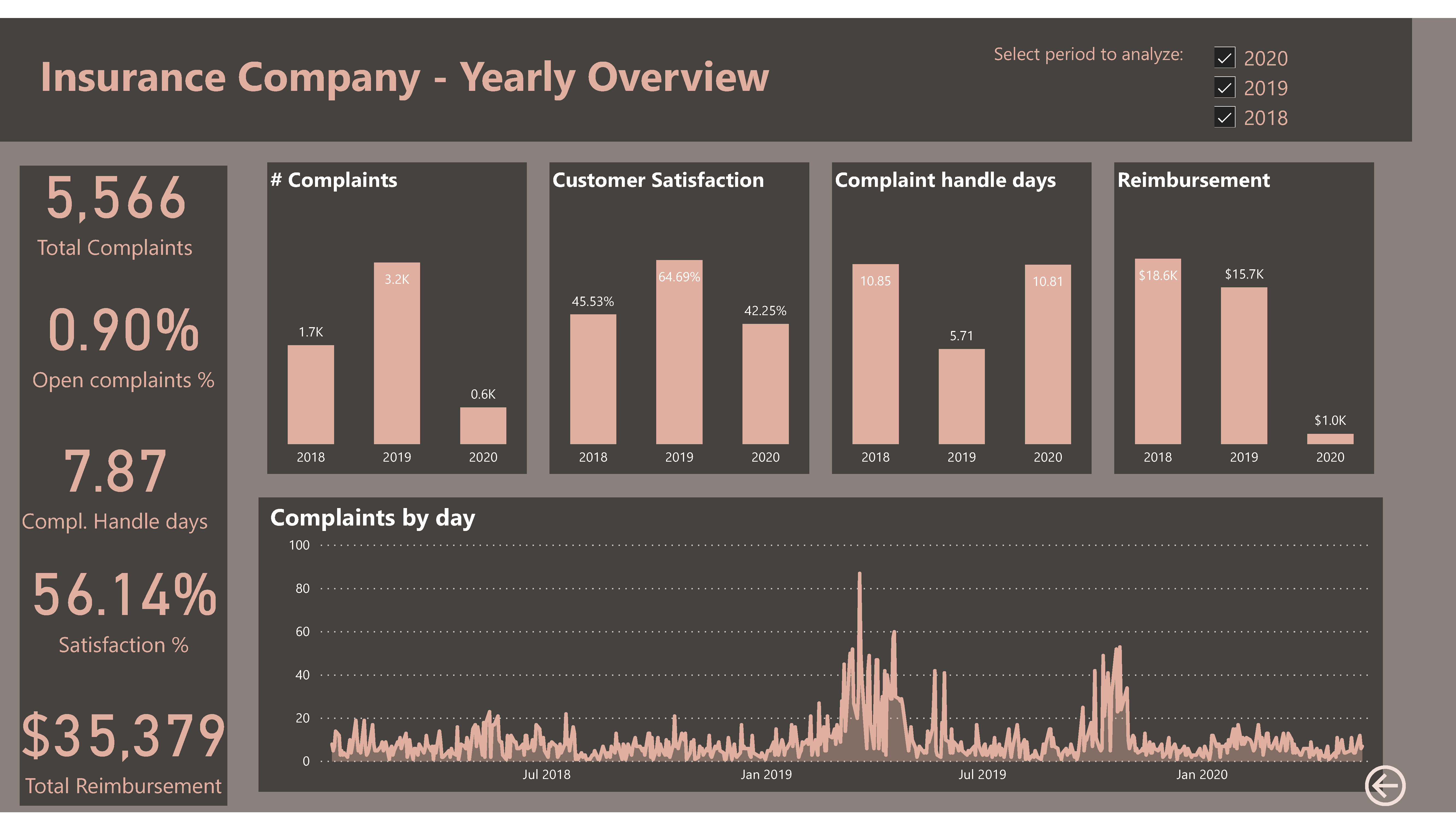
Yes, I tried to start with what i think are the main topics to show over the last years to compare them. And on this pages, the main KPI’s are showed also.
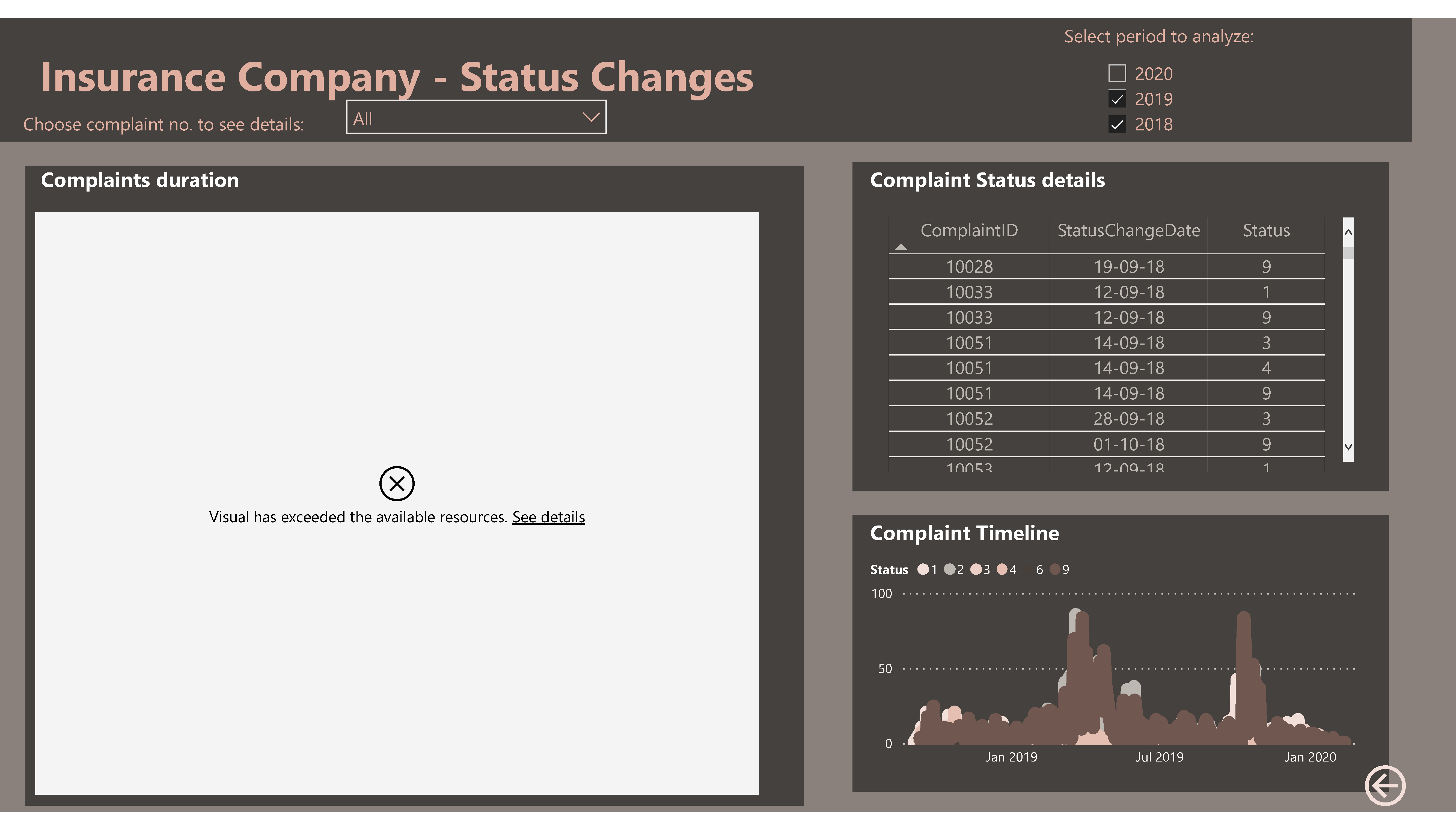
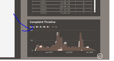
Then I wanted to go into more detail at the statusses, to focus on the complaints that are still outstanding and to show how long it takes on average to solve a complaint.
At the third page i wanted to show more details about status changed (unfortunatelly this page is not always showing correct in powerbi.com).
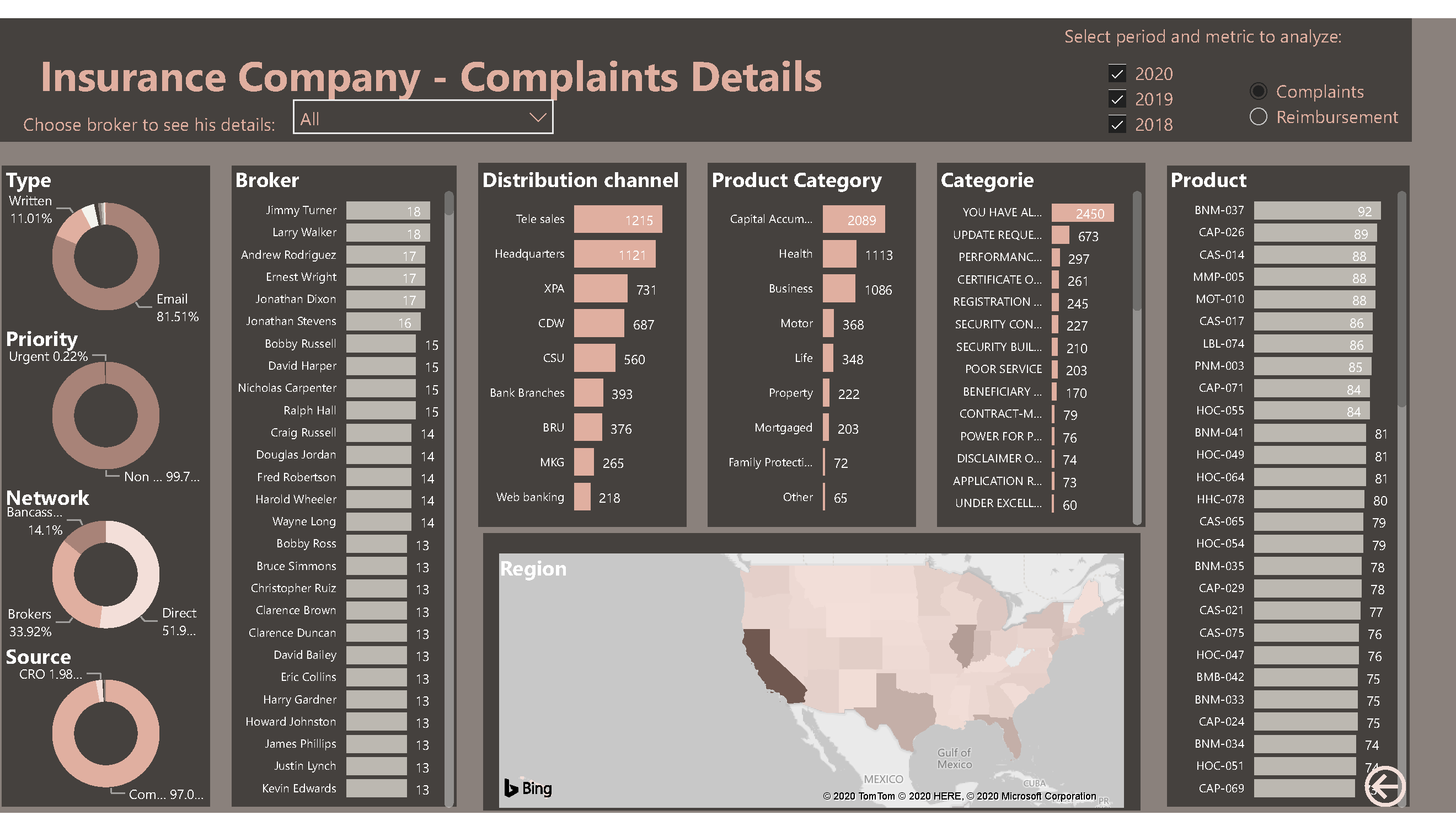
And the fourth page you can see all the complaints grouped by type, network, broker, product, region etc… And as there was quite a lot of customer details in the date, I also made a sheet to show more customer details, like age, marital status etc.
So I hope the managers from this company will now have all the insights they need to improve the complaints process
It definitely has all the attributes of a quality report. I think you’ve really kept the colors simple which I like and also the consumption experience is easy on the eye and you can understand all of the key information and key metrics very easily.
I certainly have some recommendations here though for some slight improvements.
One of them being that a lot of the backgrounds and grids that you’ve used throughout your report don’t really line up. Like even the title area and rectangle seems a bit odd that it doesn’t go across the whole length of the page. These would just be very very simple adjustments but just make it creatively a bit more compelling.
Also I feel like some of the card visuals take up a little bit too much room. Just making this font a little bit smaller would make things fit better I feel.
Also just make sure that your visuals tell an obvious story. I think some here maybe are a little bit cluttered. Again very small change but would make a big impact I think.
Certainly I get all the information that I think I would need as a stakeholder and that’s really the main job here.