Here’s the entry from one of our non-member participants, Hossein.

To learn about the real-life scenario presented for the challenge, be sure to click on the image below.

Here’s the entry from one of our non-member participants, Hossein.
To learn about the real-life scenario presented for the challenge, be sure to click on the image below.
Congrats on your submission and great to have you involved in the challenge.
Great to see that you are looking to test yourself and introducing a range of quality analysis techniques into your reports.
I have a couple of suggestions to maybe think about for next time.
Firstly I don’t really see many titles or labels showcasing what page you are on. I think you want to try and tell a bit more of a story here rather than just having vocalisations planted across pages.
Also I think you could use a simpler colour palette. Some of these colours I can feel work that well together. Check out the colour theme generator by enterprise DNA and you can get a simple colour palette there quickly.
Also when you are setting out visuals make sure they are set up in a way that you can fully comprehend the insights that you’re looking to show. These are all just really small fixes and updates that are so cool and you could make these very quickly.
Maybe spend some time before jumping into your reports thinking about how you want to design the consumer experience, think about what story you want to tell with your analysis. That is really gonna help you a lot.
Well done and looking forward to seeing more of your work in the future.
Sam
Here are some details about Hossein’s report:
I used a dark theme because I thought it is so attractive.
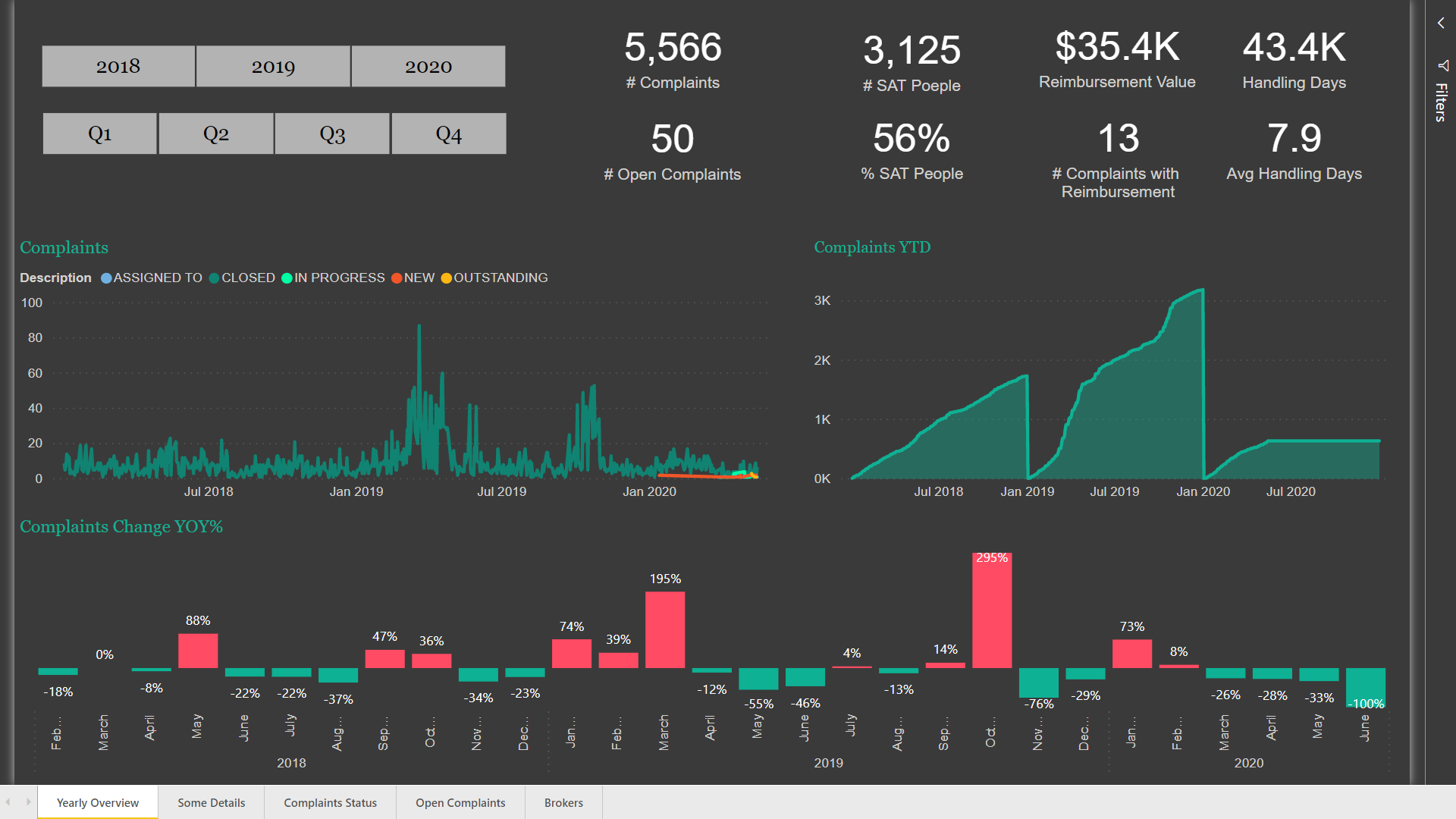
In the “Yearly Overview” Page, I placed some general information about the data, as well as “Number of Complaints Year to Date” using Time Intelligence function in Power BI for calculating every complaint through the year till the end of the year. It obviously shows that the amount of complaints in year 2019 is much more than both 2018 and 2020 years and also the amount of complaints till the first quarter of the 2019 is virtually the same as all the complaints in 2018. I’ve also used Year over Year function for creating a visual at the bottom of the page to monthly show the percentage of changes in the number of complaints. It’s clearly showing that the biggest increases in the amount of complaints took place in March 2019 and October 2020.
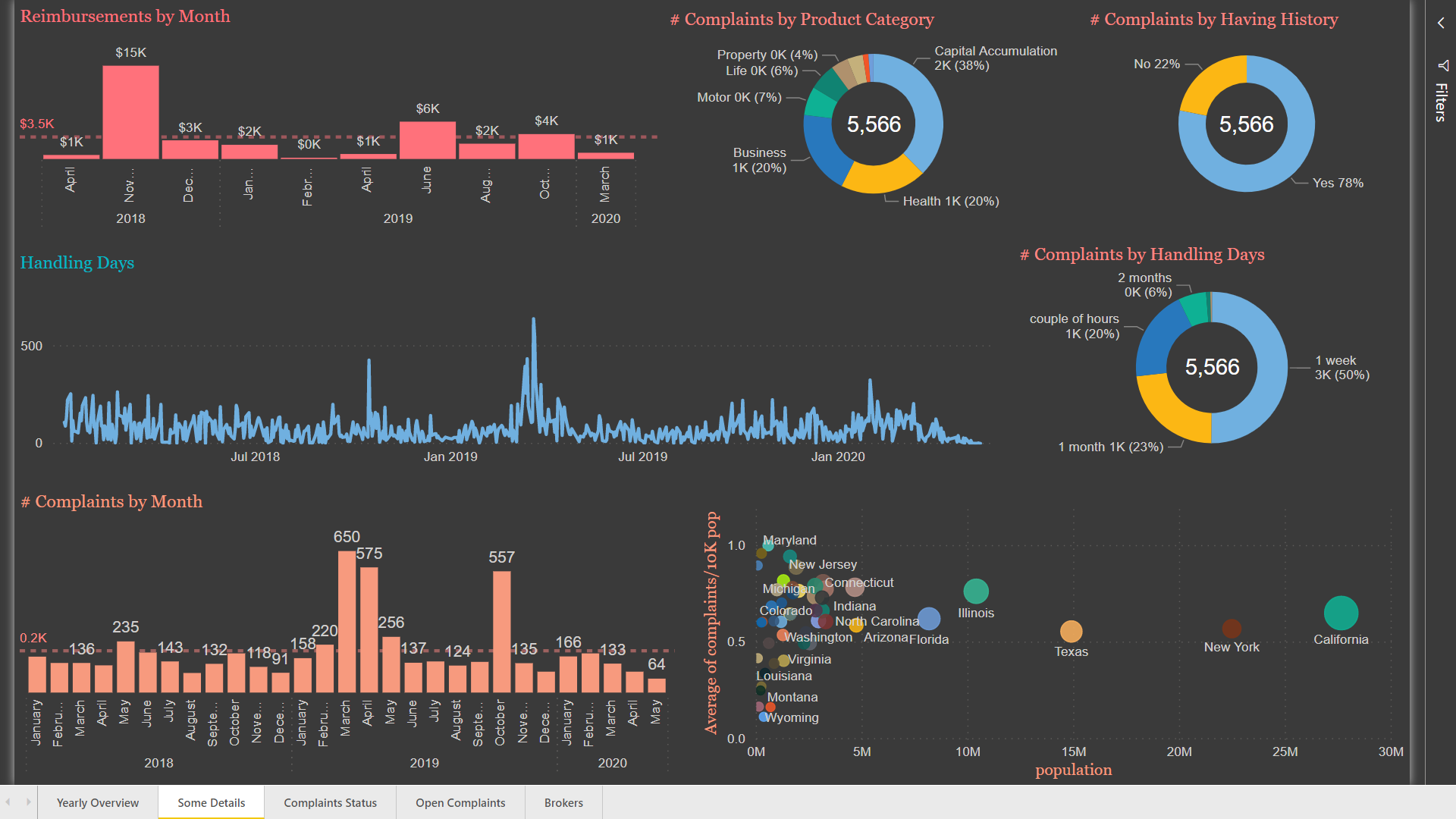
In the “Some Details” Page, I used a typical line chart for the number of handling days, but since it has a lot of details, I thought that maybe a categorical column named “handling duration” can practically explain the subject. So, I created a pie chart to summarize the line chart based on “handling duration”. As the pie chart shows, 70% of the complaints were handles less than a week which is good. But I think focusing on the 7% of complaints that it took two or more than two months to handle is more important. Since the population in each region is different, I decided to standardize the number of complaints in each region based on the population so that I can correctly understand in which region the number of complaints is more than other regions. Therefore, I created a column named “complaints in each region” and based on that created another column named “Complaint/10k Population” using the following formulas:
Complaints In each Region = CALCULATE(SUM(Customers_L[# Complaints for each Customer]),FILTER(Customers_L,Customers_L[RegionID]=Regions_L[Region ID]))
complaints/10K pop = DIVIDE(Regions_L[Complaints In each Region],Regions_L[population])*10000
and finally created the scatter plot in this page based on the average number of complaints per 10K population.
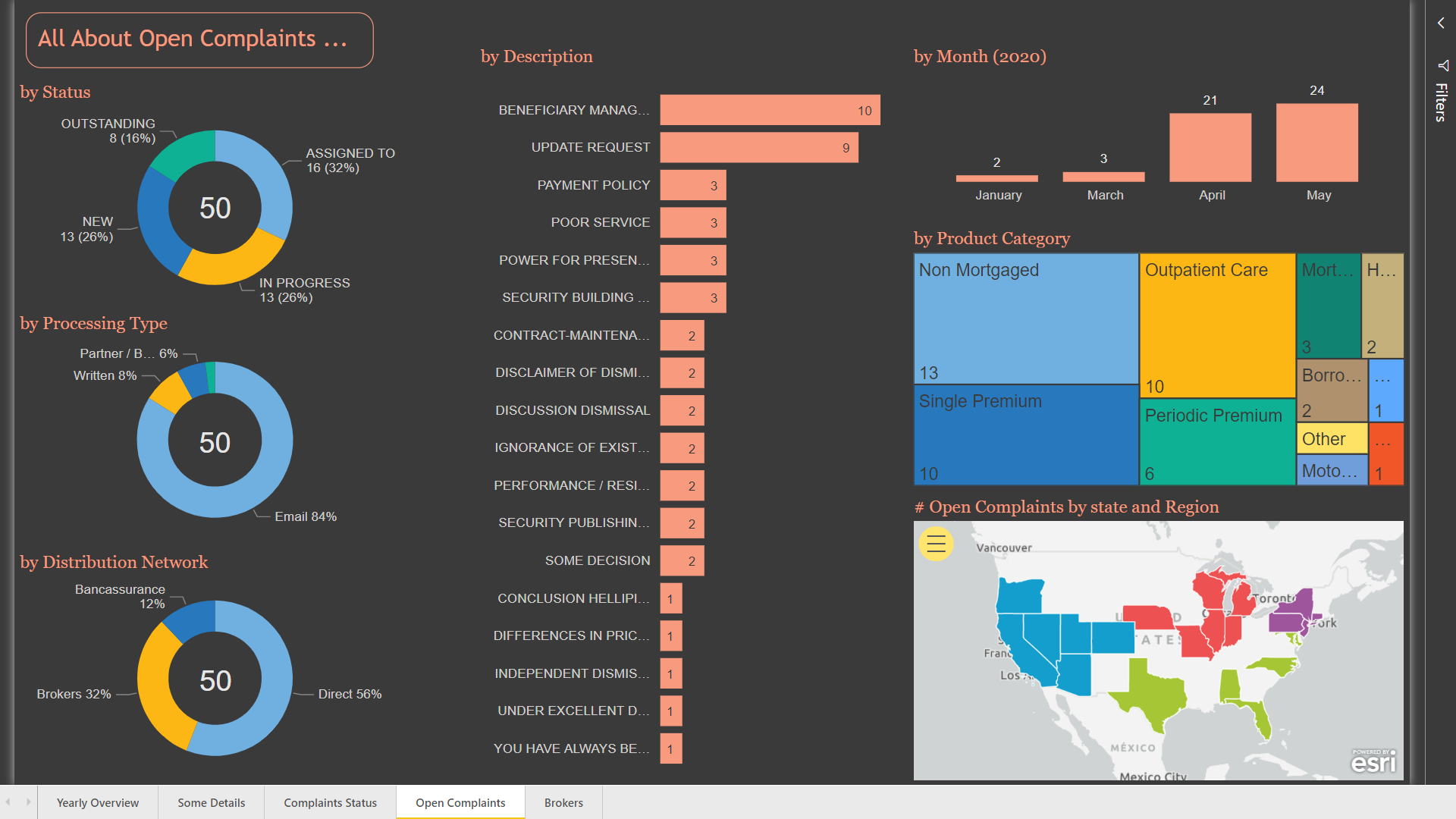
drill through this page and find details about the complaints with the filters you have made in the other page.
In the “Open Complaints” page, I created some regular graphs.
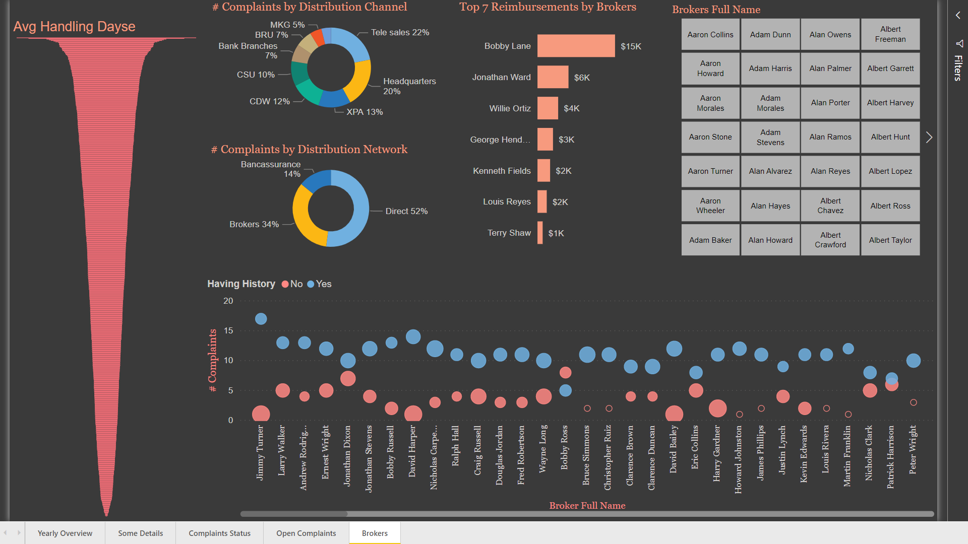
In the “Broker” Page, I used a scatter plot to show the number of complaints for each broker, as well as complaints status history –which is a column created using number of replicates column-and the percent of satisfied people. I think that the funnel plot for showing Avg handling days is so representative.
I will welcome any feedback.
Best Regards Hossein