Power BI Challenge 6 - Insurance Complaints Entry from Hideo

Here’s Hideo’s entry for Power BI Challenge 6. @Hideo, feel free to add other details of your work.

image

image

Here is the link to the report:

And here’s how Hideo described it:

I have created two parameters for status changes and completion days so the auditors can find which complaint ID files they need to look into.

After filtering those, result details are shown on the table.

Red flag pops up in visual tool tip if days to complete (average 13 days) or number of status changes (average 3 times) are over the average.

My focus on this challenge 6 are:

  • Simple colour use
  • Pages to condense
  • Logo size and locations to be consistent

To learn about the real-life scenario presented for the challenge, be sure to click on the image below.

power-bi-chal-1

2 Likes

Hello Forum,

First of all thank you so much for giving me an opportunity to join this challenge.
Following the challenge5, I needed to improve some points in this challenge6.

*Simple colour use
*Pages to condense
*Logo size and locations to be consistent

As I was not focusing those before, it became my challenge this time.
What I have done to improve these points are

  • After selected logo image from website, I have created background image by PPT.
  • After importing background image to PBIX, I have tried to match up font colours with logo colours.
  • For the pages condense, I have used bookmarks to finish in one page.

(First time to use)
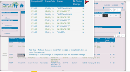
On this challenge, I have used measure slicer for the first time.

Slicer image is as blow.

By using this parameter, I wanted to change the tables dynamically with having only selected numbers.
As a result, there is no one who answered “Satisfied” after status number change 8.
Frequent status changes must take longer time to complete that’s why customer would not be happy.

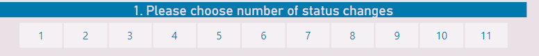
The process of this measure slicer is as below.

As a first step I have created parameter
Measure is shown as below.

StatusChangeP =
VAR maxstatuschange = CALCULATE(
    MAX( 'Status History Data'[Nr.Status Change] ),
    ALL( 'Status History Data' )
) 
VAR statuschange = SELECTCOLUMNS( GENERATESERIES( 1, maxstatuschange, 1 ), 
                       "Status Nr. change", [Value] ) 
return statuschange

We can use this parameter as a slicer

And as a 2nd step, I have created filter measure.(this is to use to filter the table we need)

Measure is shown as below.

Status Filter =
var statuschange=MAX('Status History Data'[Nr.Status Change])
var statusmin= MIN(StatusChangeP[Status Nr. change])
var statusmax= MAX(StatusChangeP[Status Nr. change])
var result= IF(statuschange >= statusmin && statuschange <= statusmax , 1, 0)
return result

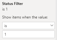
Then on the required table I set up filter as below image.
image

This was working fine on this report and I’m thinking I would explore more possibility to adopt this methodology on the other reports.

All the participants reports are so nice and beautiful.

Thank you Edna experts and all the members for letting me share the report.

Regards,

Hideo

challenge6 (Hideo).pbix (1.5 MB)

7 Likes

@Hideo,

Great job on the submission and the write up. To me, what you’ve done here is what these challenges are all about – taking the feedback received to heart, building specific learning goals around that feedback, and challenging yourself to improve in those areas. While your analytic approaches are always interesting and innovative, I think this submission is a big leap forward from your previous entries in terms of a more polished, attractive presentation style. This is exactly what I mean by “competing against yourself”.

Keep up the great work! Can’t wait to see what your future entries bring…

  • Brian
1 Like

@BrianJ

I appreciate for your warm words and looking at the details of the report. When I tried to set up the parameter, your video about Harvest Date was somewhere on my mind. Not exactly the same use but I was feeling someday there could be an opportunity to adopt that methodology.That is a great video.
I sometimes feel I could be wrong but it is really nice to get feedback from you. You are always nice and gentle to all the members. Thank you so much.

Regards,

Hideo

Very clever use of tooltips - I had not realized that you could create a tooltip of a custom size (I have just always restricted myself to the standard tooltip size). I also like the very clear red flag/white flag indicators, with guidance to the reader what those mean.

Kudos for trying to contain everything on a single page with bookmarks - given how many visuals you are using, I would probably have created two pages with the same buttons at the top, and simply linked one to the other with bookmarks. (a few less headaches)

One suggestion - on your Status Change bookmark, consider pixel cost. By that I mean you have two slicers that take up a very large section of your report, these could have been half the size, and allowed you to add some other visual (like perhaps line chart showing active complaints over time?)

1 Like

@Heather,

Thank you so much for your gentle feedback. It is nice to hear from consumer’s and also professional point of view.
I still can’t find any good medicine for the bookmark headache :blush:
I totally agree with you for the pixel cost and I have also noticed that I could have wrap column title for the top table so I could get more space to add on another charts.

Thank you again for your precious feedback.

Regards,

Hideo

Wow so impressed by the improvement over time.

And innovation around the tooltips. That has inspired me to do something just like this and future challenges.

I really like the colour theme that you’ve used and also the alignment of visuals. This is a compelling report is really easy on the eye and really informative at the same time.

It’s great to see that you’re learning so much and taking on board new ideas and techniques and putting them into your efforts around the challenges.

And innovation around the tooltips. That has inspired me to do something just like this and future challenges.

I really like the colour theme that you’ve used and also the alignment of visuals. This is a compelling report is really easy on the eye and really informative at the same time.

It’s great to see that you’re learning so much and taking on board new ideas and techniques and putting them into your efforts around the challenges. Just showcases how valuable these challenges are as a education experience.

Also I really like your creativity around the new business name and company logo. I think that’s great.

Well done on this round of the challenge

Sam

1 Like