Here’s Eze’s entry for Power BI Challenge 6. @Eze, would you like to share how you built this dashboard and what your inspiration is in building it?


Here’s how Eze described it:
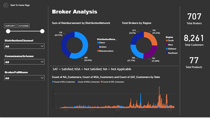
- Created a reporting homepage from where we can access three other reports
(i.e. Customer,Complaints and Broker Analysis) using page navigation.
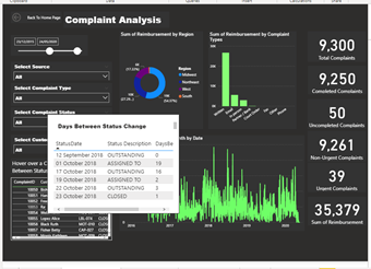
- Created a table tooltip on the Complaints analysis page to show the numbers of days between change in status.
To learn about the real-life scenario presented for the challenge, be sure to click on the image below.

Congrats on your submission here.
I like how you’ve been bold with the black background and the bright colour theme.
I think the navigation around the report works and I like how you have challenged yourself to add some new visualisation ideass like the tool tip page.
Couple of things I would have a think about for next time.
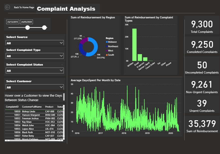
I think with both the line charts used it is a little busy. So think about maybe averaging the numbers or just working out a way to highlight the trend versus having too much granular information taking up one visualisation.
Sometimes when you have a busy chart like the average days per complaint it’s sometimes better to just spell out the trend versus showing every daily piece of information. This certainly isn’t always the case but something that just struck my eye when I looked at this particular report.
Also with your table in one of the pages I’ve never been a fan of having to scroll across to see something. Scrolling vertically is all good I think but horizontally I feel is a bit messy for power BI users and consumers.
Anyway just a couple of thoughts there for me to have a think about. I think you’ve done some great work here and maybe just a couple of small tweaks and it will take your development work to another level.
Sam
