Power BI Challenge 6 - Insurance Complaints Entry from Diana

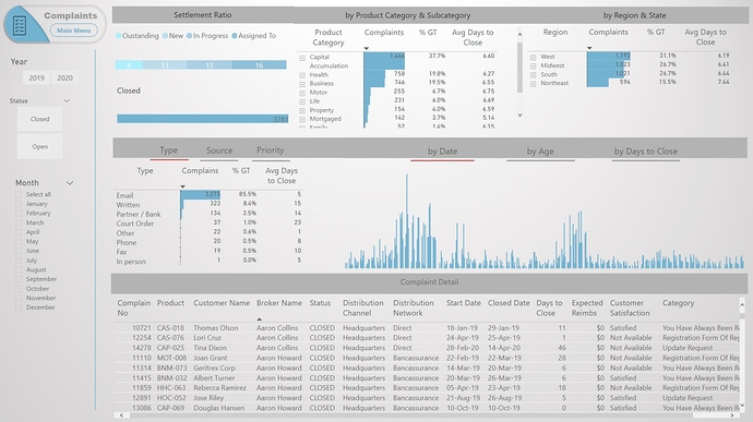
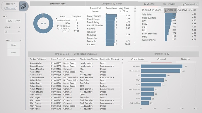
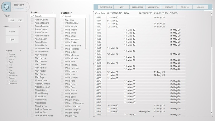
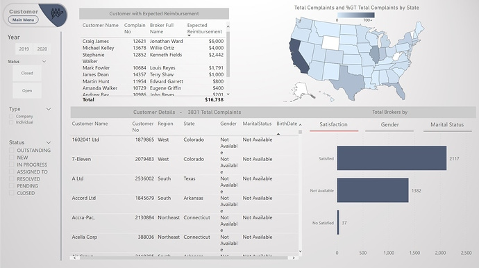
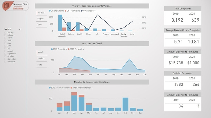
Here’s Diana’s entry for Power BI Challenge 6. @DianaB, would you like to share how you built this dashboard and what your inspiration is in building it?

image

image

image

image

image

image

Here is the link to the report:

And here’s how Diana described it:

I love this challenges and they are really a challenge. We really need to dedicate time to meet the standards.

For me a good report is the one that in a simplified way can explain a complex situation. This is a challenge when we want to display quantitative measures.

We need to be careful. Not everything that can be counted counts and not everything that counts can be counted.

To learn about the real-life scenario presented for the challenge, be sure to click on the image below.

power-bi-chal-1

2 Likes

Well done again Diana. I really like what you’ve created here and how you’re showcasing these insights.

Once again the navigation is really well thought out and implemented beautifully. It’s simple and very effective.

Colour theme is also outstanding, with all the visualisation’s and conditional formatting all blending in really well together.

I also like how you’ve broken down the analysis in two separate areas or pages in the report. Really focused in on a key attributes or key parts of your analysis. It’s almost like you’ve looked to tell a story here, which consumers really appreciate.

I also really like how you have changed up the title on each page. That’s really innovative and not something I’ve done before. With a simple change to the logo and colour it really breaks out each different part or the area of the model and report.

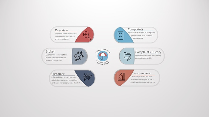
The navigation homepage is just epic and it’s a design concept that I think I’d love to use in some future work that I complete myself.

Well done on this definitely covered all of the brief really effectively here.

Sam

1 Like

Hi all,
For this challenge I wanted to continuing working with the Bookmarks, last time I got frustrated, but now I feel comfortable I like a lot you can have to much data without the views looking crowsder.

The model was easy, the data clean, the only think was having two Fact tables, but that was okay. I created a non active relationship between Status_History and Statues tables, when I needed the statuses description, I used DAX:
USERELATIONSHIP( Statuses[ID], ‘Status_History’[ComplaintStatusID] )
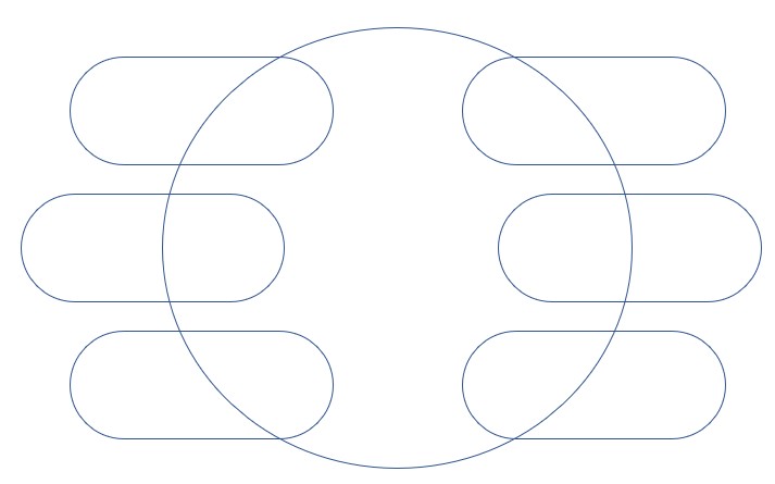
The design is simple, because is a big amount of data I created a navigation page. The creation of the navigation is simple in PowerPoint.

Insert rectangles and move the orange bottom to make it mor round

a

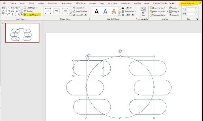
Then select one rectangle and the circle and combine the shapes: Shape Format -> Merge Shapes -> Fragment.


Then select one rectangle and the circle and combine the shapes: Shape Format -> Merge Shapes -> Fragment.
Repeat for the same with each rectangle.
After this if you move the circle is will be look like this:

d
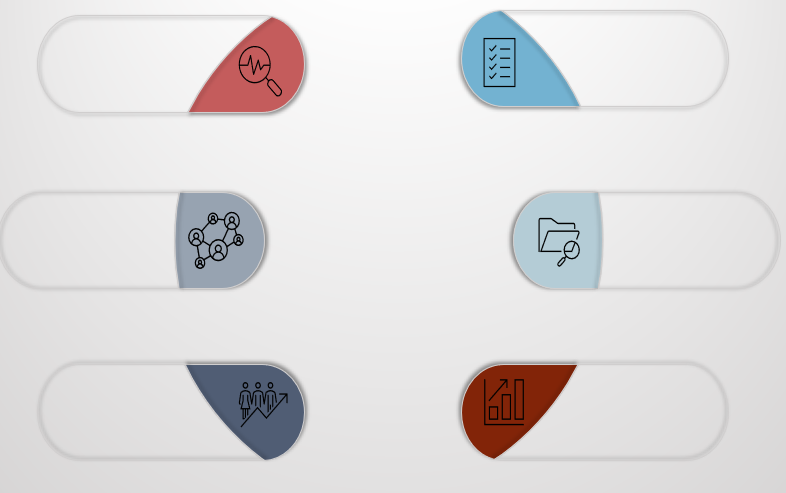
And the rectangles like this:

Now you can change colors and add icons, is god idea to group each rectangle with the circle fragment to have one image:

I saved each rectangle as a .jpg and used the image in Power BI.

Power BI visuals:

In the Overview view I have many total values that I wanted to show so I used tables and not Card.

To Show graph using different dimensions I used Bookmarks and bottoms, to avoid big number of filters. I also add a blank at the beginning in the on hoover text.

For the map I added a color image that indicate the amount of complains by color.

I wanted to do more with the History data, but I run out of time, next time I will try to start earlier.

Any feedback is welcome.

here the report

Challenge 6 - Insurance Compliance insight - Diana Bello.pbix (1.8 MB)

Thanks
5 Likes

Thanks for your comments @sam.mckay, I will try to put more complex formulas next time, I always try to do everything very simple.
I have posted how I did the navigation, really simple. You can use it whenever you want, I am very happy to contribute.

Thanks,

DianaB

your overall design and navigation tricks are really great - this is definitely going into my ‘inspiration’ files :slight_smile:

I seldom take the time to do the design work in Power Point, but you’ve come up with something worth paying attention to here, without taking up too much space on the report pages.

1 Like

Wow awesome, thanks for sharing this

1 Like

HI is there a video of how you created the power point slides for this challenge