Hi
I think this challenge was by far the most demanding in terms of deciding what to put in the report as most of the data was dimensional (a lot of dimensions!) and very few measures to play with, infact the number of complaints, total reimbursements and days taken to resolve these complaints were the only measures I could find in the data
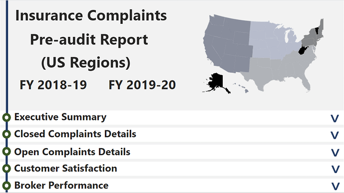
To start with the problem statement of the challenge, I just focused to keep the pre-audit report focused on the financial year 2018-19 and 2019-20 so that the user just focuses on the data from a financial year’s perspective (most financial and administrative audits focus on financial year instead of the calendar year). FY was put as a slicer on most pages of the report to keep the filtering simple and focused on that aspect.
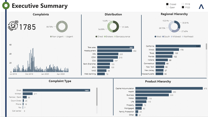
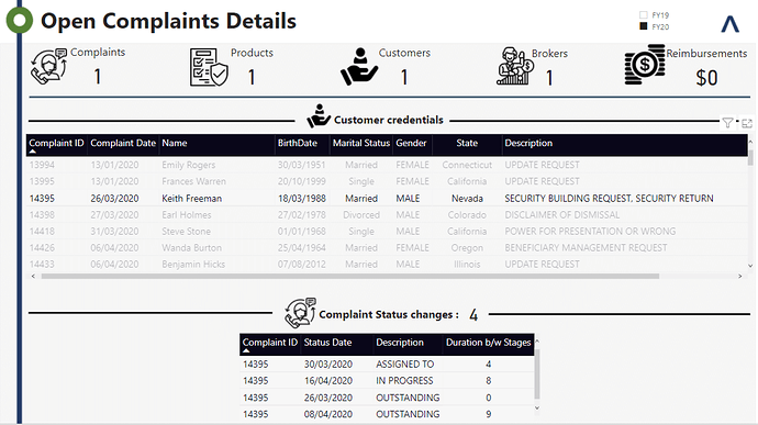
The next important aspect was the complaint itself, which could be either open or closed. I simply added a calculated column to label each entry in the ‘complaints data’ table as open or closed. This field was used to filter the report pages and segregate the complaint status analysis.
For the complaint status analysis part, the most challenging bit was to compute the number of days between status changes. I got help from this video of @sam.mckay that explains the process in a very simple manner.
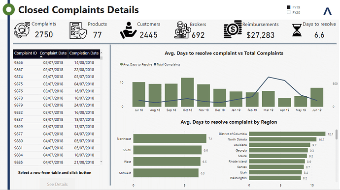
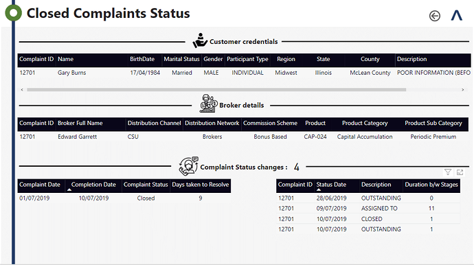
For ‘closed’ complaints, the number of complaints and average days to resolve the complaints are both helpful to give a perspective to the end user of the report about the overall complaint handling process. Each complaint can be further drilled down to see how the process changed states from ‘NEW’ to ‘CLOSED’. During this process, I found a few discrepancies in the data where the ‘complaint date’ and ‘completion date’ mismatches with the data in the ‘Status History Data’ table. I am copying just 2 instances as examples
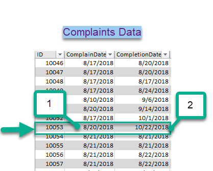
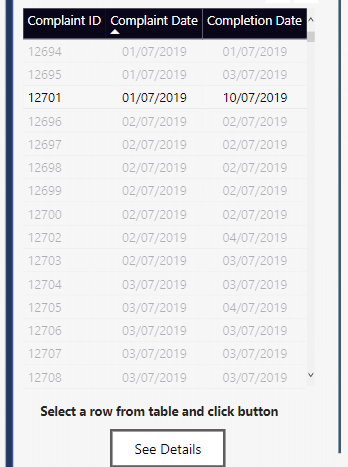
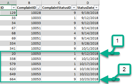
In the snapshot from the ‘Complaints Data’ table the complaint date is 20-08-2018 and the completion date is 22-10-2018, whereas in the screen shot from ‘Status History Data’ (below) these dates do not match with the status, so the duration to resolve the complaint comes out different.
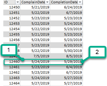
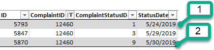
Similarly, in another example one of the dates matches and the other date is different between the two tables.
I could find this for many other entries as well. Maybe there is some confusion in understanding of this aspect on my end or the data entries are incorrect, somebody can further comment on that. I have used the ‘Complaints Data’ table to compute the ‘days to resolve’ and ‘duration b/w stages’ has been calculated using the ‘Status History’ table.
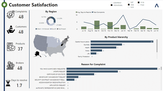
For customer satisfaction, ‘client satisfaction’ column has been used as a filter to see the satisfaction across regions, product hierarchy and the ‘reason for complaint’ dimensions. It is very hard to say what dimension the end user would prefer to gauge the customer satisfaction.
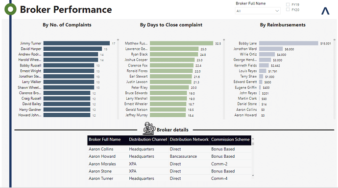
Similarly, the broker performance has been broken down against the number of complaints, time taken to resolve and the reimbursements measures so the end user can decide which of these dimensions to use for making a decision.
The report design has been inspired by a ‘menu driven’ style, where each of the options is expanded to see the details. I have tried to keep it simple and less cluttered so that the end user can use self-service BI, with minimum slicers, to navigate the report.
I am a bit divided on putting findings in the report, both as comments on each page or separately as a different page, partly because I feel Power BI enables and empowers self-service BI and the end user should be given the freedom to navigate the report in an unbiased manner, but I would love to hear the opinion of other forum members on this aspect as these findings can be easily fitted in the report. I have seen a few videos and read a few columns and the opinion of most experts is divided, especially when the report is being presented to an audience vs when it is shared with different stakeholders. I would love to hear the opinion of others for a better understanding.
I enjoyed working on the report and it was by far the most time consuming challenge, although I started a bit late thinking that it would not be that complex. I am super impressed with all the other submissions and the report by @sam.mckay is perhaps the most detailed I have seen in any of his previous showcase reports.
I hope to see some feedback on my submission and best wishes to the challenge winner!
Regards
Abu Bakar Alvi