Power BI Challenge 6 - Insurance Complaints Entry from Alex

Here’s Alex’s entry for Power BI Challenge 6. @alexbadiu, feel free to add other details of your work.

image

image

image

image

image

image

Here is the link to the report:

And here’s how Alex described it:

I went for a different approach for this challenge.

I wanted to try out some new ideas and techniques and also concentrate on the message to transmit.

GLOBAL OVERVIEW

I started with a Global Overview which contains the main information I considered useful. I wanted the end users to know the main facts and numbers. Basically I wanted them to know the “WHAT and WHEN”

The main KPI, the one related to the Average Duration, has more information to it then we consider at first glance. We have the card that shows the average duration, the trend below, a tooltip and a Visual Header

BROKERS

My second page navigation focuses on the “WHO” question.

ZOOM into MAR-APR 19/ OCT 19

By now I should have the attention of the public and the story needs to focus to smaller details.
I built the navigation so that the user could drill down into 2 periods that are the outliers of the data.

2 Periods are in this category, MAR-APR 2019 and OCT 2019.

INSIGHTS AND RECOMMENDATIONS

The difficulty of this challenge is that we have to provide a lot of information to the user. But to much information presented could create to much mental fatigue.

In order to avoid that, I concentrated to show only informations I think are useful and added an Insight and Recommendation page.

To learn about the real-life scenario presented for the challenge, be sure to click on the image below.

power-bi-chal-1

Hello all,

For this challenge number 6 I wanted to try something new.
As @BrianJ presents in his inspiring video: Five Strategies to Enhance Your DAX Toolbox , regularly pushing yourself to build something new challenges yourself to expand your PBI skillset.
For this challenge, my first thought was to build buttons, white background and a clean, professional look, as we all expect when we think about audit.
But afterwards I thought that this challenge is the perfect occasion to think differently. Try (even if I fail) to do something I do not usually create.
I do not use often black backgrounds or bold colors or interactions that I never created before in my day to day job, so I use these challenges as an “experience lab”.

So, what I think was difficult in this challenge was the amount of information we had to present… There were so many combinations of numbers and dimensions to present… I came with the idea of using blocks, like in Windows 8, but without using so many different colours. What I liked about the blocks in Windows 8 was the fact that it had icons, text, it was quite appealing… So I thought I could present different things in different blocks for the KPIs.
The second decision was to think about the KPIs that might be interesting. For finding out the KPIs I put myself the following question : So What?
If I chose to present a certain number, what does it bring to the general story? Why is it important to present, where do I want to go with it?
I like creating reports by creating a story. It has to be clear, to have a focus, to bring something new. it has to be visually appealing of course, that’s the first impression you make, the reason someone would stop and look at your report.
What I was afraid was to present to much information, lose the focus and attention of the user.
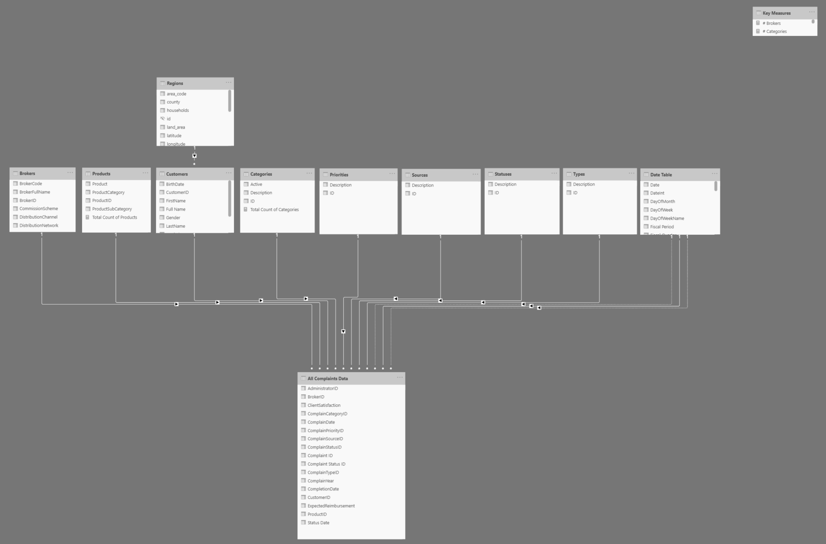
THE MODEL

The model I used is the following.
I went back an forth and tried out multiple variances, but at the end the easiest for me was to merge Complains Data and Status History Data into one single Fact Table

From the transformation point of view, I used a pretty nice trick for automating the last 2 years of data using Power Query. The trick is detailed in the following blogpost shared by by Gilbert Quevauvilliers

REPORT, INTERACTIVITY AND VISUALS

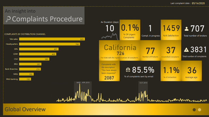
I started with a global overview that presents the main KPIs I want the users to be aware of. My goal was to lay out the cards and let the user know the overall situation.

I started with the Average Duration in days. It is the main KPI, the one that everyone is interested to see.
It is strategically placed, first number on the far left of the blocks. It has a trend under the number that also has the advantage of highlighting even more the card. For the trend I used a Moving Average on a monthly basis).

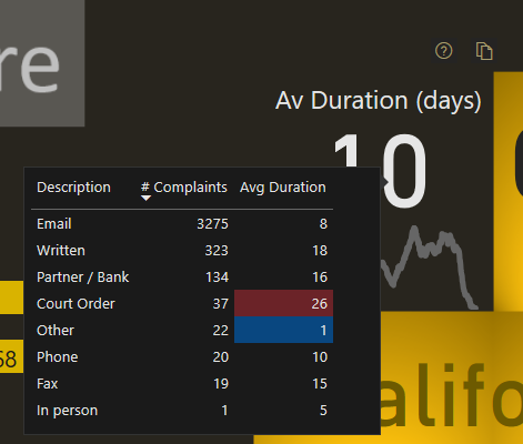
The card Average duration has a tooltip that splits down the duration and the number of complaints by type: email, written etc.
I think this is important because based on the channel of complaints, we can focus on taking action.
Another small trick I wanted to test is the following: Highlighting the minimum and the maximum only in a table.
Color always catches the eye. I wanted to facilitate the reading of the user to the details I wanted him/her to see: Where do we perform well, where we do not perform well?

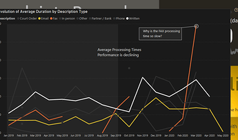
Last but not least, I created a visual header tooltip to present an insight concerning the evolution of complaints by type. I used it as a static view, that is not influenced by the different interactions. Knowing that, I added additional information, shadows and text to be clear on the message I wanted my users to understand.

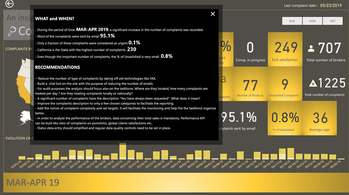
The line chart with the two active buttons fixed on the two periods: Mar-Apr 19 and Oct 19 is the solution I found to invite the user to focus on the outliers. It is also a good strategy of making sure the user follows the prepared journey.


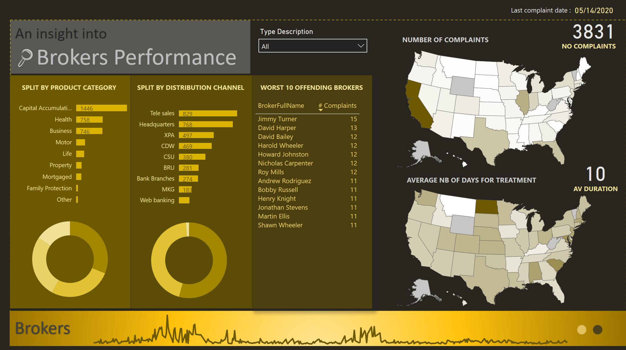
I added dots for creating interactivity for a second page that concentrates on the brokers
In this page I let the user play around with the interactions and easily check the worst 10 brokers based on different dimensions. For the piecharts, I am not showing the datalabels because I want to push the user to discover and invite him to click or hover and explore
The line chart on the low part of the page has two main advantages: it is a filter and it adds visually an elegant touch
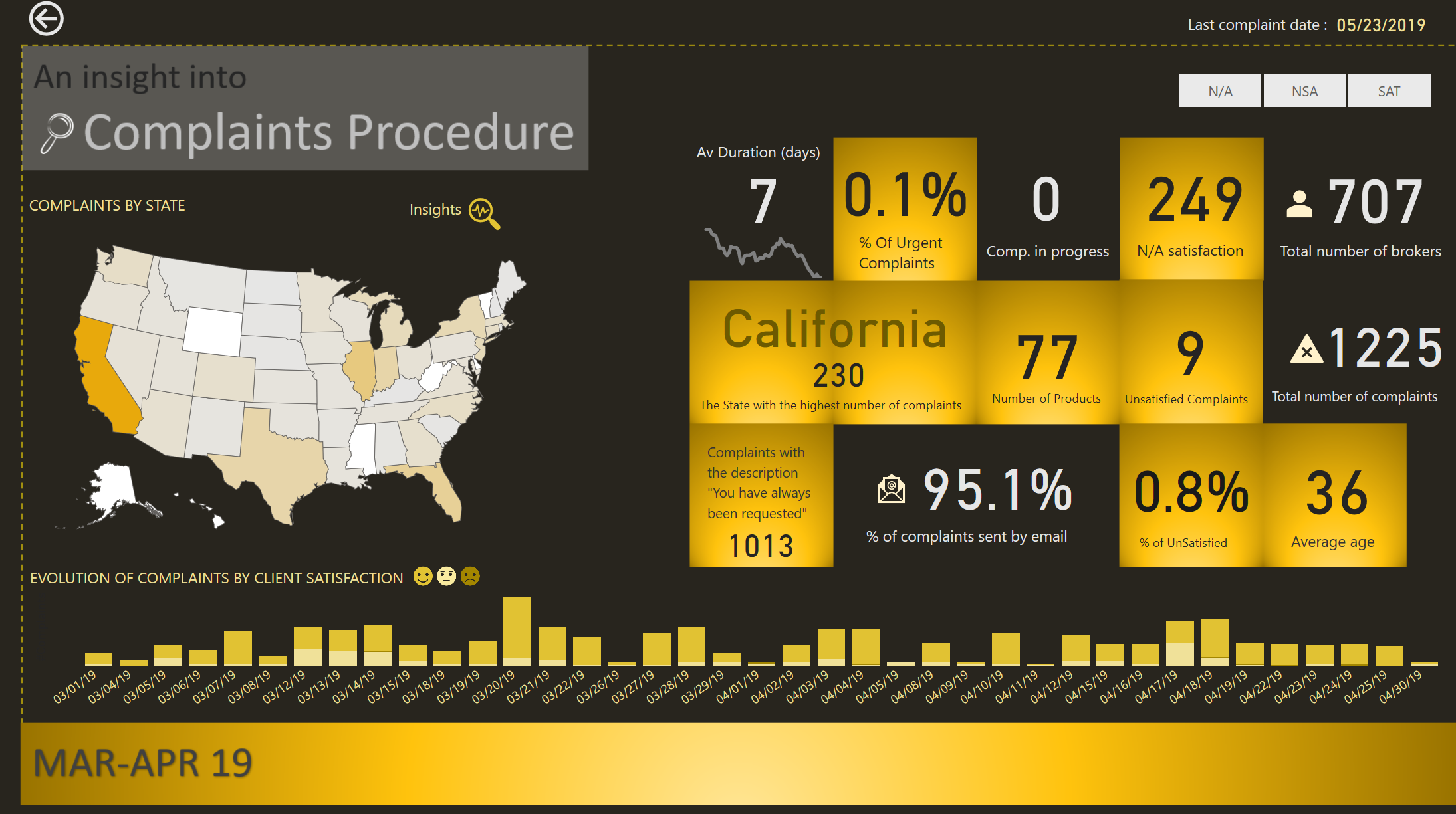
ZOOM TO DETAILS

Here I focus only on the period that has a lot of complaints. I created a similar type of analysis but with a slight change. First I added a map to localize by state the complaints, second, I focused on the evolution of satisfaction. I was inspired by @DianaB legend in Challenge number 3, so I used the same approach.
An user will understand very quickly that most of the complaints were addressed by email, were considered not important, the users are pretty satisfied, the average duration is good. What I wanted them to ask themselves (and maybe focus on during the audit) is the description: “You have always been requested”. Does it mean that basically 83% of the complaints could have been avoided? That could be an interesting insight…

Last part of my report concerns the insights. It is like a conclusion, the signature of my report. I create a synthetic description of the findings just to make sure the insights I wanted to push forward are well transmitted, and I add my recommendations.

As usual, it was fun to participate to this challenge. The quality of the reports being submitted is impressive. It only motivates you to push more, read more, learn more for the following challenges.

Best regards,
Alex

For those who want to look closer at the report, I attach below my pbix
Challenge 6 AlexBadiu.pbix (1.5 MB)

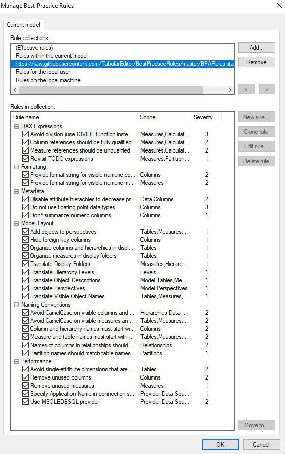
P.S. I almost forgot. I used Tabular Editor to test Best Practice Analyzer. I imported from the github lots of rules and added on the local machine a rule for disabling auto time intelligence. I am taking some time to make sure I understand all these rules and which ones I want to keep as reference.
This is my second challenge where I test Tabular Editor functionalities. In one of the past challenges I created my first calculation groups.

9 Likes

I think that one thing that stands out for me most with your report @alexbadiu is the zoom interaction you have for the two periods, with the insights pop-up.

This is one area that I always struggle with, because so few of my reports actually exist in a static period of time. I rarely think to actually put my conclusions into the report - as the period being evaluated will continue to change. I think I’ll have to pull this report up for inspiration next time I need to present a report that represents a slice of time.

I also like how you have drawn the user into those zoom areas, subtle, yet it does the trick. Without reading your recap, I clicked straight into the Mar-Apr zoom.

Now if I can only figure out a way to build that same zoom logic into a report that is not static… (a puzzle for sure :wink: )

3 Likes

Thank you for your feedback @Heather.
You are right concerning the dynamic period of time.
I am also very interested to know how to apply this logic dynamically. I suppose it cannot be very simple taking into consideration that the highlight should be dynamic and also the button to lead to /drillthrough to the Zoom area should be on top.
I think it works best on static periods of time. I suppose it depends on the type of report you are building. I considered this report as explanatory. It’s purpose is temporary (pre audit). All designs ideas are therefore permitted :slight_smile:

1 Like

Exactly! And that is why it is so intriguing to me, because my work is dynamic most of the time.

I think making the logic dynamic would involve something more like

  1. a drill-through button for navigation (with the drill-through destination handled dynamically)
  2. conditional formatting on the chart in question to highlight the period. In the case of a line chart, you might even need an additional measure to handle formatting an entire period (month or whatever seemed logical)
  3. the drill-through button would probably need to have dynamic text associated in some fashion to let the user know where they were going.

I might have to spend some time playing with this to see what I can come up with - thanks for the inspiration! :slight_smile:

2 Likes

@alexbadiu,

Thanks so much for taking the time to put together such a thoughtful, detailed writeup. Every challenge, I look forward to seeing your report design, since they are always strikingly creative and beautifully implemented. I don’t ever expect to be able to put together a design this good, but having you walk through your thought process start to finish, explaining what you are trying to accomplish with your design, where you get your inspirations (Windows 8 menus?!?!), and how you expect the user will interact with your report are all great questions to ask/evaluate in improving my own designs. Plus, it’s really valuable to hear how folks like you, @datazoe and @greg are leveraging the power of Tabular Editor in different ways.

As always, phenomenal job on this entry and writeup. Tons we can all learn from here – thanks again for sharing.

  • Brian
3 Likes

@alexbadiu This report is really amazing not only to look at, but also with all the insights it provides. I’ve also struggled with the black background and you pulled it off so elegantly.

The little details also make this report – highlighting of the ranges that stood out, the FAX processing call out, and providing recommendations.

Great job!

I haven’t used the best practice analyzer yet, but that is super cool too!

2 Likes

Wow wow wow

Just so good.

One of the most inspirational reports I’ve ever seen. Taking Power BI to its extremes visually. So compelling, well done.

The creativity here is superb. I’m looking forward to highlighting many aspects of your reports on the channel with some videos.

Everything works here, the colours, the visuals, the insights, the navigation. All unique and all seamlessly woven together. Just beautiful.

The tooltip also. That is a magic way to showcase dynamic text and analysis. The colours work as well I think because it blends in the black border on tooltips (which I don’t like)

I also agree having a dynamic visual highlight the outlier results like you have down would be epic, I’m sure there is a way. Will just have to play around and experiment.

My only concern is you would set the bar so high your stakeholders would expert the same innovation every time you produced something!

Crazy good.

Well done this time round.

Sam

2 Likes

@BrianJ, I am very touched by your message. I think with all the great reports people are sharing every challenge, everyone will improve from the design point of view very fast. While the design is important, the analysis, technical knowledge and statistical insights are key. Your knowledge is so impressive and unique from so many points of view, that I am honored to receive such a feedback. Thank you very much for everything! I have more pressure now to continue producing good looking reports, and you know…creativity is not a constant… Sometimes it comes, sometimes it doesn’t. :slight_smile:

2 Likes

Thank you very much for your very positive feedback @sam.mckay! I am always trying new things, and some ideas I had for some time, but never had the opportunity to test. I can say that the challenges are the best place to test. And what a satisfaction it is to give life to ideas! And the feedback helps tremendously!
I can say that I absolutely adore your designs and I envy the speed you put everything together. I hope one day to reach that level of experience, clarity and knowledge !
I think what is great about this platform is the leading by example. You guys are awesome!

That’s great.

Within the Analyst Hub we are designing a personal portfolio app, which will enable you to showcases this great work more.

Everyone deserves to see quality reports like this, and I’ll certainly be pushing this in some youtube videos in the near future.

Sam