Here’s the entry from one of our non-member participants, Alejandro.
Here’s how Alejandro described it:
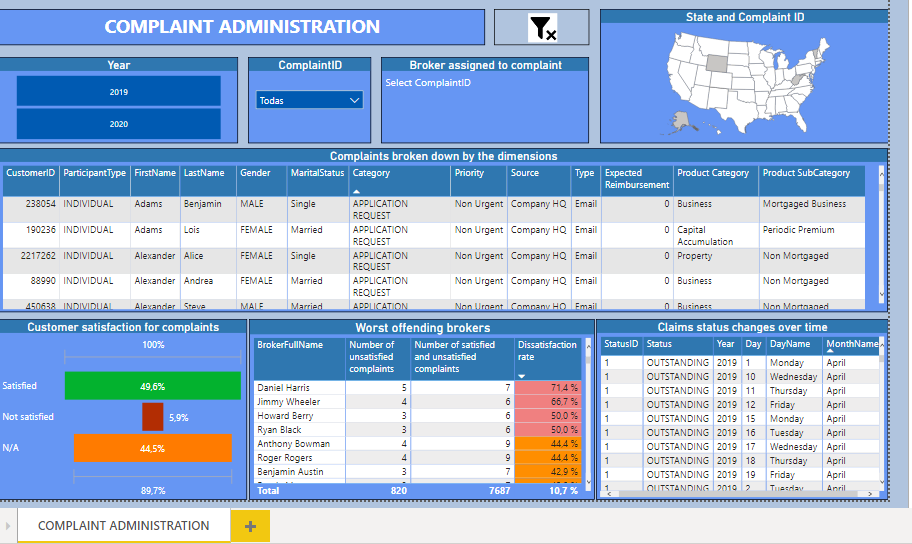
It is a simple model for the last two years, composed of a single page that contains the specific responses to user requests. Using two segmenters; one for the years and one for the ComplaintID.
By selecting a year and / or a ComplaintID, the dimensions for each complaint are displayed in the table called “Complaints broken down by the dimensions”. The map shows the state where the complaint occurred and the card shows the broker’s name and code.
The table called “Claims status changes over time” indicates the statuses of the complaint over time.
The funnel type graph called “Customer satisfaction for complaints” indicates what the customer’s feeling was when their complaint was addressed (satisfied, not satisfied or N / A) in percentage.
The “Worst offending brokers” table shows the brokers that have produced the most dissatisfaction among clients, measured in a dissatisfaction rate.
To learn about the real-life scenario presented for the challenge, be sure to click on the image below.

