Power BI Builds 4 - Delivery App Review

Hey all,

Here is my submission. I have created a report page for each of the key metrics that management are interested in. Each page is filterable via the bar charts so that individual store / warehouses can be viewed.

Store / warehouse combinations are shown in the table along with their performance compared to the average.

The Match Method page is filterable via whether or not it has scan damage so that we can identify stores/warehouses not scanning when they should be and remaining pages filterable via the match method so that we can view the performance when the app is used and when it is not.


7 Likes

@Luke,

:+1:. I like this entry a lot – it’s clean, attractive, and most importantly it directly answers the questions at hand without making the client do a lot of work on their own to find the answers.

If I might, two minor constructive suggestions:

  1. I like the top 10 charts at the bottom of each page. However, I think it would also be really helpful to add a toggle that lets the manager/client switch to a bottom 10 view and back. Would take up very little real estate on the page, but add substantial additional analytical power and insights.
  2. For the line charts, I would suggest adding an average line to each. Alternatively, I might suggest replacing the line chart with a frequency or probability histogram for each metric. Personally, I find the latter easier to read and better able to generate actionable insights from.

Really nice job on this.

– Brian

1 Like

Below is my submission:


Challenge4 Link

Review:

  1. Need to split the arrival date and then format again as the date time column and calculate the duration between the Arrival time and Departure time, join with date.
  2. Created Key measures to get the count of deliveries, matched, scanned, returns, total damaged and percentages.
  3. Created overview key measures to get the dimensions & measures for min and max damages, returns for warehouses and stores
  4. Used some custom visuals like cards with states for word wrap, tornado chart between 2 measures, timeline to get overview.
6 Likes

Thanks @BrianJ for the kind words and really appreciate the feedback! Fully agree with both points. Both would have been fairly simple to implement and provide further insight.

1 Like

Hi Haroon,

Wanted to steal some minutes from your time to check three assumptions:

  1. In an ideal process for everything to be perfect, the input should be scanned, no damage to label or general damage. Returns would be a separate process as it can also represent the customers options to return it and not an actual defect.
  2. If Label Damage and Damage are set to false, it means it was an actual choice to input it manually and not to scan it.
  3. If Label Damage and Damage are set to false but still returned, it means it was a customer choice or a business reason behind.

Thanks,
Michael

Dear all,
Please find below my submission for challenge 4.


It was not an easy task for me to answer this challenge request :
“The management is now looking to evaluate how the business has reacted and how effective the app is.”
I hesitated between building an interactive report with a focus on data exploration and building a report more static focusing on analysis/insights and information I wanted to push forward.
As in the challenge request it was not mentioned how will the analysis be consumed, either by sending the management a link and letting them understand the report by their own, or a presentation where you develop your thoughts and use the report as a support, I decided to reconciliate the two worlds and do a report that is both interactive and informative.
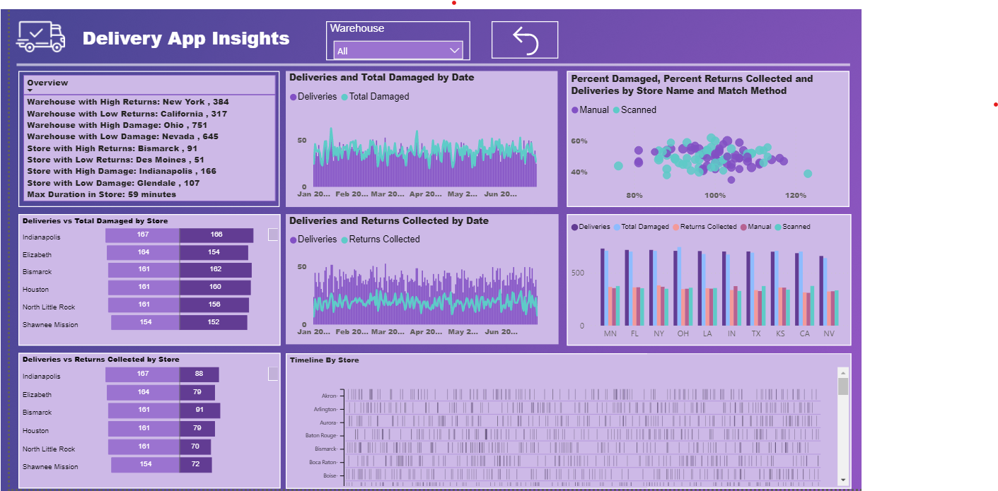
I decided to present my work for this challenge as an application that focuses on 3 main topics: UNDERSTAND, EXPLORE, TAKE ACTION.
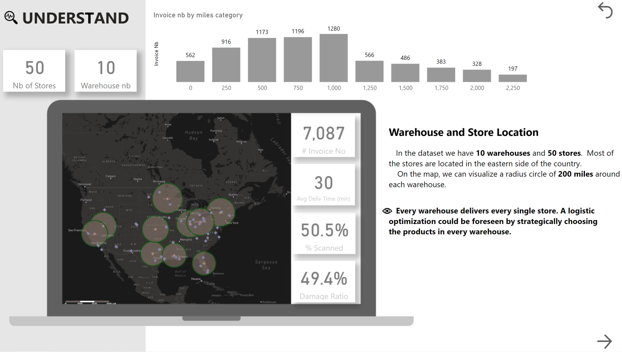
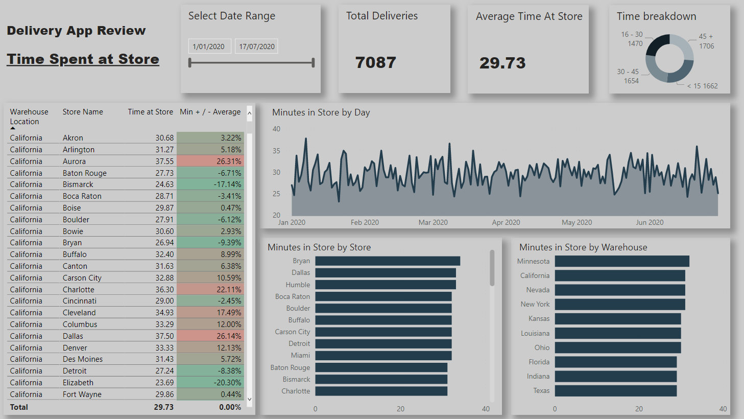
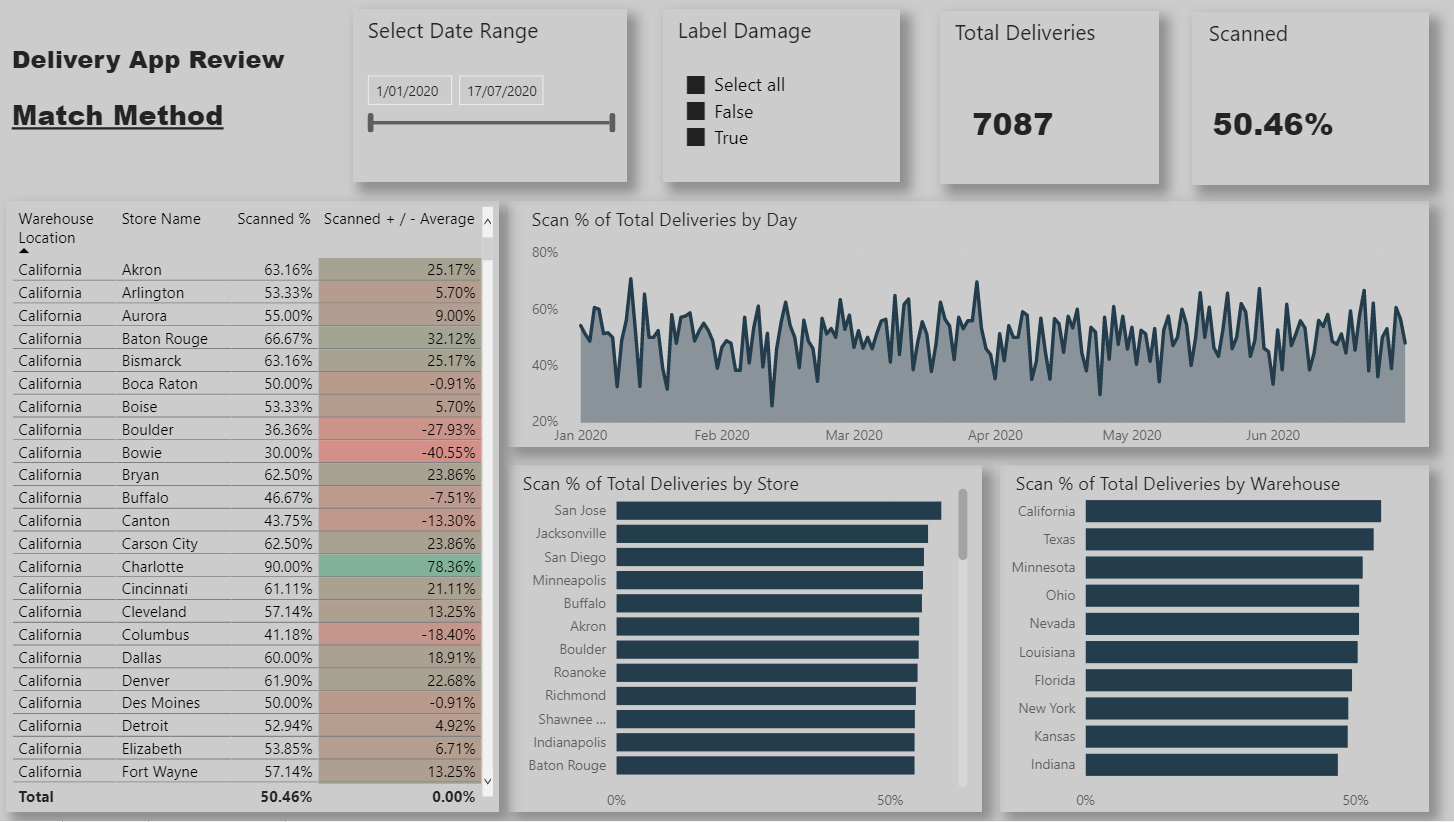
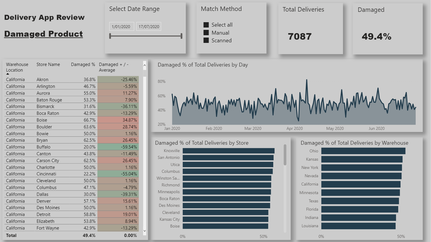
1. UNDERSTAND

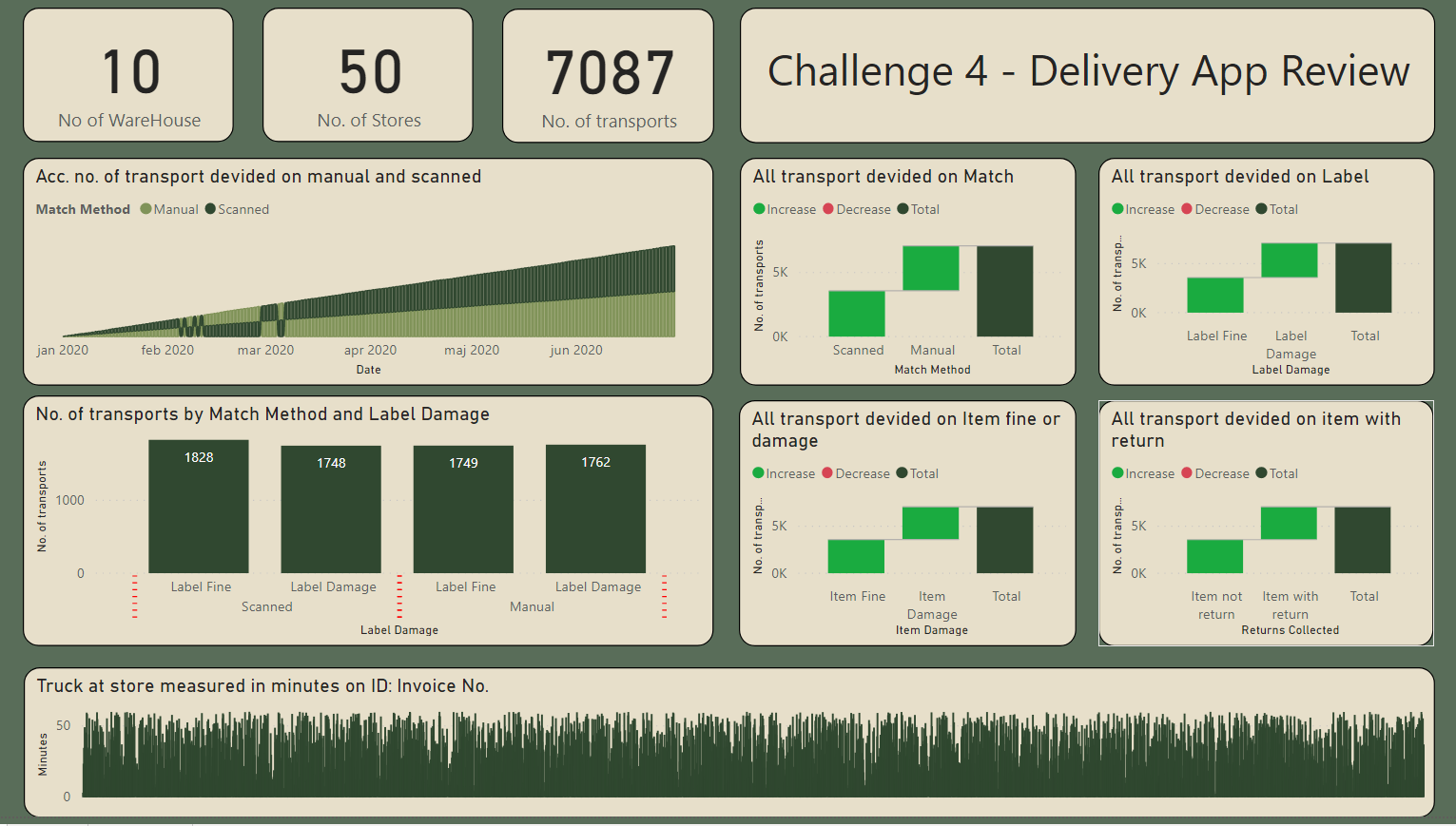
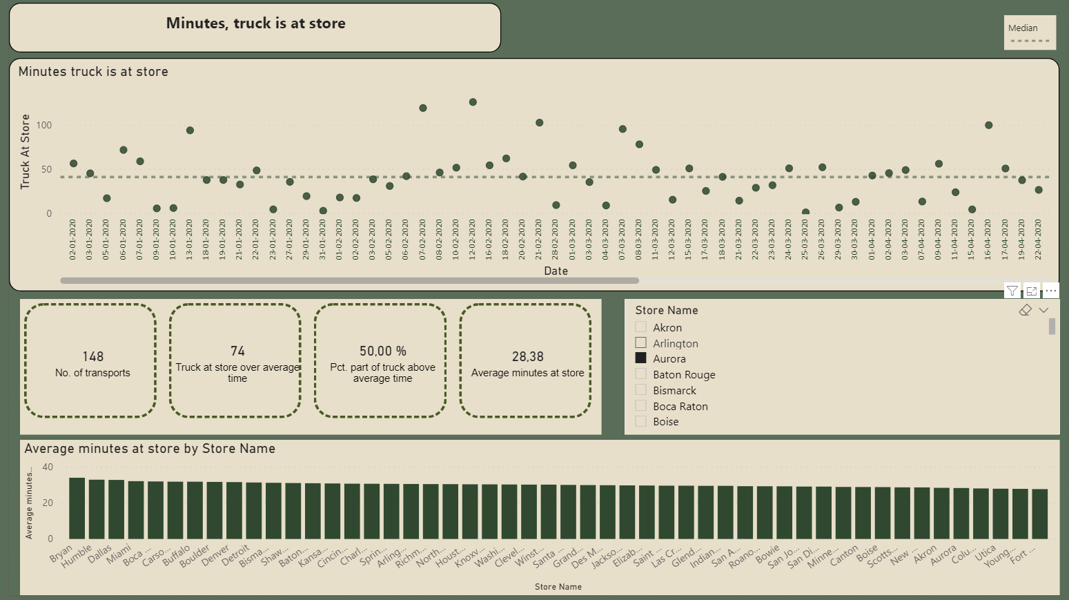
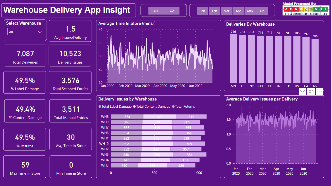
==> Start with the base, the warehouses, the stores, the main KPIs.

The data provided did not include information related to: latitude/longitude or distance.
For me these information are very important to show. When I was exploring the data for the challenge I observed that every Warehouse is delivering every store (which does not seem a very good strategy). As the stores can be potentially very far away from the warehouse, I focused from the beginning on this aspect. But where to take the data from, how to calculate the distances, how to show the data?

  • I used Alteryx, another tool I am using for my work to create a dataset with all the warehouse/store combinations and distances (as crow flies).
  • I also used Alteryx to create a 200 miles radius around warehouses. I tried of course different radius sizes, but 200 miles made the most sense to me, as it covers most of the store locations
    • I wanted to create a dynamic map directly on Power Bi to re-create the map I genereted. I created an account on mapbox, seen some videos on the subject, searched for shapemaps on the web, and tried to build an awesome map. It didn’t work. It didn’t work with the new Azure Map either… So I adapted…
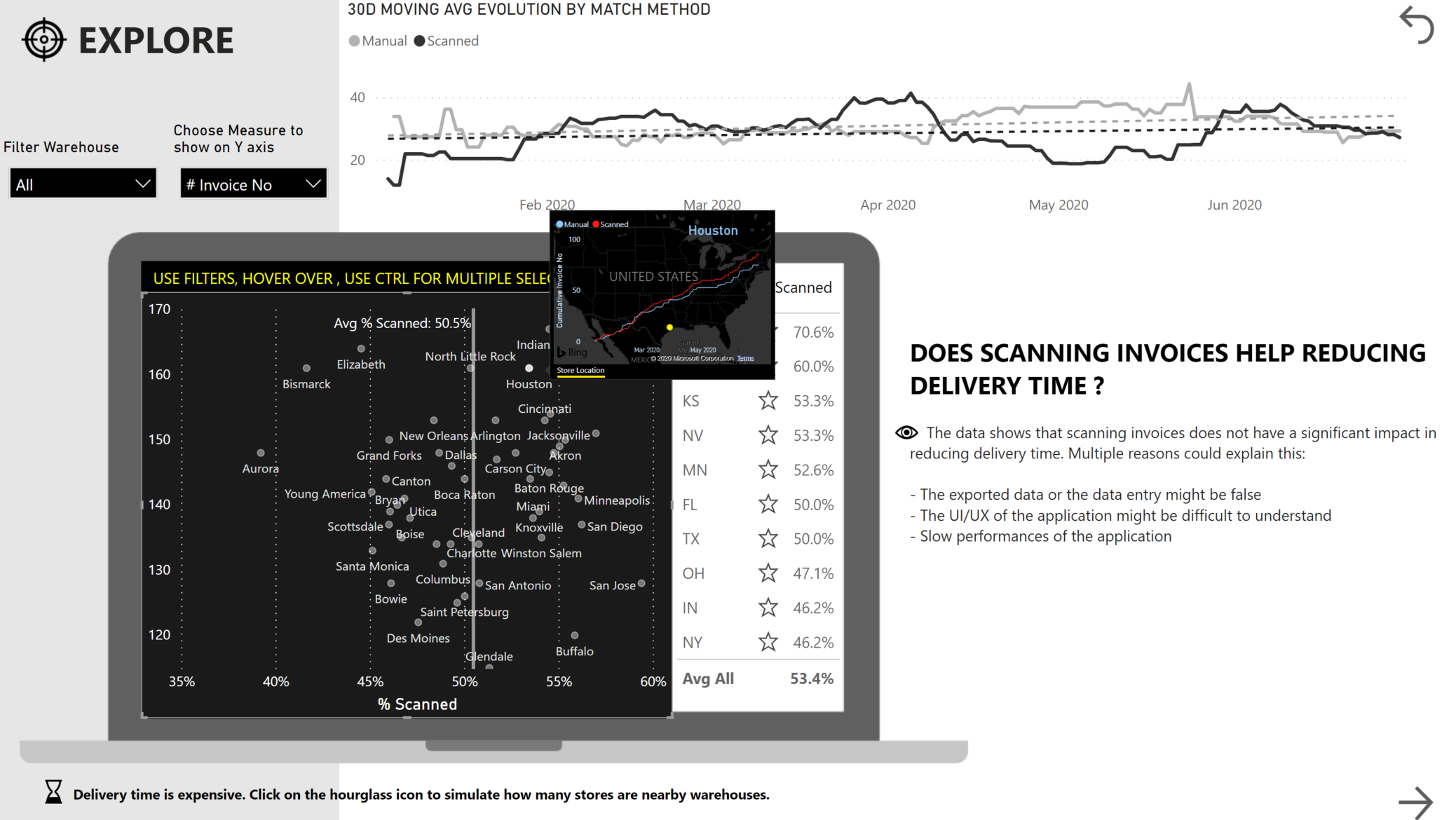
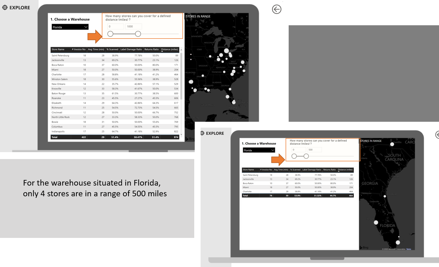
2. EXPLORE
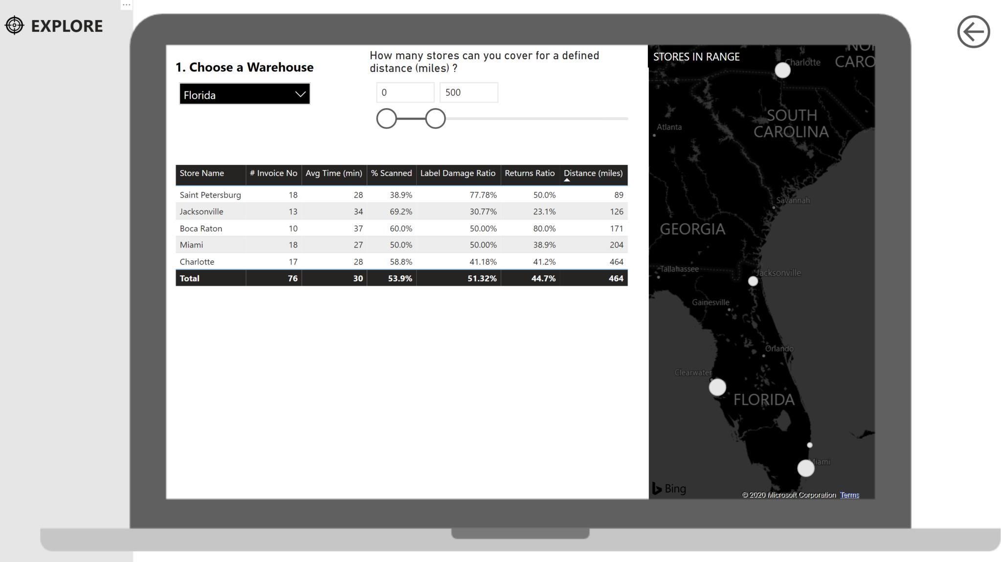
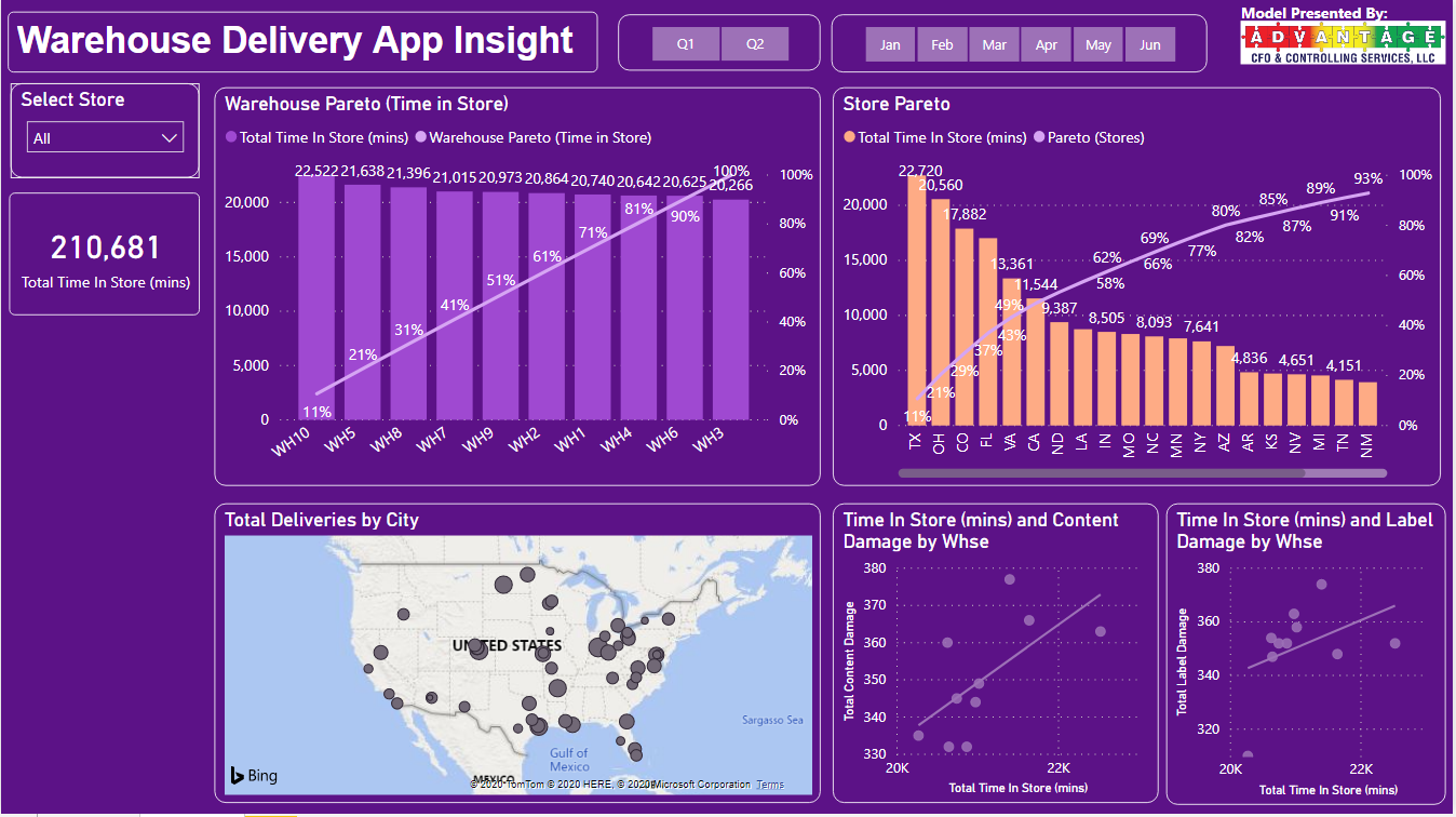
I used as an image the map I created with my other tool inside the Understand section, and used a standard map for simulation/scenarios inside explore section. Basically, the user can play with the distances to find out for a given warehouse, how many stores are in a choosen distance. I needed to use a specific technique I never used before with a supporting table.

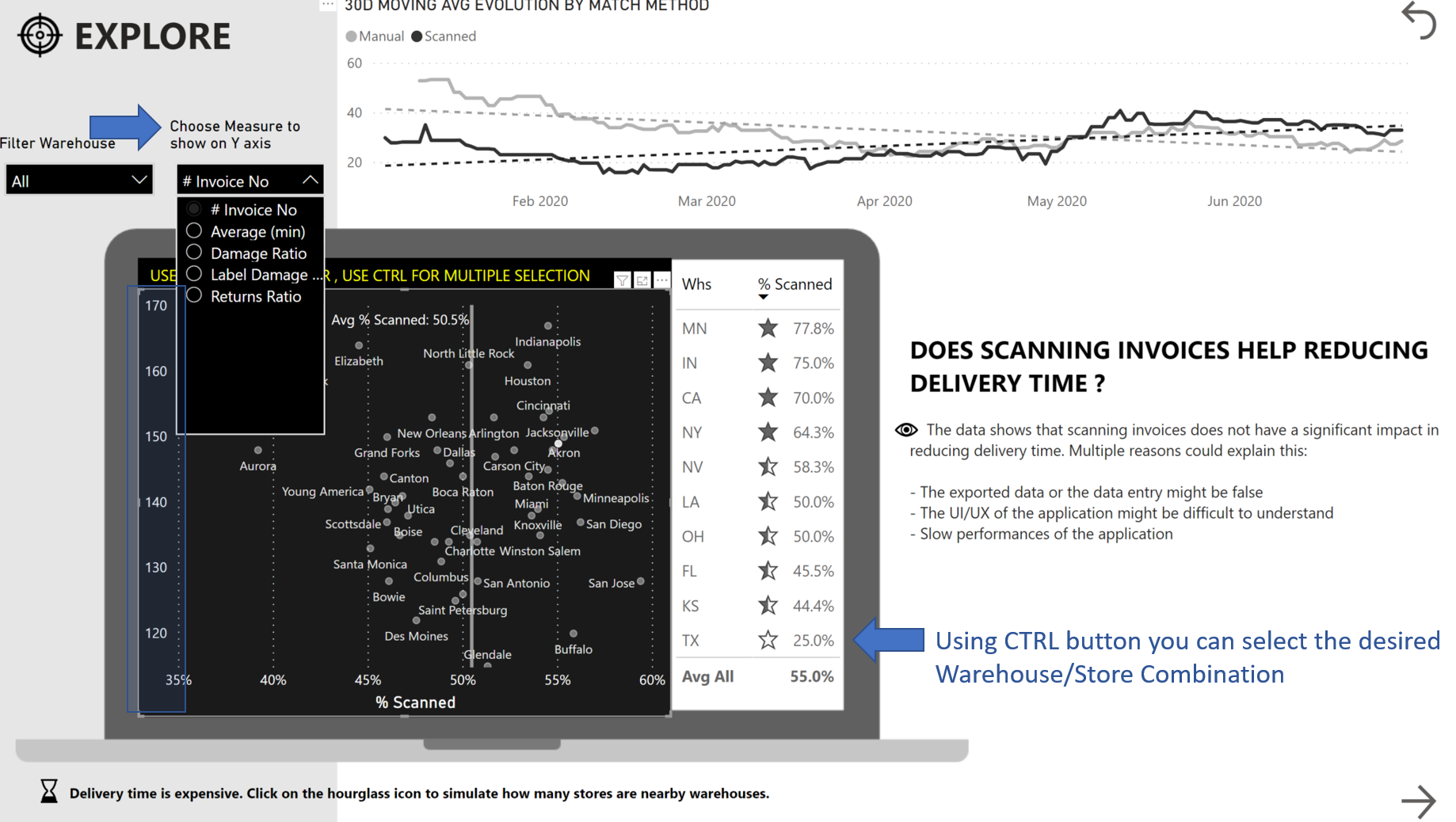
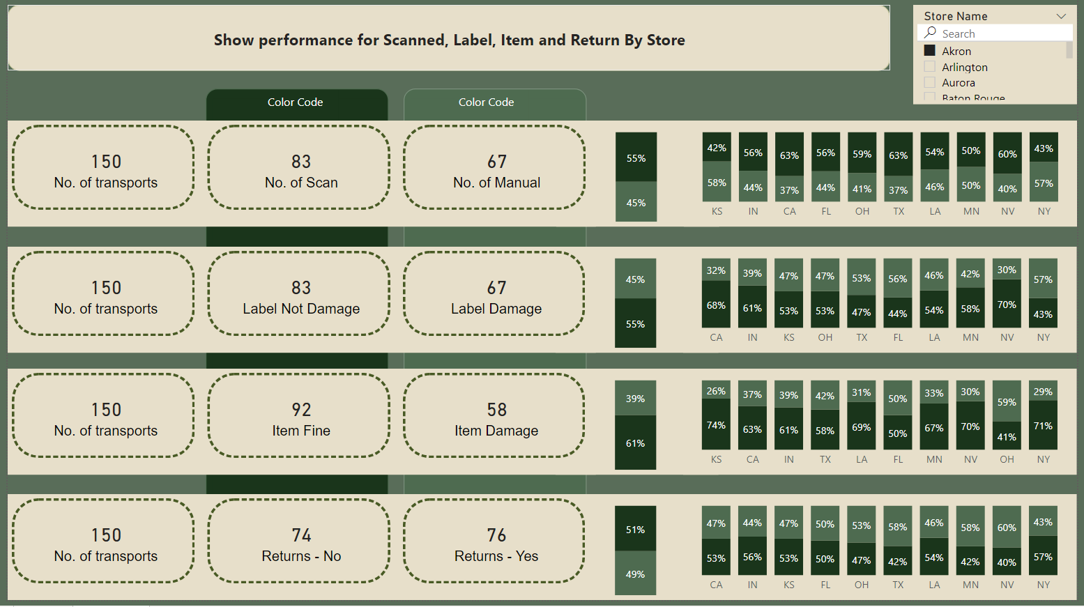
The Explore Section was built to be very interactive. You can for example personalize your Y axis to see the scatter chart and warehouse/store performance by volume (number of invoice) or by delivery speed.
You can also hover a store and see the evolution of scanned & manual. Using the cumulative number of invoices helps seeing the dynamic of the evolution.
Last interaction concerns the 30D moving average for Avg Delivery TIme. It shows when was the use of scanned technology faster than the manual and how it evolved.
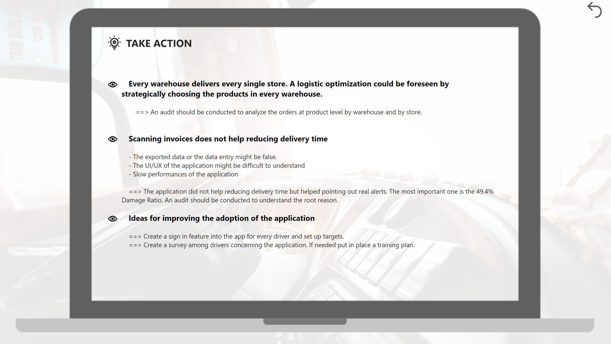

3. TAKE ACTION
Here is the conclusion of the report. After knowing all this, what are the next steps to be taken.
I retook the findings of each section and proposed actions.

I spent many hours on this report, a lot of testing, a lot of learning, but it was great. I am happy with the result.
I hope you as well :wink:
Best regards,
Alex

12 Likes

@alexbadiu,

Magnificent job on this! Really robust analysis, organized logically with a beautiful design.

Two questions:

  1. I’m curious what assumptions you made with regard to citing the locations of the warehouses? @greg and I took different approaches, and I’m thinking that perhaps you’ve used yet a third approach.

  2. When calculating distances, did you use the Haversine formula or a map API call?

Thanks.

  • Brian

Thank you very much for your feedback, BrianJ!

  1. As I did not know exactly the geographical lat/long of the warehouses I considered the middle of the state.
  2. I did not use neither Haversine formula or map API call.
    I used spatial analysis inside Alteryx Using the latitude and longitude I created centroids for warehouses and for stores. I selected afterwards my Centroid Source and Destination Stop. The Distance calculates the ellipsoidal direct point-to-point. It would have been even better with information regarding DriveTime, but this option is an add-on I do not have.

Best regards,
Alexandru

1 Like

Dear all
Here is My suggestion.
Picture: The overview.

Will show over time if there has been an improvement of Match Scanned or manual.

To show the process when scanned, what was the quality of the label. Also, when the process for label is manual registered

Then on four visualizations give a concentration on how the slit have been on Match (scanned), Label quality, Item quality and Item returns.

Picture: Minutes

On each store to see how many of the transports to the store have time over the calculated average time for the store in pct.

Picture: Performance

From the store to see how the divide for Match (scanned, manual), Label quality, Item quality and Item returns have been for the store and to see from which warehouse.

I would also like to show on map. But it would only be possible for Warehose as a town have duplicates in other states.

My PBIX file:
Challenge 4- Delivery App Data Amdi Silword.pbix (1.3 MB)

5 Likes

Wow very creative.

Really like the colours being used across all reports. Seems like everyone is getting some great inspiration from past challenge winners.

2 Likes

How are you sharing? The way I am trying to do is prompting for credentials.

@sunip After publishing on Power BI Services, open the report and click on the three dots at the top of the report and go to Embed and there is an option to publish the report into public web. It gives you a web address with your report and you can share the link.

I was able to figure out now. Thank you, Neba!

1 Like

Hi everyone! Great to see all of your submissions to the 4th Power BI Challenge.

Please send your entries to our email: powerbichallenge@enterprisedna.co

Thanks for your participation to this challenge!

Here is my submission and published report.

Kind Regards,
Chad

5 Likes

Hi @michaelsampsonidis

Your assumptions are correct.

Regards,
Haroon

I’ve posted my development up on youtube

I walk through how I went about the challenge.

Sam

10 Likes

Hi All,

I am new to Power BI and this group and already loving the level of creativity people are exhibiting in their reports.

I would like to thank Sam for reaching out to me and posting my challenge in non-members area as I couldn’t post by myself due to some technical issues. Frankly speaking, I thought that my work won’t be submitted but thanks to Sam and Enterprise DNA once again.

Looking forward to learn a lot from this group.

Congratulations to @alexbadiu!!! Your submission was :+1: :+1: :+1:

@MudassirAli,

Welcome to the forum! - great to have you here.

Thanks for your participation in the challenge. Can you please post the link to the nonmembers area and your submission? I haven’t seen that yet but would like to take a look.

  • Brian