This was a unique challenge that I enjoyed working through. It was working with data that I hadn’t really dealt with in any specific way in the past even though there was a lot of common parts to the data set.
So nothing that couldn’t be curated and analyzed really well in Power BI.
I recorded most of my development so you can watch it here

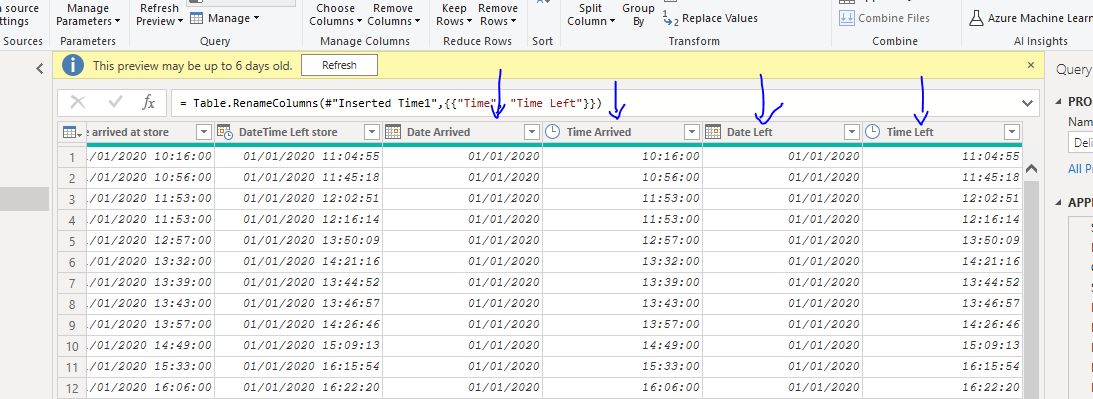
The only part of the data that was a little tricky was the date/time data. Columns of information like this are not useful in Power BI, so you need to break them out like the below.
Very easily done in the query editor
Once this was done I could see that the data set itself wasn’t too complex in could be easily modeled using the waterfall technique.
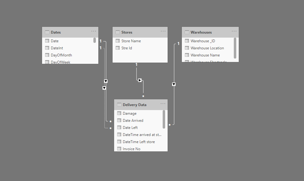
I also made limited transformations in the power query editor. Only adjusting a few column names and table names to make sure that whenever I created a visualization in my model I could very easily get all of the right labelings.
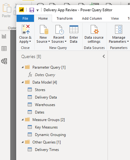
So with the core back end of my model sorted I jumped to the front end and started to create a few measures.
I quickly realized here as well that I didn’t feel I needed to create many measures to be able to showcase the analysis that was required in the brief of this challenge.
It’s been amazing to review some of the other submissions because I kept things pretty simple from an analysis point of view compared to some of the other reports that I’ve reviewed. I don’t think there is one right or wrong way here it is a matter of interpretation. I thought when reading the brief of the challenge that we just needed to showcase some key metrics versus each different warehouse location.
I realized relatively quickly that the visualization aspect of my report was going to be what would really highlight these key insights.
So with that in mind, I really spent a lot of time working on the visualization in my report. I went over to the report design inspiration area of the Enterprise DNA Knowledge Base, and I decided to do something a little bit different and really take my grid system within reports to another level.
https://info.enterprisedna.co/report-design-inspiration/
I focused on layering squares and rectangle shapes into the report and then placing key parts of the analysis in each of these different sections or grids within the report page.
It actually took me quite a long time to get to the final look of the report but with a lot of iteration until I think I finally got to a style which actually looks quite good, but at the very same time showcases the main insights that the stakeholders of the challenge wanted to see.
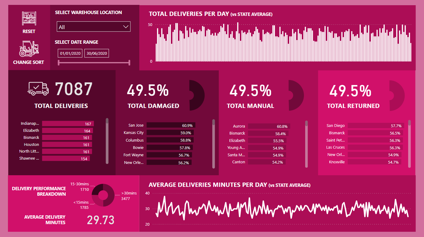
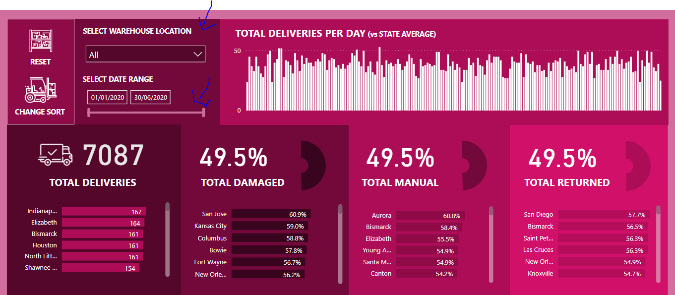
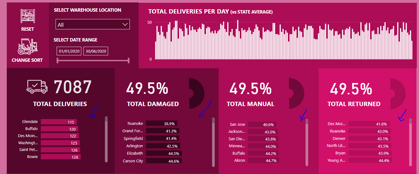
So a user can select a certain warehouse and very quickly see all of the deliveries over a certain timeframe and also the number of damaged products, menu entry, and returns. This is what the challenge was asking for and so I made it front and center in my report. Making it very obvious what the results were whenever a specific filter was placed into the report.
Down in the lower section of the report, I’ve also done some analysis on-time of deliveries. I’ve used a simple average technique to aggregate up each different today in the selected time frame.
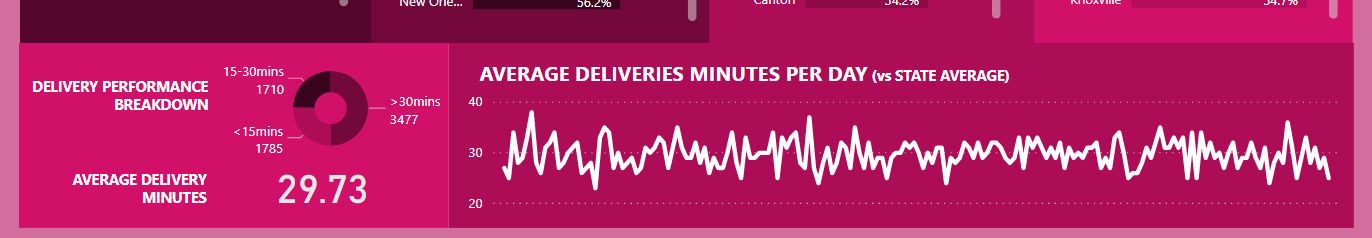
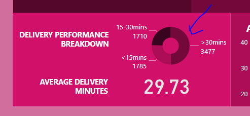
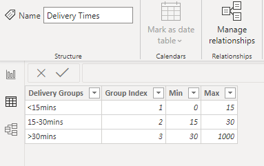
Two other interesting elements I’ve added to the report is the delivery performance breakdown. So I used a dynamic grouping technique here with a supporting table. I wanted to see what segments of our deliveries would be grouped into specific time frames for example less than 15 minutes, greater than 30 minutes and between 15 to 30 minutes.
Delivery Time Groups =
CALCULATE (
   [Deliveries],
    FILTER (
        VALUES
            ('Delivery Data'[Invoice No] ),
            COUNTROWS (
                FILTER (
                  'Delivery Times',
                   [Delivery Minutes] >'Delivery Times'[Min]
                  &&[Delivery Minutes] <='Delivery Times'[Max]
                )
            ) > 0
    )
)
This particular data did not exist in the raw tables. So we needed to create a supporting table in our model with these groups. That would then become a filter within the dynamic grouping DAX formula pattern.
Don’t forget also to utilize the DAX Clean Up tool when having to create longer formulas like this.
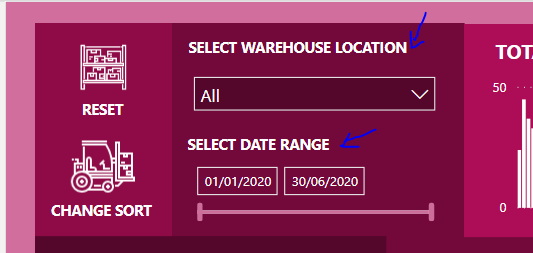
The last small addition I made to my report was the ability to reset any of the filters in the report and go back to the initial state. And then also I’ve created another bookmark for changing the sort of the middle bar charts. Because a user might want to see the worst performing but also their best performing stores or store locations. What I’ve done with the logos or the icons in the top left of the report as if I’ve just made the navigation that much easier for any user.
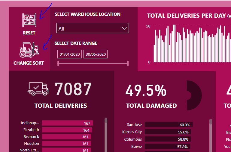
One of the other things I did here was I just tried to label everything really clearly. So it’s very easy for the consumer of the report to know exactly what they’re looking at with no ambiguity over what the metrics are telling them based on any filters that they might have in the report.
Overall the part I liked the most about this particular challenge was doing something different with the visualization. I decided to challenge myself by doing something a bit out there on the visualization side to really showcase how far you can push Power BI with design and also colors.
All that’s holding you back is your creativity and I really want to stress that. The more engaging you can make a report the more you’ll impress users and the more they will utilize your analysis and Power BI reports.
You can play around with this report here.
This will be available to all members as a pbix file in our showcase shortly also.
Thanks all for your wonderful participation in this challenge. It’s getting better every iteration.
Well done
Sam