I think just including a small note at the bottom of the page linking back to the source is fine. For my reports, I typically include an information page at the end, listing any additional data, custom visuals, supporting programs I used to create the report. I was going to put the link there. Here’s an example from my report on Challenge #2:
Of course, if you don’t want to bother with the citation, there are tons of other free city database sources. I just happened to like the layout and content of this one…
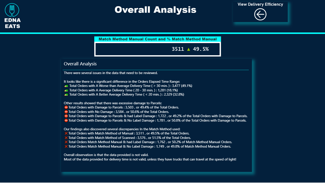
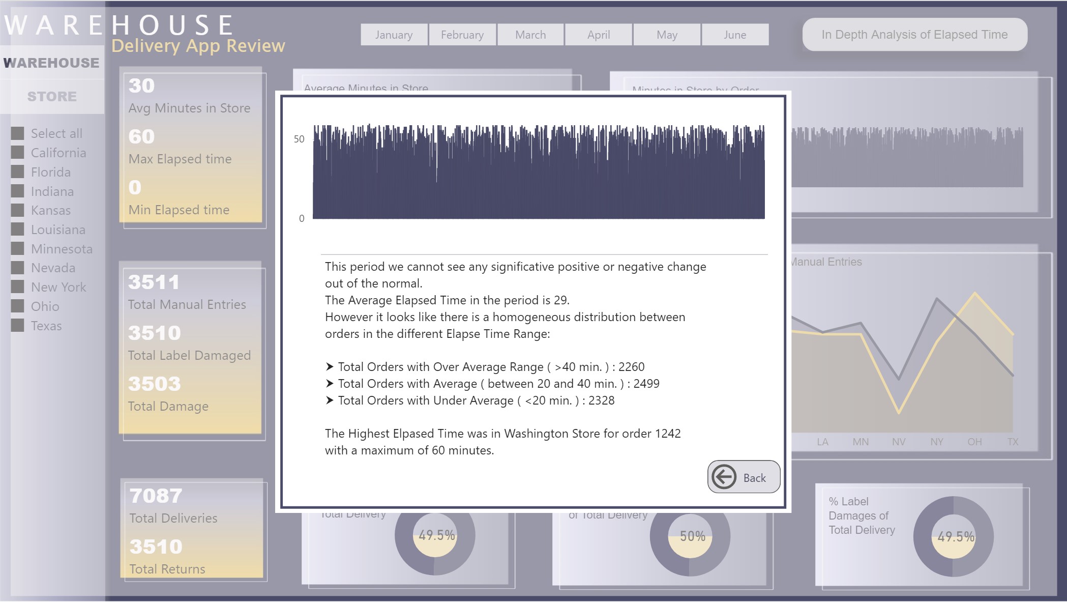
QUESTION!!! I could not figure out how to get the store with the highest elapsed time in a measure, I wrote the name, but I wanted to have it dynamic. If some one has a suggestion, I will appreciate your comments.
I’ve really gone out there with my visualization and challenged myself to do something different. The visual part of the challenge took me the longest time, just working out what would look good together.
I took inspiration for the report design inspiration section of our knowledge base.
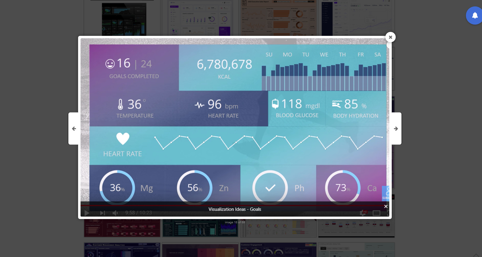
. I never would’ve imagined that visual scheme would work, but it really does. It’s striking, but not to the point of detracting/distracting from the analysis itself.
The report design inspiration gallery is also really developing well as more and more of these challenges produce great submissions.
Working on getting mine finalized over the next day or so and look forward to posting it, and can’t wait to see the other entries…
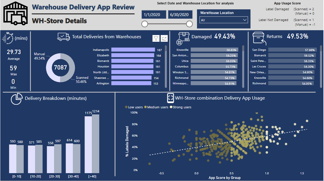
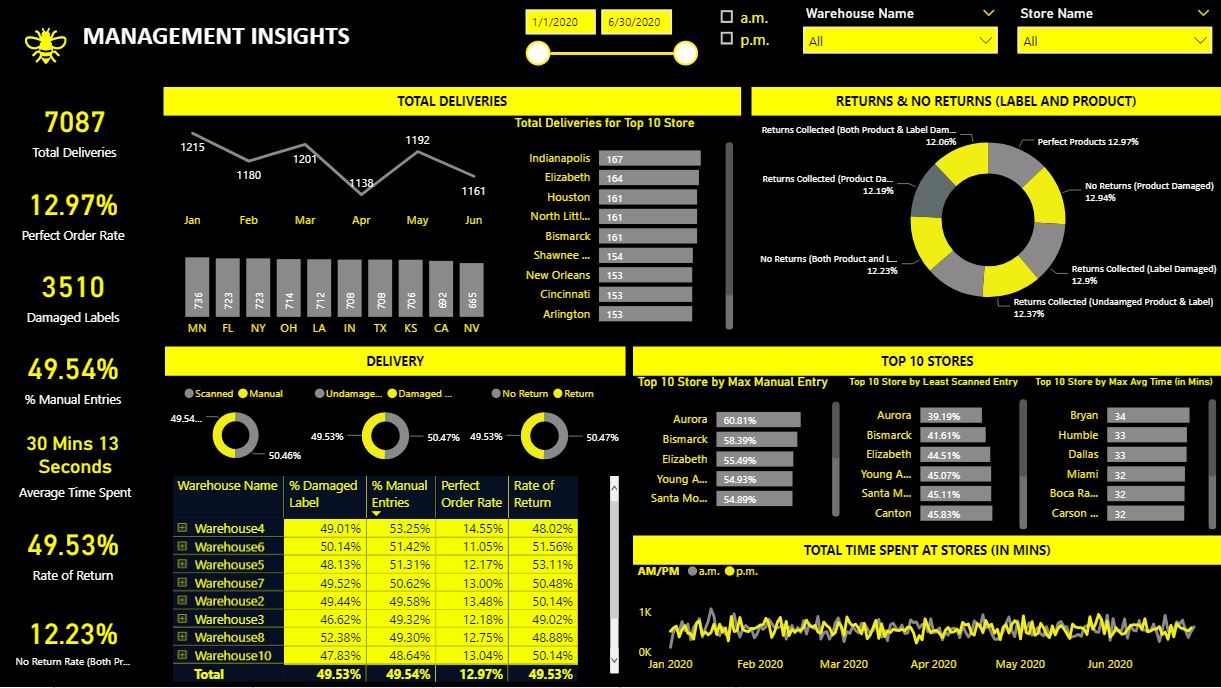
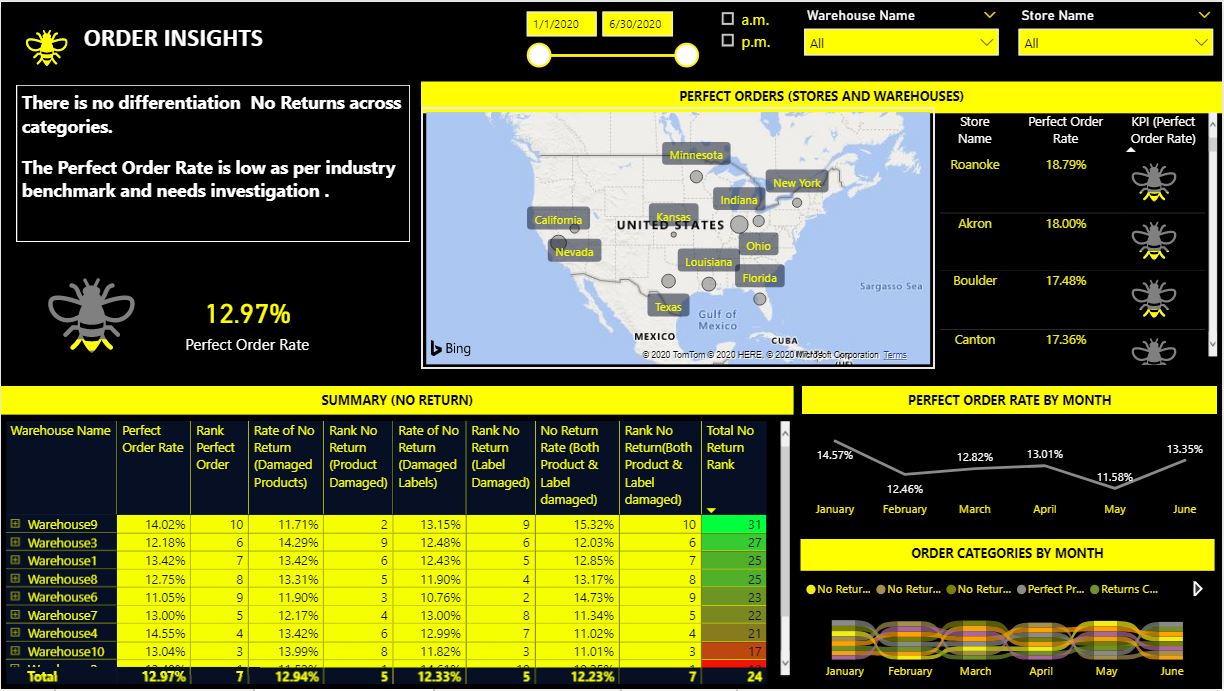
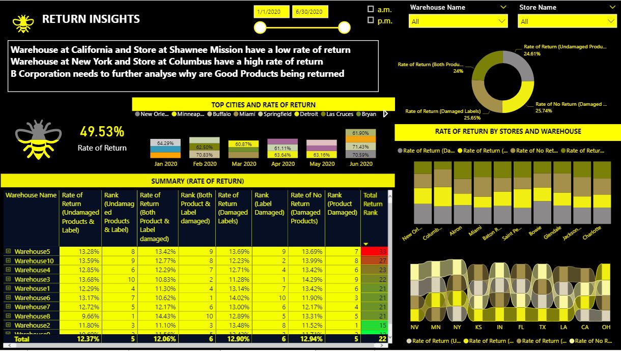
A brief overview of what I have done in this report.
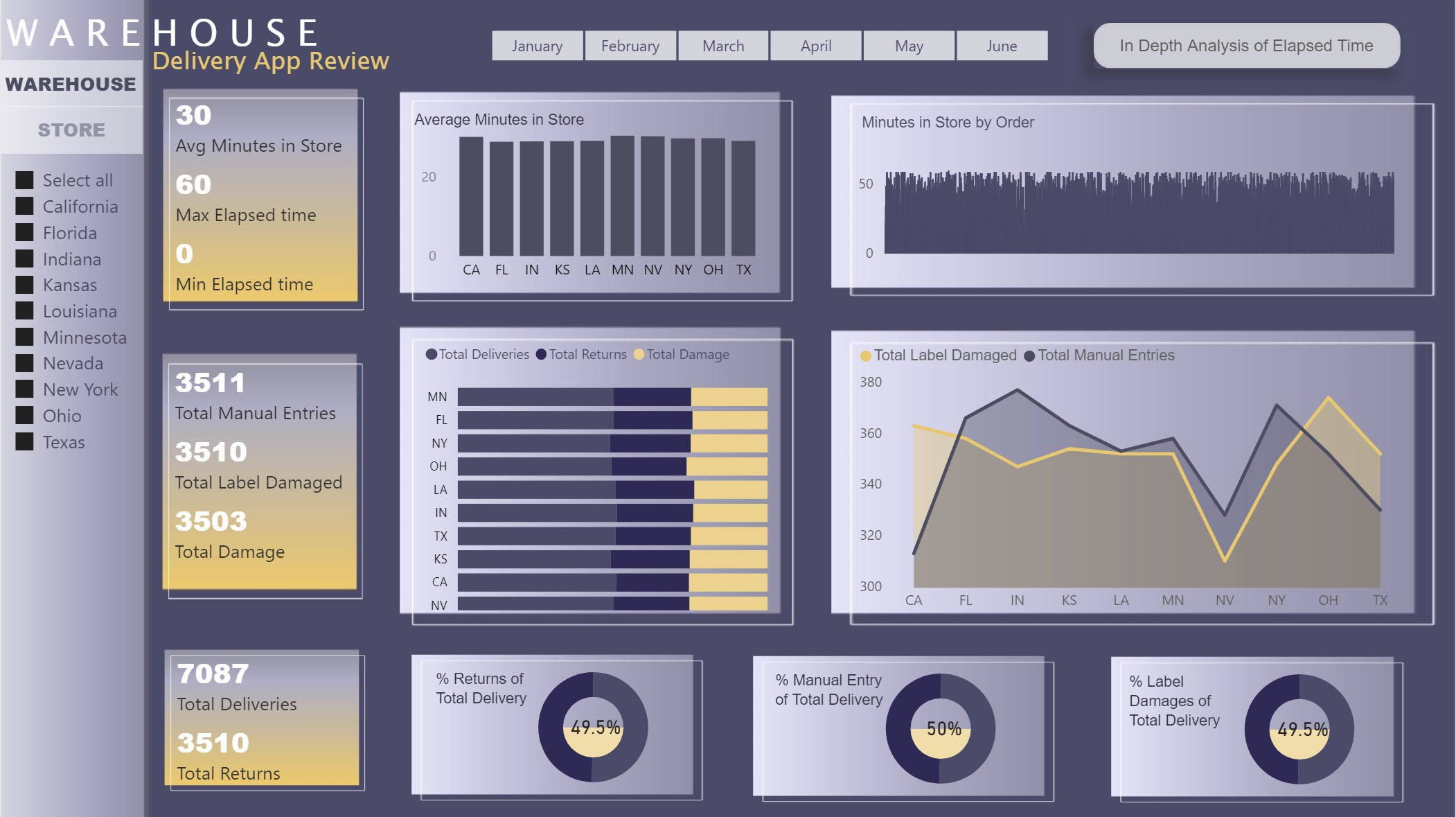
In order to analyse which WH-store combination is using the App regularly, I have created a metric called ‘App usage score’ and the average value of each WH-store combination is calculated.
The scoring criteria to calculate ‘App usage score’ for each delivery I use is
The goal is to benefit the app users more (those who scan) for scanning, even when the label is damaged, and to penalize those who do not scan even when the Label is perfectly OK.
The average app score for all WH-Store combinations is then used to segment in Groups (Strong, medium and low) based on their App usage and compared with % Label Damaged in a scatter plot. It can be seen that most WH-Store combination show some kind of a trend to use the Delivery App, while some are not using it at all. This will help the management to see the WH-Store combination where app usage is greatest and also the percentage of label damages.
I have also segmented the time spent in store in 5 categories, [0-10], [10-20], [20-30], [30-40] and [>40] for all deliveries.
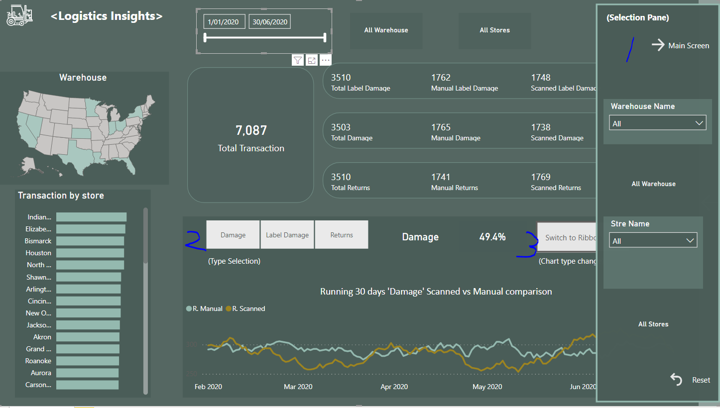
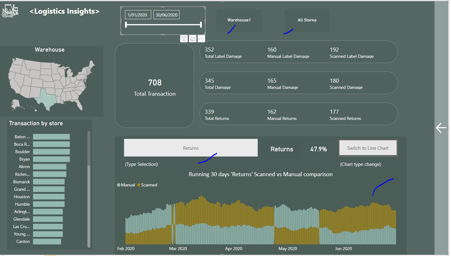
Hello Forum,
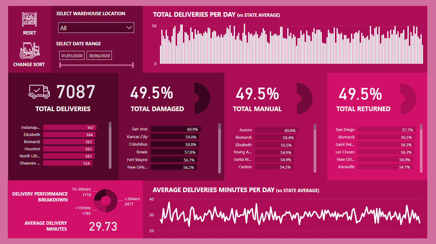
Please find the snapshot for my submission for Challenge 4.
Looking for any type of feedback on the report will help me to learn and improve more.


 . I never would’ve imagined that visual scheme would work, but it really does. It’s striking, but not to the point of detracting/distracting from the analysis itself.